Software
Houzz Logo Print
boychx

Need a lighter version of BM Edgecomb Gray!!!

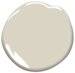
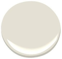
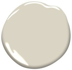
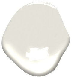
Help! I've used BM's Edgecomb Gray in 2 of my previous homes. It's always been my favorite for it's neutral tones, not too gray, not too beige, etc. We just moved into a new construction home, and I naturally assumed Edgecomb would be there perfect choice. Boy was I wrong! It looks more like Revere Pewter, with it's darker tones. I've tried having Edgecomb mixed at 50% value, but it totally changed the color, and just looked like a chalky gray. - Does anyone know of a LIGHTER version of Edgecomb?


Thanks,

Carol

Comments (56)

  • 8 years ago
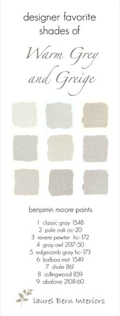
    BM Ballet White is s beautiful neutral. Depending on how the light hits it, it can look beige or gray. Also, check out BM Classic Gray.
    Business_Name_Placeholder thanked hopingtogetfit
  • 8 years ago
    BM gray mist
    Business_Name_Placeholder thanked Melissa Gallagher
  • 8 years ago
    BM classic gray
    Business_Name_Placeholder thanked Melissa Gallagher
  • 8 years ago
    ....
    Business_Name_Placeholder thanked Melissa Gallagher
  • 8 years ago

    For what its worth, when I had a similar dilemma, the clerk at the Benjamin Moore store recommended Balboa Mist and Wind's Breath. I ended up with Wind's Breath since the Balboa had a lavender appearance at times.

    Business_Name_Placeholder thanked H D
  • 8 years ago

    Did Wind's Breath look yellow?

    Business_Name_Placeholder thanked Micheline Hellwege
  • 8 years ago

    For me it is more of an off white/light taupe which looks peachy at times. I have it in my kitchen but would most likely not use it in a large open area.

    Business_Name_Placeholder thanked H D
  • 8 years ago
    Lacey pearl is on the same pallet as edgecomb gray but lighter. I also love classic gray. I’m currently stuck between these two colors for my small house.
    If you want something a little darker, light pewter is a light-ish version of revere pewter but it reads as fairly gray.
    Business_Name_Placeholder thanked Elle
  • 8 years ago
    BM Classic Gray?
    Business_Name_Placeholder thanked hopingtogetfit
  • 7 years ago

    I've had the same question ! I want a lighter version of Edgecomb Gray but it doesn't seem to exist. It's such a complex color and half strength of any color is totally unreliable. There is usually another solution than half strength of any color. (I wanted 50% Manchester Tan some years ago and discovered that Feather Down is almost exactly like 50% Manchester Tan. Very pretty color.) Gray Mist , Classic Gray Light Pewter, and Pale Oak are a bit too gray for my taste. I'm considering Winds Breath as I have it in other rooms upstairs and like it a lot, it's neither too beige nor too gray, or Ballet White. I'll look into Lacey Pearl and Fossil as recommended by others. Carol, let us know if you find a good color to stand in for that 50% Edgecomb Gray !

    Business_Name_Placeholder thanked ekaterine
  • PRO
    7 years ago
    last modified: 7 years ago


    Hi all, My apologies... I just now saw everyone's reply to my Edgecomb Gray question a while back. Thank you for taking the time to reply! After many trips and painted walls, we ended up with BM's "China White". In hindsight, I think Pale Oak might have been the better choice (as I've seen a few neighbours use it, and its beautiful!), but I decided to go with China White, as it's lighter (thus safer), then the others. Thanks! Carol

  • 7 years ago

    It looks great!

    Business_Name_Placeholder thanked Jenni B
  • PRO
    7 years ago

    The natural choice for a color lighter than Edgecomb Gray is Glacier White it's around 3 shades lighter in the same tones.

    Business_Name_Placeholder thanked Schmidt Painting
  • 7 years ago

    I have found that BM Gray Mist or Fog Mist are really to my eyes lighter versions of Edgecomb Gray. They have no weird undertones either. I think they are underused colors. Edgecomb gray always looked too dark in my house, whereas these colors look exactly like the pictures of Edgecomb Gray did.

    Business_Name_Placeholder thanked ekaterine
  • PRO
    7 years ago

    I will have to try the Gray Mist and Fog Mist. Glacier White is like the 5th most popular color on Cape Cod but it does not cover very well at all. It's aggravating that when you are at Revere Pewter the color under that is Edgecomb Gray and Edgecomb Gray is one step lighter but the same tones but then the next below Edgecomb Gray on the color wheel has nothing to do with being a lighter shade of Edgecomb Gray. I would think you would want a natural progression on the color wheels so the color wheel people should get on the ball.

    Business_Name_Placeholder thanked Schmidt Painting
  • PRO
    7 years ago

    By the way that's actually how they do the Sherwin Williams color wheel.

  • 7 years ago
    last modified: 7 years ago

    I agree. Benjamin Moore could do a much better job of organizing their colors.

    Business_Name_Placeholder thanked ekaterine
  • PRO
    7 years ago
    last modified: 7 years ago

    If you understand how to use color data values - think of it as color DNA - it doesn't matter how the chips are shuffled.

    But that's not helpful to the average person shopping for color. The displays and fandecks *look* like there's some logic built in or some kind of system is behind the order of the colors but there really isn't any rhyme or reason whatsoever.

    Some of the strip chips in the Sherwin-Williams new fandeck are comprised of colors from the same hue family, some of them aren't. So, you shouldn't count on it working like that.

    Business_Name_Placeholder thanked Lori A. Sawaya
  • 6 years ago

    i purchased Edgecomb Gray and full strenght was great in my formal areas foyer so, I tried it in my family room and found it was darker even with 3... 72x72 windows lots of natural light. I want to lighten it by 25%....will it be chalky?

    Thank you,

    Lisa

    Business_Name_Placeholder thanked Lisa Lindsey
  • PRO
    6 years ago

    Won't know until you have it mixed and can look at it.


    It all depends on how the person cutting the formula decides to do the math. Which means one person's success story cutting a particular color is no guarantee that others will get the same result out of their local paint store.

    Business_Name_Placeholder thanked Lori A. Sawaya
  • 6 years ago

    Sand White by glidden is a great color. I have had it made at a paint store since I liked their brand better, but it has worked for us. I have edgecomb in my master, so I hope that helps.

    Business_Name_Placeholder thanked Jolene
  • PRO
    6 years ago

    Just a word of advice most people can not see the difference at 25% lighter believe it or not. I've use Edgecomb Gray in areas and the homeowner wanted a accent wall in 25% lighter Edgecomb Gray. When they came home they thought we did not do it yet. I had to put the paint on their and show them that it was the right color. They ended up using glacier white instead. Remember 25% less tint does not equal the color 25% lighter. I'm not sure why but that has been my experience and some colors change to a totally different color. Take a color the has a little magenta in it removing just a little will cause a drastic shift in the color as magenta is the most powerful tint added into the paint. I believe that alot of times if it has magenta the paint store will do 25% of the color and then slowly add magenta back in a little at a time till the color looks right. At Sherwin Williams ever color that is matched that has magenta has to be put on something dryed out with a dry and tested against the sample. That's because magenta can be very unpredictable. Good luck. My advice use Pale Oak for this room which is a lighter version of Edgecomb Gray and save yourself the alot of trouble.

    Business_Name_Placeholder thanked Schmidt Painting
  • PRO
    6 years ago

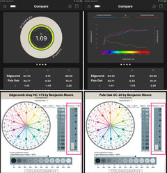
    Pale Oak and Edgecomb Gray are so similar it's not super obvious that they're not the same color.


    In terms of Value and LRV (lightness) specifically they're very close.


    Bottom line, Pale Oak is not a lighter version of Edgecomb Gray.


    Where they differ the most is Hue and Chroma.


    Most noticeable is Pale Oak is grayer, less colorful than Edgecomb Gray which is probably why some may perceive it as lighter even tho it isn't.


    Options that are truly lighter than Edgecomb Gray are Sail Cloth, Fog Mist OC-31 and Maritime White OC-5 could also be an option.


    I suggest getting chips of all four so you can compare and decide which one looks the most like a lighter version of Edgecomb Gray to you.


    Business_Name_Placeholder thanked Lori A. Sawaya
  • 6 years ago

    Pale oak is really pretty

    Business_Name_Placeholder thanked User
  • 6 years ago

    I tried Edgecomb 75% lighter REALLY did not like! I ended up with SW Alabaster... I originally wanted a light gray with a soft subtle blue hue but couldn't find it . If you can suggest one on a west facing family room with 3 ....72x72 windows I'd appreciate it.

    Thank you,

    Lisa

    Business_Name_Placeholder thanked Lisa Lindsey
  • PRO
    6 years ago

    If you can suggest one on a west facing family room with 3 ....72x72 windows I'd appreciate it.


    The direction the windows face doesn't matter.


    Because that's just ONE factor (of many) that contributes to the overall quality of light you have to work with. Which way the windows fact is certainly not THE defining factor.


    The light is what it is.


    Since "75% Edgecomb Gray" is not a standard, meaning the 75% version you got from your paint store is VERY likely completely unique to that one can of paint, that's not a good nugget of info to use either.


    The easiest place to start is with a list of the light grays that you tested and what specifically you didn't like about those colors.

    Business_Name_Placeholder thanked Lori A. Sawaya
  • PRO
    6 years ago

    Marylin's Dress is gray blue that is work.

  • 6 years ago

    SW Zircon is light gray with cool tone

  • 6 years ago

    Baby fawn is similar to Edgecomb gray but a tad lighter and a tad more silvery... but beautiful in my east west facing condo. It is more silvery in the room that has a west window and more greige in the rooms with an east window.

  • 6 years ago

    Has anyone used Pale Oak in a large open concept home? is it too feminine? other sources say it flashes pink. I've seen picture of it uses in bedrooms and they always have a floral picture or a light pink throw on the bed. Can it handle a big open space with living room furniture?

  • 5 years ago

    I have Pale Oak in my foyer and living room with cathedral ceilings. It came out great!

  • 5 years ago

    Try soft chamois...lovely, light greige..I also had edgecomb grey in my last home and wanted something lighter/whiter but still warm and with some depth. Very pleased with it but I don’t get a lot of direct sunlight so it works well.

  • 5 years ago
    last modified: 5 years ago

    you guys are speaking my colors so to speak! I'm currently in the big middle of looking at all these colors. I have trim & cabinets painted in SW Kestrel White which is very pretty but is slightly too dark a tone for trim and it flashes an ugly pink at times. Thought I had found a winner with Elmira White which I planned to use on the walls cabinets and trim in my triple Jack and Jill bath but the slight yellow undertone kind of bother me plus it is actually slightly darker then Kestrel White which is the opposite of what I want. Countertops are Cambria Berwyn we just had installed. My niece who is an interior designer looked at my multitude of paint swatches and picked Pale Oak which I am hoping is what I have been looking for. I considered Ballet White but it is just too light. Our home has the Kestrel White trim throughout and mostly mid to dark toned colors. So while my bathroom needs to be lighter, it cant be too light or it won't flow with the rest of the house. Taupe colors are the hardest to work with but they just seem to fit this space so well I that I cant give it up! I'll post results and pics soon.

  • 5 years ago

    How did the pale oak turn out? I decided edgecomb is too dark. I am worried about all the undertones people talk about.

  • 5 years ago

    I have a mixture of colors in my home that may sound odd but in my lighting it works. I had my bathroom cabinets painted in Pale Oak...great color for cabinets. It works well with the SW Rainwashed walls. I have lots of lights in this room but he rest of my house is less well lit and gets very little natural light. I went with SW Aggreeable Beige in my bedroom and home office, BW Paladian Blue in my living room and BW Edgecomb Grey in my hallways and plan on using it in my kitchen.


    I agree with Lori, Edgecomb Grey is more colorful than Pale Oak.


  • 5 years ago

    I have been going over colours for weeks now and its driving me mad.lol But for what its worth I just decided on Ballet White for something after MUCH deliberation and many samples...and I would have to say that imo its the most like Edgecomb that I've found in the lighter range. Its LRV is 73 so not super light, def lighter than Edgecomb which is 63, and still has the same neutral, warm greige look and feel. Side by side they look in the same family to me anyway.

  • 5 years ago

    Do you have a picture?

  • 5 years ago

    BM Lacey Pearl

  • 4 years ago

    Late to this thread but in case it helps anyone in the future... BM Ashwood is a “Greige” similar to Edgecomb. When trying to find lighter versions of paint it’s helpful to look at the LRV (light reflective value. Edgecomb is 64, where Ashwood is 68 (lighter). Ashwood has a more of a green undertone for those that are worried about the pink hue of pale oak. I prefer green undertone due to the fact I have a lot of natural wood features but others may not.

  • 4 years ago

    Hi I am considering ash wood in my home so was excited to see your post. Do you possibly have any photos to share?

  • 4 years ago

    I know I'm joining in this conversation a little late in the game but I am painting my hallway and edge foam Gray I have chosen Kendall charcoal from my front doorway I have an area on the side of the doors underneath my stairwell that I need to paint some sort of off-white. I am between Swiss coffee and glacier white, I've even contemplated Dove wing which to me looks too pink. The room to the left of the hallway is currently Stonington Gray so I need something that's going to sort of blend the cool blue gray of Stonington to the warmer green Gray of edgecomb I am completely at a loss and could use any suggestions possible. Tia

  • 4 years ago

    @shellirave probably best to start your own post with pictures.

  • 4 years ago

    Classic grey

  • 3 years ago
    last modified: 3 years ago

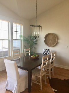
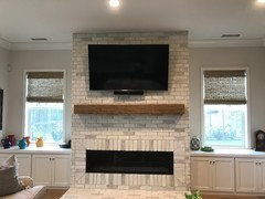
    this post might be too old to help - but on the off chance that someone is still looking for a 'less grey' edgecomb grey - this is what we did. we reduced the formula by 25% and added white. Regular Edgecomb grey can top reads: Y3 0x 18.0000 / S1 0x 11.0000 / S2 0x 2.0000 / R1 0x 15.0000 but we changed it to this and it turned out beautifully: Y3 0x 13.7500 / S1 0x 8.25000 / W1 0x 30.5000 / S2 0x 1.5000/ R1 0x 11.5000. The photos are the result in a west facing room mid morning and gets warmer throughout the day

  • 3 years ago

    Is it reading more beige or gray?

  • 3 years ago
    last modified: 3 years ago

    I have a windowless laundry room. Does anyone know how Edgecomb gray works without natural light?

  • PRO
    3 years ago
    last modified: 3 years ago

    Electricity is as varied as natural light. Nobody knows how you light your laundry. What fixtures, how many or where. Led or other? Surface mount or recessed ?Best test ? Roll it on your walls : )

  • 2 years ago

    We used Edgecomb gray in downstairs bathrooms with no natural light. It looks kind of like … nothing. Kind of off white, maybe gray, definitely nondescript. That’s ok because the tile is the star, but I wouldn’t use it again.

  • 2 years ago

    @apsheri - do you have a pic of your lightened edgecomb grey? Thanks!