Software
Houzz Logo Print
sunshineglo

Need Help for New Kitchen

13 years ago
last modified: 13 years ago
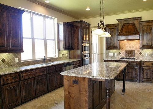
Our Builder has a standard Kitchen layout.
I want to re.arrange and change the design..
Please give some ideas...
The kitchen width is 13' and 20' long includes breakfast area.
Does anyone believe in Vaastu...i never did....but wonder how does it really help
The Sink is in South....gas is in West....breakfast is in East..

Comments (24)

  • PRO
    13 years ago
    last modified: 13 years ago
    Hi ! What are the bits you are not happy with ? Does it need to be adapted to be Kosher or something along those lines ?!
  • 13 years ago
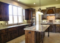
    I like the layout pictured ... if you are sitting at the breakfast counter, you can see out the window. One thing I might suggest is taking the cabinets up to the ceiling.
  • 13 years ago
    @Pattihenderson.....extending the cabinets up to the ceiling is an awesome idea....wow that would make them more than 42"
  • 13 years ago
    last modified: 13 years ago
    Your kitchen looks amazing! Congratulations! The back-splash goes with the counter tops and the flooring, its amazing. It looks very comfortable and family friendly. The only thing are the low cabinets, as pattihenderson mentioned. Good luck with your kitchen, it looks amazing!
    sunshineglo thanked mariamaly1999
  • 13 years ago
    "extending the cabinets up to the ceiling is an awesome idea." Without a full cabinet replacement . . . what can be placed on top of them to extend up to the ceiling?
  • 13 years ago
    Connect the 2 sets of cupboards over the sink with a valance. Also, take this side (sink side) up to the ceiling. Then take the range hood to the ceiling, but not the adjoining cabinets. This will help it stand out. Also, consider making the hood black or other painted color
  • 13 years ago
    @ OnePlan , in the pics the island look....
  • 13 years ago
    Your pics are not all the same kitchen. The wall where cooktop goes, I would have bigger cooktop and hood. I would take cabinets to ceiling.
  • 13 years ago
    Am I the only one that notices that each of those kitchens are different?? Different flooring in one, different location of a cabinet in another. Different location of the oven in another. Are those the kitchen design options the builder has and you want input on which is the best?
  • 13 years ago
    That's what I meant too Megan.
  • PRO
    13 years ago
    how about a custom round island?... i also like the newer look of lighter cupboards above with darker below
  • 13 years ago
    You might try balancing the large talls /bookending the wall ovens and ref. if possible to do plbg in island, you get a more inward facing sink station. If plbg stays to outside wall, then maybe island can hold the ovens and ref can get tucked into corner wall and a pantry to balance at the other end
  • 13 years ago
    @megalauer. @shortped........ Correct ..i was going to add a new post for Flooring !,

    Which one looks better?

    Plain Porcelain 20x20
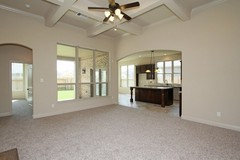
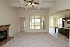
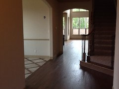
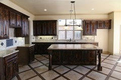
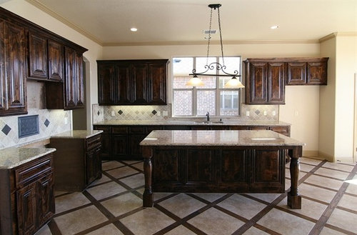
    Porcelain with woodlike inserts Checkered...dining with Chekered floor in last pic..
    Will Foyer.Entry look good with Chekered Tiles
    WoodFloors
  • PRO
    13 years ago
    I was confused too by the different pictures. Are you showing different kitchens that this builder has done that are his standard? You need to get a kitchen designer involved. Kitchens should not only take into consideration the architecture but your style of living and your taste.
  • 13 years ago
    Which kitchen layout looks better.?
    The gas Range
    The Sink
    The Refrigerator.
    The oven Microwave
  • PRO
    13 years ago
    Wood floors are more comfortable on the feet and forgiving if you happen to drop something. Just be sure there is contrast between the floor and the cabinets. There is not enough contrast in the pictures. Are you going with such a dark cabinet finish?
    sunshineglo thanked KBDesign
  • 13 years ago
    last modified: 13 years ago
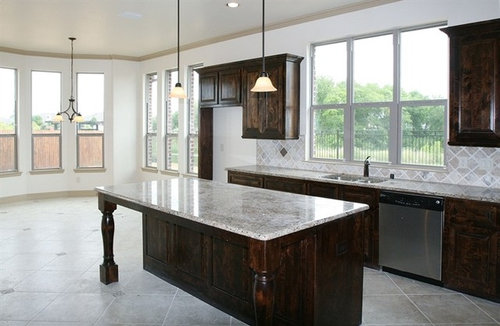
    @ eagledzine.... Correct.Builder has standard designs...and he says every design change i make....he charges 1k the gas range position....or the sink position.
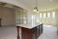
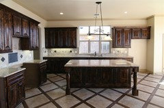
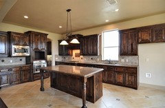
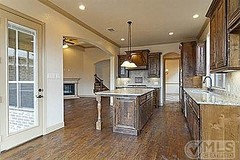
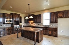
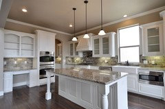
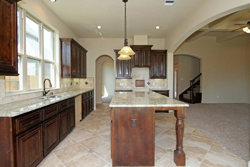
    The 1st pic below have a gas range with hood- tile floor
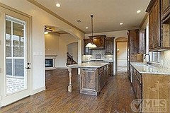
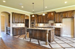
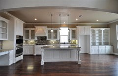
    The 2nd pic same layout with Wood Floor
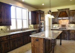
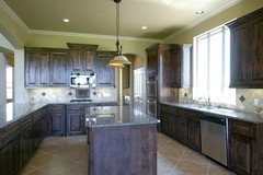
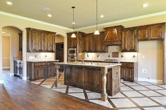
    The 3rd pic Gas + Sink + Refrigerator on one counter top,M/W+ Oven on side.
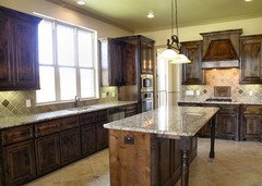
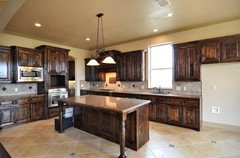
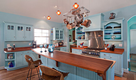
    The 4th pic M/w Oven + Gas Range + Refrigerator on single counter, Sink on Island
  • 13 years ago
    Top left
    sunshineglo thanked Jessie Rountree
  • PRO
    13 years ago
    I prefer the first layout. Where is the refrigerator?
    sunshineglo thanked KBDesign
  • PRO
    13 years ago
    In the fifth set of pictures you show:

    The Ovens—The oven in #2 looks out of place. What is the hole above it for? Perhaps a microwave will be placed there. The oven in #1, #3and #4 opens into a doorway. This creates a traffic obstruction. In #1 it would be better placed under the stove top and install a drawer microwave or put it on the shelf. In #3 it would have been better placed on the left wall with the microwave above it. In #4 it may have been the most logical place for it since it is a double oven with a separate microwave.

    Sinks—I can’t really see the sinks but I can see the faucets. They all have single handles, which are preferable. It makes turning them on and getting the right temperature much easier especially when you have something in one hand or your hands are slippery. #1 and #3 look like they have pullout sprayers, which are usually more expensive unless you get a cheap brand that does not have a ceramic washer and won’t last as long. #3 has a taller neck, which makes filling large pots of water much easier and gives you more working height in the sink. These kitchens all look large enough to benefit from a prep sink in the island. It is very helpful when there are more than two people in the kitchen and odd jobs.

    The refrigerator—In both #2 and #3 the refrigerator cabinet is 12” (or 13” in some cases). That makes them very difficult to access. They should be 24” and the refrigerator panel should correspondingly be 24”. Otherwise, your refrigerator will partially stick out and stand out visibly to the adjoining area. 24” deep cabinets are slightly more expensive so this may be a budget issue that is not included in allowances. Be careful not to put a refrigerator against a wall that is deeper than the refrigerator box including the space behind it or the door will not swing open far enough to open the drawers.

    The finish—Ask to visit other jobs and make sure the finish on the cabinets is smooth and meets your satisfaction.

    The legs on the islands don’t fit the windows. The legs are colonial but there is no colonial trim around the windows. An alternative would be to put a panel there and cover them with a cabinet door. Something straighter would be fit the look better. Or a straight leg with an arch between the leg and the island. The range hoods are also Colonial. I would opt for something different there.

    The lighting—There isn’t enough can lighting. Can lighting is designed to light the walkways of the kitchen without interruption. The light over the sink, which shines down to illuminate the working area of the sink and the light over the island which is designed to give some downward shining light and some light spread around the room is not designed to light the walkways. The lights in #3 don’t look sufficient. They should be 60” off the floor more or less. These look higher and too small to do the job well. This could have been a budget issue.

    The moldings and cabinet height—Since the ceilings and windows are high, it would be better to go with taller cabinets or put a frieze around the top of the cabinets underneath the crown to bring the cabinets at least up to the height of the window. Then either a single crown or a stacked crown could be used. In picture # 2 there appears to be three
    Separate cabinet heights, each one less than the other. This creates a visual slant not pleasing to the eye.

    There are no knobs on any of these cabinets. Allowances may not be sufficient to put knobs on but if you can afford it, it would add immeasurably to the look.

    There are no drawer banks at all. It is advisable to have at least one drawer bank. The more the better. They are much more convenient than pullouts since you don’t have to open the door(s) to get to the pullout. This is often a budget issue, since they cost more. It may not be included in your allowances but could be offered as an upgrade.

    Shelves—The shelves should be adjustable on both top and bottom.

    Construction—3/4” interior plywood boxes are preferable. After that 5/8”plywood. They should be screwed to the wall with 4” installation screws.

    If you want to hang your drapes on the outside of the windows instead of the inside make sure the crown is high enough or sets back enough to do this. Roman shades hung on the inside of the window look very nice however and are quite popular now.

    These cabinets look to be Birch, which has a nice tight grain and is good for painting. They would look better painted a bone given the color of the counters and floor and style of the interior of the house. Take a look at some kitchens with arches. This is also a budget issue. Painted cabinets usually cost more. http://www.houzz.com/kitchen-arches/p/8

    One last thing. The cabinets seem very uniform. I'd try to give them some variation either in size or in some glass in the uppers. Glass shelves look good in glassed door uppers. This too is a budget consideration.

    Best wishes.
    sunshineglo thanked Linda Mayo
  • 13 years ago
    @KBDesign.........Century21 .... Yes i do like light cabinets..but builder says...i should choose from 4 standard dark cabinet......the builder would charge extra ..which lighter shades should i choose....
  • 13 years ago
    I like the white cabinets with wood floors
    sunshineglo thanked Katie Layfield
  • PRO
    13 years ago
    I too, like the white cabinets with the old floor ! Very classy !
    sunshineglo thanked OnePlan