

Which curtains?
8 years ago
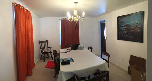
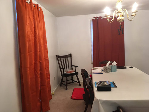


Bright orange

Rusty orange
Featured Answer
Sort by:Oldest
Comments (15)
 PRO8 years ago
Related Professionals
Plymouth Interior Designers & Decorators · Palm Desert Interior Designers & Decorators · Evanston Interior Designers & Decorators · San Antonio Kitchen & Bathroom Designers · Poplar Bluff Furniture & Accessories · San Antonio Furniture & Accessories · Salt Lake City Furniture & Accessories · Omaha Interior Designers & Decorators · Houma Architects & Building Designers · Gulfport Architects & Building Designers · Richmond Architects & Building Designers · Garden City Design-Build Firms · Middlesboro General Contractors · Chico General Contractors · Temecula General Contractors 8 years ago
- 8 years ago
- 8 years ago
- 8 years ago
 PRO8 years ago
 8 years agolast modified: 8 years ago
- 8 years ago
 PRO8 years ago
- 8 years ago
- 8 years ago
 8 years ago
 8 years agolast modified: 8 years ago
- 8 years ago

Related Stories
DECORATING GUIDESWhich Wallcovering Is Right for You?
Transform a Space With a Wall of Wood, Paper, Fabric, Maps and More
Full Story
BATHROOM DESIGNWhich Bathroom Vanity Will Work for You?
Vanities can be smart centerpieces and offer tons of storage. See which design would best suit your bathroom
Full Story
REMODELING GUIDESWhich Window for Your World?
The view and fresh air from your windows make a huge impact on the experience of being in your house
Full Story
KITCHEN DESIGN12 Great Kitchen Styles — Which One’s for You?
Sometimes you can be surprised by the kitchen style that really calls to you. The proof is in the pictures
Full Story
WINDOW TREATMENTSHow to Choose the Right Curtains
Custom or ready-made? Pinch or pencil pleats? Knowing the options will help you decide which window coverings are right for your space
Full Story
HOME TECHIs It Curtains for Curtains? Smart Glass Eliminates Window Coverings
Windows can now control light and heat through electricity and high-tech formulations, making blinds and shades optional
Full Story
DECORATING GUIDESDark Curtains See the Light
For a cozy feel or a visual trick for ceilings and windows, dark, moody curtains and drapery treatments have a bright outlook
Full Story
Curtain Rods: Wood or Metal?
Give your windows top billing with curtain hardware that hits the high notes
Full Story
BATHROOM DESIGNShower Curtain or Shower Door: Which Is Right for You?
Find out which option is the ideal partner for your shower-bath combo
Full Story
WINDOW TREATMENTSEmbellishing Tricks for Cost-Effective Custom Curtains
Get curtains that look high end — even if you don't sew — with just a little trim here or a little banding there
Full Story




phuninthesun