Software
Houzz Logo Print
enk05

Need help deciding on a backsplash

8 years ago

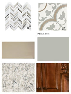
I'm trying to decide which backsplash would work best in our kitchen. I
like the color contrast in the chevron pattern, but most of our kitchen
is very traditional style, so I'm wondering if it's too modern to fit
the style of the kitchen. We would just be doing the accent tile above
the stove & then subway around the rest. The small square at the bottom of the comparison photo is our countertop sample.

Thanks!


Comments (25)

  • 8 years ago

    Upfront disclaimer: I am generally not fond of chevron/herringbone patterns. That said, I think that the multi-color chevron pattern fights with the countertop. If it was a solid color chevron, I think it would be better. However, your cabinets are traditional and have some curvy elements. I think the medallion pattern would blend better with the style, and the colors are also softer and a big enough pattern to be in better scale with the countertop pattern. It's easier to blend a large and small pattern than two patterns in similar scale. Maybe someone could help and photoshop them both into the space for you. A picture of the range area from slightly farther back would be better.

  • 8 years ago

    Your cabinets are busy (in a good way) and your countertop is busy. I would not add a third busy element with a busy backsplash.

  • 8 years ago

    Neither one .. you already have elaborate cabinets and swirly countertop material. You don't need another high-impact spot clamoring for attention.

    Of the two tiles, the rounded design would be a better blend. The herringbone is sharp and angular, the cabinets and stone are rounded and not angular - they clash.

  • 8 years ago
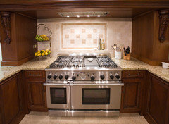
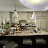
    Here's a picture of the full kitchen if it's helpful. The color of subway tile I picked only comes in 4x8" I'm wondering if those would look too large if I used them in a herringbone pattern as the accent?
    https://www.tileshop.com/product/imperial+oatmeal+gloss+ceramic+tile+-+4+x+8+in.do
  • PRO
    8 years ago

    Those tiles do not work with your countertop. Keep it far simpler.

  • 8 years ago

    I would not mix the chevron and the encaustic tile together. I did my laundry room with the encaustic....it is beautiful but very busy.

  • 8 years ago
    No, not planning on mixing those two. I was thinking subway with one of those as the accent.
  • 8 years ago

    I misunderstood.....thought you wanted to mix the two. In any case I would keep it simple. I don’t care for either one of them with your counters and cabinets.

  • 8 years ago
    last modified: 8 years ago
    i agree with others, no-go on either... find something way simpler...

    you have beautiful counters, let them be the star!!

    JMO, i like a matte tile vs. a shiny one, but that's just me...

  • 8 years ago

    I like both of those tiles but I don't like either of them in your kitchen. I'm also wondering why you have chosen grey subways for the rest of your backsplash - IMO it clashes with your other finishes and darkens an already darkish room (wood cabs and dark wood floors).

    With all of the warm brown wood and your counters (which appear cream colored from a distance), I would go with a warmer and lighter backsplash. Personally, I would look at a cream colored crackle subway or something equally warm-neutral for your main tile and then consider a bright color for an accent if you are set on having an accent above the stove.

  • 8 years ago
    It is actually cream colored. Maybe the photo looks different. The color is called oatmeal.
  • 8 years ago

    Oh wait, I see grey subways in your first photo and then cream ones in the second photo, in your actual kitchen. I like the cream ones very much! But neither of those accent tiles work with the cream at all, imo.

  • 8 years ago
    last modified: 8 years ago
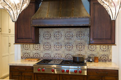
    I agree that those accent tiles don't go with the rest of your kitchen, both in terms of pattern and color (the grays are too cool for the rest of your kitchen).

    If you like a herringbone pattern, why don't you use your cream tile (which looks like a lovely match with your counters) in a herringbone pattern throughout your backsplash and skip the idea of an accent behind the stove?

  • 8 years ago
    Here are the colors from the product web pages if it helps to see colors.
  • 8 years ago

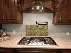
    IMO the best photo is the one showing the samples in your kitchen. That way you see them against your appliances, in the real lighting conditions - and in that photo, it is clear that the two accent tiles clash with your cream background tile and your countertops. The accent tiles both have a cool white color in them (not to mention the cool grey) that really fights with the warm cream of your background tile. Your countertops seem to have some white (and grey) in them, but they read cream from a distance and your background tile reinforces that impression. If you are really set on the cream background tiles, you need to look at other accent designs.

  • 8 years ago

    I'm with jannicone. You counter top reads 1 color from distance and the pattern tile is different enough to go nicely with it. Also, your wooden hood vent above has a curve, just like the pattern. I'm so tired of safe and "bring your personality in towels and vases" kitchens....this makes your eyes light up, go for it! Have fun, it's just a back splash, not a 50 year commitment!

    enk05 thanked lucky998877
  • 8 years ago

    Thanks for the feedback. I see what some are saying about keeping it simple, but it's 22' of countertop and backsplash, so matching cream with more cream just seems like it would get boring. I'd like to break up the cream with some contrast too.

  • 8 years ago

    Like luckyblueeye, I am kind of tired of the safe, white on white or cream on cream kitchens I am seeing everywhere these days. I am definitely a fan of contrast and I think an accent tile of some type would look great in your kitchen. Just not those particular accents! Your countertops aren't so busy that you can't do a backsplash with more pizzazz, but the white/grey combo just doesn't work with the cream.

    BTW, your countertops remind me somewhat of the granite I put in my previous home, which I paired with a glass mosaic backsplash in various shades of copper, terracotta and bronze. I never once regretted the color nor the "busyness." Unless I choose a truly showstopping granite for my next kitchen remodel, I will absolutely have another colorful backsplash.

  • 8 years ago
    Does anyone have an example of an accent tile that would look good with our countertops & cabinets?
  • 8 years ago

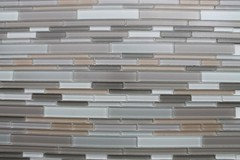
    Maybe something like this?

    Or this?

    (they're both from Rocky Point Tile)

  • 8 years ago

    What colors do you like? I personally would be tempted to go with some shade of green in your kitchen, but if you hate green that would be a no go. Do you have accent pieces in some color scheme already chosen?

  • 8 years ago
    Blues, greens, teal, gray, tan.. everything is pretty neutral in there so far. We will have a bench seat that's this color
  • 8 years ago

    Here are a couple of greens - not that these are necessarily what I would choose, but they give you and idea of what a color might look like in there!


  • 8 years ago
    last modified: 8 years ago

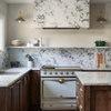
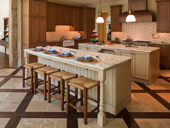
    I like your kitchen and I think the tile choices you made are lovely. It would be busy so if that bothers you, what about going with a pattern but similar color to your counters? Or maybe around the cook top put a herringbone, texture or a pretty design...

    Here are some ideas that look pretty to me, maybe you might like them.

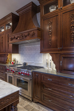
    William T Baker Houses · More Info

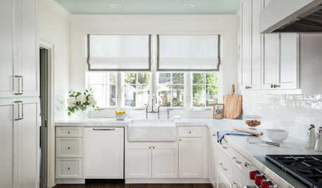
    Mediterranean Bliss · More Info

    Traditional Home Renovation · More Info

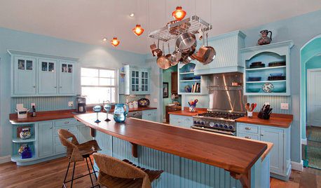
    A Victorian Kitchen · More Info