Software
Houzz Logo Print
slipton769

HELP!! Need perfect cool, light gray, not too blue/green, no greige!

8 years ago

HHAAAAALLLLPPPPP!!


I'm looking for the perfect very light gray paint that doesn't look too blue! After reading a million design blogs, I settled on Stonington Gray by Benjamin Moore, and it really looks very blue in the area I painted, after everything I read swore it wouldn't be blue. It didn't even look blue in the swatch I painted on the walls, but then once the whole wall was done, bam. Blue. I wanted to do my whole entry hall, stairwell to upstairs, and upstairs hallway in the same super light gray. We've only done one coat of the Stonington so far, and I'm afraid it will look even more blue after coat #2, so not sure how to proceed. I thought about lightening the can I have by 50%, but not sure if that would help or make it even more blue.


I don't want any greige/cream at all, as we're doing stark white trim/ceilings. Gray, black, and white is the color scheme for the kitchen, and I want the entry hall/stairwell to match. Preferably would like to stick to Benjamin Moore.


Who can help a gal out?? Please and thanks!!

Comments (35)

  • 8 years ago

    Finding the perfect gray is so hard. I have at least 10 samples of gray paint, and in each room they looked different but most of them were purple. We chose collonade gray for our den, it has a very subtle blue tint I don't love, but can live with overall. It's very cool. I've had luck with other grays, but they all turned out very dark, which works well in our bedroom but wouldn't for a common area. Best advice is to get samples, because what looks good in one room may not look good in another. Good luck!

    Sam thanked Liz O
  • 8 years ago

    These may read as too blue/green for you, but we have loved BM Wickham Gray and BM Pale Oak. Good luck-- finding the right paint color is a science and an art form, and lots of trial and error!!

    Sam thanked jmccleery
  • PRO
    8 years ago
    last modified: 8 years ago

    I have gray owl in our finished basement. I don't think it pulls any of the tones that you are looking to avoid.

    We have stonington gray in our office and also wickham gray. *wickham gray has very green/blue tones

  • 8 years ago

    I tried gray owl and it was too green for me. Same with the wickham :-/

  • PRO
    8 years ago

    Harbor gray looks like it might be more neutral. AC-25

    Sam thanked Barnes Custom Builders
  • 8 years ago
    No advice, but I totally know what you're going through. We're trying to find the right grey right now. We're leaving our woodwork natural, so we're hoping for a grey with blue undertones, since anything else appears to yellow next to it. But the key part is UNDERtones. I'm worried about it actually looking blue, especially since we're using teal accessories as accent colors and I don't want the wrong blues to clash. It's tough.
  • PRO
    8 years ago

    Try Benjamin Moore Silver Chain. Perfect gray.

    Sam thanked vanessa_ghee
  • 8 years ago
    Have you tried a sample of BM’s Classic Gray? It’s an off white with warm gray undertones. We just painted the entire interior of our home this color, and love it!
  • 8 years ago

    @hopingtogetfit thanks but looking for a cool gray not warm!!

  • 8 years ago

    We used SW Fleur de Sel in master bedroom and bath and it is a cool, very light gray. A hint warmer is SW First Dawn - we used that downstairs b/c Fleur de Sel was a little "too" cool. I know you want BM but you may find some hints in the color formula. SW sample quarts are very inexpensive (almost always coupons online 30-40% off). I think Fleur de Sel is listed as a "white" in the SW categorization. You may find similar light grays classified as whites in BM, too.

  • 8 years ago

    I truly love BM paint but could never get the exact light gray I was looking for without any green/purple/blue undertones. Reached out to the Houzz community and they advised that French Gray or Light French Gray from Sherwin Williams are the perfect true grays. Loved them and think either might be what you're looking for.

    Sam thanked SP McKenzie
  • 8 years ago

    I too am looking for that perfect gray. Everything I read said BM Silver Chain is a true gray but in my space it went blue! Just a heads up since you seem to have similar issues. Good luck!

    Sam thanked tonyntab
  • 8 years ago
    last modified: 8 years ago

    Cool grays will always look blue or purple. You want unobtanium. A warm gray to griege is what you actually need, as it will read cooler on your walls, since in your light, true grays pull cold.

    And you can put paint samples on the wall color mail the cows come home and not get the right color because you are ruling out the right colors without a even trying them.

  • 8 years ago
    last modified: 8 years ago

    The color of the light in you house is not something that can be internetted. You have to try out colors for yourself, in your house. Warm beiges that will read gray would be the best choice to look gray once painted. But paint colors are not internettable. Despite there being a cottage industry in bilking people out of money for Internet color consulting.

    Sam thanked User
  • 8 years ago
    Try 'Alpaca' - I think it is Benjamin Moore. It is a soft, subtle grey - we get loads of compliments on it.
    Sam thanked Meg Mc
  • 8 years ago
    Gray Owl by Benjamin Moore
    Sterling by Valspar

    I researched the same criteria for a true gray and I found these two recommendations from ELLE Decor. I love them both. Sterling is a touch lighter, like the name suggests. More of a silver gray.
    Sam thanked lshack17
  • 8 years ago
    last modified: 8 years ago

    If I come up with a gray that doesn't read as blue I will be sure to post if here for you!I will be watching this thread closely to see what other advice you receive. Because we are also looking for a Ben Moore gray as well which is not 'blue looking' to do our foyer in, and perhaps also do our new kitchen walls in as well. We are almost done with a reno of our new WHITE kitchen & may do either white walls, or possibly light gray on the walls, haven't decide yet and Ben Moore is our brand of choice it's a pleasure to work with. I once read that if a room nearby or if something near by has the color 'red' in it, then that red color will bring out the blue qualities of any color of gray nearby to it. This has been a problem for us finding a gray which will work, because right next to our kitchen is our red dining room and each room can be viewed from the other one. Oh yeah, and our kitchen is on the Northern side of the house which brings in bluish light from the kitchen windows which has also been a challenge. I'm curious, which side of your house is your kitchen on?

  • 8 years ago
    last modified: 8 years ago

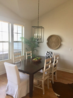
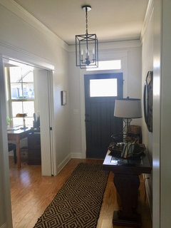
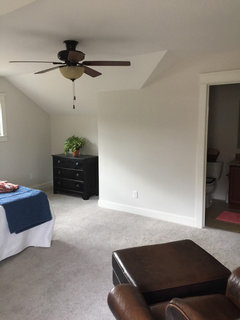
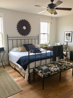
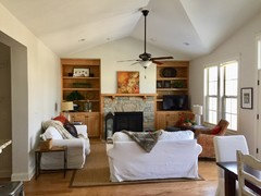
    @hopingtogetfit ,I love the way the pale light gray looks in your pretty home! I might try out your Ben Moore Classic Gray & get myself a sample! It is so nice and pale with just a hint of gray, might be just what I need for my kitchen {as long as our red dining room doesn't make it read blue that is}. The only photo you posted where the color doesn't seem to read as gray is in your dining room where it looks in that photo more of a beige, I'm sure sunlight is doing that.--thanks for posting your photos --you may wind up helping more people than just Sam who started this thread : }

  • 8 years ago
    Try Agreeable Grey Sherwin Williams
  • Sam thanked My House
  • 8 years ago
    Sherwin WILLIAMS Knitting Needles. Completely neutral gray.
    Sam thanked Marna Grim
  • 8 years ago
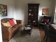
    Artsyphartsy, here are a few more pics of the BM Classic Gray.
  • 8 years ago

    @hopingtogetfit , Thank your for posting the extra photos! it's a very nice color, & love the painting of the two Beagle dogs!

  • PRO
    8 years ago

    Greys change in different lighting.

    So, what may work in one home or room may not work in another.

    Painting samples on walls in direct sun light, indirect sunlight & in artificial light will help choose the best for the space. If you find a grey you like in daytime but not in evening, then changing the hue of lighting could help resolve it back to your liking.

    Here is a link to help in choosing greys for sampling.

    https://www.apartmenttherapy.com/color-cheat-sheet-15-perfect-gray-paint-colors-246554

    Link to help pick light bulbs for the color

    https://blog.1000bulbs.com/home/how-to-choose-lighting-for-paint-colors

    Sam thanked Business_Name_Placeholder
  • 8 years ago

    I would suggest looking at SW or Farrow and Ball. From my experience the colors from BM are quite inconsistent.

    F&B is such true color.

    http://us.farrow-ball.com/purbeck-stone/paint-colours/farrow-ball/fcp-product/100275#BVRRWidgetID


    Sam thanked imhofan
  • 8 years ago

    SW March Wind is my favorite. Good Luck!


    Sam thanked stumpedinnc
  • PRO
    8 years ago
    last modified: 8 years ago

    After reading a million design blogs, I settled on Stonington Gray by Benjamin Moore, and it really looks very blue in the area I painted, after everything I read swore it wouldn't be blue.

    Gotta love color and design blogs. They're a lot like design discussion forums. Some info is good, some of it is woefully misinformed.

    Every color of gray belongs to a hue family. If a color shifts off from its hue family notation, then that indicates the inherent light is not balanced. How it shifts tells us what to do next to find the right color.

    It didn't even look blue in the swatch I painted on the walls, but then once the whole wall was done, bam. Blue.

    Most of the time people will choose a well lit spot on the wall to test color; where there is the best light. Makes sense because they want to see the color. But here's the thing, that sweet, well-lit spot more than likely is the one spot in the room that catches the most balanced quality of light in the whole space.

    As a result, the sample looks true to the chip because it's being viewed in a balanced (or close to) quality of light. But applied to the rest of the room where the light isn't so nicely balanced, it shifts... and reflects off itself and ricochets wall to wall. This is where using a sample board is helpful. You need to be able to move the sample around the room and see what happens.

    We've only done one coat of the Stonington so far, and I'm afraid it will look even more blue after coat #2, so not sure how to proceed.

    Probably not *more* blue. Could actually look less blue once it cures. But you're at the awkward color crossroads of stay the course and make the decision to choose to be happy with the result or start over. If you don't think you can choose to be happy with the result after coat #2, you need to stop and start over.

    I thought about lightening the can I have by 50%, but not sure if that would help or make it even more blue.

    After a color is mixed, it can take A LOT of white paint to lighten it. Every color is different. Some colors will lighten with just a cup of white added while other colors don't budge even after you've added an entire gallon of white.

    If it works, you end up with a weird color that you'll never be able to mix again so you better be sure you have enough. OR, you have to scrap all the paint you mixed at home, paint a sample, take that sample to the store so they can use it to create a custom formula for you so they can mix multiple gallons that match.

    If it doesn't work, you now have multiple gallons of a color you don't like instead of just the few that you started out with.

    You are always, always, always better off spending your time and money looking for the right color instead of trying to make the wrong one work by messing around with the formula.

    Get a chip of BenM's Wish AF-680. The chip is not going to look like the kind of gray you're envisioning so be prepared. -BUT- Take it home any way. Move it around and see how it renders. If you buy a wet sample, don't paint the sample on the wall. Paint a board so you can move it around.

    Sam thanked Lori A. Sawaya
  • 8 years ago

    SW French Gray

    Sam thanked lrunner
  • 8 years ago
    Sherwin williams Dorian Gray or Repose Gray
    Sam thanked kruben
  • 8 years ago
    SW 7064 Passive. I used this for the main color in my new house. It doesn’t read blue or green.
    Sam thanked jean1
  • 4 years ago

    Hi, I'm wondering, Sam, if you ever found the right paint? Here I am, 3 years later, looking for the same answer. I painted my kitchen Wickham Gray and then Stonington and both are far too gray. I'm looking for an airy light gray to go with my new medium-gray cabinets and white trim and backsplash. Thanks!

  • 4 years ago

    If your room is north facing, it will always bring out the blue in cool grays. The key is to find a gray with more of a green or violet undertone. Some consider grays with violet undertones cool and many consider them warm grays.

    Crushed Ice
    On the Rocks ( could go slightly blue in north facing room)
    Silverplate
    Passive ( has more green )
    Repose (muddy green)
    Collingwood (violet undertones)
    Tinsmith
    Gray Screen
    Front Porch

  • 4 years ago

    @jean1 - I see you chose SW Passive for your home. We are considering it too, can you please post some pictures

  • 4 years ago

    Passive is a cool gray, it has blue undertones at different times of the day, Repose gray is a more neutral gray slightly warm that is more consistently gray. Passive is a very modern cool gray. Repose gray is in my opinion a better choice for an entire house since it is more neutral and a truer gray. Gray is tough to choose because of the various undertones. My suggestion is to paint a small section of a wall with different grays just to be sure.