Software
Houzz Logo Print
jeneric_travelers

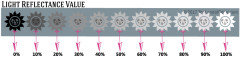
The best article I've read on LRV (Light Reflectance Value)

8 years ago
last modified: 8 years ago

I'm re-painting our whole home interior (Have advice? I'd love it. Here's my question/post [Need help picking neutral paint color for whole home interior)[(https://www.houzz.com/discussions/need-help-picking-neutral-whole-home-interior-paint-color-dsvw-vd~5216132)


I found this article Paint Colours and LRV: The Ultimate Guide You Need to Read to be very helpful in understanding how LRV can affect color choices. In fact, everything I've read from this decorator has been very useful.


Happy painting

Comments (34)

  • 8 years ago

    This was very helpful. I have read many of her articles, and this one just confirmed the LRV of the paint I chose as being in the right range.

  • 8 years ago

    All it really says is high numbers=lighter, low numbers=dark. What am I missing?

    Id hoped to find out what to do about all the high LRVs looking so dingy in my house (which gets some sun but not a lot) . I think it has something to do with the grayness of the paint base itself - and there not being enough light to overcome it. So thats why Id been thinking of moving to lower LRV.... but without going too low.

  • 8 years ago

    @Current resident - I appreciated that she used her own client experiences to note that an LRV of 62 was the most common LRV and works well in most lighting scenarios. This was helpful to me, as I wasn't focused on white colors. Perhaps these articles will touch on the undertone and 'dingy' that you're experiencing. I Googled 'LRV dingy whites' and scanned these.

    The 4 Best White Paint Colours: Sherwin Williams

    The 8 Best Benjamin Moore WHITE Paint Colours – Undertones and More…

    20 great shades of white paint {and some to avoid} (this one is 4 years old, but the LRV discussion is mostly in the comments and the comment section is very good)

  • 8 years ago
    @Lori great explanation of how multiple factors work into paint color. But you have to admit, as a consumer we are not privy to chroma and hue based on the information provided to us. I've tried looking up these aspects of paint, but the calculators and articles are very convoluted and written more scientifically than for the consumer.

    The science of color is dependent on the eye of the beholder, much like taste and smell color is unique to people and we only have a color memory distance of about 6 to 8 ft so when we walk away we forget what it looks like. I worked in fabrics and textiles for quite a few years and it's amazing the conversations I had with customers regarding color, the type of textile, the light of the store vs natural, the changing of the color because the fabric is going in different directions it's been pleated it's been pintucked it's been gathered. regarding color, the type of textile, the light of the storm versus naturally, the changing of the color when it's sewed because the fabric is going in different directions, been pleaded, pintucked, gathered.
  • PRO
    8 years ago
    last modified: 8 years ago

    But you have to admit, as a consumer we are not privy to chroma and hue based on the information provided to us. I've tried looking up these aspects of paint, but the calculators and articles are very convoluted and written more scientifically than for the consumer.

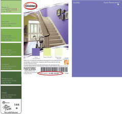
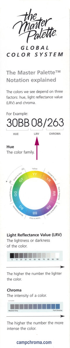
    Glidden has included hue/LRV/chroma notations in their index and on their chips since 1978. It's on the front and back of some of the chips.


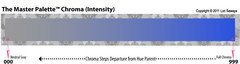
    Chroma is the last number in their notation Just like LRV it runs on a scale. 0 is low chroma and 1000 is a lot of chroma. Just like LRV, chroma is a measurement - it is a quantity.

    The instructions are in the front of The Master Palette fandeck.

  • PRO
    8 years ago

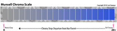
    Dunn-Edwards also includes a notation for their colors -- right next to LRV. They use a Munsell notation. And, again, chroma is the last number in the notation and instructions are in the front of the fandeck.


    This is the chroma scale they use. Starts at 0 and technically has no end but anything above 12 is SUPER VIVID RIDICULOUS.

  • PRO
    8 years ago
    last modified: 8 years ago

    A Color Muse or ColorSnap

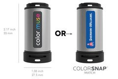
    Sherwin Williams branded the Color Muse device and called it ColorSnap Match. They sell it for $60.


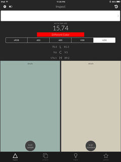
    The free app displays LCh. L is lightness (do not confuse with LRV because lightness and LRV are not the same thing). C is chroma. h is hue angle. You can use it to scan any color - from anywhere - and get the chroma.

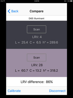
    Chroma is actually easier to get than LRV. But if you want to get LRV and LCh (chroma) together you have to download the LRV Guru app on iTunes. This is what it displays. It's iOS only.

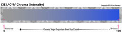
    This is the chroma scale for LCh. Again - very basic - generally speaking chroma scales are the same, zero is no chroma and scales up from there. A low number is low chroma a high number is high chroma.

  • PRO
    8 years ago
    last modified: 8 years ago

    Know that I could have kept going but thought three examples would be enough. :D From a lo-tech fandeck you can find at The Home Depot to hi-tech color measurement devices under $100 that you can order from Amazon or pick up at SW.

    So, no, I don't have to admit consumers are not privy to chroma and hue based on the information provided to us. I do believe some people don't want you to find the painfully user-friendly tools and information that is out there because they have their own agenda - a consumer who is completely ignorant about how color really works is easier to manipulate and take money from.

    I've tried looking up these aspects of paint, but the calculators and articles are very convoluted and written more scientifically than for the consumer.

    It's hidden in plain sight. Always has been. For some reason blogosphere glommed on to LRV. LRV is actually one of the lesser useful color attributes. Because it's strictly about how much light energy a color reflects and conversely absorbs. It's a measurement, a number, a data point. It's mostly applicable to lighting design; it's good for managing the quantity of light in a space and contrasts. What LRV doesn't do is tell you a whole lot about a color's characteristics or help you predict or anticipate how a color will render and be perceived in a space.... because it's a measurement, a number, a data point.

    In order for LRV to be useful in architectural color it should be transformed into a Lightness value which is more about how we see color vs. a data point like LRV. Which is why you don't see a whole lot of information correlating LRV to paint and color design - more often than not it's not the right value to use.

    LRV is darn handy for the right application, but that range of useful application is pretty narrow.

    What is confusing is subjective and objective. Colorimetry is the science and technology used to quantify and describe physically how humans experience color.

    While color is indeed subjective you can't define and categorize color based on subjective judgments. The result of subjectively trying to categorize color based on subjective opinion is a hot mess.

  • 8 years ago

    Thank you Lori. You have done an excellent job of explaining color. I never knew any of this information and I'm grateful for your easy to understand analysis.

  • PRO
    8 years ago

    Well, I wish I could say it was all my idea, lol!

    But it's been around for more than 100 years. I have no idea why I am the only oddball who talks about this stuff. #colorfreak

  • 8 years ago
    Great information and a lot for somebody to learn from. I look forward to reading more. But, I'm not feeling your vibe 'the information is painfully obvious and if you don' know how to find it you must be willfully ignorant.' Off putting but typical.

    I see you're in my hometown of Phoenix AX. I miss the Sonoran Desert. Have a great weekend.
  • 8 years ago

    Lori A. Sawaya. I am a fellow 'oddball' who loves this stuff (and teaches it in the UK). I never get tired of obsessing about colour. @colourtutor

  • PRO
    8 years ago
    last modified: 8 years ago

    But, I'm not feeling your vibe 'the information is painfully obvious and if you don' know how to find it you must be willfully ignorant.' Off putting but typical.

    Jennifer K, feeling is mutual. I've had it with people like you trying to make legitimate science-based information about how color works sound like it's supposed to make people's eyes glaze over -- like they're supposed to be too stupid to understand it. Like good, user-friendly information about color doesn't exist, when -clearly- it does.

    Implying that color literacy is beyond the normal person is wrong. And I'm going to get in front of that and tell people the truth about how color really works -- and how easy it is to learn about how color really works -- whenever I can.

  • 8 years ago
    last modified: 8 years ago

    It's color science. I get that color can be broken down into specific numbers. In my case, I am a very visual person. I can see nuances in chroma and lrv. But to be perfectly honest, the actual number combinations often confuse me.

    Some people's brains just don't work in the same way that other's brains work. It's not willful ignorance or stupidity. Everyone has different skill sets.

    I often don't understand why some people can't "see" the same things that I see. But I don't think that they are being stupid or willfully ignorant. I am sympathetic to the fact that their brains just don't work the same way that my brain works.

  • PRO
    8 years ago
    last modified: 8 years ago

    Some people's brains just don't work in the same way that other's brains work. It's not willful ignorance or stupidity.

    Exactly.

    Likewise not everyone can deal with wordy subjective summaries of how somebody thinks a color looks. Same with artsy color jargon. Each has a limited, specific audience.

    Denigrating color science and 100+ year-old global color systems as convoluted or too "sciencey" and implying that information about how color really works is not easily available does not magically make the wordy subjective summaries or artsy jargon approachable or useful to everyone. Blowing out one candle doesn't make another burn brighter.

  • 8 years ago
    last modified: 8 years ago

    lol, there are many concepts that are easily accessible to people via the internet. It doesn't mean that they are easily understandable by everyone.

    Nobody is denigrating color science or blowing out someone's candle. I'm just suggesting that it is not always willful ignorance if someone has a hard time understanding it.

  • PRO
    8 years ago

    @d_gw, I agree. You did not.

    However, this is what Jennifer K wrote:

    But you have to admit, as a consumer we are not privy to chroma and hue based on the information provided to us. I've tried looking up these aspects of paint, but the calculators and articles are very convoluted and written more scientifically than for the consumer.

  • 8 years ago
    last modified: 8 years ago

    Yes, the chroma and hue are written on some color cards but they often aren't explained well. And Jen said that she did try to research and the articles that she read on the internet did not make sense to her.

    She was not showing willful ignorance. She researched it and still didn't understand it. For someone that doesn't do color science for a living, it was intimidating to her. Her brain obviously does not work the same way that yours does. And she doesn't have the benefit of your training and years of experience.

    She is trying to understand color science, not denigrate it.

    I am in the medical field. If someone doesn't understand the mechanics of the sodium potassium pump, I don't lecture them about there being info all over the net about it.

  • PRO
    8 years ago

    She was not showing willful ignorance.

    I never said that she was. Don't get it twisted.

  • 8 years ago
    last modified: 8 years ago

    I think there was some willful editing in this thread. Have a good day Lori.

  • 8 years ago

    So if I may take this back to the subject at hand - what chroma and LRV would I want for a dim room - is there any rule of thumb? Actually none get no sun at all, just not a lot - maybe 2 or 3 hours ea side. Ive tested some paint samples and whats really frustrating is that Ive come to the conclusion that not only does the paint not match the color chips, but that there seems to be some inherent dinginess in the paint base itself which is whats causing the color to be off. Of course the guy in paint store has no idea what Im talking about (speaking of people's brains/perceptions being different).

  • PRO
    8 years ago

    I think there was some willful editing in this thread. Have a good day Lori.

    Then that would be yet another thing you got wrong d_gw.

    I don't back pedal and I don't make apologies for my point of view because I don't need to.

  • PRO
    8 years ago

    what chroma and LRV would I want for a dim room - is there any rule of thumb?

    Yes. LRV isn't so much the issue. It's grayness. The dim light will boss you around in terms of grayness but you have some wiggle room when it comes to how light or dark you want provided you get the amount of grayness right for the light you have to work with.

    You want to choose colors that are cleaner and more vivid than you would think would look good because you need the vividness - the chroma - to bust through the dimness. Try colors that are less gray and more colorful than you would normally reach for and see what happens in the space.

  • 8 years ago
    Lori- thanks for the information. I'm afraid I am that ignorant person you guys discussed in the example. When it comes to these terms and making use and understanding of them at least.
    But when you say she needs more chroma to overcome the grey or the "dinge" well what does that mean? Any ol color with a higher than what she is currently working with in that category? I think I just don't really get how the info all comes together to help you make better decision in picking paint selection.
  • PRO
    8 years ago

    But when you say she needs more chroma to overcome the grey or the "dinge" well what does that mean? Any ol color with a higher than what she is currently working with in that category? I think I just don't really get how the info all comes together to help you make better decision in picking paint selection.

    People typically reach for soft, muted, grayish colors in the paint display because they look the prettiest. Nobody wants bright, garish wall colors.

    It's those muted colors that often don't do well in a dim quality of light because they have too much grayness and not enough colorfulness to show up and be seen in a dim quality of light.

    And that's why you want to choose colors that are cleaner and more vivid than you would normally choose.


  • 6 years ago

    Hi, I know I’m jumping in very late here, but I wanted to share with you a sort of tool I found to help choose a paint color. There is a company that matches old (and new) paint colors, called MyPerfectColor.com . All by itself that is useful, but here is what I am doing with it that is helping me pick a color. I find a few colors I want to try, go get some cheap paint samples at Home Depot. Then I try them on the wall and plug them into the the search tool on MyPerfectColor. Then what I do is click on “see related colors. “ When you do that it gives you the Hue, saturation, and lightness of that color and it displays swatches of other paints that have the same or similar values. Here is my example: I tried a Home Depot sample of benjamin moore Quincy Tan on the walls. I felt it was not showing quite enough color. It looked too gray. I was thinking I would like to see more yellow. Did I want to have more saturation or did I want the color to be a yellower hue? I decided both. The fairly low LRV of the Quincy Tan was working well, so I didn’t want to go much lighter or darker. Playing with the numbers for hue and saturation I found another Benjamin Moore color that was more yellow in hue and was also more a little more saturated, but had the same lightness number. The color I found was Yorkshire Tan. To double check, I looked at this color on a color card from Benjamin Moore and checked the LRV online. The Yorkshire Tan has an LRV of 43.65, while the Quincy Tan was 42.57...so it was still going to have enough contrast. You still have to try colors on the wall in your own light, with your own furnishings, and the first colors you try won’t be right...but using this online tool and maybe also the Benjamin Moore website you can definitely hone in on the right one. Also, I have bought some paint in a discontinued Ralph Lauren color from MyPerfectColor and it was very good paint and came fast in the mail. I would also recommend them if you have a color you like that’s discontinued.

  • PRO
    6 years ago

    I love My Perfect Color for a lot of things but their Hue, Saturation and Lightness slider feature is not one of them.


    HSL isn't the right right color space to do what you're trying to do.


    Because HSL doesn't model color attributes. In other words, HSL doesn't quantify how humans see color.


    HSL is a derivative - or transformation - of the RGB color space.


    The RGB color space and transformation from it like HSL apply to computer graphics ONLY.


    Their purpose is to instruct red, green and blue phosphors on a device how to light up in order to mimic in real life color.


    But that's the only connection to in real life color and it's the reason why many - on this forum in particular - believe that you can use RGB or HSL values to define and describe how paint colors look in real life.


    That's not what RGB and HSL values are for and using them to define and describe color appearance is wrong, that's no what they do.


    The ONLY color notations and data values that DO define and describe how the human eye sees color are:

    Hue

    Value

    Chroma

    LRV

    LCh

    CIELAB

    XYZ

    Yxy


    A quick Google search will verify all of the above. Here's two of the easier to understand sources that speaks to HSL specifically and why no one uses it for anything.

    _____


    Let’s take a step back and list a few things you should not do with HSL:


    · Find contrast between two colors

    · Find complementary colors

    · Adjust the lightness of an image

    · Adjust the saturation of an image

    · Shift the hue of an image


    In summary, HSL sucks. The reason it sucks is its simplicity, this is also the reason it grew popular in the 70s, when a more sophisticated model would have been too computationally expensive.


    Source: Alexei Boronine, Color Spaces for Human Beings, May 2012

    _____


    Next let us examine some of the RGB transformation spaces. Two of the most common are called HSL and HSV. These spaces have been developed for computer graphics applications as simple transformations from RGB color spaces with dimensions that approximate appearance attributes. HSL stand for hue-saturation-lightness and can be visualized as a bi-cone with black at a point at the bottom, white at a point at the top, and highly saturated colors around the perimeter in between. HSV stands for hue, saturation, and value and can be visualized as a cone with black at the bottom and satruated "bright" colors at the top. Both spaces are designed as simple transformations from RGB and are therefore ill-defined since RGB is ill-defined.


    Even with a good definition of RGB, such as sRGB, these spaces have little perceptual meaning. They make no attempt to model visual perception and do not use the definitions of the perceptual attributes accurately or consistently. Other similarly defined spaces exist.


    The moral? When using RGB spaces, know what they are and their transform to CIE XYZ in order to fluidly move among them. With regard to spaces like HSL, beyond being ill-defined, they can really be avoided since real color spaces are now easy to implement and use.


    Source: Handbook of Color Psychology

    Andrew J. Elliot, Mark D. Fairchild, Anna Franklin

    Cambridge University Press, Nov 30, 2015

  • 6 years ago

    Hi everyone: I am looking for a light color with a low LRV. Is that possible? I need to paint my house on the outside and the city requires LRV at or below 35 and a chroma of 6 and below. I would like a lighter beige color but those seem to all be in the high LRVs. Any trick to fix that issue? There are some houses in white on the street. How is that possible to have LRV of 35 and be white? There must be something I am missing. Thanks for any help. Appreciate it.

  • PRO
    6 years ago

    the city requires LRV at or below 35 and a chroma of 6 and below.


    This is all kinds of wrong is so many ways.


    You're not missing anything and whatever city it is needs to revisit their color standards.

  • 6 years ago

    Thanks. I am with you on that. This is Scottsdale, AZ. It gets super hot here in summer and I am just shocked that I have to paint my house in a dark color with LRV below 35. Sigh.

  • PRO
    6 years ago

    I'm in Phoenix. Below 35 is insane.


    Maybe the city of Scottsdale thinks they understand the data values they're trying to implement better than they actually do. Maybe verify that they really do mean below 35 and that they don't have the scale backwards - because that happens a lot.


    People think 100 would be full color black instead of no color white.


    When it comes to Chroma you can't pinpoint a single value because maximum chromaticity is different for each hue. So, if they want to make the Chroma value mean anything, they have to specify a hue family to go with it.


    Happy to help if I can.

  • 6 years ago

    Lori love your camp chroma site! Not sure I fully understand despite my ridiculous time spent researching color and painting samples! I want white cabinets without feeling I wAlked into OPErating room. My home transitional with good light. Kitchen has northern exposure with attached family room south west .

    White dove- is it too dingy
    Chantilly lace- worrieD to stark
    Simply white concerned to creamy
    White heron— seems good but was surprised the LRV was 74... way Lower than the other populaR whiteS I saw on A camp chroma pic that shows where all the popular white line up.

    Wasn’t sure if one metric more important: hue, chroma, value or LRV ( noted the white values all in the 9 range). Hue all over the map but didn’t quite understand degrees of difference. THANKS!!!
    Still have Oxford white and BM white to sample.

    Last concern I have not picked guartz counters yet and I want to have both cool and warm options available if possible.

  • 6 years ago

    Oops white heron LRV in the high 80s. Still interested if white heron or others are able to handle cool or warm counters. Thsnks