Software
Houzz Logo Print
cm2529

Another Long Wall Dilemma Post

8 years ago

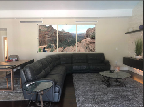
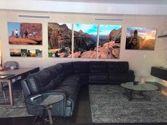
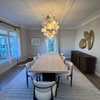
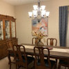
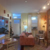
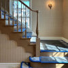
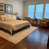
Hi everyone, I've been reading all the long wall dilemma posts and I wanted to share my own. I have 2 huge walls in my family room. I have a 25' long plain wall which I'm struggling to figure out how to decorate. Adjacent to it, I "had" another huge wall which we put a t.v and a textured stone background which looks amazing. How do I decorate the long plain wall now that the other one is textured and looking awesome? I don't want to overdo or underdo it the current large plain wall. We have a bunch of really great family travel pics that I thought we'd put along that wall. If so, we can't decide if we put several smaller ones, just a few big ones, or just 1. Just one would be 24' long and insanely expensive so we are not leaning towards that option. We are leaning towards lots of pics of many of our family trips. But we aren't sure of that either. Does it look too busy? Costco has some really good pricing on metal and acrylic prints and you can make them as big as 36" so we were leaning towards leveraging that option in order to keep the huge wall relatively cool but affordable. Any ideas are welcome, including any other ideas of how decorate the room. I am attaching pics of: 1) Wall that's already done w textured stone and tv (has some Cinco de Mayo mexican decorations for an upcoming party, disregard those lol) 2) Plain wall 3) Sample of Plain wall w multiple pics and 4) Sample of plain wall w same pic divided up.


Comments (27)

  • 8 years ago

    OK any other ideas? I'm totally stuck. I would love to show off a lot of our travel pics, just not sure how

  • 8 years ago

    If you could sort the pictures by a common color theme....such as all these have orange in them and all of these have blue as the dominate color.......OR even a common theme, like all of these are water pictures and all of these are land pictures................than I think you could place them in 2 groupings on one wall. That said....lay them out on the floor. Make the same amount of space between the pics, like all of them have 2 inches of wall visible on the same 2 sides and as close to 2 inches on the top and bottom, and than, make sure the perimeter of the group is a straight line on all sides, or at least on the right and left side, maybe going within a tolerance on the top and bottom....so that you wind up with 2 groupings in a square or a rectangle shape. Than, I think you could do all the pictures on one wall, or most of them. The odd ones out, could be put on a table and displayed alternately perhaps rotating them with seasons.. Try to make some order out of the wide variety you have, basically. Good luck. It works pretty neat if you can achieve that.

  • 8 years ago

    I think that I would try another option. Could you pull the sectional back a little, pull the rug, too, so that the front legs are on the sofa? Then possibly use matching bookshelves, or something tall and narrow at each end of the wall with one large , colorful piece of art in between.

  • PRO
    8 years ago
    last modified: 8 years ago

    I like the idea of multiple items that read as one item for your room. See below.

    Looks like you have to take a bus to reach the coffee table. Movable cubes might work better with your recliner sectional.

    I think a better selection of items could be assembled for the stone wall.

  • 8 years ago

    Showing off travel pics probably belong in a hallway like family pictures. People would need to be able to peruse them at their leisure and would have a hard time doing that on a wall behind a couch. A photo album on the coffee table would probably serve better.

  • 8 years ago
    Thanks everyone for your tips! We tried to incorporate your advice. What do you think of this ? Better ? Worse?
  • 8 years ago

    Those three big travel pictures look amazing! Since they're scenic and not family, they look great in the living room. I don't care for any of the groupings of the smaller pictures.

  • 8 years ago
    Thank you ! Btw this is not our living room, it’s our family room.
  • 8 years ago

    3 large pics are plenty.

  • 8 years ago

    I'd go for the full wall mural of your favorite locale, but have it done in gray tones. Then liven up the room from time to time with a new accent color in pillows, throws and accessories.

  • 8 years ago
    last modified: 8 years ago

    I think the triptych is really the most perfect option. Is there another wall where you can put the other two photos, which are also very nice? A lot of small pictures just don't seem to work on that wall. Also, can you please pull your rug toward the couch so that no floor is visible between the couch and rug? As mentioned, the coffee table should be much closer to the couch. If that doesn't work for you for some reason, I'd try to find an alternative option for the table. I wonder what the function of the table is that is pulled up against the couch so closely that you can't pull out those two chairs. Is it possible to move it away from the couch a few feet, along with the rug under it?

  • 8 years ago
    Ok so let’s say we go the tryptech only. What would you put on left and right if it? It’s a lot of empty wall.
  • 8 years ago

    I like the second photo with the long gallery wall. After all, it’s your family room for the family to enjoy being reminded of your travels.

  • 8 years ago

    The coffee table looks like it’s in time out being so far away for it to be usable.

  • 8 years ago
    last modified: 8 years ago

    Nice room! In addition to the three pictures, I would put a floor lamp on the right next to the sofa and a substantial centerpiece on the table on the left. Or a floor vase with tall filler. The space by the table looks pretty tight, can you move those chairs out?

    No more photographs on the wall. You need different shapes and textures to help make the wall more interesting.

  • 8 years ago
    last modified: 8 years ago

    It's your home. A picture with your family in it, makes it your home. No one in a picture? Makes it a still life display. You can buy them at art.com. You have a big room. You can look at pictures of yourselves having a great time....till you want to put them into an office, a hallway display, or whatever. You may not want the pictures up till the kids get out of college? But displaying new current pictures is why folks take pictures and have them developed. Otherwise they would disintegrate when the computer or the iphone does. That's no fun. ;D Or, don't just put them in a closet till you use them at a funeral??? You spent the money to have them made to enjoy, so ENJOY them! It's the way to remember the Memories of the moment in time. It's all fun. You did a great job with the wall display grouping. The large one and the smaller group of pictures. Great job. Watching to see what your family decides! :)

  • 8 years ago

    It is not a lot of empty wall! Not every space has to be filled. Sometimes the eye needs the blank space to be able to take everything in!

    I like the triptych. It is beautiful! The family pictures are nice, but all of those pictures, IMHO, compete instead of complement.

    However, it is your house and your room. Do what you like.

  • 8 years ago
    Ok thanks for the feedback. How do you guys feel about this layout? Too busy? Btw no worries on the rug and coffee table. Rug will be moved under the sofa and we are replacing the current table w another. Just using this picture to figure out what to do w the wall. If you have any coffee table suggestions pls share. It’s a big room. 25x20. So not easy.
  • 8 years ago

    Looks like you’re trying too hard. Not engaging at all. Looks like a staged home.

  • 8 years ago
    last modified: 8 years ago

    Too many things. The eye needs a space to rest. When you put too many small things on a large wall, the eye jumps around and can't absorb all the individual things.

    I'd put your three large photos up and live with it for a while. Like I mentioned above, you can add interest to the wall area without actually putting things on the wall. A throw on the sofa, a floor lamp, a decorative item on your table.

  • 8 years ago
    Ok everyone. Thanks so much for your advice! This is what we’ve decided. No worries on the rug and coffee table. Those will be adjusted properly we r just using this pic to figure out the pic. So the 4 choices are as follows: 48” or 60” height. Border or no border. Go! Thanks!
  • 8 years ago

    I really like it! There's a somewhat consensus here that "public" areas of your home shouldn't have family photos but every area of my home "public" or private is still my home. I think what you've done is great and being reminded of your travels and loved ones enjoying life should be shared and reminded. Your life should be all around you, not in a book on the coffee table or relegated into a hallway.

    I think the dark framing is a little heavy and I'd play with the right to left center/balance. Looks like happy times, enjoy!

  • 8 years ago

    My vote is for 60” and no border.

  • 8 years ago

    48" and border. Sorry.

  • 8 years ago

    Whatever the top one is. Way cool!

  • 8 years ago

    My thoughts are that there should be 2 groupings and not one big long one if you want to do a grouping. One that centers on the sofa and one for the table since you have the room divided into two areas. The problem to my eye with one big long one is that it makes it a single room and to me should then have a single grouping of furniture vs. 2 groupings make it seem more divided just like the furniture is.

Sponsored
Buckeye Basements, Inc.
Average rating: 5 out of 5 stars40 Reviews
Central Ohio's Basement Finishing ExpertsBest Of Houzz '13-'21