Software
Houzz Logo Print

Comments (32)

  • 8 years ago
    last modified: 8 years ago

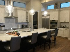
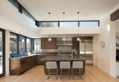
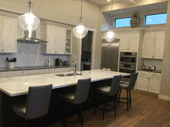
    No decor. Maybe some horizontal mirrors on the range run to echo the clerestory windows above the cabinets on the other side. That was a detail that should have been repeated throughout the space.

  • PRO
    8 years ago
    last modified: 8 years ago

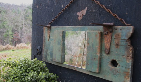
    Here are the mirrors Sophie recommended. That's a good look.

    Step down the wattage on those pendants. The glare in the room detracts from your great kitchen.

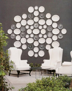
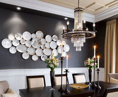
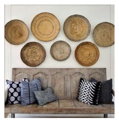
    A collection of interesting plates or objects could be another option.


  • 8 years ago

    Beautiful kitchen! Love Sophie’s mirror idea! Also, think more about how to style the space to bring the eye down and create a more welcoming environment. High ceilings are impressive, but they can be cold. Details like the tray Beverly is showing on your counter would really help finish the space. Good luck!!

  • 8 years ago

    Some large flat baskets flat on the walls but mostly a fan of nothing there.

  • 8 years ago

    I would not put mirrors over tile that high up in a kitchen trying to mimic windows, that would look ridiculous. Windows were not meant to be repeated on a wall that has the stove top on it. That wall is meant to be a wall of tile as it is. I wouldn't put anything above any of the cabinets. Just leave it with the modern look you have going on.

  • 8 years ago
    last modified: 8 years ago

    Leave it bare. Clean. No tchotchkes, no dishes or baskets, no mirrors. BTW, who is going to climb up there to dust those mirrors, cause they will get a film of dust on them.

  • 8 years ago
    Sheesh. The same person that has to clean the actual windows on the other side will clean the mirrors or anything else up there for that matter. I also like the mirror idea. But the trick is to do a flat polished custom cut so they mimic the architecture of the real windows. Don’t skimp and put ready made mirrors.
    OXB STUDIO Architects · More Info
  • 8 years ago

    I also love the mirror idea (or nothing). Please share what your flooring is, it's gorgeous!

  • 8 years ago

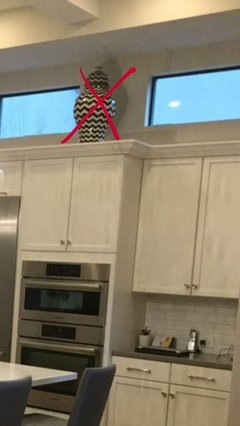
    I would like it plain and minus the large vase thing on the window side, too.

  • 8 years ago
    last modified: 8 years ago

    Usually I eschew items on top of cabinets, but this kitchen is so unrelentingly monochromatic, I actually thought I was looking at a black and white photo. The backsplash is already done, so no possibility of adding color there, nor in the chairs. So the only place left is on top of cabinets. But even the one piece of pottery already on top is black and white. The plates and baskets suggested above are more of the same monochrome, so I disagree with those suggestions. If I walked into this kitchen and saw rectangular mirrors up high as has been suggested, I'd be asking "why are there mirrors up there?".

    Please put some colorful large pottery up there. Different colors. No white. No beige.

    Maybe a bowl of fruit on the counter. Something not gray or beige.

  • 8 years ago

    Is it the light from the pendants that is causing the cabinets to appear streaky/splotchy?

    Nothing above the cabinets. Maybe a nice pink orchid arrangement on the island. You could even do faux, if you don't have a green thumb.
    http://www.gumps.com/p/enchanting-pink-orchid-arrangement

  • PRO
    8 years ago

    Would not have tiled side wall, but since it is - would tile it all, so it does not look like you ran out of tile.

  • 8 years ago
    last modified: 8 years ago

    I wouldn’t put anything up there. I think mirrors would look strange to my eye in that location. I think it only helps draw attention to the windows. I think they would need to be the exact same size and frame similar so that it looked the same unless you were really looking. I think it would be hard to pull off. Even so I prefer them not there.

    If you did want to add some color you could do it on the counters or island with bowl of fruit or flowers. You could use a tray to gather items. You could prop art against backsplash as a backdrop to items in front. you could maybe even use that large ginger jar on the island in a grouping. I’d use a tray and you could maybe add a blue fruit bowl and flowers. Maybe even use the ginger jar as a vase.

  • 8 years ago

    Dressing the space above your cupboards was all the rage a few years ago so I totally understand where your question comes from. There is currently a minimalist vibe being brought forward on these boards. Women of a certain age, I have been noticing begin to "de-clutter"/SIMPLIFY their homes. I am wondering if the average age of posters here is fueling this idea of less is more, versus it being an actual design trend? They want us to believe leaving such a great space NAKED is currently "a thing"? I am not so inclined to believe that. The cupboards over the stove are BEGGING for something IMHO. As far as cleaning, yes dust will collect, grime is a thing over/near a stove...back in the day when I had my crystal displayed above my cupboards every January I brought it all down, washed it up, vaccumend the tops of the cupboards..NOT a big deal. Dust and grime, undisturbed does not draw attention to itself!!!

  • 8 years ago
    last modified: 8 years ago

    Women of a certain age, I have been noticing begin to "de-clutter"/SIMPLIFY their homes. I am wondering if the average age of posters here is fueling this idea of less is more

    Saying that people prefer a non-cluttered above-cabinet look because they are "women of a certain age" is the most presumptuous, assumptive, generalization I've seen on this forum, with ageism and sexism thrown in.

    Your use of the phrase "less is more" in your post is ironic. It is not "currently a thing" as you put it. The phrase was adopted from a Robert Browning poem in 1947 by Ludwig Mies van der Rohe. He was an architect, a pioneer of modernist architecture, and a man.

  • 8 years ago

    arch_gw, what an ageist, sexist thing to say. Wow.

    In my (not a woman of a certain age) opinion, tops of cabinets shouldn’t be decorated. Pretty much ever. My parents do this, and every time I’m at their house I want to climb up and take down the vases and tchotchkes and put them somewhere at eye level to enjoy.

    Now I confess, in my family room I have one cabinet that ends up being decorated with various electronics or toys I’ve taken off of my annoying children. But that’s not decor. That’s just toy time out.

  • 8 years ago
    last modified: 8 years ago

    The only reason that the dilemma exists is an error in architecture. If the range wall doesn’t lead to a space that would have allowed the repetition of clerestory windows, perhaps the overall room height should have been reduced to work on the human scale.

    If the clerestory were designed to work primarily with the external fenestration, then perhaps an angled vault to them would have been the better interior response. Which would have left no awkward open space to create a dilemma.

  • 8 years ago

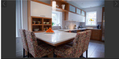
    I don't think it was an error in architecture, but probably the best of the possible solutions. Here's what it would look like with a soffit.

    I actually like it the way it is, and I wouldn't put anything on top, not even mirrors.

  • 8 years ago

    I like what you have now. This includes the vase. I don't think you can go wrong with whatever decision you make. You've done a very nice job.

  • 8 years ago

    Sophie is right, as is usually the case. The design was not properly thought out, and it would’ve been a fairly easy thing to design differently.

    That being said, I think it’ll be fine once you use decor to warm the space and create a more welcoming environment. Putting a bunch of bricka brack above the cabinets is only going to pull the eye up toward a mistake.

    arch_gw, I am a millennial, but I credit my professors “of a certain age” at arguably one of the best design schools in the country for teaching me that no group is a monolith when it comes to preference for style. If you have a true interest in design, I would encourage you to listen and learn from more experienced posters instead of being so dismissive.

  • 8 years ago

    I’m laughing because I actually think groveraxle’s picture of a soffit looks much better.

    To each his/her own..

    so what do YOU like? Go with it! :).

  • 8 years ago

    I agree with others who said don't put anything up there. That opinion has nothing to do with my age or gender, but everything to do with the design principle that you should pick a focal point and not detract from it. Should we be noticing your lovely backsplash, shiny hood, glass-fronted cabinet on the right, or bright pendants? Stuff on top of cabinets is visual clutter with all of those other elements.

    Adding stuff above cabinets usually increases the visual entropy of a kitchen. It's too much.

  • PRO
    8 years ago

    I'm surprised by how hard on you many of these answers are. I see a lot of kitchens and yours is in the top 90 percent of being truly nice. Look at the portfolios of those who comment so you get a sense of where the advice is coming from. I love color but honestly I love your white and gray kitchen, it has great massing and overall very good design decisions.

    Here's my thoughts - for you it's all about accessories. You have too many small things on the counter tops. Your kitchen is so nice it is worthy of some very nice accessories. Spend some money on them - it will pay off. Consider scale to not have so many tiny items. Also I would very carefully add color. Vey carefully! Your kitchen is so sophisticated I would consider a plum or dark plum or a soft mauve as the accent color. A grayed out color. I do not see bright yellow, orange, red or blue - will be garish. I would also blend in copper and natural woven materials like wood, baskets materials with some stainless. This is the trick to getting more interest in your kitchen so the accessories compliment the look and feel. Think a big object with a medium and small one or with two mediums ones grouped on the counter in a few places. You also need a large scaled low bowl for the island in a tarnished metal or mauve ceramic would be beautiful.

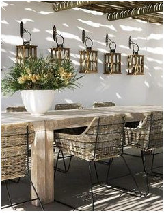
    As to the top of you cabinets, here's the way you should look at it - you have a great opportunity for some statement pieces! I love the spaces above the cabinets - they look intentionally designed as such begging for something special and notable. Not bright garish color statements. I see large scaled antique/vintage pieces. Objects that have the beauty of time. Interesting objects that don't scream but are so beautiful as to notice and love them. Think Sonoma and Soho inspired. Some large vintage farm items would be great. One on one side of the hood and one on the other. Or one big with a smaller in front to the side. Go tall - really fill up the space. Go two thirds high or perhaps three quarters. You do not need the vase to the right. Not enough empty space to need filling. It's all about what the eye feels is missing or feels is right. Good luck and make it great!

    DEB thanked Suzette Sherman Design
  • 8 years ago
    last modified: 8 years ago

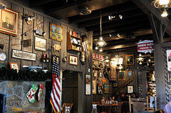
    Uh, NO to the the faux rusticity of Cracker Barrel decor. That would be the worst mistake of all.

  • 8 years ago
    last modified: 8 years ago


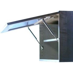
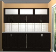
    I really think the best of the solutions suggested so far is to fill the space with cabinets. You could even do swing up glass doors to mimic the windows.

    Like this only the same color as your cabinets:


  • 8 years ago

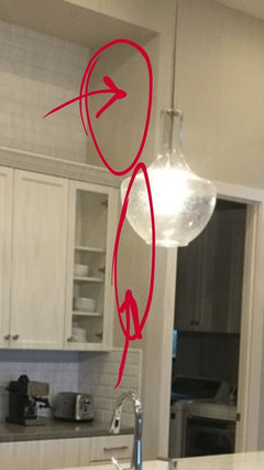
    I don't think the empty space above the cabinets is the main problem. The tiled wall is an attractive feature in itself and does not need clutter. However the wall architecture is in my opinion a bit unfortunate the way it creates a soffit like structure and recessed area, making it all a bit awkward. I would probably paint the walls the color of the tile to lessen the effect, or perhaps even go darker to highlight the tile and windows. The kitchen could use some warming up though.

  • 8 years ago

    Two sweet flat screen TVs is the obvious answer. Then you can make them look like anything you want. (Sort of a joke, but the space would fit TVs. . .

  • 8 years ago

    It kills me when the OP doesn't bother to even come back and comment. No explanation what bugs her, why she feels that the room is incomplete etc...

  • 8 years ago

    I don't think the answer has to be so black and white: Nothing or almost nothing or Cracker Barrel hee haw mish mash.


    I think some large, original ,handmade pottery would be beautifully set off although expensive. Maybe blown glass instead. Only a few pieces at most and very big. The chevron pot looks like a kirkland/home goods thing and is trite and the wrong shape and color. A lovely kitchen.

  • 8 years ago

    caligirl5's link to the blog is awesome!!

    I think mirrors or nothing.

    And SHAME on arcy_gw.....we women of "a certain age" declutter because we have the experience of wisdom, not the folly of youth.

    Wisdom derives more from mistakes and failures than from success.

    And because we know better than to clutter up a space with useless stuff.