

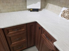
Help with backsplash choices
8 years ago

Featured Answer
Sort by:Oldest
Comments (15)
 8 years ago
- 8 years ago
Related Professionals
Des Moines Kitchen & Bathroom Designers · Milwaukee Kitchen & Bathroom Designers · Concord Kitchen & Bathroom Designers · San Bernardino Kitchen & Bathroom Designers · Santa Fe Kitchen & Bathroom Designers · Sedalia Kitchen Remodelers · Muncie Kitchen Remodelers · Portland Kitchen Remodelers · Elmira Kitchen Remodelers · Cleveland Kitchen Remodelers · San Bernardino Kitchen Remodelers · Atlantic City Custom Countertops · Lawton Custom Countertops · Burlington Custom Countertops · Las Vegas Custom Countertops- 8 years ago
- 8 years ago
 8 years ago
- 8 years ago
- 8 years ago
- 8 years ago
 8 years ago
- 8 years ago
- 8 years ago
- 8 years agolast modified: 8 years ago
- 8 years ago
- 8 years ago

Related Stories

LIFE12 House-Hunting Tips to Help You Make the Right Choice
Stay organized and focused on your quest for a new home, to make the search easier and avoid surprises later
Full Story
LATEST NEWS FOR PROFESSIONALS‘Help Clients Narrow Down Choices’ and Other Advice From Pros
Home design and building professionals share tips they learned from recently completed projects
Full Story0
COLORPick-a-Paint Help: How to Quit Procrastinating on Color Choice
If you're up to your ears in paint chips but no further to pinning down a hue, our new 3-part series is for you
Full Story
KITCHEN DESIGNHouzz Quiz: Which Kitchen Backsplash Material Is Right for You?
With so many options available, see if we can help you narrow down the selection
Full Story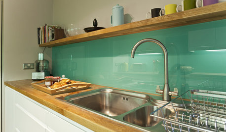
KITCHEN DESIGNHow to Pick a Kitchen Backsplash That Wows
Design your ideal backsplash with help from these Houzz guides and inspiring ideas for every kitchen style
Full Story
BATHROOM DESIGN10 Minimalist Choices That Will Bring Calm to Your Bathroom
Clean lines and a quiet palette can help create a more relaxing space
Full Story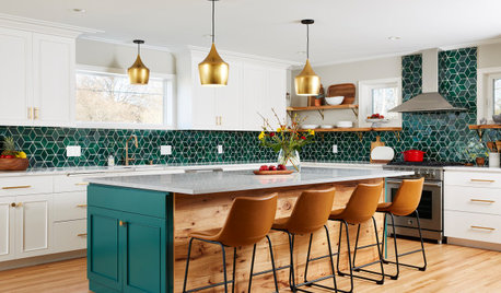
KITCHEN MAKEOVERSKitchen of the Week: Backsplash Dazzles in Green Geometric Tile
A designer helps a growing family function better at home with a new kitchen, mudroom and dining room bar
Full Story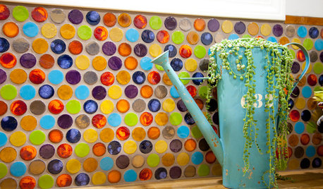
TILE5 Head-Turning Tile Styles for Backsplashes and More
If plain subway tile would derail your bold decorating vision, these dashing tiles can help you arrive at a brilliant solution
Full Story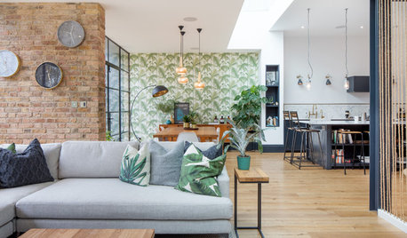
DECORATING GUIDESHow to Create Flow and Cohesion With Your Design Choices
These 8 tips can help you select products, finishes and styles that work together from room to room
Full Story
KITCHEN BACKSPLASHES8 Clever Ways to Put Your Backsplash to Work
Leave art for art's sake to another spot. Hardworking cooks deserve a kitchen backsplash that helps them do their job
Full Story
Blueostrich