

Opinion Please
8 years ago
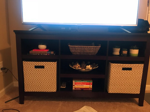
Featured Answer
Sort by:Oldest
Comments (13)
 8 years ago
Related Professionals
Columbia Bathroom Remodelers · Miami Bathroom Remodelers · Rock Hill Bathroom Remodelers · Keene Bathroom Remodelers · Toledo Bathroom Remodelers · Elk City General Contractors · Grand Island General Contractors · Edison Interior Designers & Decorators · Great Bend Interior Designers & Decorators · Raleigh Interior Designers & Decorators · Georgetown Interior Designers & Decorators · Newport News Interior Designers & Decorators · Lawrenceburg Kitchen & Bathroom Designers · Lafayette Kitchen & Bathroom Designers · Boston Kitchen & Bathroom Designers 8 years ago
 PRO8 years ago
 8 years ago
 8 years agolast modified: 8 years ago
- 8 years agolast modified: 8 years ago
 8 years ago
- 8 years ago
 8 years ago
 8 years ago
 PRO8 years agolast modified: 8 years ago
- 8 years ago
Related Stories
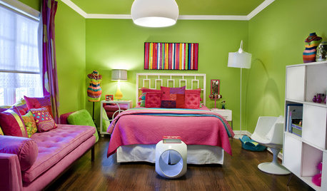
DECORATING GUIDESNo Neutral Ground? Why the Color Camps Are So Opinionated
Can't we all just get along when it comes to color versus neutrals?
Full Story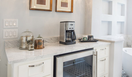
BATHROOM DESIGNUpload of the Day: A Mini Fridge in the Master Bathroom? Yes, Please!
Talk about convenience. Better yet, get it yourself after being inspired by this Texas bath
Full Story
TILEMoor Tile, Please!
Add an exotic touch with Moroccan tiles in everything from intricate patterns and rich colors to subtle, luminous neutrals
Full Story
DECORATING GUIDESPlease Touch: Texture Makes Rooms Spring to Life
Great design stimulates all the senses, including touch. Check out these great uses of texture, then let your fingers do the walking
Full Story
DECORATING GUIDESThe Hottest Houzz Discussion Topics of 2012
Discussions rocked and rolled this year with advice, support, budding friendships — and oh, yes, a political opinion or two
Full Story
LIFEWhen Design Tastes Change: A Guide for Couples
Learn how to thoughtfully handle conflicting opinions about new furniture, paint colors and more when you're ready to redo
Full Story
Sales Secrets for Interior Designers
Pro to pro: Learn 3 proven techniques to please clients and increase revenues, developed by a designer with 40 years of success
Full Story
DECORATING GUIDESLuxuriate in a Gentlemen's Club Look at Home
Rich colors, comfy furniture and cozy paneling make these masculine spaces inviting, but you can keep them as private as you please
Full Story
FEEL-GOOD HOMESimple Pleasures: The Joy of Fresh Sheets
Make your bed a place of comfort and relaxation with good-quality linens, ample pillows and other pleasing accoutrements
Full Story
DECORATING GUIDESAsk an Expert: How to Decorate a Long, Narrow Room
Distract attention away from an awkward room shape and create a pleasing design using these pro tips
Full Story
JAN MOYER