Software
Houzz Logo Print
mbinford

Another back splash dilemma

8 years ago
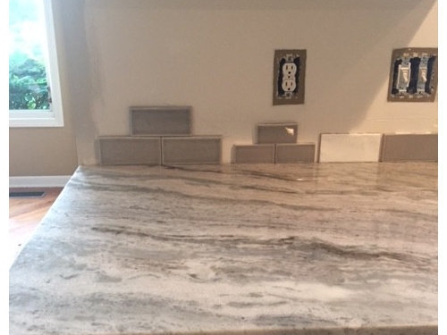
Need to wrap this project up, trying to pick cabinet hardware and soon worn floors are being refinished in walnut or darker.


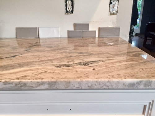
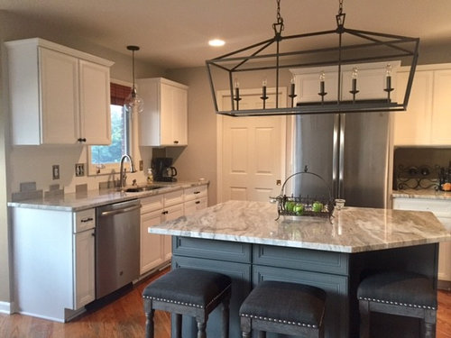
Cabinets are BM white dove, counters are fantasy brown quartzite.

Tile will be on 3 walls as kitchen is horseshoe shape around island


Current considerations are closest to end of counter Highland Park dove gray 3 x6

Sonoma Stellar rainstorm 3x6 or 3x9, also looked at penthouse or pumice


White is a matte in Cloud

and I also have Adex Nature in Smoke


Any ideas, opinions are appreciated


Comments (23)

  • 8 years ago
    I think the one all the way to the right. Your counters are busy (in a beautiful way) and since you have a good amount of area to cover, bigger tiles would look better.
    mbinford thanked K R
  • 8 years ago

    I'm sorry I don't have an opinion on backsplash tile. Just wanted to say your counter tops are beautiful!!!

    mbinford thanked ohsoslow
  • 8 years ago

    I would want something in between that white and the grays you have.

    mbinford thanked Chessie
  • 8 years ago

    I was also thinking a color in between the white and the grays would look fabulous. I agree that a larger tile would work since you do have a large area to tile. Have you looked at light to medium grays?

    mbinford thanked Bev
  • 8 years ago

    Something close to the wall color in the rest of the kitchen, which appears to be a bit lighter than the dark tiles.

    mbinford thanked chispa
  • 8 years ago
    I like the bigger tile far left of pic
    mbinford thanked Irene Morresey
  • 8 years ago
    White will give those beautiful countertops more focus and the kitchen will look brighter and crisper. The gray will lend a sophisticated look to your kitchen, but will also contribute to its smaller dimensions.

    Either way, I would try to find longer tiles in whichever color you select. The previous poster was correct, your kitchen will seem larger the bigger the tile.

    Nice kitchen!
    mbinford thanked Hamdsome Smitty
  • 8 years ago

    Thanks for the feedback and pics! I was feeling the same about tile size and color, just difficult finding right shades that are lighter.

    Sonoma makes a 3x9. I am going to go back and look again at the lighter penthouse color.

    Would love to open it up further and add some glass to cabinets too, just can't choose which ones. That can wait for now.

  • 8 years ago

    I am looking at 44 sq ft f tile- I know Sonoma is pricey + shipping. If anyone has thoughts on other tiles would love to look at those too!

  • 8 years ago

    Love the kitchen! What color is the paint you chose? Looks great. I'm going with a similar theme and thinking about gray tile as well. One thing I note is that the white tile (in images on pinterest and houzz) really does lighten up the space and it would give you ultimate flexibility on the kitchen paint in years to come. I think you can't go wrong with either but am adding my 2 cents.

    mbinford thanked User
  • 8 years ago
    Check out the Tile Bar, free shipping, inexpensive samples, lots of good choices for you. We installed a 3x10 (about) white handmade looking subway which we love!
    mbinford thanked Susan Sease
  • 8 years ago
    last modified: 8 years ago

    What about something like this? This is Nabi Tundra, from TileBar.

    https://tilebar.com/nabi-tundra-3x6-ceramic-tile.html

  • PRO
    8 years ago
    I think the white will look clean and fresh keeping the focus on your countertop (stunning) and your island. Your kitchen looks great, keep the backsplash simple so that the rest is appreciated.
    mbinford thanked Passé/Present Interiors
  • 8 years ago

    Your kitchen is stunning. I vote larger white tiles that will enhance that counter.


    mbinford thanked Boxerpal
  • 8 years ago

    Chess- I am looking for that shading or lighter. I need to find a pic of that installed, so pretty! So many are just flat gray.

    Will entertain more white options too, I think thats why I was not loving the darker shades, distracting me from counter which I do love.

    Thanks for Tile Bar idea, I ordered several samples hopefully I find something soon!

    Appreciate all the feedback!


  • 8 years ago
    I don’t feel quailed to make color recommendations, especially from a monitor, but I just wanted to say that I have Sonoma stellar tile and both I an my installer can highly recommend it. Mine are 2x8 crackled in the color smoke. I too considered Highland Park dove gray but it was too dark and too gray for my kitchen. I’m not necessarily recommending this color to you (although it might work) but I selected it because it offered a nice contrast to off white cabinets without being too dark. Sonoma has so many beautiful colors. Best of luck in finding “the one”.
    mbinford thanked Lisa SW
  • 8 years ago
    Sorry, just saw your comment on the price of Sonoma. It was a bit of a stretch for me too, but I found it so worthwhile. Now if you had asked for an alternative to Encore (my absolute first choice) I’d have recommended Sonoma;)
    mbinford thanked Lisa SW
  • 8 years ago

    Kikodog- Thanks!!

    The perimeter is BM White Dove and the island is Kendall Charcoal. Kendall Charcoal does take on a blue gray hint in some light. I don't notice it as much on island except in photo.

    We had SW Dover White oil base on our trim and doors and it had darkened with age already a problem in areas we wanted to touch up with latex. They were never going to match.Now we need to redo all doors and trim, but I do love the BM White Dove.

  • 8 years ago

    LW- Thanks! The Highland Park is a browner gray than what I found in Sonoma. I of course wanted to love it for $. Sonoma too offers the most colors and sizes. Holding out for samples from Tile bar and another Online order to compare to Sonoma.

  • 7 years ago

    I know this is an old post but what did you end up with? I am looking at both Sonoma Penthouse or Truffle and Highland Park.

  • 7 years ago
    From different angles, or with different lighting, your counter looks different.
    I think the white is too white. My rule is that the backsplash must match one of the colors in the counter.
  • 7 years ago
    The greys seem too heavy.