Software
Houzz Logo Print
cmcole01

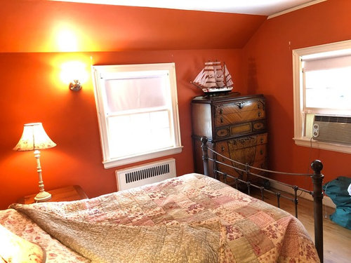
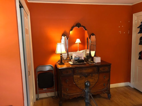
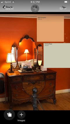
Help me redecorate this awful Orange guest room!

8 years ago
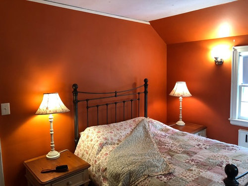
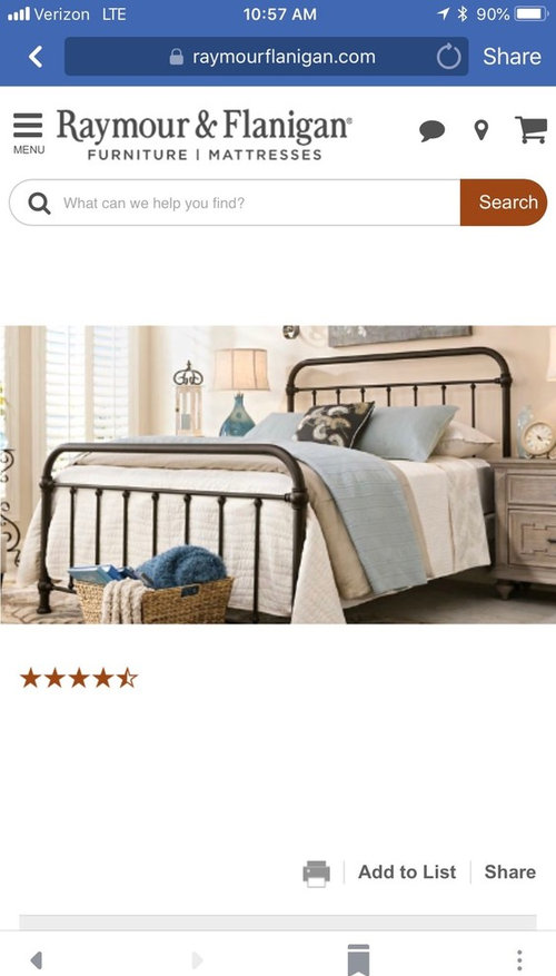
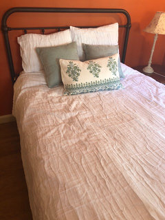
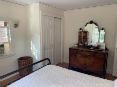
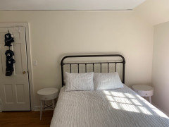
Hi all - I need help with redoing my guest room. I have bought a new queen size bed (pic attached) to replace the full size currently in the room. The only things in the room that need to stay are the dressers.

I obviously need a new wall color, bedding, nightstand (prob only 1 will fit), lamps, other decor. I’ve added more pictures in the comments.

I had a different post a while back with some great ideas - I’ve attached link here.
https://www.houzz.com/discussions/help-me-completely-redo-my-guest-bedroom-dsvw-vd~3621033

Comments (91)

  • 8 years ago

    The only other comment I would have would be to suggest putting the tall dresser on an angle in the corner.

  • 8 years ago
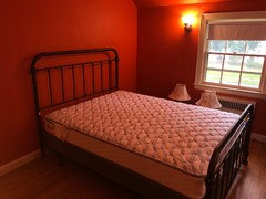
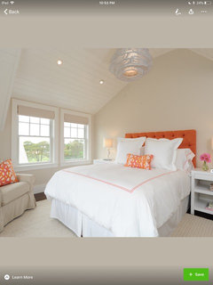
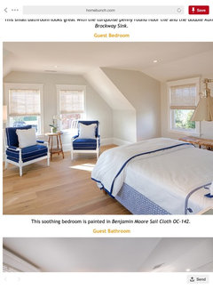
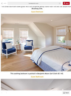
    Hi all - bed was delivered today & I love it. I’m working on picking a paint color and am leaning towards BM Sail Cloth with BM White Dove trim. What do u think?
    Also any ideas about bedding, lamps and end tables? I have to measure but it does seem like we have room for small side tables. I know I will not do wood but would love some ideas. Someone suggested nesting tables, which could be interesting. For bedding I think I want to keep it simple - no duvet.
  • 8 years ago

    Following


  • 8 years ago

    Do what decorators do - pick the paint last. It's easier and you will have a better result. The paint comes in an infinite number of colors, so it's easier to match it to the bedding instead of the other way around.

  • 8 years ago
    Thank you for the advice about picking paint last - normally that is what I do. But in this case I know I want to do a creamy white color and it is very difficult to see this room and the possibilities with it Orange. Any bedding I pick will work with the wall colors I’m considering so I’m eager to get the room painted and then see what comes from that.

    Based on this - are there any thoughts about the paint color I’ve mentioned (based on the photos I’ve shared as examples both here and earlier)?
  • 8 years ago
    Anyone?
  • 8 years ago

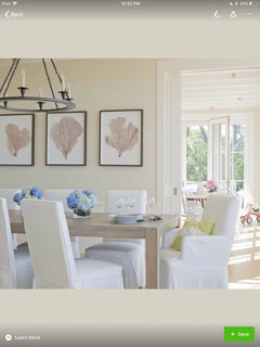
    I like the paint color wiith the table and white chair set

  • 8 years ago
    Thanks - actually the paint color is the same in all the above pics (even post that shows new bed in room). BM Sail Cloth. Here’s another
  • 8 years ago
    https://www.kylieminteriors.ca/the-4-best-white-paint-colours-sherwin-williams/

    https://www.kylieminteriors.ca/the-8-best-benjamin-moore-white-paint-colours-undertones-and-more/

    These articles helped me recently. Maybe they’ll help you. I used BM simply white in my house and BM white dove in my dad’s. Both turned out great. It’s all about the lighting.
  • 8 years ago

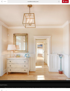
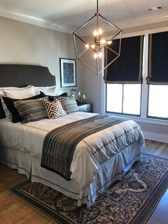
    This is a favorite room. White bedding, simple pillows and a throw with coordinating rug. Done deal.


    ST. ANDREWS MODEL · More Info

  • 8 years ago
    We can’t really guess at the color because we don’t know how lighting will impact. Why don’t you pick up 3 or 4 samples and then you can test them out.


    At the least start by priming the room.... it will help you see everything better
  • 8 years ago
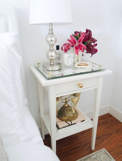
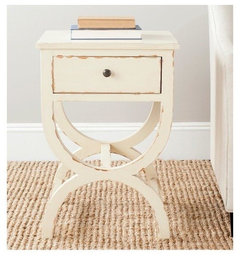
    The cream crafar table from Wayfair, love the mirrored tray on top.
  • 8 years ago
    We chose a paint based on some art. We love the paint, and it is still there, but it made finding off the shelf bedding hell. We finally chose a neutral bedding. If you are choosing paint first (and there is a reason these great decorators on Houzz tell you not to), then pick something that can work with the color trends in off the shelf bedding.

    My guests love the fold-up luggage racks. I recently found some with a bottom rack that give a place for shoes or small dirty clothes basket. I also provide plugs-ins with USB recepticles. Please be sure to have a reading lamp on both sides of the bed.
  • 8 years ago
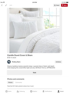
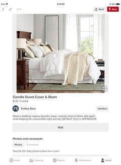
    Hi all - I really like the look of the attached bedding. The patterned coral sheet with white duvet cover and a grey throw. But I’m thinking of the PB Duvet cover instead (Camille Duvet Cover). I also like the white and ivory bedding attached.

    That with the Sail Cloth Paint. Thoughts?
  • 8 years ago
    Following. Anxiously awaiting to see the room completed. The furniture is the star:)
  • 8 years ago
    I love love love the sailcloth color in all the pics you posted. I especially adore the first with the white bedding pops of the bright orange. And that ceiling was to die for. The last round of pics you posted with the white and orange bedding I like but because the pattern with the orange is so small it is reading pink to me.

    I would sample first but I really like it and to be honest I think I will sample the same color in my master as the griege I have now looks sad. My room is very dark, north window so it’s a little tough for me. Does that room receive adequate lighting?
  • 8 years ago
    Looking closer I’m worried the Pottery Barn Camille duvet- solid color with textured pattern(?) could clash. Not sure if clash is the right word but maybe just look off if they are so close to the same color but not actually the same. Like one look dingy compared to the other if that makes sense.
  • 8 years ago
    I think I would opt for white bedding... any of the texture options work. Then You can add a throw etc. Like other posters have mentioned: the star will be your furniture. (And maybe some artwork!)
  • 8 years ago

    Take a dresser drawer with you to the paint store to make sure bM Sail Cloth isn’t too tan.

  • 8 years ago
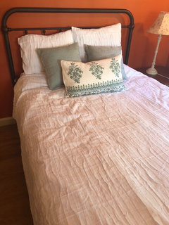
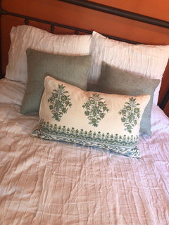
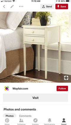
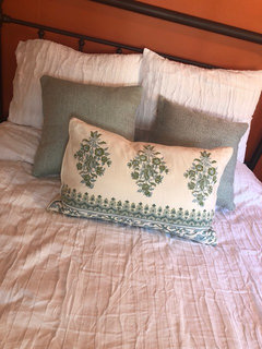
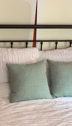
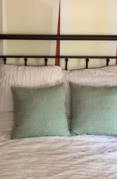
    Hi all - ok I ordered the white Camille duvet cover and got a few throw pillows from a local store. The pillows are a blue green color (very pretty). So what do u think? What color throw/blanket would u add? I know it is still hard to really see it with the walls Orange - but it’s the best I can do right now. I’m also considering some small white nightstands like the attached. Thoughts.
  • 8 years ago
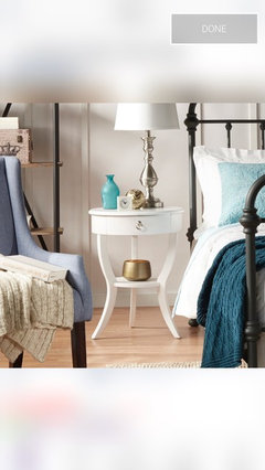
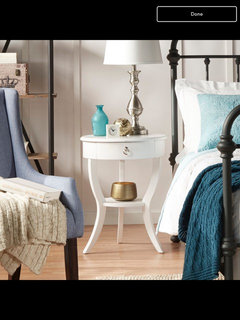
    Hi again - I’m following up on my last post about nightstand & bedding. I’m really considering these nightstands - do u think the round shape will work? Look forward to thoughts on table and bedding
  • 8 years ago

    Yes, white round table will work. You can find the square one at flee markets and second hand shops. I’m picking up a vibe from Grnadma’s attic bedroom in Iowa.

  • 8 years ago
    @marylut are u saying this is reminding you of your grandmas bedroom? I assume not a compliment & not what I’m going for. If you can be more specific that would be helpful.
    For pillows the lumbar style pillow was one I had and added. The bed clearly needed another pillow, not necessarily that one.
  • 8 years ago
    I love old furniture mixed in with my more current, transitional stuff. It gives any room a bit of personality which matchy-matchy sets don't have.
  • 7 years ago

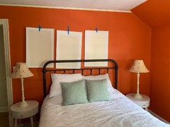
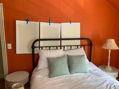
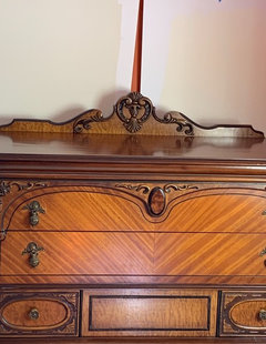
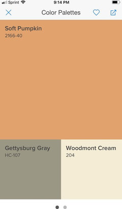
    What do you think of these paint options for this room? The first 2 pics have 3 colors (L to R; Sail Cloth, Ballet White, Timid White) and the last 2 pics have only Ballet White & Timid White (L to R). These pics were taken at different times of the day in this S & W facing bedroom.

    I already pulled Sailcloth out of the running because I felt it may be a bit too dark & I like the other 2 better. Please let me know your thoughts on these 2 colors in this room and with this furniture.

  • 7 years ago

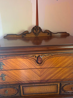
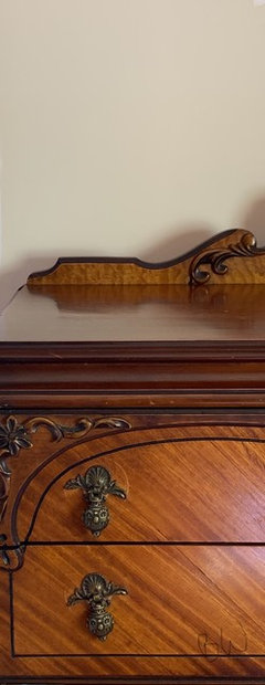
    Timid White. The Ballet looks a bit dirty to me, in that room’s light, like the walls need to be washed. Timid looks great with your dresser, by the way, which I love even more now that you’ve given the closeup. Wow.

  • 7 years ago

    Yes to a blackout shade or a pair of heavy draperies to minimize the daylight.
    Yes to painting the walls and ceiling. If you want to keep the quilt on the bed, select a light color from the quilt for the paint. Then pick a deeper or brighter color from the quilt for an accent pillow or two. The dressers are old and very interesting...keep both of them if you can fit them, even both on one wall.

  • 7 years ago

    Of the two, I like timid white, but I'd prime the room before making a final decision.

  • 7 years ago

    Thanks - here are the 2 separated & close up. As you can see when not looking at the Ballet White next to the stark white it is quite nice too. I. First pic is ballet white, 2nd Timid White.

  • 7 years ago

    If you chose a bed cover that’s a soft pink, the whites you’re showing (on my monitor) are too beige. They don’t not complement the pink. I actually love the pink, so would you consider a super soft blush color for the walls? I’m not a designer but I do love, and own, antiques. Those dressers are beyond fabulous. The choices so far look dull next to the veneers on the dressers.

  • 7 years ago

    Thanks all - the bed, White bedding, and nightstands in the last few pictures are recently purchased (and of course dressers are staying). The accent colors on bed (pillows, throw) are up for discussion and then of course I will need new lamps, window treatments, a rug, etc. I’d love help with picking the “white” paint for this room & of course those additional items.

  • 7 years ago

    I didn’t realize you want white walls. Sorry.

  • 7 years ago

    On my monitor, Timid White is a beautiful background for your dresser. Much livelier than Ballet White. How does it look with your white bedding? Your dressers are beauts!

  • 7 years ago

    Thanks all. I’ve tried to get closer picks of both colors against bed at different times of day. Ballet white on left, Timid White on right.

  • 7 years ago

    Timid White. Much cleaner than Ballet White and a better "match" for your white bedding. (That orange is not a timid one. Very nice. Could see it in an office or library.)

  • 7 years ago

    I like the ballet white because the timid white looks yellow to me. I think the ballet is more neutral and would be easier to work with a lot of other colors if you want to change later. I also like it better with your furniture. I love your furniture.

  • 7 years ago

    You're right that Timid White looks yellow, Cheryl Smith. I don't find that would impede future colours being introduced. Blues (though OP says they have enough in the house), pinks, greys, greens, purple...lots of colours look great with yellow.

  • 7 years ago

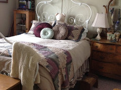
    Not a fan of your bedding selection or the lamps. Definitely got the granny vibe.

  • 7 years ago

    1. Pretty much any neutral color paint/beige would be better than the orange.

    2. Why can't you use the same nightstands that are in your original post? They look like they would fit.

    3. Regarding the wide pillow on your bed...try flipping it upside down, I'm feeling like the border should be on top.

  • 7 years ago

    The lamps are not staying - they were my mother in laws. The comment about Timid White looking yellow is my concern as well. I will probably paint a few more boards to put around the room.

  • 7 years ago
    last modified: 7 years ago

    "Granny vibe"? How so? The furnishing are giving me a country vibe. I'm not sure I understand this seeming obsession in decor to make things looks "young". In the current issue of HGTV, there's a feature on a MB and it's "Help us make our bedroom look a whole lot younger".

    Kate, the OP did say:

    The accent colors on bed (pillows, throw) are up for discussion and then of course I will need new lamps, window treatments, a rug, etc. I’d love help with picking the “white” paint for this room & of course those additional items.


    ETA: Are you any closer in deciding on your additional bedding colour? What's your budget for your lamps and what size do you need?

  • 7 years ago

    I really do think it's best to maybe just put a primer on the walls first before actually picking a color. You will probably need 2 coats of any color anyway to cover that orange. Decide on other things and colors you want in the room and then pick a wall color that coordinates with everything. I really don't like white walls and beiges with yellow or pink undertones. Keeping the bedding white and bringing in color with pillows make it easy to change without changing more expensive things. I like keeping my sheets white or ivory too. Every time I have picked a color I like but went with a lighter version on the sample strip I have regretted not going with my original choice. I think it's because I always played it safe with whites and off whites. my current favorite color is Sherwin Williams kilm beige. It is a color I know I can totally change the look without changing the wall color. My guest room is filled with family peices and we DO lovingly call it "grammas room"

  • 7 years ago

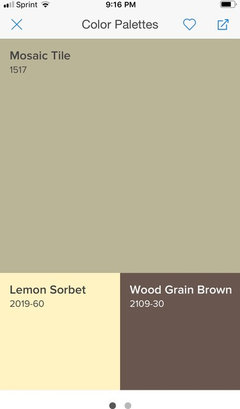
    I just quickly read through this and see this dilemma has been going on for a while! While your original paint color is a bit strong I don’t think a cream is a good fit here either! You want your bedding and furnishings to have a backdrop and the antique furniture will benefit from some color too. Here are a couple suggestions.

  • 7 years ago

    I appreciate the advice about painting with primer and then deciding, but I won’t have that luxury. I am having new windows installed throughout my house and have someone who will paint those and 2 rooms. I need to decide soon. The white walls were picked to let the furniture shine and not interfere with the coloring there. I want an inviting room (not cold) but also pretty, allowing accent colors to come through and be flexible. I do like the blue/green color in the square accent pillows (which are colors brought through my home). But I’m not tied to anything other than the furniture in the room. I did just buy the white bedding and I do like it - the idea was to add some color with a throw or coverlet.
    As for lamps I really haven’t thought about them yet, other than them not being too large. The night stands are not large and I don’t want the lamps to take up the whole table top.

  • 7 years ago

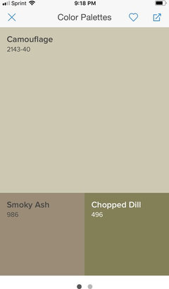
    If you use a quality paint most are paint and primer in one. You will have to do two coats anyway so buy good paint and you should be fine! My guest room is painted in BM camouflage. A perfect, light, soft , sage green!

  • 7 years ago

    Priming it wouldn't be for sake of prep or quality--it would be a way to get a blank canvas so that it's easier to pick the right color. Putting paint samples, even with a white border, against that deep/bright orange is going to skew perception. Primer is often cheaper than paint, and you will need a few coats (I'm betting at least 3 if you're picky and don't do too thick of coats) to go from such a dark color to such a light color anyway. If primer is not cheaper than the paint you plan to buy, just go ahead and slap a coat of paint on and give yourself permission to alter the color before the second and third coats.

    That said--if you're paying a painter to do this for you, it can be more affordable to pick colors first rather than experimenting.

  • 6 years ago
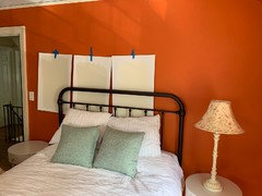
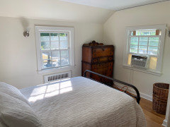
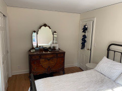
    UPDATE! No more orange! The room is painted, new windows, and new white linen cellular shades (top down/bottom up) on the way. Now I need HELP in picking accent colors and decorating. Specifically lamps, accent pillows, blanket/throw, rug, new sconces on the wall. This is a picture at 4pm - so the walls will get creamier or whiter depending on amount of sunlight coming in. Also obviously the AC will come out of the window very soon.

  • 6 years ago
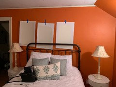
    Thanks for the up-date. Looking so much nicer.

  • 6 years ago
    Your room looks real nice. Calm and serene. The orange was bold but a little fun too

  • 6 years ago
    Wow! Just read this whole thread, kind of timely too as we just painted our son’s room a light cream color and it was BRIGHT ORANGE!. It took 3 coats of paint plus primer, it was insane. His room is black, white and blue. Looks very manly but in a soothing way.
    Buy some colored papers from michaels (the kind they use for scrapbooking I believed and set them in the room. See what works best.

    Would you consider painting the ceiling the same color as the walls?

Sponsored
Mary Shipley Interiors
Average rating: 4.8 out of 5 stars34 Reviews
Columbus OH Premier Interior Designer 10x Best of Houzz