Software
Houzz Logo Print
paula_sanders

About my kitchen paint color

13 years ago
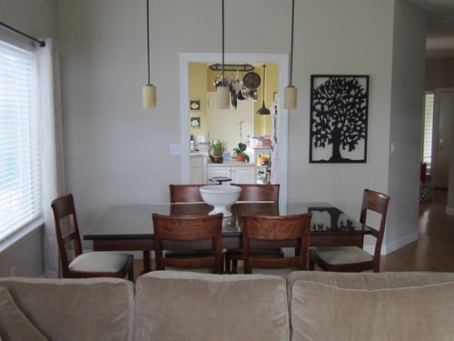
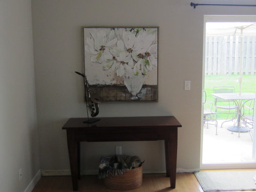
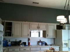
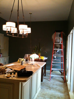
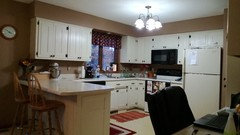
My cabinets are white. My floor is beige and so are my countertops. My dining/living room are painted s w accessible beige. Colors in these rooms are white flower picture and a taupe (more beige) sofa. I need suggestions for kitchen wall paint. I will try to attach pics.

Comments (44)

  • PRO
    13 years ago
    You could look at the greens in your flower painting and if you are really feeling bold you could look at the reds in that painting. If the flower colors are too bold or bright your paint store can help you soften and lighten while still complimenting the painting.
    Paula Sanders thanked Interiors Unleashed
  • 13 years ago
    last modified: 13 years ago
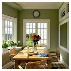
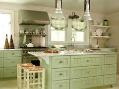
    Look at SW Sheraton Sage. I am feeling the greens, too, as is Interiors Unleashed.
    Glad you took the picture from the angle that you did as it is important to view a color from the adjoining room, too.
    Sheraton Sage SW0014 Paint · More Info
    Paula Sanders thanked elcieg
  • 13 years ago
    ANYTHING goes with your beige AND your white cabinets! The question is: what colors do YOU like? Do you have kitchen collectibles with a pop of color that you love? Find some old faves to display or shop for something new for your kitchen, then coordinate the wall color.
    Paula Sanders thanked msmliss
  • 13 years ago
    What is the white at the end of the kitchen? There needs to be color there, don't you think? I love the greens! I see it softer than the sage shown though....
    I also agree with carrying the color from what ever paint from art goes in your dining room to the kitchen as a tie in.
    Paula Sanders thanked Joani Moore
  • PRO
    13 years ago
    I agree with msmliss - for color ideas, find a thing (or two) that you love, ya know, that makes you smile every time you see it. It can be fresh flowers in a vase, or a fun dish towel. Find that one thing that touches you - and voila! Let that be your jumping off point. Also, something else to keep in mind, most kitchen walls are minimal, due to the cabinets taking up the wall space -- so whatever color you decide on, you can go a shade (or two) darker, because you won't be seeing too much of it. Whatever color you decide on, you can have something in that color on your table in the dining room, and even pillows on the couch, and it will all feel balanced without feeling too matchy-matchy. I hope that helps. Good luck and have FUN!
    Paula Sanders thanked colorific
  • 13 years ago
    My favorite colors for pizzazz are cheery yellow and red!
    Paula Sanders thanked bookworm202
  • 13 years ago
    Stick with color from dining rm. when rms look or flow into each other better to keep the same. You can add yellow or red, or what ever color you want as accent. Use in your accessories, like bright yellow canisters. Place a red tray with some kitchen items, olive oil bottles , fun pepper grinders, mix it up. But don't over do. On wall looking into kitchen. Mirror what you have on other side, to balance the look. Good job.
    Paula Sanders thanked Nancy Travisinteriors
  • 13 years ago
    @amy thompson: I have a cream cheese box I've been saving for the same reasons! Packaging IS good place to find a color palette you love (and so portable too!)
  • 13 years ago
    I found a similar sage / taupe or sand color scheme from Laura Ashley. The colors work beautifully together and would not fight your living room neutrals. Also would provide a little color, which I think you sort of need with white cabinets and a beige floor! I don't think the sage is too strong at all. It was called sand #5 for walls with sand #3 for trim. Can't even find a color palette online anymore sadly, they used to have lovely color scheme cards made up for Lowes.
    Paula Sanders thanked Jackie P
  • 13 years ago
    I would keep the kitchen yellow, to me it adds life!
    Paula Sanders thanked User
  • 13 years ago
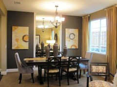
    I like the yellow :) I think if you bring some of the yellow into the dining room it would nice. Maybe have a light/medium gray accent wall as in pic:
    Paula Sanders thanked indianpatti
  • 13 years ago
    I like it too. If you just want a change you could try aqua.
    Paula Sanders thanked maryfowlie
  • PRO
    13 years ago
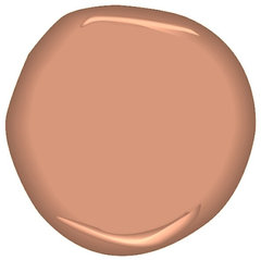
    I would probably choose a soft coral as it warms the kitchen and is appetizing. It is a great color to sprinkle in your adjacent rooms for a little more interest and warmth for those rooms. All rooms will work together subtly.
    tuscan tile CSP-1130 · More Info

    or something like this
    Benjamin Moore Glacial Till AF-390 · More Info
    Paula Sanders thanked LB Interiors
  • PRO
    13 years ago
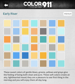
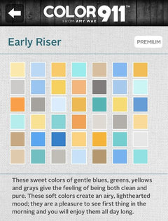
    i think it would be helpful if you had a color theme to use as your guide. I think all design needs a solid color plan. I created an app that is designed to help both designers and homeowner s choose their colors. The app, called Color911 (Color911.com) has several features. You can create your own palette of colors, or use the pre-made color themes so that you can visualize the colors together and see options for additional accents. Use any number of colors from any theme. I attached a color theme (a screen shot from the app) that you might like, there are many many color themes to choose from this is just one example. Once you find a theme you want to work with, you can use this as a guide for choosing anything thats a color.. wall color.. accent color... pillows...whatever you want. Because the colors go together in each theme iit is great for choosing the colors for adjoining rooms, I think colors should flow from room to room. I hope you like this theme.. its only one among many in Color911. I hope it inspires you!
    Paula Sanders thanked Amy Wax
  • 13 years ago
    I think your painting has great colors as a starting point. I'd stick with yellow. I used a KM pale butter in my kitchen/family room. I think a soft sage (pale) would be great as an accent. I consider green to be neutral & like it in small doses.
    Paula Sanders thanked lamaisonbleu
  • 13 years ago
    Agree with the sage greens. Your home has a nice soft feel, easy and calming. The sage would compliment and enhance that look.
    Paula Sanders thanked leelee
  • 13 years ago
    Sherwin Williams has an awesome green called Lemongrass in their concepts collection that i think would look great.
    Paula Sanders thanked Bobbi Gjertsen
  • 13 years ago
    We LOVE greens, but with the abundance of beige in the floor and cabinets (which have a bronze accent line) decided to go with a greenish/grayish blue. We think it worked!
    Paula Sanders thanked Leslie Ligon
  • 13 years ago
    I agree with MsMliss and TravisInteriors. If you REALLY want to paint, I would go to your local home improvement store and look at the brochure collections. They usually have color schemes already put together. Pick your favorite, remembering that you'll have a nice glimpse from your other rooms and you want it to flow. Remember, when you put a single color in at least 3 places in a room, it suddenly becomes an accent color, so you don't need to paint all the colors suggested together, to get that look.
    Paula Sanders thanked leezway
  • 13 years ago
    It seems to me that what's not working is all the beige. Keep the yellow. Throw some yellow and green patterned pillows on the couch. Put another piece of art on the wall next to the kitchen to tie in the colors more, some candles on the table and I think you'll be much happier. It's worth a try right before all that painting?
    Paula Sanders thanked Tina Rawson
  • 13 years ago
    Take a look at Sherwin-Williams "Sea Salt." Very cool and soothing color and would look nice with your beige and white as well as with the colors of the adjoining room.
    Paula Sanders thanked Jennifer Barnett
  • 13 years ago
    My kitchen is quite small so I've just had a total refit with cream cabinets and wood effect floor and counter tops in light ash......I then had the space between cabients and counters tiles in matt cream and a splashback in the brightest red tiles I could find, taking a border of half tiles right round the wall where the counter tops and walls meet....does that make sense? It looks fab.....go for bright as it'll liven up even the dreariest of days.
    Paula Sanders thanked mrsevans1
  • 13 years ago
    Sadly, I think Paula Sanders liked none of our suggestions…..
    Paula Sanders thanked elcieg
  • PRO
    13 years ago
    I like the softness of this color. Love the subtle warmth and touch of spark.
    Squire Hill Buff 1068 by Benjamin Moore · More Info
    Paula Sanders thanked LB Interiors
  • PRO
    13 years ago
    Squire Hill Buff is a good color but before you choose one color, think of all the colors around it so that the rooms flow together. That's one of the reasons I think going with a color theme (see earlier post) might be helpful.
    Paula Sanders thanked Amy Wax
  • PRO
    13 years ago
    Thanks for asking. I created an app called Color911 to help people select colors for their homes. Within the app are color themes which are a collection of colors that all go together. Each theme is different. I recommend looking through the themes and finding one you like and using it as your guide. For example if you find a theme like the one I attached, you can choose a color for the wall and match it at the paint store, choose another color for a rug, another for an accent color and so forth. By using a theme it's a great guide for you and makes all of your color decisions a lot easier ..and a lot more fun. I hope this helps explain it a little better thanks again for asking!
    Paula Sanders thanked Amy Wax
  • 13 years ago
    Sometimes people choose wall color & trim that are in the same shade, but one may be a few shades lighter - a less saturated version of the same color. If you are painting all your rooms the same shade then you have less to worry about. If adjacent rooms are different colors, you will see into the next room when the door is open - or if there is an open theme - no door even has to be open. You can have colors that clash with each other / fight each other - that is why themes or color coordinated paint cards were recommended. All the colors on that 1 card are going to look decent with each other. If you have a good eye for color & willing to hold up the squares next to each other to see how it looks that will work too. Those little squares don't always give you a good idea. I got tiny cans of paint, and painted good sized patches of the different shades I was considering on a wall - even putting squares of color next to each other to see how they would look on a bigger scale. You also get an idea of how the color changes with different lighting, different times of day, etc.
    Paula Sanders thanked Jackie P
  • PRO
    13 years ago
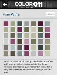
    I attached another example of a color theme from the Color911 app. You can see how different each theme can be :)
  • 13 years ago
    Theme (in design terms)means the idea you want to carry though home, color is only one.
    Paula Sanders thanked Nancy Travisinteriors
  • 13 years ago
    Love what you have already. If looking for a change try adding some decorative tile. Is your taste more rustic or clean and modern? Have to decide so you can narrow things down. Also, by adding backsplash and changing the hardware on the cabinets, you can change the look of the kitchen drastically.
    Paula Sanders thanked bksavy
  • 13 years ago
    I have white cabinets that are glazed with mocha corian countertops, oil rubbed bronze hardware/faucet and the walls are painted yellow.
    Paula Sanders thanked meora
  • 13 years ago
    I agree with using a green (with a tint of grey in it), a beige, and a accent color as the stand out element.
    Paula Sanders thanked Patti
  • 13 years ago
    last modified: 13 years ago
    I used Behr paint. The color name is caramel latte. Works well with everything.
    Paula Sanders thanked Dan D
  • PRO
    13 years ago
    I immediately thot Celadon, the greyer green sage-type color. You have some very good suggestions and what sounds like a concensus! I love the yellow in your kitchen, and it should coordinate very well. It is my dream house scheme as well. Good luck! Please let us see what you go with!
    Paula Sanders thanked MBBCreativity
  • 13 years ago
    Your home appears so clean and contemporary but the hanging pot rack in the kitchen is throwing me off. It gives a country vibe to the space. If you don't need the extra storage possibly you could remove it and then go with a gray/sage hue of green for the paint color.
    Paula Sanders thanked Carolina Girl
  • 13 years ago
    So Paula, you got lots of great comments here - are you reading them? Any response?
  • 13 years ago
    I agree with green recommendations. Check BW Georgian green.
    Paula Sanders thanked ncole2849
  • PRO
    13 years ago
    If you go with green, take a peak at BM fernwood green- think it would be a nice selection. Many possibilities here, good luck!
    Paula Sanders thanked Color Zen
  • 13 years ago
    You have a lot of beige and other neutral colors so why not go with something brighter than sage which is another boring color. Step it up a notch and go with something brighter and more fun. Just about any color would go with your beiges. It is just paint and you won't be stuck with it forever! Think light blue, yellow, citron, apricot......
  • 13 years ago
    Calling Paula - yoohoo.... where are you!! A response would be appropriate to all these nice suggestions!
  • 13 years ago
    You are right! And I appreciate the responses. I tried several times to download photos and I got blasted for multiple posts that were identical. No one responded so I gave up. I actually saw all these suggestions in my email and was quite surprised! So thanks to all. I have lots of good ideas now
  • 13 years ago
    Paula... it is just a houzz blog.... You did just fine.
    Paula Sanders thanked Joani Moore
  • 13 years ago
    I like the sage idea . BM Lapland is a good contender. I also like the idea of same color as dining/ living area adding accent color. I like the calm. Hectic life.......Calm home. Thanks again.