Software
Houzz Logo Print
jonrobison

HELP us update and De-Tuscanize

8 years ago
Hello all, we wrote some time ago but have been dragging our feet on pulling the trigger.
We plan to paint our kitchen cabinets and islands, change the entire house walls to one paint color, and change out kitchen countertops/backsplash/lighting.

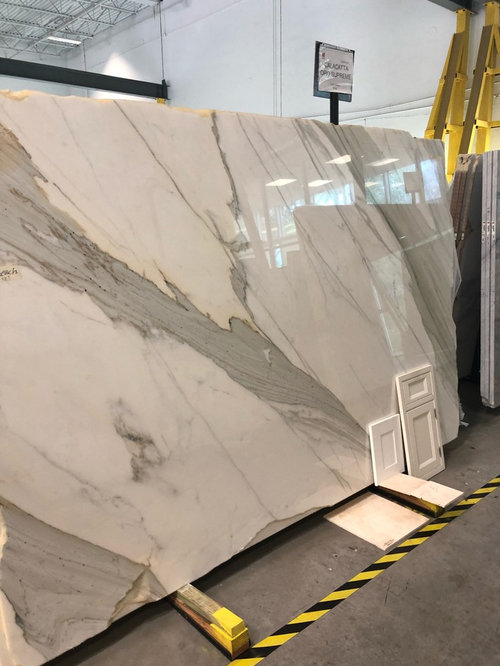
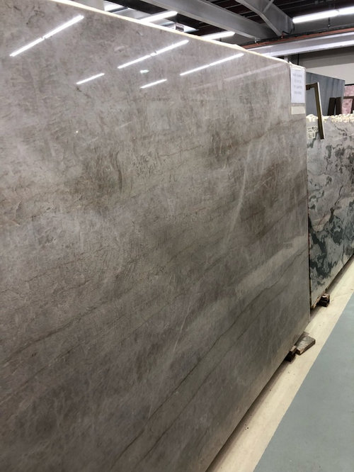
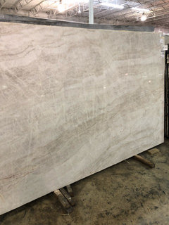
Twntaitive paint color in kitchen for perimeter...white dove. Islands will be painted different color depending on counters chosen. Would love to hear thoughts on our two counter slab options we have on hold...calacatta oro supreme or Taj Mahal..

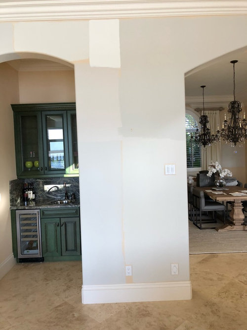
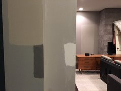
Below is the wall color options...the 2 closest to the floor are Pale Oak (left) and Winds Breath (right). Directly above them are accessible beige 70% (left) and revere pewter 50% (right). For reference I painted a swatch of white dove between those 2 next to the ceiling trim. The other colors going up the left column we aren’t really considering.
Would love to hear thoughts and if you think wall colors and countertops would be acceptable options with our travertine floors and creamy trim which we are trying to avoid painting. Thanks for any and all input!!

Comments (27)

  • 8 years ago

    It is much busier, but, I really love the calacatta oro supreme. Taj Mahal is very popular right now, and doesnt look quite as busy, but, for me personally, it is just not anything I would ever choose.

  • PRO
    8 years ago

    Calacatta Oro Supreme is a marble with marble characteristics that you have to be able to know before you buy as it looks like you will need a lot of it.

    Taj Mahal is a Quartzite.

    have you been given info on these two products?

  • PRO
    8 years ago

    The Calacatta is always a classic option, but as stated above, it is important to know the characteristics. Being a marble, this soft stone is more easily damaged and prone to staining. Be careful placing it in a kitchen! It is not recommended. The Taj Mahal is likely the best option for a kitchen because it is more dense, and therefore won't be as easily damaged. Both are beautiful options, but it comes down the the maintenance and longevity of the products! Hope this helps!

  • 8 years ago
    I like the revere pewter best with your current flooring. Would you consider leaving your islands unpainted? I love white kitchens, but your current cabinetry is really pretty...might be worth saving some of it. Best of luck!
  • 8 years ago

    I love the countertops in the last picture ( I assume that's the Taj Mahal), but the Calcutta will definitely make a statement if that's what you are going for. Also, I love the colors happening in your butler's pantry. Might be a good option for the island color.

  • 8 years ago

    Following.....

  • 8 years ago

    I like Pale Oak (considering it myself). I also like White Dove, but there isn't a lot of contrast against white so maybe think about using Dove Wing (next up on the strip). I love the Taj Mahal. If I ever redo my counters, it's under serious consideration.

  • 8 years ago
    The paint colors are driving us crazy. The pale oak (on the lower left) appears so much more blue than any photo Ive ever seen online. My heart was saying pale oak and now that it’s on the wall I’m second guessing so much because of the blue. Is it just my eye that it looks blue or is anyone else seeing this? Is it the overall yellow walls enveloping the room that are casting a shadow on my paint samples and making the pale oak and even the winds breath to the lower right look blue? I’m scared to take the plunge and wonder if after painting all the walls the blue will disappear and it will turn a true light greige like it looks on my sample board.
  • 8 years ago
    last modified: 8 years ago

    I have the exact same issue! My new house was tuscanized by the previous owner. The floors appear the same as yours; travertine. Since the flooring is really expensive, the last thing you want to do is rip them out. Your paint choices are narrow since the floor oozes yellow. If your paint has yellow in it, the walls look like wee-wee. If the paint has blue in it; it clashes. The best paint choices for this floor seem to be neutrals.

    I bought a Guggenheim paint deck; these are colors used in the Guggenheim museum. There are a lot of colors in the deck that work perfectly with the yellows you have in the granite, wood and flooring. Once you find a color you like, you can match it at the store.

    https://www.finepaintsofeurope.com/Guggenheim.aspx

    You need to be careful with the granite choice if you re-do the countertops. Those greys you picked are fine with the cabinets, but are going to clash with the flooring. Before you pick out any granite, look at it in terms clashing against the flooring.


  • 8 years ago

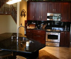
    Here is an example of your colored cabinets, same colored floor, with a "Verde Uba Tuba" granite countertop. It looks a little black in the photo, but it has heavy greenish gold undertones that work very well with the travertine. This granite color works because it is a green right next to the color wheel by the yellow travertine.


    The grays you picked are not even across the color wheel from the travertine, so the grays will appear jarring against everything else.


  • 8 years ago

    Paint color should be considered once the cabinets are painted and the countertops installed. Those 2 elements are going to drastically change the kitchen. Then you need to consider the light both natural & artificial. Also I would consider removing the interior island. To me it cuts the kitchen up

  • 8 years ago

    Gray over tan - the struggle is real. We somewhat successfully de-tuscanized our main level. I will tell you that the project snowballs. What started out as just refinishing the floor became all the lighting, blinds, counters, floors, etc. Because as you go from room to room the color is so jarring... We FINALLY chose a couple "grays" that we feel works with our northern exposure. But every swatch feeds off of all the other colors in the room and whenever up against tan, becomes more purply-bluish.


    Now... Here's the lesson I can share with you. Samples should be painted on foam poster boards instead of walls. Everyone says it but it's really, truly true! And in the end, the color we picked was the one I had the Sherwin Williams rep help me select in a color consult 8 or 9 months ago (Elephant Ear and Skyline Steel). But when we bought the paint and started putting it on the walls we thought we had made a horrible mistake.

    What color is your trim? Ours is Feather Down (BM 0C-6) - very creamy. We painted our cabinets the same color (they had been a mix of cherry-stained maple and a darker enamel, but the finish was in rough shape and they needed to be painted). BUT we were able to stain our floors from a natural jatoba (Brazilian Cherry) to a nice rich ebony. You cannot discount your floors and the role they will play in this. I think the tan in your floors will fight with the white in your top counter (taj, maybe?) and make the floors look downright yellow and the counters look cold and bluish by comparison. I think the Elephant Ear really complements our creamy trim but still has a nice muddy grayish-ness to it. I also think your wood is beautiful and you should try to keep it if you can. Try a few new sleeker pull options. Do not drill additional holes just yet but you can get the idea by screwing one side in. Wishing you the best of luck!

  • 8 years ago

    Flo is needed here.

  • PRO
    8 years ago

    To my eye, the lighting fixtures, granite counter tops, backsplash and the travertine flooring are more "tuscan" than the cabinets, which look to be a Colonial raised panel. The only feature on the cabinetry that bothers me are the ornate corbels on the range hood. So you'd yield a better result by changing those out rather than painting the cabinets.

    As far as the counter top material, the Calacatta is stunning! I'd choose that, but keep in mind that it is marble and will exhibit all the good and bad of marble. Make sure you can live with etching and chipping if you choose it.

  • 8 years ago

    Mnmamax....question for you....when you started painted your entire walls and the color began to look like the blue you didn't want, did the color eventually lose the blue as the entire wall and room finished being painted? In other words, did it end up looking like the sample board you originally envisioned or did it keep the blueish look that it had when just a few brushes of paint swatch were on the wall??

  • 8 years ago

    We live on the water in Florida, and alot these new construction homes seem to be very light walls, light furniture, etc....with that in mind, does anyone think the Revere Pewter at 50% on the upper right is too dark for the look we are seeking? On the other hand, with our creamier trim, is there enough contrast on the lower left color (Pale Oak) and does the color have enough pop???

  • 8 years ago

    jonrobison - hard to answer. Definitely I got a better feel for the colors the more I put on (covering up whatever shade of gray or tan was there), but in some cases the color was simply wrong. We are trying to match the creamy trim with golden undertones and still compliment our fireplace with a blue tinge in a Northern facing room. I think this looks about as good as we can expect. This is my final decision!

    The Elephant Ear actually seems to complement my tan (Spice Gold from BM) but the lighting is no good right now so I can't get a decent picture. I think for you the key will be finding something you can love that works with the tone in your floors.

  • 8 years ago

    It seems your dilemma is between cool grays and warm beiges. Given that you are keeping the travertine floor, I would opt for the warm beiges. I would eliminate the Revere pewter and Taj Mahal to narrow down your choices. Decide on the color you want for your cabinets and go from there. You have great taste!

  • 8 years ago

    "The paint colors are driving us crazy. The pale oak (on the lower left)
    appears so much more blue than any photo Ive ever seen online."

    I lived with Pale Oak for about seven years and really liked it . . . but, yes, there were times that it turned a blueish violet in my west facing room living room. In the east facing dining room, it read exactly like I wanted it to - a warm off white greige. So, it could be your exposure that's turning it for you.

    As others have mentioned I think it's good to choose the counters first, then paint. I am concerned with how your travertine floor will interact with counter tops you're considering. Travertine has a tendancy to nod towards pink. So be sure you take that into consideration in selecting your counter tops.

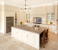
    Here are a couple of kitchens with travertine floors and white cabinetry. Take not of the counter tops.


    HIA 2012 Award Winner · More Info


    Transition in Caldwell · More Info


    Riebl Residence, New Floor · More Info


  • 8 years ago

    OP, may I ask where you dining room chairs are from? I love them! Good luck with your project.


  • 8 years ago
    The dining chairs are from Restoration Hardware. I don’t remember the specific name but am sure they are still available online.
  • 8 years ago

    Thank you!!

  • 8 years ago
    Mnmax...thank you for your comments. I think your color looks fantastic. Sounds like you put the effort in and it paid off.

    We have pulled the trigger on our countertops...they are a very light Taj Mahal, with some hints of orangey-rust veins...it is definitely on the lighter side of the Taj slabs we’ve seen, not too taupe and not too green. So now that we have the counters, and will have perimeter white dove cabinets with island colors to be decided, does anyone have any suggestions for all over paint color for the house???? Remember, the trim is on the creamier side...
  • 8 years ago

    Beautiful slab!

    Are you for sure painting the cabinets? I might get the slab in there first to see how much it changes the look. Paint can be tweaked so much, that should not work into your decision until the end.

    Try the Elephant Ear (and lighter version Alpaca) to see if it bridges your floor color and the new counters. I also had a lot of luck with Jamesboro Gold (HC-88 from BM), to compliment your floor tones but bring a calming shade. A color consult from Sherwin Williams was very helpful to get books of color in your home with your lighting (and hopefully a decently representative sample of your counter).

  • PRO
    7 years ago

    What was the final outcome for this project???