Software
Houzz Logo Print
sandra_grimsley

wall paint and painted cabinets issue

8 years ago
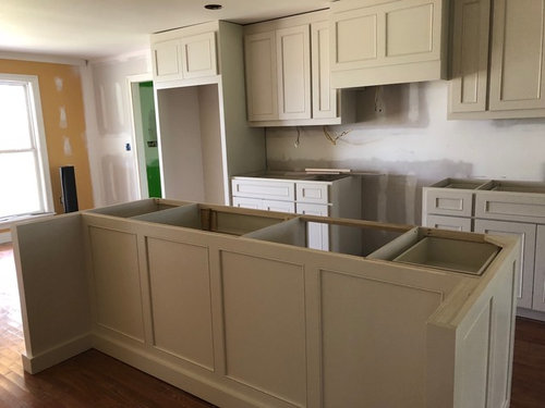
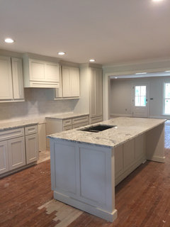
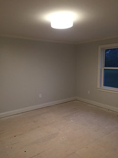
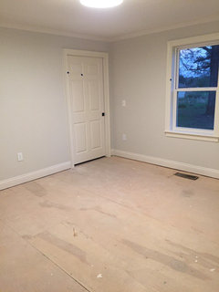
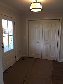
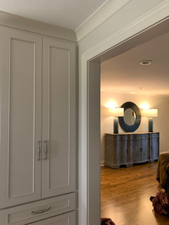
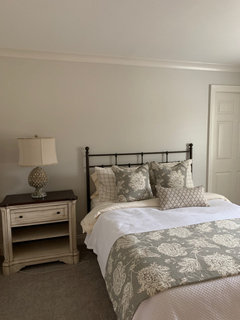
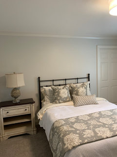
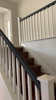
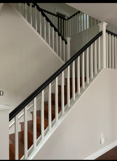
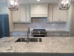
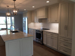
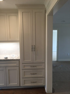
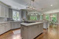
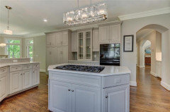
My kitchen cabinets are painted SW Gossamer Veil 9165. They are installed in a small 1700 sf, open concept kitchen breakfast area and living area, with 8 ft ceilings. All the remaining rooms on the opposite sides of the home touch this room. I opted to use one paint color-SW Drift of Mist 9166-for the entire home except,the main bath and love all my paint, tile/counter, and cabinet selections. The trim is SW Origami White 7636. My tile/counter consultant helped me with the paint color selections and I do truly love them and everything that has been installed so far. I am a little worried that the cabinet color and wall color are side by side on the color strip, the top two colors. Cabinet is darker than the wall. I have not been able to experiment with samples due to the distance from the home, and honestly don’t want to even attempt to figure it out. I am no good with paint colors. Has anyone had any experience in using colors side by side on the color chart that are adjacent to each other or in this situation?

Comments (80)

  • 7 years ago
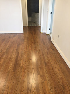
    Lesliealicesmith I am still working on my project. It got hit by hurricane Michael back in October. I used Gossmerveil on my cabinets and drift of mist on my walls. Here is a photo that I have before the floors were stripped and restained. I can send you a photo tomorrow with the kitchen with the newly stained floors. At first I was worried that the two colors were so similar that they looked the same, however, now I understand why the person I was working with suggested the two colors. They are a great contrast together, without looking like all the same color. The drift of mist looked much less grey on the swatch than in my house. I’m sure it is the lighting. It is so hard deciding on paint colors. That’s why I reached out to someone to help me. I finally just trusted her and quit worrying about it.
  • 7 years ago

    Is your project finished? Looks like it will be beautiful when done. I searched "Drift of Mist" and this is one of the questions it brought me to. Lori, if you read this, can you tell me what color you used for trim in your rental?

  • 7 years ago
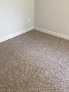
    Kate R. I am almost finished. Things got all out of sorts because the carpet was backordered. They delivered furniture today, but it is a mess because they won’t be installing carpet till Wednesday. This is the only decent picture I have from today and yet to get the dining light hung. Here are a few more mid construction pictures. I’ll post some more later this week. I used the Origami White for the trim because I didn’t want a white-white. It is very pretty. And my painter used oil based paint for all the trim and doors and it looks so good.
  • 7 years ago
    Kate R.
  • 7 years ago
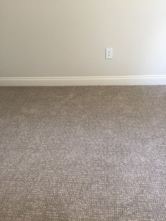
    More photos with drift of mist walls and installed carpet.
  • PRO
    7 years ago

    Lori, if you read this, can you tell me what color you used for trim in your rental?


    Sherwin-Williams Extra White mixed in PPG's Break Through satin.

  • 7 years ago
    last modified: 7 years ago

    Lori and Sandra, I just selected Drift of Mist for the majority of my open concept home with back large windows facing East in family room area. It looked like a slightly warm Neutral on the SW swatch, which is what I’m hoping for. Although I want neutral colors, now I’m concerned it may be too cool. I want an updated transitional style, but still want some brown leather furniture and light French oak floors. My kitchen cabinets are stained similar to a white washed walnut color. My dining table is walnut. I am selecting a light granite with subtle movements of gray and beige. I’m hoping to strike the perfect Greige . Although I’ve selected the paint Drift of Mist, the painting will not start for two days. Have I made a good choice for what I’m trying to achieve? Please help... also, Lori, can you comment on this? I greatly appreciate anyone’s assistance!

    Thank You, Joy

  • PRO
    7 years ago

    I personally love Drift of Mist. It has moments of green-blue, like the palest cloudy aqua ever. And I just think how it shifts and changes with the light is pretty.


    Absolutely stunning with brown leather, French Oak and walnut. It balances those elements and I would expect the contrast of Drift of Mist to emphasize their warm tones.

  • 6 years ago

    @Lori A. Sawaya- please help me! We have painted most of our house Drift of Mist but my living room wall is absolutely ruining it for me and I'm SO bummed!!! I dont have a ton of natural light and Ive noticed when you see it in a corner with low light, I see faint green-blue. I WANT WARMTH.... ; - (


    I know this post if old but could I share a few photos?

  • 6 years ago
    last modified: 6 years ago

    Hi! If anyone gets this message will you please post your home pictures of drift of mist and gossamer veil? I have it narrowed down to these two paint colors., BUT i wonder how grey this looks. anyone see pink tones? anyone hate drift of mist since living with it?? PLEASE HELP I'm almost to the point of hypervenilating.. My cabinets are hickory stained walnut. Lori.... would drift of mist look ok with dark wood cabinets? also, I had someone tell me to use pure white trim and doors with either drift or gossamer.. What white color did everyone use? extra white?

  • PRO
    6 years ago

    would drift of mist look ok with dark wood cabinets? also,


    I've used it with various colors of wood tone floors. Bleached oak to dark brown and I think it's very pretty.


    My favorite clean, crisp SW white is Extra White.

  • 6 years ago

    Lori, do You have pictures of drift of mist with your dark cabinets and flooring choice? If I went with extra white for trim and doors would that White look ok on 1 shiplap wall in a bedroom? Or is that tooo white?

  • PRO
    6 years ago

    Cabinets and trim are Extra White. https://www.houzz.com/hznb/projects/condominium-remodel-pj-vj~2063118


    I don't think it's too white but get a sample and see what you think.

  • 6 years ago

    Lori, thank you! Now the big question! When you look at drift of mist does it look really grey? Does it pull pink? Right now I have city loft in another house and sometimes it has a pink hue. I don’t love that... and I don’t want to make that same mistake again.

  • PRO
    6 years ago

    When you look at drift of mist does it look really grey?


    No. Most people would describe it as greige. It can have moments of blue-green


    city loft in another house and sometimes it has a pink hue.


    Drift of Mist is more in the middle of the yellow hue family.


    City Loft is over closer to the yellow-red hue family - which explains why you sometimes see pink.


    You can see the difference if you compare the Colorographies. Drift of Mist | City Loft

  • 6 years ago

    Thank you Lori! I know you really like drift of mist— but—- would you choose agreeable grey, gossamer veil or drift of mist with dark stained wood cabinets? Then I have Dark leather furniture. I’d like to get some lighter leather couches but I don’t know how that would look with the drift?

  • 6 years ago

    @Lori A. Sawaya , thank you for your reply. I did choose Drift of Mist throughout my open great room, kitchen , dining area with SW Pure White trim . I love it! It seems to me to be the perfect greige, which is exactly what I was hoping for. I will post pictures later. Again, thank you!

  • 6 years ago
    last modified: 6 years ago

    @Joy Hayes Would you please post your pictures of drift of mist? Thank you!

  • 6 years ago
    last modified: 6 years ago

    @Lori A. Sawaya would you please tell me the difference between gossamer veil and agreeable gray? and how they compare to drift of mist. I've looked at the color wheel and drift of mist is closer to yellow. that's all i can determine.

  • 6 years ago

    Sapphire this is my cabinet which is gv and wall is dom.

  • 6 years ago

    Sapphire first photo is natural light only second with over head led fixture with south window

  • 6 years ago

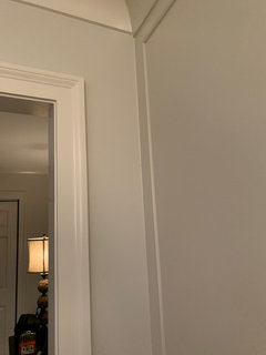
    Sapphire my trim is origami white and I love it!

  • 6 years ago

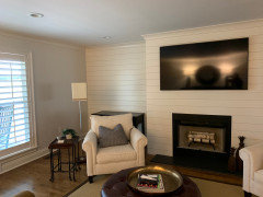
    Sapphire first picture is natural light second with recessed lighting. Window is west facing. Wall is dom and ship lap is origami white.

  • 6 years ago

    Sapphire my only comment is that this color is all over the place for me. Time of day, natural vs light and lamps, cloudy vs sunny. This is my honest opinion, if I could repaint it I would. It looks nothing like what I though according to the samples. If you are having second thoughts, that may be your answer. And for me, I knew I didn’t want a bright white trim so I stayed away from that all together. I love the gv on the cabinets and think it would be a good wall choice. I personally would prefer it over the dom. These are just my feelings and I am no professional and did have someone pick these colors for me when choosing tile and floor options. I think it turned out nice and love the space, but would I use dom again, no.

  • 6 years ago

    Hi Joy. Sorry I’m just getting to this. I agree with you that I thought dom would be more of a slightly warm neutral and that’s what I wanted. You can see my comments to Sapphire as to my feelings. It is a little too cool for me. My space turned out fantastic and not worth the hassle and expense to repaint. It was funny, because the day I walked in after having most of one coat painted, and asked the painter if he had the right color. I was disappoint, but moved on cause at that point I don’t know what I would have chosen. Everything was done and geared toward that color. It is a beautiful space and I don’t despise it and have learned to look to other things.

  • 6 years ago

    Thank you! do you love drift of mist?


  • 6 years ago

    Love it, no. It works with the total overall space. It was designed to go with the cabinets/granite, flooring, bathroom tile, and such. It is a beautiful space. It is just a little cool for me. Wish it had more of a warm tone instead of the cool tone. I don’t despise it and once it is all put together with curtain, art, and rugs, I hope I don’t notice it as much. Right now it is blank empty walls I’m looking at.

  • 6 years ago

    Sapphire0905 I posted some pictures in my comments above. Did you see them?

  • 6 years ago

    yes i did. Thank you!

  • 6 years ago

    I'm actually in high stress mode. I have my painter asking me for wall color. and i thought i had it narrowed down to gossamer veil. Then i see pictures online and it looks dark. I know screens don't depict colors that well, but I have to decide by 8am tomorrow morning. What do you think about gossamer? agreeable gray? any other paint you'd recommend?

  • 6 years ago

    Sapphire - my DOM looks nothing like Sandra’s. I actually love how cool gets look but I think it’s cooler/bluer than DOM is supposed to be. If her painter didn’t use SW paint then it’s possible they didn’t mix it right. My DOM is a tad too warm for me but I think it’s true DOM. I would describe it as a white with a hint of tan and grey. I have warm floors so they warm up the walls even more I think. I think it’s a clean neutral and works with greys and browns. No blue/grey in it in my house.

  • 6 years ago

    I have the gossamer veil in my cabinets and I think it would be great on a wall. It is very close to dom. Here are the two side by side. Hard to tell. I just like the gv better. It may be a tad darker, but like it much more than dom.

  • 6 years ago

    Here are some pics. This is the coolest it looks in my space. Most of the time it’s like a soft Tan white. I think it’s a great color and if you stick to SW product you’ll get a nice neutral that’ll go with everything.

  • 6 years ago

    Sandra - Love your space - so fresh and prefect. I think the cool balances out the warm.

  • 6 years ago

    Sandra - can we see more of your cabinets - perhaps a full room view? I have brown granite counters from 15 years ago and thinking of painting cabinets white, DOM or GV. I don’t love the bright white cabinets with warm counters too much.

  • 6 years ago

    DOM and Pure white - finished.

  • 6 years ago

    Hi Annie B. Your paint looks a lot more warmer in your space than mine. The ceilings are only 8ft in the home and I’m sure that is some of the issue. And there are not a lot of windows and porches on front and back blocking some of that light. This is a property we renovated in the town I was raised in. We visit once a week for my Husband’s job, so I’m not looking at it every day. Your space looks more like what I wanted and was expecting from seeing the sample. I love the gv on the cabinets. I knew right off I didn’t want white cabinets. It is a nice color. I love the way the kitchen turned out, even with the dom walls. Some of these are construction photos. I am at the house now and I will get some better photos in the morning. Suppose to be sunny tomorrow so maybe you’ll be able to tell better. There is only this one wall of cabinets and the island. So I don’t have much to show you.

  • 6 years ago

    Annie B. It is SW paint and when I walked in after the first coat I asked him if it was the right paint. He said it was and put the chip next to it. That just goes to show that lighting, ceiling height, etc play a huge part in how paint will look in a space. I still wonder from time to time if it was mixed correctly.

  • 6 years ago

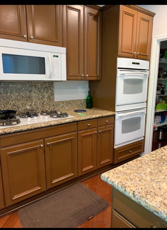
    I didn’t realize you were the original poster. Love the cabinets - look more high end than white. Attaching a picture of my kitchen cabinets. Do you think GV will work with my counters? I’m also going to take the backsplash out and do what you do. Plain subway style..what color are they?

  • 6 years ago

    @Sandra Grimsley where did you get your pendant lights? And I would love to see more photos

  • 6 years ago

    Annie A. My trim and shiplap wall is painted origami white and it would be great for your kitchen cabinets instead of the gv...imo. I have seen cabinets painted in origami white and it is nice. I’m not quite sure how the gv would do with your granite color. From the looks of your dom, I’d say that is a better match for your granite. Consider the origami white as well. I’ll send some better photos tomorrow.

  • 6 years ago

    Sapphire 0905 I purchased the lighting from Build.com. They are by Millennium. The Antique Silver finish.

  • 6 years ago

    @Annie A thank you for the pictures. Do you have any more photos you could share? I have pure white on my doors and trim now. Next is giving painter wall color...

  • 6 years ago

    Couple more pictures from this morning. Again this color goes warm in my house. Warm one is getting light from south and big room faces north. Have your painter do a couple walls in the house. It’s really not a huge effort for them to be honest. My painter did big sections on the wall and at times even did the whole wall. DOM looked very khaki as a sample but lightened up when it went on all walls.

  • 6 years ago
    last modified: 6 years ago

    @Sapphire0905

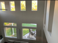
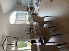
    Attached are just a few pictures of DOM with SW Pure White trim. We’re not settled and organized yet, but here you go!


  • 6 years ago

    Oh my gosh Joy Hayes. This looks nothing like the color on my walls. This is what I wanted and was expecting. No wonder I am so disappointed. My only thought is that in your home and Annie A’s is the large open spaces with the large windows and the natural light. Just doesn’t look the same with my 8ft ceiling and so few windows. Here the DOM is perfect. I think to satisfy myself, I am going to get a new gallon and paint a wall. It looks nothing like my DOM.

  • 6 years ago

    @Joy Hayes I love your flooring and cabinets and paint! Would you please post more photos of the kitchen and what your cabinet wood is and stain and flooring details! Do you have a fireplace (did you use stone, brick)? What brand of paint did you use (sherwin williams), but what brand and is it satin, semi gloss?


  • 6 years ago

    We had Gossomer Veil on the walls and cabinets of our last house with a gray subway tile and got many many compliments on it. As a result we're doing the same thing in our new house. It's a combination that looks great year round - key is the right lighting as with most colors.


  • 6 years ago
    last modified: 6 years ago

    Yes, I have Gossamer Veil in my entire upstairs. Each wall changes throughout the day. Mainly a gray/green with a touch of blue now and then. Compared to Ageeable Gray, GV has far less blue. I Love it. Thinking of starting it on the basement. I think I'm going with Drift of Mist for my attached Screened in porch.

  • 4 years ago
    last modified: 4 years ago
    https://www.thecreativityexchange.com/2017/07/jaw-dropping-total-home-renovation-project.html

    This is Gossamer Veil and Alabaster trim, My Gossamer Veil looks more creamy compared to these pictures. Guess it depends on the light. I love Drift of mist, it is much lighter. I have it on covered porch. Agreeable Gray looked too blue in my house.