Software
Houzz Logo Print
abmeyerman

Trouble decorating contiguous rooms

7 years ago
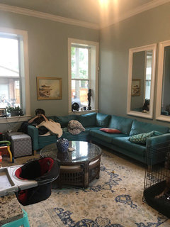
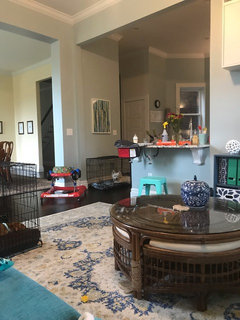
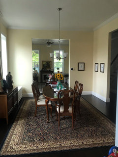
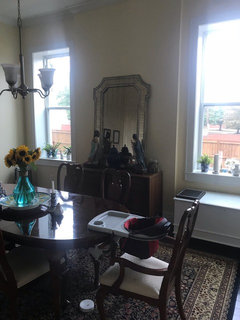
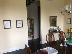
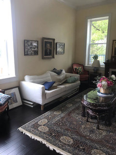
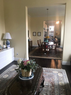
Hi everyone! We bought our 1892 French Mansard house just under two years ago and I love it, but I am having a hard time decorating the three main rooms on our first floor. No matter what I move around, something just doesn’t feel right... and the front room sits barely used. I like our furniture, but I’m not wild about the yellow color in two of the rooms (looks beautiful in the sunset but drab most of the rest of the time). I think that our art is part of the problem because of how high the ceilings are. Please ignore the mess, we have two kids and the baby’s things just seem to take over! Advice from new sets of eyes would be very very welcome! I am posting pictures of each room below

Comments (16)

  • 7 years ago
    The family room is at the back of the house and is currently the room that we use the most
  • 7 years ago
    We use the dining room every day. The white chest was abandoned there by my husband, but doesn’t belong
  • 7 years ago
    The front room isn’t used much, other than to listen to music and overflow when we have parties. The carpet, coffee table and red chairs are sentimental pieces of my childhood from my grandparents
  • 7 years ago
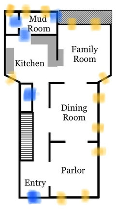
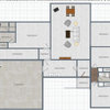
    I don’t have a proper floor plan, but this gives an idea of the flow of rooms and windows. All windows are the same size, tall windows. The light is good throughout the house although there is less of it in the kitchen
  • 7 years ago
    This is my first time posting with this so it is a little awkward on the app. But thanks for your questions and comments! I am going to try and get better picture. On the plan, you can see the large openings between rooms. All yellow represents windows, blues represent actual doors. Bottom of picture is front of the house. I appreciate you!
  • 7 years ago

    You have beautiful rugs. Your artwork is way too small. You need curtains and another chandelier over the dining table....for starters.

  • 7 years ago
    Also, I should have said that dogs are temporary... we are dog sitting for my sister in law, but the cages are not usually there
  • 7 years ago
    If a repaint is possible, I’d start with a fresh creamy white background, making sure the one you pick works with the rugs. The art needs to be grouped tighter to have any impact. Hang multiple pieces in a grouping and leave some walls bare. The pieces are to small to work individually.
  • 7 years ago

    I like your home and pieces. We also have high ceilings, and the thing that helped the most was window treatments. Even panels on the sides of the windows can help a lot.


    Please hang that mirror securely to the wall. That could really hurt little kids if it fell.

  • 7 years ago

    Hi, abmeyerman. You have a beautiful house and really nice things. From what I can see the color balance in the family room is perfect. All three rooms open to one another, so you'll want to have some continuity in color. The yellow walls in the dining and living room,aren't reading very well, are they?


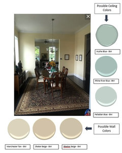
    One idea is to repeat an analogous color scheme from the blue to bluish green on the walls for the three rooms. What colors do you see in the dining and living room area rugs?

  • 7 years ago

    Very pretty house! Also good layout - the one in my house is very similar, though without the family room next to the kitchen. We use our front parlor all the time (hanging out there right now with my laptop).


    I definitely sensed something off and it took me a while to figure it out: I think it's the lack of casing around the doorways.


    I'm guessing the intent of the no-casing doorways was to make the spaces feel more open and fluid without disrespecting the traditional layout with an "open concept" treatment. However, I think it gives off an "incomplete" vibe and, to me at least, has the adverse effect of making the spaces, especially the living room and dining room. bleed together in ways they aren't supposed to. Makes the living room and dining room feel like divided halves of the same room rather than two different rooms. Them being the same color doesn't help.


    I think adding casings to the doorways will help define the rooms as distinct areas a bit better, and make it super easy to paint the rooms different colors without the ambiguity of where to end one color and start the other with the uncased doorways.


    As for actually USING the space, I think the presence of the family room makes it easy to bypass the parlor, especially since the family room, with its big sofa, makes the parlor somewhat redundant. I don't have a family (yet), but growing up, I lived in a house with a strong division between adult spaces and kid/family-activity spaces. It worked out quite well. We could escape from each other easily (especially as us kids got older) and the downstairs TV den was great for all of us flopping down and watching a movie together, without it encroaching on the traditional living room. In my case, the adult spaces were formal, but yours don't have to be (my parents loved the vibe and aesthetic of traditional formal spaces - I've grown up to have house decorating tastes just like them, funnily enough).


    If you give the parlor its own distinct role in your house, it will stop being redundant and stop being bypassed in favor of the family room. Traditionally, the parlor was for receiving and entertaining your guests before dinner, and then when it was time to eat, you'd float on over to the adjacent dining room, and afterwards, move back for the parlor for more drinks or coffee (and this is how we host our dinner parties - our old school house layout is totally conducive to it and it's great). Nowadays, I think the front parlor does a great job of also providing a readily available, peaceful, tidy, and aesthetically pleasing place to wind down/decompress after work. Our front parlor is where my husband and I sit down together after work, maybe with a drink if we had a rough day, and chit chat and just relax. No TV here - we designated an extra bedroom upstairs as the TV den.


    I think the furniture arrangement in your parlor could be improved by moving the seating away from the wall. When the seating is all against the wall, you get what I call a "waiting room vibe". Bring the couch and the chairs closer together - make the arrangement intimate. Imagine your close friends are over and think about where all the chairs and couch would need to be for you guys to be having an epic gossip session over wine. They'd need to be way closer than they are now. Also, can't tell from the pics, but all I can see are the sofa and that one chair. On one side of the room. You need seating facing each other. Dueling sofas, or a sofa and two nice-sized arm chairs opposite it with a coffee table in the middle. Also add end tables and lamps. I can't tell you how friggin' much we improved the vibe of our place by adding lamps and not relying entirely on the overhead lighting.


    Anyways, just some thoughts.

  • 7 years ago
    Thank you all very much for the advice! It is getting dark here so hard to see the rooms, but I will try some things out tomorrow and take some pictures. I really appreciate all of your feedback, it all makes sense.

    Not sure how to work on the openings - I had thought about casing them too, but never got to a viable plan. The original pocket doors are in the basement but they are ridiculously huge/heavy and - although I love pocket doors usually, I’m not sure that they would improve the space now that it’s been opened up. Another thought I had was to trim out the openings and add transom windows along the top to close them in a little bit without sacrificing the lovely light. I wish I had owned this house while it was being rehabbed!
  • 7 years ago
    last modified: 7 years ago

    Queenvictorian, made some keen observations and points. It would be great to restore the rooms with their original casing and doors, if possible. Perhaps a goal to work towards.

    In terms of color continuity, here's an idea for the dining room. I like the idea of treating the dining room as a little jewel box nestled between the parlour and living room. In the living room, you could return to a blue wall color in a similar shade as the family room. Those vintage coral chairs would really stand out against the blue!


  • 7 years ago

    I love your house!

    I think you need to decide on a budget and what room you want to work on first.. Then finish that room completely!

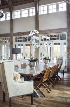
    Another thing the I notice is that when opening get taller they need to get wider, as exhibited by your views thru the rooms....the openings I believe are called an enfilade, which is a run of rooms opening up onto one another......the thought came to me that the openings are too tall; maybe an antique or modern window hung horizontally in each opening about 12-18 inches tall to get the proportions better.....then decide what room you want to tackle first and then take your time and do it.


    Riverhouse Enfilade · More Info


    Note the horizontal windows over the french door; that was the effect I had in mind and you would only need two for parlor/dining room and the dining room/family room.....what do you think? Just an idea. Keep posting.

    Sticks and Stones · More Info


  • 7 years ago

    love your home!

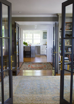
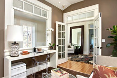
    I think the proportions for the openings, which are called 'enfilade' are a bit off.....could you put in a glass clerestory window in the openings to lower the door way a bit and make it appear wider?


    Sticks and Stones · More Info


    The Passage · More Info


    Transitional Home Office · More Info