Software
Houzz Logo Print
sun_n_fun_mom

Help me choose a backsplash please

8 years ago
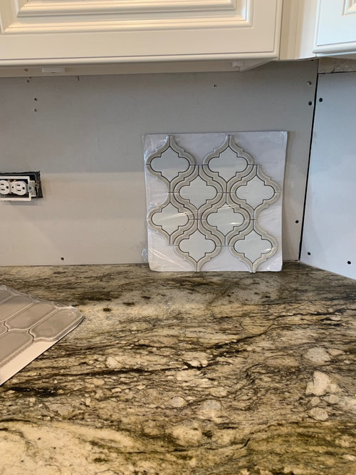
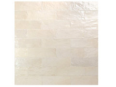
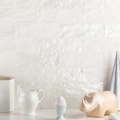
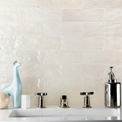
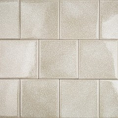
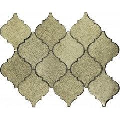
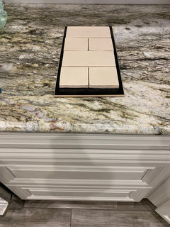
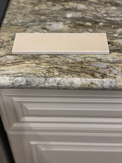
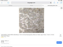
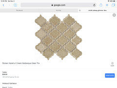
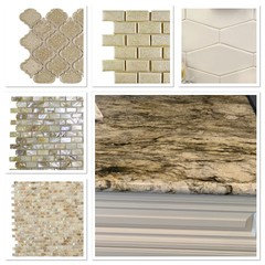
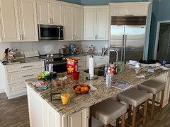
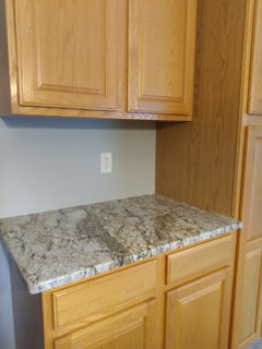
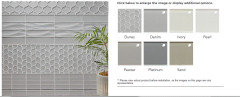
We are nearing the end of our kitchen remodel. I have cream cabinets, blue dunes granite, traditional pulls, ceramic light wood floors. The walls will be painted Ethereal Mood which is a greige-ish color. Appliances and pulls are stainless and nickel. I am really liking this distressed mirror laterna. Thoughts? I’ve included others I like too.

Comments (92)

  • 8 years ago
    Which is also this
  • PRO
    8 years ago

    Just keep in mind when that type tile that has uneven surface is installed the grout will not cover all the sides of the tile the same...some clients that have installed it have not been happy with the finished look...looks sloppy...more rustic finish.....so if looking for a modern very finished look this may not be what you will like...just something to think about...

  • 8 years ago

    On my monitor it is looking pink.. can you post a photo of it on the wall with the cabinet.


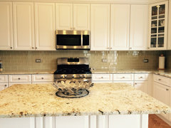
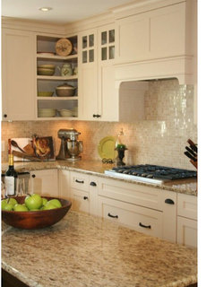
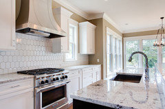
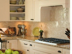
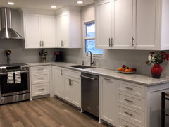
    I came across this kitchen which reminded me of yours to some degree and gives you an idea what a subway tile would look like.


    Khaki Glass Tile Kitchen Backsplash with White Cabinets & Granite - Subway Tile · More Info


  • PRO
    8 years ago

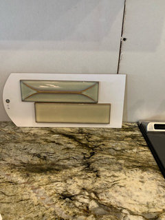
    Here is a finished sample...


  • 8 years ago
    I think the colors for which you have samples clash. The back splashes look more grey, and your counters are not. A simple cream that compliments your counters would be best to my eye.
  • 8 years ago
    last modified: 8 years ago

    grace, if you like that tile (and at Tilebar it's the Montauk). I think yours is the SandDune (#2, ) but it also comes in Gin, Fog and Sky


    https://tilebar.com/montauk-gin-2x8-ceramic-wall-tile.html

    I kind of like the tone in the bottom tile in your pic (byzantine latte)

    what about the Roman Frosty Morning? can't tell if this beige tan tone would work

    found another antique mirror tile you like

    https://www.glasstileoasis.com/arabesque-antique-mirror-glass-tile.html

  • PRO
    8 years ago

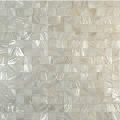
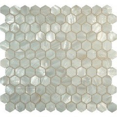
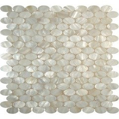
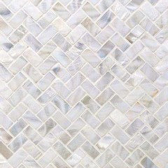
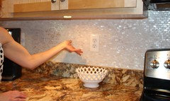
    This is a really good example of how a mother of pearl backsplash would look in your kitchen..

  • 8 years ago

    i agree with beth, i like #3.. which is right above this post^^

    i think it compliments your granite very well., doesn't try to over take it. easy on your eye, "soft" .

    #1, i could not take all the shine and glare day in and day out.. pretty just not my taste but it 'goes'

    # 2 too stark and loud

    #4 just blah

    the black ones, just no...too busy..

    #3, ahh, just right...i would go with just the beige one not the green.

  • PRO
    8 years ago
    last modified: 8 years ago

    Yep agree Mother of Pearl is just beautiful for your space...so many to choose from...Beth those are all very pretty variations of MOP....can’t go wrong.

    Hi Beth..hope all is well...any new lamps?

    got my new coffee table..so happy and new pillows coming tomorrow..keeping my fingers crossed!:)


  • 8 years ago
    I like this Terra Ignis Mocha too, but the edge coloring might be too busy?
  • 8 years ago

    just get the grout to match it exactly and it will be fine... you can always make a small sample board to see if u like it... even if its printed from your computer.

    leave it up for a day or two and see what u think.... u can do that for the MOP as well

  • 8 years ago
    And I am just now seeing all the other MoP samples. I’ll go back to the tile store tomorrow and see what samples they have.
  • 8 years ago
    last modified: 8 years ago

    grace, go to the link I posted w/the MOP tiles. see if they can send you out some samples. each sq ft was around $20-$25 or so. (pretty standard price for MOP)

    and that Terra Ignis, looks identical to the Tilebar Latte tile. $17.30 here, w/$10 for shipping. (although, they''re out of stock at the moment)

    https://tilebar.com/byzantine-latte-ceramic-tile.html

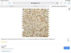
    and Grace, on another post, someone just finished using those shimmery tiles for their kitchen. not sure of the exact color, but they look like this

    Keiko Childs

  • 8 years ago
    Those shimmery ones def look rustic.
  • PRO
    8 years ago

    More of a old farmhouse look..my neighbor did them in white and was very unhappy with the uneven effect and uneven look...

  • 8 years ago
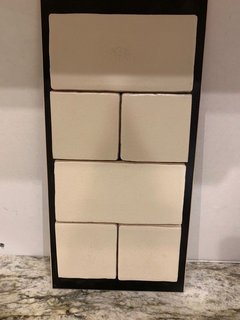
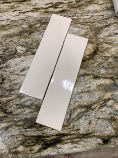
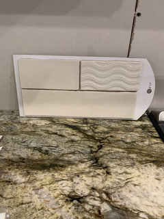
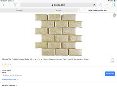
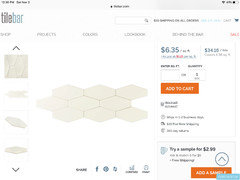
    I have these crackled tiles too. So many samples. And these cream 3x12 ones.
  • 8 years ago
    last modified: 8 years ago

    the first ones are too yellow. the longer, whiter ones would work if you want plain. if you did it in a herringbone, it would look 10X better.

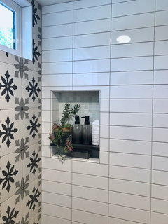
    here is the same size tile in more of a contemporary layout. The tiles are not wavy, but perfectly flat. I don't know what look you're after, but if you do them in a stacked layout, like shown, it's a bit more modern looking.

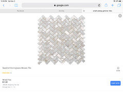
    your wavy tiles in a herringbone would resemble this:


    you could also go back to this style

  • PRO
    8 years ago

    The top tiles look way to ivory...and the long lighter tiles look like they have the same uneven surface and uneven edges..it will give that same farmhouse style...

  • 8 years ago
    last modified: 8 years ago

    I like the last light tiles you posted. I would caution about using a herringbone pattern...not seeing the resulting strong visual angles with the curves and swirls in the granite.

    The last tile has a modern look to a rectangle (subway) shape so the typical 1/2 offset will have a more modern vibe. There is also stacking which gives an even more modern vibe; but it will emphasize very strong vertical lines against the curves and swirls in your beautiful granite. Thus, I would lean toward a 1/2 offset layout.

    Monitors differ so when you hold the tile against the cabs, are there any pink undertones in the tile?

  • 8 years ago
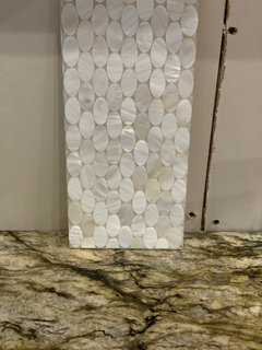
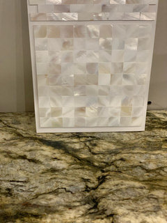
    I picked up MoP samples. I think I like the seamless better than the ovals. I picked up more cream samples too.
  • 8 years ago

    seamless is better. hard to imagine how that would look. I do like the new creamy colors, the crackle one and the longer one in #4.

  • PRO
    8 years ago

    Seamless is really pretty!

  • PRO
    8 years ago

    I think it will be very close to this....

  • 8 years ago
    There are some pink undertones on the slightly lighter 3x12. So far, these are my faves. I like the MoP, but I don’t know if I like it enough to justify $40/sqft. It’s not screaming “I am the one!” Maybe I just don’t have confidence in my selections. I also really like the Terra Ignis Mocha and will probably buy box and duct tape them to my wall. Or just print them out. If I went with the 3x12 I would like a chevron or herringbone, but I didn’t think about angles and all that. I was just wanting to avoid predicable subway look.
  • PRO
    8 years ago

    Are you trying to achieve a modern or more glam look...mid century modern?

  • PRO
    8 years ago

    would look great and look at the price!


  • PRO
  • PRO
    8 years ago

    Really like these..


  • 8 years ago
    I love that stuff! I can’t believe those prices?! Is it because of where I’m looking (Europa Stone)?
  • PRO
    8 years ago

    Oh my you are going to pay top dollar over there!

  • 8 years ago
    last modified: 8 years ago

    grace, probably. shop around and don't use the middle man! I ordered some of my marble tiles from AliBaba (straight from China) and you can't believe how much they mark it up when it gets over here. $5 sq ft is what I paid for tile that was going for $20-$30 sq ft in the stores here. even Tilebar marks up their prices. but, their shipping is only $10. which is good.

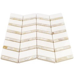
    found this on on Home Depot. it's MOP and Thassos marble.

    https://www.homedepot.com/p/Splashback-Tile-Blazon-White-Thassos-And-Mother-Of-Pearl-Herringbone-11-3-4-in-x-11-5-8-in-Polished-Glass-Mosaic-Tile-HERALDRYTHSPRL/306585969

    $20

    https://tilebar.com/collection/pearl-shell-tiles.html


    but, quality can vary. some are very thin and feel almost like plastic. make sure you order samples so you can see for yourself.

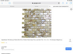
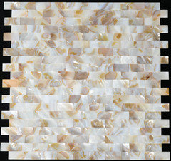
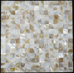
    others w/golden tones

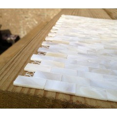
    and how it looks. these are the small bar mosaics

  • 8 years ago
    When I clicked on that HD link it was showing $34.30/sqft for the marble and MoP. I usually buy everything online, but I’d hate to buy something so big and heavy without seeing it first in person. I’m gonna search around for this particular MoP mosaic and see what I can find online.
  • 8 years ago

    they have a sample of that you can buy for a few bucks. just look up Tile Samples mother of pearl

  • 8 years ago
    Oh dear, I think u need really plain tile!! YouI’ve got so much going on with the granite, and the floor adds movement too. I’d stay away from patterns altogether
  • 7 years ago
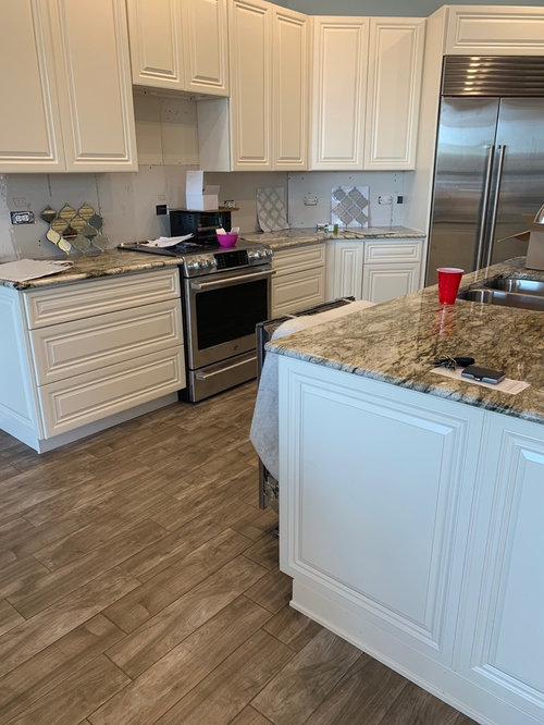
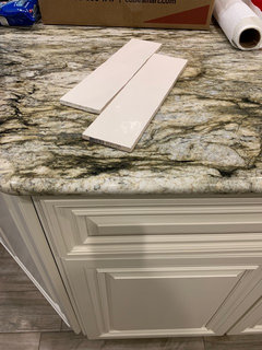
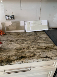
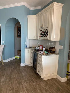
    Ok. I have exhausted all my tile options and have narrowed it down to 3x12 glass tiles in either a cream or beige. I’m leaning towards cream because I’m thinking the beige will clash with the paint. You can see the paint on the pic with beverage center area. The glass is plain and predictable, but because it’s glass maybe it’s not too plain and predictable? Please excuse the mess—the pulls were just installed and I’m slowly putting things away.
  • 7 years ago

    The cream looks like it clashes with your cabinets. I would skip the glass & go back to the ceramic cream tile.

  • 7 years ago

    I would pick the light only because I don't see windows here..not because of the paint.

  • PRO
    7 years ago

    Cream glass if these are the two choices.

  • 7 years ago

    I like both. Though I think the darker you would want UCL if you went with those. But with the wall color lean towards the lighter tile.

  • 7 years ago

    The lighter one on the right. As long as it matches or blends with the color of your cabinets.

  • PRO
    7 years ago

    Of these, cream glass, but make sure the tiler knows to use the white adhesive for glass applications not normal gray stuff. Then use light grout too.

  • 7 years ago
    last modified: 7 years ago

    At one point you said that the 2x8 Myorka Cream tile was your new favorite. It's hard to tell how creamy it is in your light, but it is also my favorite of all the tiles in this thread. It has the lightness, the shimmer, and the 2x8 won't be so busy that it competes with the counters. We have tentatively chosen our backsplash but my plan (now that the cabinets have finally arrived) is to wait until the counters are in and get several more sample pieces and just LOOK at it for a couple of weeks before finalizing our decision. I like the idea of going light because Ethereal Mood can be a bit dark, depending on your lighting. You're right that going too beige or brown will fight with the paint. I love EM, I used it in my office to create a modern but calm mood. When we tried to use it in a hall and bedroom at home, our lighting there made it just too flat and dark, but if you have the lighting for it, it is a beautiful color, and the 2x8 Myorka that has that MOP quality you like should complement your other elements well. Can you get more samples (of that and any other top contenders) and see how they feel to you after a few days? And - what Flo said about adhesive & grout (and matching silicone caulk if applicable). I had to insist on white thin set and non-sanded grout for our bathroom glass subway, they are so used to using the gray stuff and sanded grout. Glass tile is different.

  • 5 years ago

    What did you decide?!!? Just had Blue Dune installed and struggling with backsplash choices. Painting cabinets was not an option. Plan is to add simple black hardware.


  • 5 years ago
    last modified: 5 years ago
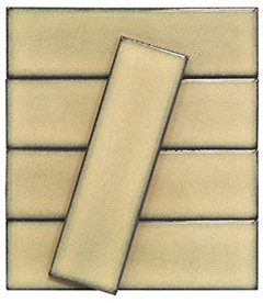
    We *finished* our remodel in mid-late December that year - just before Christmas with company coming. We decided to wait on the backsplash as the kitchen looked quite nice without it, and there was not time to order & have it installed before the holiday. 2.5 years later - we are still loving the clean lines and backsplash-free kitchen. Whaaatt!? No backsplash? We've found very little "splashing" has taken place. A rare dot of something once in a blue moon we just wipe off. Maybe we will add backsplash, maybe we never will. If we do - Arizona Tile Dunes Wave is still our choice. Dunes is the style and also the color that looks best with our White Macaubus countertops. Wave is the 3rd style down from the top:


  • 5 years ago

    I can’t tell from your photo- what about behind the sink and range? Any mess there?

  • 5 years ago
    last modified: 5 years ago
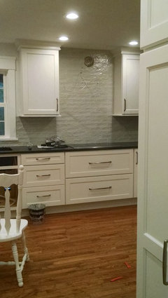
    I lived without a splash for year and yes, it's fine.

    however, a tile adds more interest. Like wearing a black dress. does it look fine alone wearing plain sandals? yes. But, it looks way better w/some jewelry and nice heels

    Same with your kitchen. does it look fine? yes. would it look better with a tile splash? yes.

  • 5 years ago

    Your counter is busy...your backsplash should be very simple, one color only, and must match a color in the counter (I suggest a light color for the backsplash).

  • 5 years ago

    TJW, I had no backsplash anywhere in my kitchen, for 22 years. It was perfectly fine. It never even occurred to me that I didn't have one. I mean, I never had one before in any house I ever lived it, so big whoop! :-) My kitchen had horrid wallpaper all over it, and I lived with it for the 22 years. The previous owner had put clear contact paper behind the range so that it would be easy to wipe off, but after many years it yellowed.


    Only when I redid my kichen in 2017 and started looking and kitchen designs did I think "Hey - tile would look cool!". Honestly I think painted walls look perfectly fine! No one NEEDS a backsplash.

  • 5 years ago
    last modified: 5 years ago
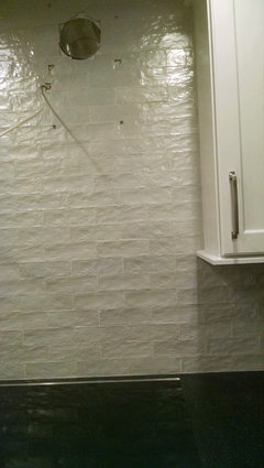
    Chessie, I always assumed we wanted/needed one, but we are quite happy with, and if we add the Dune Wave at some point, we will be happy then also. Previously, we had a really nice tile counter (not old school but would have seemed dated had we done something similar in 2018) and the backsplash then was the same as the counter - beautiful and indestructible!

    Loobab, nope - no mess either place. I'm not sure why ~ we don't fry, usually use lids or occasionally a grease cover for some dishes on the stove and as for the sink, we have a very deep sink, so maybe that's why. That said, we understood and were okay with what we saw as a relatively minor 'risk' of not having a backsplash - especially around the stove. A little touchup, a bit of fresh paint, no big deal but as it ahs turned out, it's worked perfectly well and we like the clean uncluttered look . . . LOL, for now : )) One of the deciding factors was to think back about our previous backsplash - we have had 2 in this house - the one it came with and the one we installed circa 2005. Just did not remember ever having to clean up the backsplash then, so it seemed a relatively safe bet that we would not be risking a mess now.