Software
Houzz Logo Print
newproject858

Please help me to choose grout color.

7 years ago
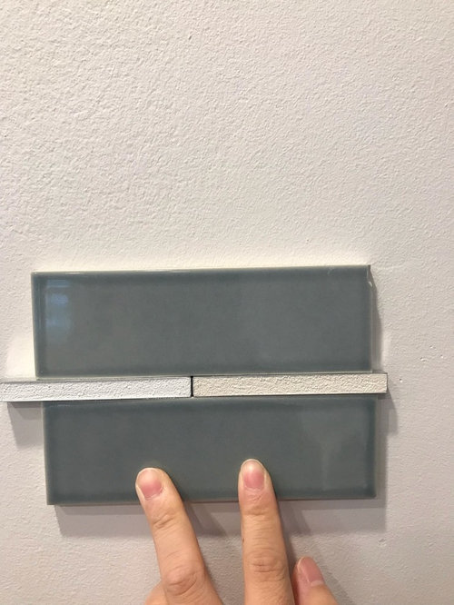
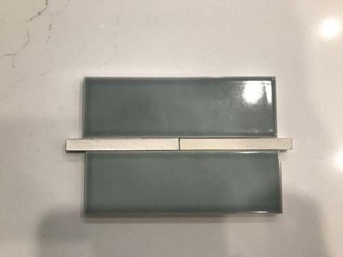
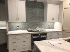
The tiles are Crystal blue from Heath Ceramics.

The counter top is Brittanica from Cambria.

Our contractor will use grouts from Superior.


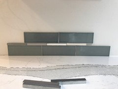
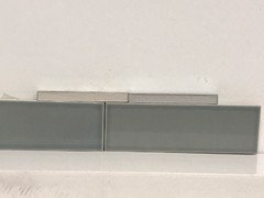
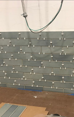
Left is Antique White and right is Ivory.

Which one looks better?

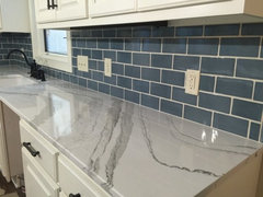
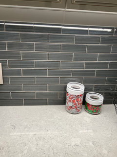
First pic is on the wall, second pic is on the counter top.

The grout spacing will be 1/8”.

Comments (48)

  • 7 years ago

    In the first pic, I would have picked the ivory. But in the second pick, the ivory almost looks too yellow... Tough call but if you see that yellow tone in real life, I'd go with the antique white. Lovely tile!

  • 7 years ago
    Neither the tile or grout will work with that. The counter has bold veins and has to be the star. The backsplash is too dark and harsh for it and the light grout with the darker tile will fight it for attention. It will look better with a tile that picks up one of the light to medium greys in it and a slightly lighter grout. What you want to do needs a much.plainer counter.
  • 7 years ago
    It will be very busy with contrasting grout. Are you prepared for that? If not, pick a grout close to the tile color.
  • 7 years ago

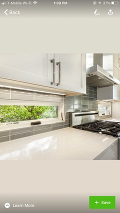
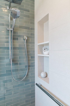
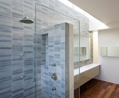
    I found this photo, which will show the look that you describe.

  • 7 years ago
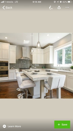
    My inspiration was this kitchen.. except that I chose a counter top with veins just because I liked it. Was that a mistake? :(
  • 7 years ago

    use gray grout...there are as many gray shades as tans and whites. you can have the grout show a little ...but stay with a gray.

  • 7 years ago
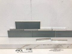
    I found a couple of grays.. will any of these work? :(
  • 7 years ago

    It's not a mistake to choose something you like...I'd go with silvery-gray grout, like the tiles.

  • 7 years ago
    Oh -- on my screen, the tiles looked like a smokey blue.
  • 7 years ago
    @annie It has variations, plus lighting can make them look different. However, I got an idea from your pic.
  • 7 years ago
    This is another pic with grays.. I feel so lost.
  • 7 years ago
    last modified: 7 years ago

    Are your counters already installed.? I just re-did my kitchen and I would really really really suggest making the final decision on your backsplash tile AND grout AFTER the counters are in. Then check your favorite choices in different lighting situations, daylight and night time with the lighting you will use.

    I had purchased a grey glass tile simular to yours for behind my stove BUT after the counters were in I double checked my choice and while I still liked them in the daylight, with the lighting at night my pretty grey tiles looked like a dark muddy mess. I ended up totally changing the backsplash and I am so glad I did. Now my backsplash looks wonderful during the day and at night too.

    In the end it is all of to what you like!

  • 7 years ago

    I like the darkest gray because I don’t like a lot of contrast with grout.

  • 7 years ago

    I like one of the two darker greys, with my favorite being the darker one. The grout lines will be smaller than what you're holding up. It's worth the effort to make a sample board with a couple grout colors.

  • 7 years ago
    I have a similar gray backsplash and I matched it as close as I could to the tile.
  • 7 years ago
    From a distance...
  • 7 years ago

    Beautiful tiles and countertop! I agree to go with gray to compliment the countertop. I like the lighter one.

  • 7 years ago

    I agree with Karen. Hers is beautiful! Find a grout that closely matches the tile. It makes the tile a cohesive element instead of each individual tile standing out.

  • 7 years ago

    I vote for the darkest one you show above. And second the recommendation for a mock-up. It’ll make you feel better, if nothing else. Good luck! Pretty tiles :-)

  • 7 years ago
    @karen Beautiful kitchen! May I ask the grout color you used?
  • 7 years ago
    It’s the Mapei silver grout...can’t remember if it was sanded or unsanded...

    https://www.lowes.com/pd/MAPEI-Keracolor-S-25-lb-Silver-Sanded-Grout/1191597
  • 7 years ago
    It really blends in well.
  • 7 years ago
    @karen Thanks! I’ll definitely check this out.
  • 7 years ago

    I will say it again....Karen, that kitchen is beautiful!!!

  • 7 years ago
    I know you don’t want them hear this again, but wait until the countertop is installed. With your final selection of lighting. Those two decisions will drive your countertop decisions- both the tile and grout.

    Your choice of tile might end up being perfect but without having the stone top fully laid out horizontally and a sample of the tiles-grouted on a board- placed vertically, it’s hard for anyone to advise you.

    The choices look great on my monitor, but that may not relate to the reality once installed. I do like the darkest, most matched grout color so the tiles are not individually noticed. It will be gorgeous when done but take the time to test each element in the lighting of your new kitchen.
  • 7 years ago
    The countertop is beautiful, it's the tile that's not working. I agree 100% with blondell. Look for a lighter gray tile like the one shown in your inspiration pic.
  • 7 years ago
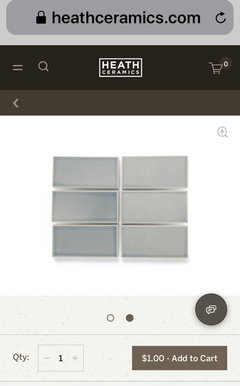
    @grace My tiles are what’s in the inspiration picture - Crystal Blue from Heath Ceramics. I don’t know why mine are so darker than in the picture.. :( Here is another photo of Crystal Blue(Heath Ceramics did confirm this is Crystal Blue), they are much lighter than mine.
  • 7 years ago
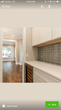
    This was another inspiration photo I had. I don’t know the brand and color of these tiles. However, I knew I wanted something lighter and went with Heath Ceramics - Crystal Blue.

    Do you think my output will be much darker than this? I’m willing to take this, although I wanted something lighter. :(
  • 7 years ago
    Another pic of the same kitchen that used non-Heath tiles. It looks like the tiles look much darker without much natural lights. Is that why my tiles look so much darker? :( I was very excited after getting counter top yesterday. I am very sad thinking about the tiles today.
  • 7 years ago
    Are these going to help, in my case?


    1. Doing straight stacked, instead of 1/2 off-set

    2. Going up to right below of hood, instead of up to ceiling
  • 7 years ago
    I think you should do the dark grout and go all the way to the ceiling behind the range hood. I think it’ll look fantastic.
  • 7 years ago

    Very much suggest as others have that you have the counter installed before picking tile and grout. Also suggest picking a few different grouts that you think might work. Do a sample board using each and let it DRY at least overnight or a couple of days. It lightens as it dries. Then put the sample boards up against wall on the countertop and stand back and see which one you like. With a contrasting grout, you will see the tile pattern more, which may compete with the pattern in the countertop (maybe not). With a grout similar to the tile, you wil see less of a pattern and more just overall color. Be sure to look at it in daylight and night lighting. Take your time till you find what looks good to you. Sometimes taking a picture can give you a little different perspective. You will have to look at this a long time or spend a lot of $$$ to have it re-done). Be sure you like it before you have it installed. We did 5 sample boards before we found the grout color that we thought looked the best. Wishing you good vibes for your project.

  • 7 years ago

    Here’s a pic from Heaths site that might help. There’s a lot of variation in the tiles & they suggest ordering up to 10 to get the overall look. Why don’t you contact them about the grout? I’m sure they’ll have a recommendation. They may even give more color options for your countertop. https://www.heathceramics.com/pages/heath-tile-faq


  • 7 years ago
    I just don't see these together! Is it just me?!
  • 7 years ago
    last modified: 7 years ago

    i think the tiles look fine w/the countertop. on my screen it looks like blue/gray. in their photo, they prob have a lot of lighting and a bit of yellow light to make it look warmer.

    will you have under cabinet lighting? if so, any idea what temp bulb you're going to use? anything under the 3500K range is going to give off more yellow, warmer light. if you will be using that, then the ivory might work. if using a whiter white bulb (4000K) then a neutral medium gray might also work. Is ivory and bright white the only white options? nothing in between the two?

    here is Crystal blue in a shower w/what looks like a regular white. notice the warmer light tone


    these also say crystal blue, but the light in this room is much cooler. a whiter-white. see the diff?


  • 7 years ago
    @beth The under cabinet lights are 3000k.
  • 7 years ago
    @beth Yes, these are geenish blue.
  • 7 years ago
    Thank you Kathi! And good luck OP, I agree, wait until the counter is installed, the backsplash (and grout) was the absolute last thing I picked!
  • 7 years ago
    @karen

    The biggest mistake I made was ordering tiles even before the cabinets were installed. :( The tiles are handmade and their lead time was 2 months. Silly me, I learned this in a very hard way.
  • 7 years ago

    new project, after he sets the tiles, take some of the scraps and have him make a sample board. do one half w/the white/or ivory, and the other w/one of the grays. (I'm sure you tile guy has plenty of bags of grout w/those colors. you only need about a tablespoon of grout to try on your sample). let it dry and view it w/the under cab lights on and off. he can do the sample board for you on the same day he sets the tiles. he will come back the following day to grout.

  • 7 years ago
    Ok, I left out all of whites and narrowed down to these two.

    Left: Mobe Pearl
    Right: Dove Grey


    Heath Ceramics lady said Dove Grey is good, but she didn’t see the Mobe Pearl.

    Am I correct to think Mobe Pearl is a mixture of taupe and gray and will compliment with my greenish brown tiles?

    Or the Dove Grey is still better, because the grouts will be less visible?
  • 7 years ago
    @beth that’s a great idea! I thought I won’t be able to do the sample board, because I didn’t order a lot of extras. I can still use the scraps!! Thanks for the idea. Is it ok if I use cardboard box to place grouts and tiles on?
  • 7 years ago

    it would work. or you could use scrap pieces of drywall or even plywood.

    dove gray looks like a frontrunner. if going white, pick a brighter white.

  • 7 years ago
    These tiles are the ones with high variations, and the box I first opened up must have contained dark ones only.

    My tile guy opened up all of the boxes and sorted them, I do see lots of less dark, greenish ones. I’m much happier with these.

    With 3000k under cabinet lights, hope these will look warmer. Hope these won’t crash with my counter top very much.
  • 7 years ago
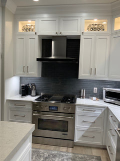
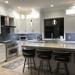
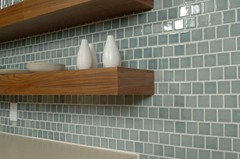
    I selected Dove Grey, and here is the output. I LOVE these tiles, and I think the grout looks fantastic. Thanks everyone for your inputs! :)
  • 7 years ago

    I love those tiles. so much nicer than a standard white subway tile!

  • 7 years ago

    Looks very nice!