Software
Houzz Logo Print
joanne_grech

Guest bedroom wall paint

7 years ago
last modified: 7 years ago
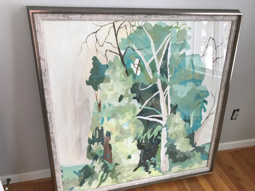
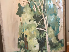
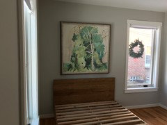
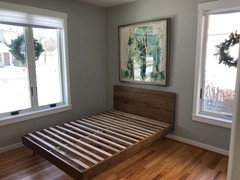
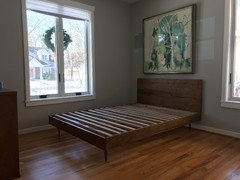
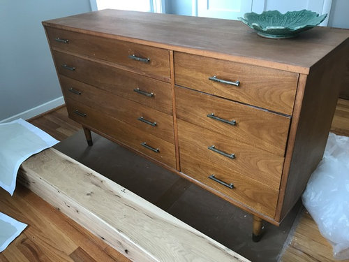
Looking for wall paint suggestions for a guest bedroom that would compliment this art piece. The furniture is 1960’s Biscanne medium walnut. Currently the room is Repose Gray, but it’s reading too cool and not quite jiving with the palate of the abstract tree art piece that has various greens, blue/greens, creams, and brown in it. The two windows in the room are west (larger/main room, front of house window) and north facing (smaller/side of house window). Photo taken on a cloudy morning. This room gets the most light in the afternoon/later in the day. Thanks in advance for the ideas.


Comments (17)

  • 7 years ago

    I wish the color appearing in the photo is how it translates in reality. The photos seem a bit blurry, too (*audible sigh). It’s definitely clashing.

  • 7 years ago


  • 7 years ago

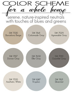
    Love the art! Wall colour is not clashing with it on my screen either. I'm not very familiar with SW colours but looking at blog images of their neutrals on my screen, I wonder if Agreeable Gray (or Colonnade Gray) would be the warm gray you seem to want in this room?


    Maison de pax - SW neutrals


    J GB thanked tartanmeup
  • 7 years ago

    Buying testers today. I’ll add those to list. Thank you!

  • PRO
    7 years ago

    Love the art but what is the bedding going to be I find the wall color now works very well with the art but I almost always use the bedding for color scheme so I think white bedding and beautiful throw in a color from the painting and wall color the same as the grayed green but lighter that is in the painting would be my choice with that wood and some nice drpaes in the same color as the walls so choose the drapes first then color match with the paint.

    J GB thanked Patricia Colwell Consulting
  • PRO
    7 years ago


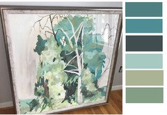
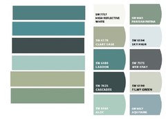
    Here are possible paint colors for your room.

    J GB thanked BeverlyFLADeziner
  • 7 years ago

    These are beautiful. The 4th swatch from the top/3rd up from bottom intrigues me. Do you know the name of that particular swatch?

  • PRO
    7 years ago

    No paint colors. I pulled them from the photo of your art. Now use this as inspiration and take the photo to the paint chips and select a range of chips that are in the same family. Then once you get it narrowed down to a few options, you can order samples to put on the wall.

    https://samplize.com/


    J GB thanked BeverlyFLADeziner
  • 7 years ago
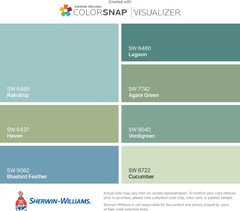
    This is what I got with SW color snap. However, I usually don’t choose the exact shade they match - I go grayer (more neutral).
    J GB thanked Susie .
  • 7 years ago

    All of this is so incredibly helpful. Thank you, Beverly& Susie.

  • PRO
    7 years ago

    Here are the SW paint colors as selected by the SW computer.

    J GB thanked BeverlyFLADeziner
  • 7 years ago

    Filmy Green is one of 5 colors ordered from Sampilize. The four others are a close visual match to many of these. You’ve been such a knowledgeable resource. Thank you, Beverly.

  • 7 years ago
    last modified: 7 years ago


    Before I begin painting, I’d like pinions as to whether the overall look of the art piece (size/shape) is suitable. I do have another area in our home this can be placed but I had envisioned it here, too. I’m wondering if such a large art piece

    can go above this bed. The bed is not centered in the room but between the the adjacent wall and a vertical window; this may have an effect as to whether this works or not (square shape art next to vertical rectangle window). Once a matttress is placed on top of the bed frame, only 11” of the headboard will be seen. Actually less since pillows will also take up space. I figured I’d hang it now before painting the room considering the painting itself will determine the color choice. I do appreciate the opinions. This is such a helpful forum.

  • 7 years ago


  • 7 years ago

    I'm no pro but I love that artwork and would find whatever place for it that suited me. I think it works really well on that wall and while I'm not sure if that is the best spot in the room for your bed, I would center the piece over the headboard. I'm not a stickler for size rules when it comes to artwork. A few inches more or less - what does it matter as long as the art makes your heart sing? Of course, everyone is different. For some, asymmetry or a few inches shy of the "ideal" recommendation takes over when they're appreciating a room.

    J GB thanked tartanmeup
  • 7 years ago
    last modified: 7 years ago
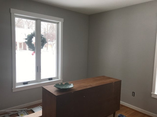
    Thank you, Tartanmeup. Your kind words about the art piece are so appreciated! We had placed the bed on the opposite wall where the dresser is positioned now, but I found walking into the room with the side of the bed in such an obstructive position upon entrance off-putting. Not having an on-going pathway threw me off. The overall feeling seemed cluttered. We also placed the bed in front of the window but it seemed a bit odd with the type of windows we have (vertical, crank-style); opening the windows would prove to be so challenging. Maybe, too, seeing the back of the headboard from the window view which is at the front of the house strikes me as a bit odd, more so than if this were at the back of the house. Mostly, it’s the window style that doesn't seem to suit having the bed in front of the that window. It just seems that the bed is best suited in this position so as to create more space. Thank you again!