

Kitchen Paint for my Kitchen
7 years ago
Featured Answer
Sort by:Oldest
Comments (21)
 7 years agolast modified: 7 years ago
- 7 years ago
Related Professionals
Raleigh Interior Designers & Decorators · Oklahoma City Interior Designers & Decorators · Aiken Interior Designers & Decorators · Amherst Interior Designers & Decorators · Colorado Springs Interior Designers & Decorators · Albany Architects & Building Designers · Murfreesboro Architects & Building Designers · Spring Architects & Building Designers · Greenfield Architects & Building Designers · Syracuse Architects & Building Designers · Milwaukee Architects & Building Designers · Evanston Architects & Building Designers · Kansas City Kitchen & Bathroom Designers · Clarksdale Kitchen & Bathroom Designers · Fargo Kitchen & Bathroom Designers 7 years ago
- 7 years ago
- PRO7 years ago
- 7 years ago
- 7 years ago
- 7 years ago
- 7 years ago
- 7 years ago
- 7 years ago
- 7 years ago
 7 years ago
- 7 years ago
- 7 years agolast modified: 7 years ago
- 7 years ago
- 7 years ago
- 7 years ago
- 7 years ago
- 7 years ago




Related Stories
MOST POPULAR8 Great Kitchen Cabinet Color Palettes
Make your kitchen uniquely yours with painted cabinetry. Here's how (and what) to paint them
Full Story
KITCHEN DESIGNYour Kitchen: Mix Wood and Painted Finishes
Create a Grounded, Authentic Design With Layers of Natural and Painted Wood
Full Story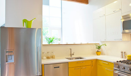
COLORCrazy for Color? Your Kitchen Cabinets Want In
Make over your kitchen in spectacular fashion with just colorful cabinet paint? Now there's a bright idea
Full Story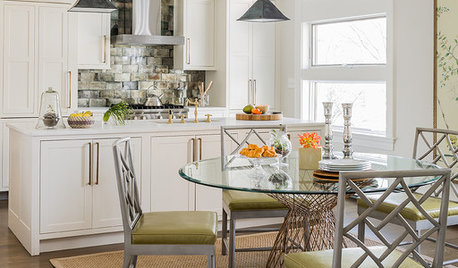
KITCHEN DESIGNKitchen of the Week: Chinoiserie Chic in New England
Sumptuous hand-painted wallpaper stands out in a Massachusetts eat-in kitchen, thanks to light and bright supporting players
Full Story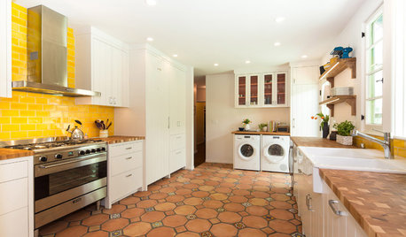
KITCHEN DESIGNNew This Week: 4 Surprising Backsplash and Countertop Pairings
Make your kitchen workspace stand out with colored ceramic tile, back-painted glass, butcher block and more
Full Story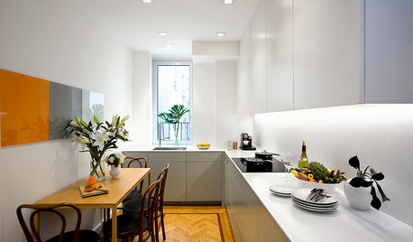
SMALL KITCHENSKitchen of the Week: Space-Saving Tricks Open Up a New York Galley
A raised ceiling, smaller appliances and white paint help bring airiness to a once-cramped Manhattan space
Full Story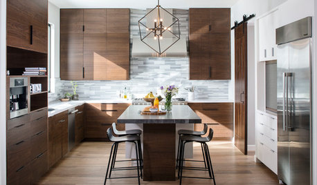
KITCHEN DESIGNNew This Week: Moody Kitchens to Make You Rethink All-White
Not into the all-white fascination? Look to these kitchens for a glimpse of the dark side
Full Story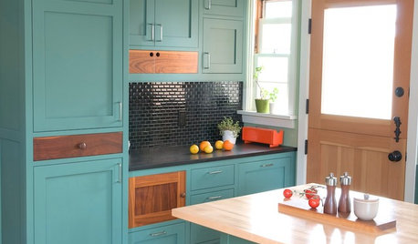
MOST POPULARFrom the Pros: How to Paint Kitchen Cabinets
Want a major new look for your kitchen or bathroom cabinets on a DIY budget? Don't pick up a paintbrush until you read this
Full StoryKITCHEN CABINETSKitchen Cabinet Color: Should You Paint or Stain?
Learn about durability, looks, cost and more for wooden cabinet finishes to make the right choice for your kitchen
Full Story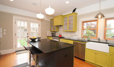
KITCHEN DESIGNKitchen of the Week: What a Difference Paint Can Make
A bold move gives a generic Portland kitchen personality without a major overhaul
Full StorySponsored

Columbus Design-Build, Kitchen & Bath Remodeling, Historic Renovations


schnable1