


Colour Scheme Assignment
Prairie Modern Designs
5 years ago
last modified: 5 years ago
Featured Answer
Comments (9)
Related Professionals
Birmingham Painters · Clarksburg Painters · Everett Painters · Plainfield Painters · South Boston Painters · White Center Cabinets & Cabinetry · Morgan Hill Flooring Contractors · Palm Valley Flooring Contractors · Worcester Flooring Contractors · Washington Interior Designers & Decorators · Holtsville Architects & Building Designers · Rochester Furniture & Accessories · Erlanger General Contractors · Greensburg General Contractors · Walker General Contractors PRO
PROPrairie Modern Designs
5 years ago- PRO
Prairie Modern Designs
5 years agolast modified: 5 years ago - PRO
Prairie Modern Designs
5 years ago


Related Stories
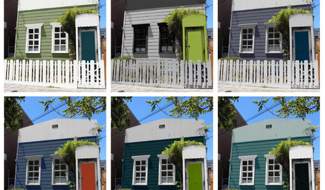
EXTERIOR COLORChoosing Color: 1 Cottage, 6 Striking New Color Schemes
See 6 color palettes for this sweet San Francisco home, vote for your favorite and then find out which one was chosen
Full Story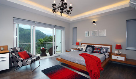
DECORATING GUIDESGreat Color Palettes: 8 Hot Bedroom Color Schemes
Go spicy, mild or a mix of both with warm and cozy hues in your bedroom
Full Story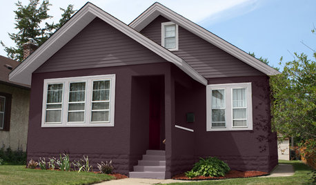
EXTERIOR COLORChoosing Color: 1 Home Has Fun With 5 Different Color Schemes
See a home’s potential for transformation with several new hues. Do you have a favorite?
Full Story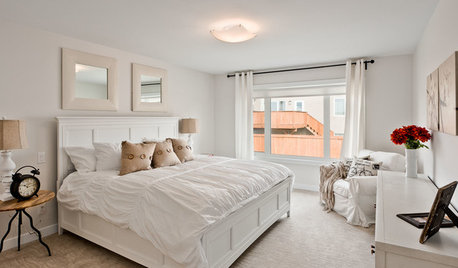
DECORATING GUIDES9 Ways to Boost Your All-White Color Scheme
Grays, seafoam, metal, wood and more help embolden a white-on-white look so it doesn't leave you cold
Full Story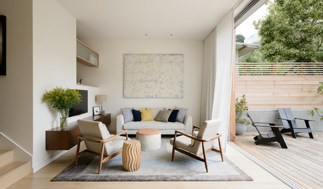
DECORATING GUIDESTake a Shortcut to Style by Choosing a One-Color Scheme
Layering tones of the same color is an easy trick for creating stylish interiors
Full Story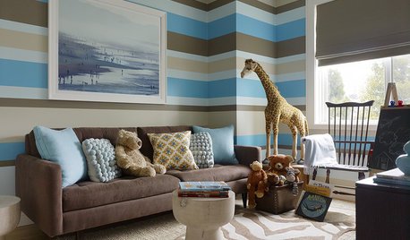
BEDROOMS9 Unexpected Cool Color Schemes for Boys' Rooms
Spark your little guy's bedroom with a fresh palette that feels age appropriate yet breaks new ground
Full Story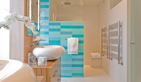
DECORATING GUIDESPalatable Palettes: 9 Bold Bathroom Color Schemes
Give your bathroom or powder room a bright new look with beautiful colors that energize the space and please the eye
Full Story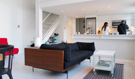
HOUZZ TOURSMy Houzz: Color Hits the Spot in a White-on-White Scheme
Bright red furniture strikes a dramatic pose against snowy walls and floors in a Montreal loft
Full Story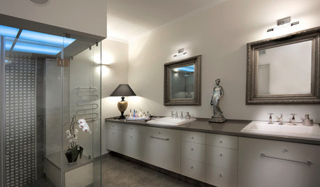
MORE ROOMSMonochromatic Color Schemes: A Room With a Hue
Can't Decide on a Paint Palette? Go All Out With One Favorite
Full Story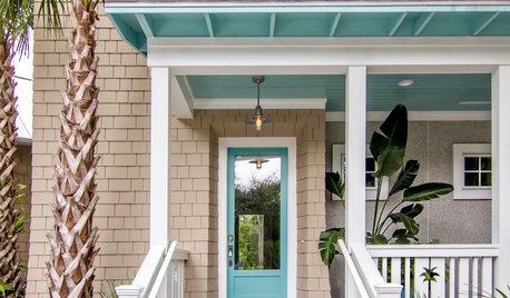
CURB APPEAL10 Unexpected Color Schemes for Home Exteriors
Give your home’s face a brand-new look with paint picks that go beyond the everyday
Full StorySponsored
Franklin County's Preferred Architectural Firm | Best of Houzz Winner
More Discussions


Sina Sadeddin Architectural Design