

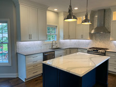
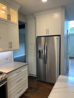
Cambria Britannica and Queen Ann
7 years ago
Featured Answer
Sort by:Oldest
Comments (22)
 7 years ago
Related Professionals
Brunswick Interior Designers & Decorators · Tulsa Architects & Building Designers · Medford Architects & Building Designers · Bainbridge Kitchen & Bathroom Designers · Lewiston Kitchen & Bathroom Designers · Yuma Kitchen & Bathroom Designers · Lexington Kitchen & Bathroom Designers · Columbus Kitchen & Bathroom Designers · Hilton Head Island Kitchen & Bathroom Designers · Santa Rosa Kitchen & Bathroom Designers · Las Cruces Kitchen & Bathroom Designers · Eugene Kitchen & Bathroom Designers · Muskegon Kitchen Remodelers · Elkton Custom Countertops · Oshkosh Custom Countertops- 7 years ago
- 7 years agolast modified: 7 years ago
- 7 years ago
- 7 years ago
 7 years ago
 7 years ago
 7 years ago
- 7 years ago
 7 years ago
 6 years ago
- 6 years ago
- 6 years ago
- 6 years ago
- 6 years ago
- 6 years ago
- 6 years ago
- 6 years ago
- 6 years ago
- 6 years ago
- 6 years ago
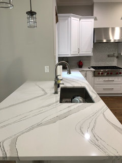
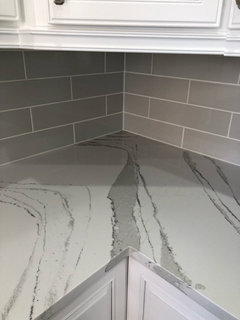
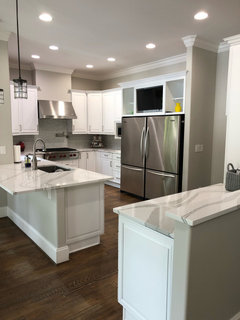
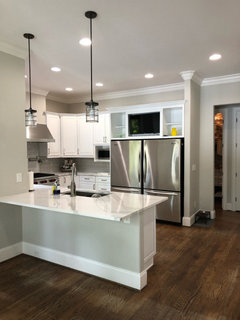
Related Stories

KITCHEN COUNTERTOPSThe Latest Colors and Styles in Engineered Surfaces
Dark and light hues, sophisticated veining and textured finishes stood out at the 2020 Kitchen & Bath Industry Show
Full Story
KITCHEN DESIGNDream Spaces: 12 Beautiful White Kitchens
Snowy cabinets and walls speak to a certain elegance, while marble counters whisper of luxury
Full Story
MOST POPULARYour Guide to 15 Popular Kitchen Countertop Materials
Get details and costs on top counter materials to help you narrow down the choices for your kitchen
Full Story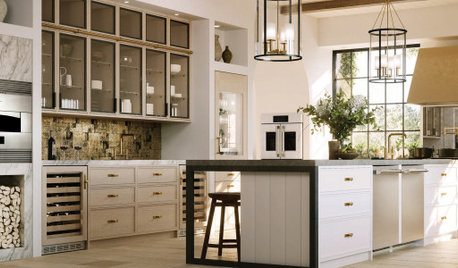
EVENTS8 Kitchen and Bathroom Trends From KBIS and IBS 2020
Dark colors, transitional style and personalization were featured at the U.S. kitchen and bath industries’ biggest event
Full Story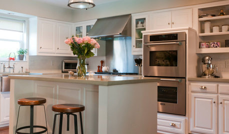
KITCHEN DESIGNShow Us Your Fabulous DIY Kitchen
Did you do a great job when you did it yourself? We want to see and hear about it
Full Story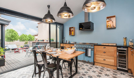
COLORColor of the Week: Watery Blue Is Summer's Best Hue
See how to bring the soothing colors of the sea into your home
Full Story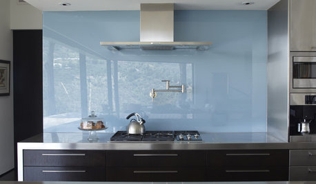
KITCHEN DESIGNThe Future of Backsplashes
Grout is out. Continuous sheets of glass, stone, metal and porcelain are saving cleaning time and offering more looks than ever
Full Story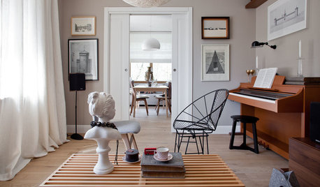
DECORATING GUIDESColor of the Week: Decorating With Warm Gray
Tired of tan? Getting gloomy from cool gray? Make warm gray your new go-to neutral
Full Story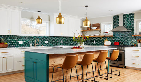
KITCHEN MAKEOVERSKitchen of the Week: Backsplash Dazzles in Green Geometric Tile
A designer helps a growing family function better at home with a new kitchen, mudroom and dining room bar
Full Story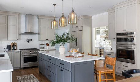
REMODELING GUIDES6 Tricky Questions to Ask When Planning Your New Kitchen
Addressing these details will ensure a smoother project with personalized style
Full Story



Sina Sadeddin Architectural Design