Software
Houzz Logo Print
njmomma

Help with Paint Colors

13 years ago
last modified: 13 years ago
What Benjamin Moore, Behrs or Sherwin Williams paint colors would you use in a small dining room with this fabric as the drapes.

Comments (36)

  • 13 years ago
    last modified: 13 years ago
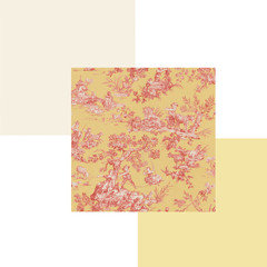
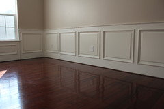
    The bottom half of the room has wainscoting and wood floors. Similar to the one pictured below.
  • 13 years ago
    last modified: 13 years ago
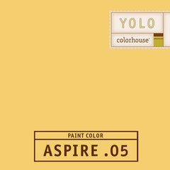
    For a sunny look, I would go with SW daffodil on the walls and leave the wainscoting white.
    http://www.sherwin-williams.com/homeowners/color/find-and-explore-colors/paint-colors-by-family/SW6901-daffodil/
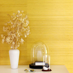
    I like grasscloth wall treatments. I would also put something similar like this on the walls
    Zephyr Collection · More Info
    njmomma thanked Chem K
  • 13 years ago
    last modified: 13 years ago

    Do you think this color would work or do you think it would be too dark for a small room? Right now I have yellow in the room. I'm looking for a change.

    http://www.benjaminmoore.com/en-us/paint-color/dragonsblood
  • 13 years ago
    What do think about a barn red? Not a lipstick red but a muted red. Reds are pretty with white and you have the wainscoting.
    njmomma thanked greenvelvettree
  • PRO
    13 years ago
    last modified: 13 years ago

    If you want to go bold, use a yellow or coral, if you want subued how about a soft grey? Take a fabric sample with you to the paint store then bring home color swatches and see how they look in the changing light... :-)
    njmomma thanked Stamps Design Services
  • 13 years ago
    I love the red tones, but I feel it would be too dark for the room and my biggest fear is that it may look like a pink room.


    Any other suggestions?????
  • 13 years ago
    I love the red tones suggested too but with such beautiful statement floors, red could overpower both curtains and floors.
    njmomma thanked Chem K
  • 13 years ago
    Now I have another dilemma, the husband put his two cents in. :-) "No red"
  • 13 years ago
    last modified: 13 years ago

    Just a thought, please weigh in. I have BM Springfield Tan in my kitchen and the dining room door way is off the kitchen. Do you think BM Yosemite Sand would work. The room is naturally dark, not much light comes into the room. Porch overhang contributes to not letting the sun come in. Small dark dining room.

    Here are the two colors

    BM Yosemite Sand AC-4 http://www.benjaminmoore.com/en-us/paint-color/yosemitesand

    BM Springfield Tan AC-5 http://www.benjaminmoore.com/en-us/paint-color/springfieldtan#ce_s=SPRINGFIELD

    They are on the same color strip.

    I know everyone's computer screen shows a different color, but if you could please give me your thoughts I would appreciate it.

    Thanks!
  • 13 years ago
    The Yosemite Sand isn't bad, I agree, and staying in the tan family in the adjacent rooms should work well. But on that page that you gave link to, look at the section that says "similar colors" - I like the first one they show, "Blond Wood", a bit better with your fabric. Interestingly, it's description says it has a red undertone.
    njmomma thanked Joyce E
  • 13 years ago
    If red is out of the question, a buttery yellow would be nice, with white wainscoting. The yosemite sand looks too pink to me and the springfield tan too brown. But... in real life they could be gorgeous of course ;-)
    njmomma thanked Carolina
  • 13 years ago
    What about the polite white that's in deco's colourscheme?
    njmomma thanked Carolina
  • PRO
    13 years ago
    Two tans maybe nice, for the wainscoting. Put in a light tan on the panels, large squares and trim darker tan as accent in side the reveals. Could be great!...
    njmomma thanked Arlene Awarda Architect
  • 13 years ago
    last modified: 13 years ago
    On my screen, yosemite tan is a brownish beige and springfield tan a peachish dark beige.
    njmomma thanked Chem K
  • 13 years ago
    I think MB dragon's blood, like you suggested, would really warm up your small space, especially if you're looking for a change! I have the same type of north-facing dining area and I need rich colors to really bring in the warmth. If you stay on the "brown" and "orange" side of reds it shouldn't come off too pink.
    njmomma thanked Christina Lynn
  • 13 years ago
    Pretty toile; what furniture style do you have? Are your dining room chairs upholstered; what color? What color is the trim in the room? Take a look at some of the colors that are suggested to coordinate with Springfield Tan…. I like Malton and Cool Breeze. Think of the overall color palette in the room (s).
    njmomma thanked trudela
  • 13 years ago
    The colors decoenthusiaste gave you.... You could choose one of the darker colors for the bottom and do the whiteer color given for the top. The colors in the wainscot example you gave would work. If you prefer say the yellow- could do the yellow in fabric on bottom and a lighter yellow, in that family above, and an even lighter family of that yellow on the ceiling. Would be very warming
    njmomma thanked Tammy Tate Kammerer
  • 13 years ago
    last modified: 13 years ago

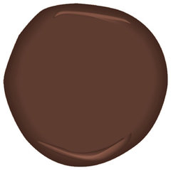
    You could even go with this

    Terrazzo Brown CSP-360 Paint · More Info
    njmomma thanked Geneviève
  • 13 years ago
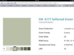
    I think you could go with something contrasting on the walls like softened green (SW 6177) but that makes the room feel natural. The other suggestions have been great but maybe predictable and not what you're looking for. With the soft green on the walls you can bring some of the muted reds/yellows into accessories or even upholstery of your chairs.
    njmomma thanked eurostilista
  • PRO
    13 years ago
    With white wainscotting at the bottom, it shouldn't be too dark.
    njmomma thanked Stamps Design Services
  • 13 years ago
    last modified: 13 years ago
    Love some of these suggestions! Some of you are really thinking out of the box and am so grateful that you took the time to post.
  • 13 years ago
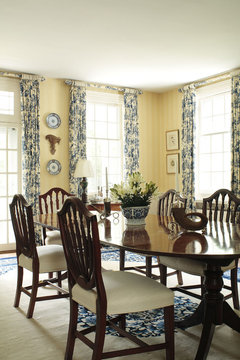
    Here' a pretty toile draped dining room to inspire you...
    Federal Farmstead · More Info
    njmomma thanked decoenthusiaste
  • 13 years ago
    @decoenthusiate thanks for posting that pic.

    I am definitely leaning towards yellow rather then the red. Finding the right color yellow is key or rather a beige yellow. I just don't want the room to scream yellow.

    I have to find the right subtle yellow to go with this fabric.

    Help.;-)

    Anyone. ;-)
  • 13 years ago
    BM Oriental Silk. it is not on the color charts anymore, but a paint store can make it. See if they can make you a sample pint.
  • 13 years ago
    If your husband doesn't like red walls, then a wheat yellow sounds nice with the white on the wainscoting and between the two areas will let the curtains stand out..
  • 13 years ago
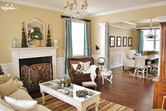
    And I want to throw this out there, too: Martha Stewart's Hickory, via Sophia's Decor. I LOVE her home and her buttery, but not too yellow, walls! If Hickory is too dark there are two other colors in her line I suggest: Reed and Ginger Root. If all else fails, I figured you could pop in at a Home Depot somewhere and check out those three shades. Good luck!
  • 13 years ago
    Paints Stains And Glazes · More Info
  • PRO
    13 years ago
    What direction do the windows face? A northern or eastern facing room will need more warmth and a southern or western facing room will need cooler tones.... Once you narrow down your paint choices, to 2-3, buy samples and paint a section that faces the windows...this should help you see how they look morning,afternoon and evening...it will help to keep from painting the room and need to redo it! :-)
  • 13 years ago
    What about a pale blue? It's one color we haven't suggested yet. A sky blue would set off the red. Also, I have recently painted a western exposure room Opal Silk by Behr primer and paint (which is great but too dark fir your dining room) but picked up Offshore Mist and Clear Pond by Behr which might be nice for you (and blue for your husband!) it is a warmer blue. It has a bit of yellow in it and that will go with the yellow in your curtains.
  • 13 years ago
    In Christina Lynn's picture, the curtains are a pretty shade of that type of blue - tiffany, turquoise, etc. that seems so popular lately! A pale shade of that blue would look nice with yellow as it does in that photo.
  • PRO
    13 years ago
    What you really need to do is photograph the drapes you have and pull the colors from it to get it just right. I created a app called Color911 for instant color help. One of the features is to take a photo and pull the colors from the photo. I attached a screen shot from the app showing when I took a photo of a pillow and pulled the colors from it. What I've done is used those colors for wall color, accent colors.. or just inspiration for anything else I am buying for the room. To match the colors to paint simply take your iPhone or iPad to the paint store and they can find a paint color to match. I have done it several times. This is an incredibly useful feature. I hope this helps you with the rest of your design.
  • 13 years ago
    I would use a very soft buttery yellow. Like Benjamin Moore's #206 Summer Harvest from the Classic Collection. It is one of my favorite yellows.
  • PRO
    13 years ago
    last modified: 13 years ago
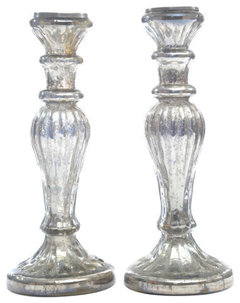
    I like the soft blue idea with silver and red accents.
    Quiet Moments 1563 Paint · More Info
    Moroccan Red 1309 Benjamin Moore · More Info
    Silver Candle Stand Set · More Info