Software
Houzz Logo Print
momofthreema

Granite too busy for backsplash?

7 years ago
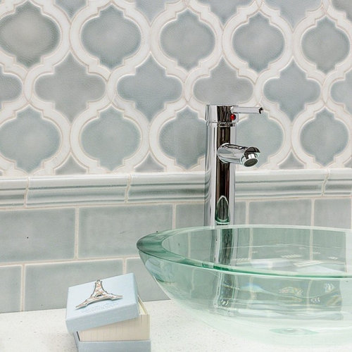
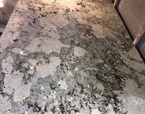
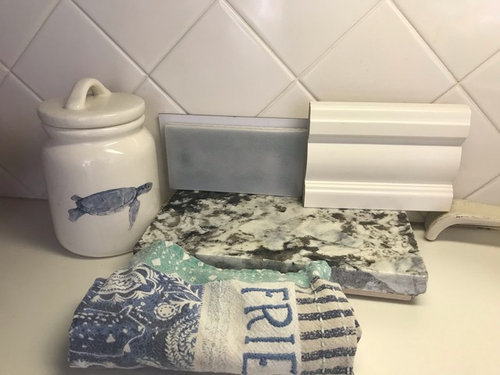
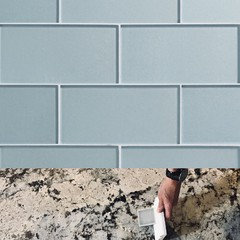
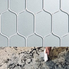
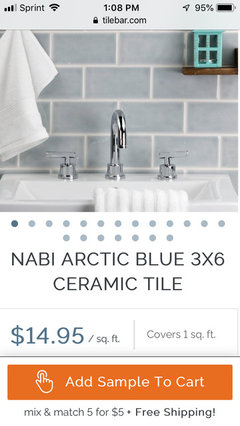
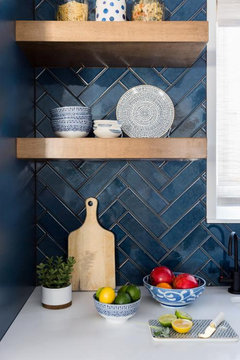
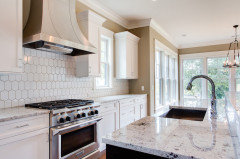
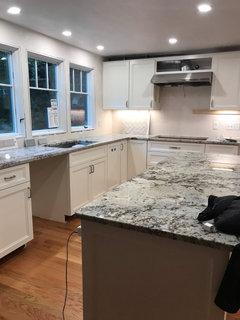
So, our cabinets and granite are firmly decided. I want a light blue tile for the backsplash and Nabi’s arctic blue is a finalist. I would like to have a different shape, same color over the range top. Do you think the granite is too busy to add the other shape over the range?

Comments (128)

  • 7 years ago

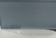
    Sonoma Tilemakers makes a gorgeous glass tile. Color Gibson Silk may be a winner for you. It comes in lots of sizes. They offer it in a glossy and matte. It’s truly stunning.

  • 7 years ago

    The line is called Astoria
    https://sonomatilemakers.com/astoria/

  • 7 years ago

    Thinkdesign, really pretty! The gloss seems to light the color a little. The first one is silk and the second and third are the gloss.

  • 7 years ago

    You have to see them in person. Actually the matte version (in real life) reads lighter than the gloss. And the floss has a subtle barely there sparkle to the paint. It’s not ‘flat’ looking. The matte almost looks like beach glass. It’s very elegant.

  • 7 years ago

    Oooohhhh, you had me at beach glass! I will check it out in person!

  • 7 years ago

    I think the paler shades and a more matte finish would enhance the stone best...beach glass sounds perfect

  • 7 years ago

    Getting a little braver with the layout will pay off in the long run...look at other shapes in the material you like..subway is too expected...it just doesn’t live up to the counters beauty

  • 7 years ago

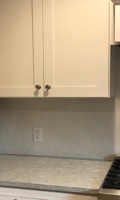
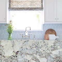
    Mom keep looking at interesting shapes that you love. I don’t think having a different shape than subway ends up being busier. I did a very light gray/blue matte tile in a picket shape and it is very subtle with my counter.

  • 7 years ago

    Kim’s choice is a perfect example of how the tile pattern and size matches the scale of the pattern in the stone...

  • 7 years ago

    The muted color of the grout also mirrors the muted pattern of the counter...in your case you can’t mirror the dramatic colors..but you can have a more dramatic layout with mixed in larger tiles

  • 7 years ago

    You all are killing me here! Way too early for me to look at tile (for our kitchen) yet... Sonoma has some beautiful tile!

    Kim, that's such an attractive tile, and I do like the shape far better than subway.

    Momofthree, I can't wait to see the finished kitchen! But then, I guess that's true for you too!

    Ok, back to work for me!

  • 7 years ago

    For instance center a horizontal line of 10-12” squares...with a border top and bottom of 2” squares...you have drama to match the counter with the bold shapes with a subtlety of color...that enhances without competing...

  • 7 years ago

    Like Kim's tile too. I am looking forward to your choice. it is difficult when you like so many different shapes and sizes.

  • 7 years ago

    Kim, that looks beautiful! Perfect choice!
    I just need to convince hubby that we could go with something a little different...I’m going to show him that pic, I love it.

  • 7 years ago

    Thanks everyone! There are so many beautiful tiles out there to choose from that it really makes it hard to choose just one. I was so tempted by some really pretty textured tile but glad that I went with an interesting shape in a quiet color. After making the gazillion decisions that go into a kitchen reno you just want to pick something and be done so I think a lot of people just see subway tile and go for it.

  • 7 years ago

    Mom...for more pictures try HOUZZ photos..for instance type in ....“your stone name” in kitchens....

  • 7 years ago

    Rita, everyone seems to do white or grey tile with Alaska White :(

  • 7 years ago

    Mom I agree with the others - the blue is really pretty with your stone!

  • 7 years ago

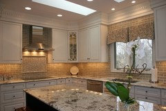
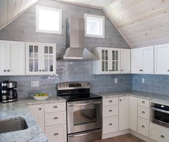
    And Alaska white seems to have a wide variation in color, ours seems to be less brown than some. These ones say Alaska white.

  • 7 years ago
    last modified: 7 years ago

    OP: out of all the samples shown, i like that first tile you picked! (the 5th pic) it has depth & subtle variation which i feel goes perfect with your granite....and i think the color is perfect!!

    although many were really pretty, i think with your granite, a simple tile pattern is best. it doesn't have to be subway. you can do 6x6's stacked, not offset. if u go subway, then match the grout to tile and you will have less visual overload.

    your granite is the star , you just need a role player here

  • 7 years ago

    The second one looks most like your stone..the third one has a definitely gray/blue backsplash....so you are in the right area color wise...but none of the stones has as distinct color variations as yours...however I did notice ...in the very beginning of the post......a tile layout example with the simple square tiles laid in a diamond arrangement......that layout could be stunningly different if you chose TWO muted shades from your stone...a pale barely gray and a pale barely tan perhaps ...just enough difference in color to create a slight variation...I ,too , am very surprised at the difference in the same name stones...but I believe it was the distinctive look of yours that made you choose it....there is time enough to find a backsplash you like as much...

  • 7 years ago

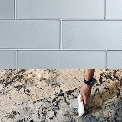
    The second pic you posted stresses the different look you will get if the grout color is too contrasting..and how it will look if the tiles are too small...

  • 7 years ago

    Your pic with the man’s hand also suggests that your stone has both gray and tan featured in the pattern...another reason to wait til after installation.....to finalize your choice...at that time you will see whether one color dominates....or both are more apparent?..the diamond pattern could have just one row of an alternate color half way up as well...or the other possible row of squares in the center(parallel) one color...and the borders of smaller tiles above and below in the other color....the real challenge in my mind is to get the right mix so they read as one look....not like the stone and backsplash are seemingly separate

  • 7 years ago

    Mans hand reference is to first mans hand post...sorry

  • 7 years ago

    Rita, yes, that’s exactly what I want...a cohesive look. I know that the stone we’ve chosen presents a bit of a challenge, but I know we can find something great!

  • 7 years ago

    Think design, I found a pick with what looks like the Sonoma tile. The hubs still isn’t sure about the shape, but I love it! Going to wait until the counters are installed, but this is a definite contender, thank you! I lighted the granite to more like what it will look like in our space(instead of the awful warehouse lighting), and I think this could be really nice together!

  • 7 years ago

    Much nicer than subway!

  • 7 years ago

    Love it momofthree ma! Beautiful choice!

  • 7 years ago

    Love it! Very pretty

  • 7 years ago

    What's nice about the line is there are many different sizes and all colors can come in either matte or shiny glass. It's so luminous in person. It's just under $30 sf for the matte in the 3x6 (the gloss is a little less expensive). I would imagine the unique shapes are a bit more $. Just FYI

  • 7 years ago

    Oh boy, ok, that’s double the price of the Nabi, so I may have more convincing to do with hubs :)

  • 7 years ago

    Gosh that is a gorgeous tile and color. It looks fabulous with your granite. Perfection. I would skip birthday, anniversary, and Christmas presents for that stunner.

  • 7 years ago

    That is beautiful! Love the shape with your granite but to be honest if it was a whole lot less with subway, for me what is so beautiful is that gorgeous color. Is there any way to do the same color in a mock up with subway? Would be interesting to compare side by side.

  • 7 years ago

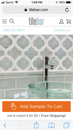
    Here you go! Tilebar.com


  • 7 years ago

    Maybe you found it in subway already though. Too many replies to read through, but I had seen it awhile back.


    Anyway, the subway tile installed in herringbone pattern or just stacked would be a nice change.

  • 7 years ago

    Spisland, yup, that’s where I started, and probably where I will end up after all this hand wringing because my hubs likes it best and it fits the budget...lol

  • 7 years ago

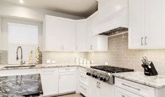
    In your last pic I think the colors look pretty dreamy...that relieves the need to have a more complicated backsplash....the curtain is a nice touch as well....I only worry that your stone is not going to read as blue as in the pic...

  • 7 years ago

    Rita, you are correct, which is why I have to wait. If it reads greyer then the blue will look weird.

  • 7 years ago

    Here's a subway tile layout I've only seen once. Several years ago now. It was in a photo of a NYC coffeehouse, and whether true or not, my impression was the tile had always been there many decades. Simple but unique.


    It was just 2 horizontally stacked subway tiles, with 1 next to it vertically. But the difference was each set of 3 was installed on the wall diagonally. This was done with just plain old white subway tile, so nothing special, but it really stuck with me :)

  • 6 years ago

    Hi All,
    Counters were installed today, and I am
    Trying to Pick tile. We definitely want subway because the counter is beautiful, but busy.
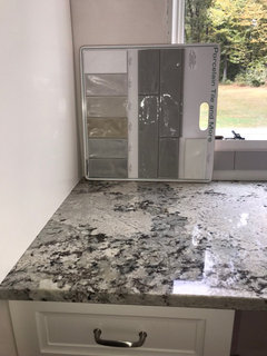
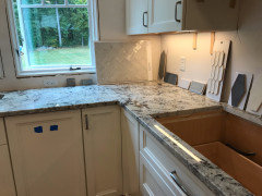
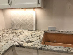
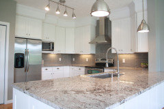
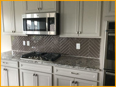
    I don’t know why this is so hard!! I really like the second from the bottom on the big board(first pic)but I worry about the “wave” texture on the tile being too much with counters. I thought the herring bone silver would be perfect, but it looks Taupey to me in daylight(pic 2). The blue just seems off to me(pic 3). Adding more pics in the evening too. Any thoughts?

  • 6 years ago
    last modified: 6 years ago


    looks great. I like, Pic 1, the large charcoal tiles. those would be a nice contrast.

    Pic2, the white pickets. don't like the color on the herringbone sample.

    I also think if you want the herringbone, then do it in larger tiles. Like your darker gray ones in the first pic. those would be pretty.

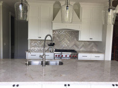
    or this size tile, dark, in the herringbone (showing your the blue just for size)


    here's a similar one to yours


    I'd also like a little darker.

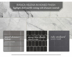
    this pearl shimmer would be beautiful


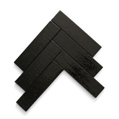
    or the black farmhouse style in the herringbone with a very light gray grout.

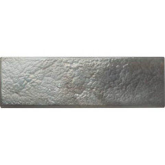
    or this charcoal glass tile from DalTile Galss Horizons

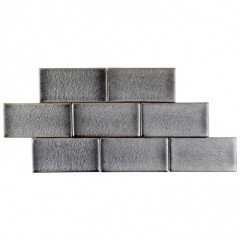
    Tilebar has the Nabi rocky edge in gunMetal


  • 6 years ago

    With that first one I just worry about the movement in the shape of the tile looking too busy with our stone???? This is a pic in a stacked pattern, I really prefer a more traditional brick.

  • PRO
    6 years ago

    Stand at least 6-7 feet away from your countertops and squint... if you don’t see the blue tint, but you see gray, I would go with gray. The darker gray from that board would be beautiful, so would the lighter gray. I agree with what others said, YOUR GRANITE IS GORGEOUS!!!! Enhance your granite, versus a tile color that stands out and your eye can’t figure out what the focal point is. That’s just my opinion. It’s your kitchen and you need to be the one who loves it!

  • 6 years ago

    Nestology, thanks! I just want to end up happy at the end. If you stand back from the island it looks very blue, so the greyer options just look off to me, plus I really want to accentuate the blue in the stone. Can you tell in this pic?

  • 6 years ago

    mom the blue will look stunning! Trust your judgment. I think you have good taste and know what looks good.

  • 6 years ago

    Thanks, New England! I just don’t want the rushing to be finished Cause me to make a bad decision. I should probably just stick with the Nabi since I keep coming back to it. Just ready to be done with decisions and enjoy this kitchen :)

  • 6 years ago

    I fully understand. I looked at a few that were contenders but when I saw the last one I knew it was THE ONE. You just know. Sure you will always find others that you like too but this one has always been the one that hit you and it really brings out the blue in the stone beautifully without overpowering the stone. It compliments it well.


  • 6 years ago

    I like the second from the bottom on your big board too. I don't think the wave is too much at all, so long as you keep your grout very similar to the tile itself the overall effect won't be too busy.

  • 6 years ago

    Have you put white paper over the other samples and looked at only the ones that are in the final run? The other colors will affect how you see them. Put your board vertical against your counter to see how your favorite 2nd from the bottom reads..alone. I'm partial to shaped tiles so my eye goes to the picket. You don't have "wrong" choices here, trust your instinct.

  • PRO
    6 years ago

    YES @Momofthree Ma, I can definitely see the blue in your granite photo! Gorgeous!!!

Sponsored
AIS Renovations
Average rating: 4.5 out of 5 stars15 Reviews
Custom Craftsmanship & Construction Solutions in Franklin County, Ohio