Software
Houzz Logo Print
holly_hewatt

Farrow and Ball Color Help

7 years ago
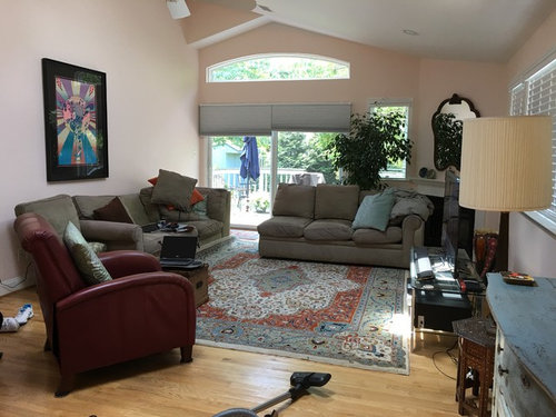
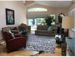
My husband nixed the idea of Cabbage White... He wants another color for the living room. I am now thinking Wimborne White. Has anyone used it? Pros/Cons? I am so over gray. The current color is Pillow Talk by C2. It's a very neutral pink and it looked nice for a long time but new sofa and new paint for this sunny room. Thanks.

kitchen · More Info


Comments (25)

  • PRO
    7 years ago

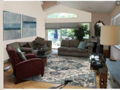
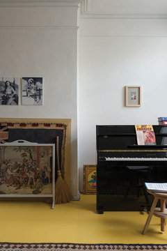
    My visual with Wimborne White

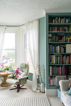
    some blue tones


    and white


  • PRO
    7 years ago

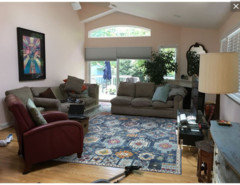
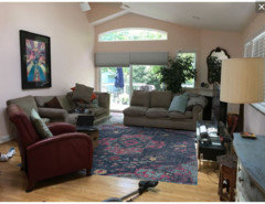
    I think it's very apparent that the wrong color rug was selected for this room. The orange in your lovely rug seems to fight with everything in the room. Before I would select a paint, I would correct the rug.

    The selections below lean heavily to blue with burgundy when offered. The rug will influence the paint your select for this room. Also if you decide to adopt my recommended furnishings layout, a much larger piece will be required over the sectional.


    Either place the black framed print over the fireplace, or find a new better location for it.


  • 7 years ago

    Thanks for the ideas. I am getting rid of the sofa. I am putting one new long sofa in on the only wall I have--below the Peter Max. As for the rug, it's staying since I am getting all new furnishings. On that note, what neutral color for my new sofa would you suggest.

  • PRO
    7 years ago
    last modified: 7 years ago

    Various sofas that could work in your room.


    Put Peter Max over the fireplace instead of the mirror.

  • 7 years ago

    I was looking at cream colored sofas. I am glad you concur. I never thought of moving the Peter Max. What would I put on this giant blank wall instead? I wonder if the mirror would be nice in a montage of pictures? Thanks again for your help.

  • 7 years ago

    Oh, and does the chair have to match the sofa? I do want a new chair or two. Thanks.

  • 7 years ago

    Wimborne White is very similar to Benjamin Moore Simply White. It's got a touch of cream to it. Do you have the F&B color deck so you can see how it looks in your light?

  • 7 years ago
    last modified: 7 years ago

    No, I don't have the color deck. This is apparently the IT color in the DC area. If it has some cream in it, I am sure it will be really nice. I have Tallow in my bedroom, Borrowed Light in my bathroom, Blackened White in another bathroom and last but not least Cabbage White in the guest room. F&B paint is the only way to go in my opinion. It's a beautiful paint. Have you seen the Wimborne White used in a home? I bought the Schoolhouse White sample and it wasn't nice in my opinion.

  • 7 years ago

    I haven't seen it in person but I'm considering it for my kitchen (but will probably go with Strong White based on how the swatches look in the room). I have the color deck and it's worth the investment in my opinion so you can get a really good idea of what the color is and see it in the actual room you're painting.

  • 7 years ago

    I think the 3rd mockup celerygirl posted looks the best -- white paint. the peachier ones look too 80s to me.

  • 7 years ago

    Wimborne White is lovely, a creamy white with no pink or green or blue. I’d also consider Pointing which is just a little less creamy but still a warm off white. If you want something more grey and cool try Wevet but it does have slightly lilac tones. Schoolhouse white is more in the beige family albeit a very very pale beige.

  • 7 years ago

    PS I have seen both Wimborne White and Pointing in homes (mine!) and both give a lovely warm but light feel. Only ever used in South facing rooms though.

  • 7 years ago

    minipie your decription of Wimborne White sounds really lovely actually. it's so hard to tell from online mockups!

  • 7 years ago

    Since my room is so bright, I have decided to do Ammonite Farrow & Ball. It's a light gray that will do well in a bright light which is what this South facing room has. I am doing Dimpse in the kitchen since the rooms flow together. I now need to pick out more than a couch. I am buying a new chair and table too. I have no idea what color couch, chair, and table. Should they all pick up the colors in the rug since that is staying? Gee, being an amateur designer is hard. I want to get this right but it ain't easy. Kudos to interior designers!

  • 7 years ago

    Why gray paint, is it to match the shades? Your rug has green, blue, cream, beige and orange in it. The cream sofa is a good choice and you were offered pretty spectacular advice from professionals! I fear you are not looking at the whole of your room.

  • 7 years ago

    I was told by the paint store that Wimborne white would be blinding in such a bright room. This room has skylights and lots of windows. In other words, I think a light gray is still a neutral without being white. I still like the cream sofa but now I need a color for the chair. When I went to the store the other day, most of the displays were neutral colors. I wasn't looking at a chair and table in the original post.

  • PRO
    7 years ago

    How would the store know that? They don't know if there are trees overhanging the house or if you are getting a reflection from an exterior object that affects the color.


    Holly H thanked BeverlyFLADeziner
  • 7 years ago
    last modified: 7 years ago

    It is a bright room as there are no trees and there are skylights. It was white before I painted it pink. So, you think I should stick with Wimborne White?

  • 7 years ago

    I thought a gray blue from the rug would look good.

    Edinburgh drawing room · More Info

    Even a stronger blue, Dix Blue 82 and woodwork in Wimborne White 239.

    Charlotte Cosby's House Tour · More Info


    Holly H thanked houssaon
  • 7 years ago

    Blue was a thought but doesn't it have to match the blue that the rug has in it?

  • 7 years ago

    light grey is a terrific neutral, but you need to consider the undertones and the shade. your couches and rug could clash with it, or blend in too well and look weird. do a really big test patch before committing.

    Holly H thanked User
  • 7 years ago
    last modified: 7 years ago

    I am actually getting a new couch so that's that ;) I have done a test patch, but I think I will in fact do another larger one this weekend.


  • 7 years ago

    I think the problem I am having with the decision is that I am not sure of my color palette. I like color as you can see from the posted pictures. I will keep the red chair and the rug and everything else will be switched out.

  • 4 years ago

    What did you end up going with? A darker cream than Wimborne may have been gone. My Wimborne White swatch is pretty white on my wall. I am thinking of using it for my kitchen cabinets and I need a color for the walls too. Room faces North and Northeast getting plenty of morning sun.