

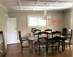
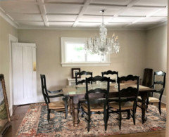
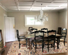
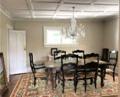
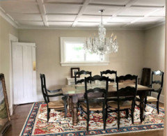
Do you like how this picture is hung?
7 years ago
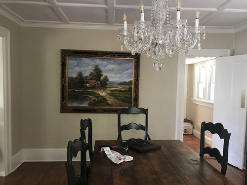
yes hung too low hang higher
no fine as is
Featured Answer
Sort by:Oldest
Comments (19)
 7 years ago
 7 years ago
Related Professionals
Jackson Architects & Building Designers · Middletown Kitchen & Bathroom Designers · Chico Kitchen & Bathroom Designers · Frederick Cabinets & Cabinetry · Worthington Cabinets & Cabinetry · Milwaukee Cabinets & Cabinetry · Waco Kitchen Remodelers · Temecula Kitchen Remodelers · Decatur Kitchen & Bathroom Designers · Frederick Kitchen & Bathroom Designers · Petersburg Kitchen & Bathroom Designers · Scranton Kitchen & Bathroom Designers · Erie General Contractors · Poplar Bluff Flooring Contractors · Pueblo Flooring Contractors- 7 years ago
 7 years ago
- 7 years ago
- 7 years ago
- 7 years ago
 7 years ago
- 7 years agolast modified: 7 years ago
 PRO7 years agolast modified: 7 years ago
 7 years ago
- 7 years ago
- 7 years ago
 7 years ago
- 7 years ago
 7 years ago
- 7 years ago
- 7 years ago

Related Stories
HOUZZ TOURSHouzz Tour: Picture-Perfect Simplicity
It’s like camping out in a catalog sometimes at this classic farmhouse — Pottery Barn and other retailers love it for photo shoots
Full Story
HOME TECHPicture This: Your Digital Photos Deserve Frames Too
Decorate with family memories — and swap them out in an instant — with frames made just for showing and sharing digital photos
Full Story
WINDOWSPicture Windows, Chicago-Style
Classic window design brings in big views, fresh air and versatile style
Full Story
DECORATING GUIDESDecorating Secrets: Picture-Perfect Way to Hang Art
Save your drywall with these easy steps for hanging framed pieces
Full Story
DECORATING GUIDES11 Tips for Picture-Perfect Mantel Styling All Year
The garland is gone; the holly is history. But you can keep your mantel arrangements artful no matter which decorations you choose next
Full Story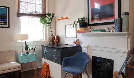
HOUZZ TOURSMy Houzz: Every Picture Has a Story in a 1920s New Orleans Rental
Original and secondhand artwork, furnishings and accessories come together in a creative couple’s 1,000-square-foot apartment
Full Story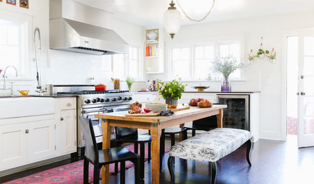
RUSTIC STYLEThese Rustic Accents Can Really Make Your House Feel Like Home
Add warmth and personality with woven baskets, wood ladders, quilts and more
Full Story
COLORLoving Color: More Ways to Like Stripes
Wake up a room with multiple types of stripes — or just one dramatic band of color
Full Story
HOW TO PHOTOGRAPH YOUR HOUSESmall-Business Savvy: Photograph Products Like a Pro
Take impressive photos of your work for a website, a portfolio or packaging with any camera and these 5 tips
Full Story



hollybar