Software
Houzz Logo Print
mshutterbug

Should we center the bookcase??

7 years ago
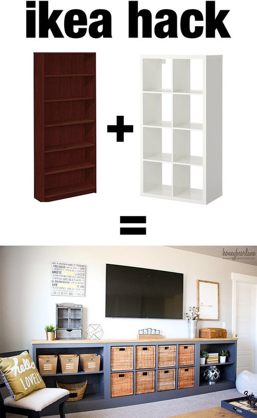
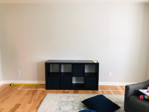
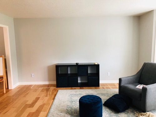
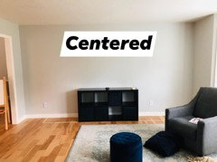
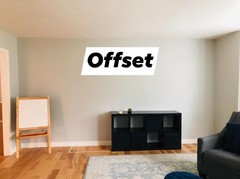
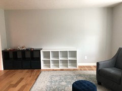
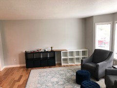
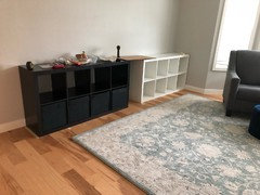
This ikea hack is the inspiration and it just occurred to me, we could push it all the way toward the window to make a bigger gap on the dining room side. Hopefully that makes sense lol. So, do you think it should be centered? Centered would leave around 20” on either end.

Comments (33)

  • 7 years ago

    Thoughts?

  • 7 years ago

    Either could look good, but it really depends on what other furnishing you have in the room. Can you show the rest of the room and include what other furniture and art pieces you have in mind.

  • 7 years ago

    We have ours offset but I really prefer centered. Will be rearranging soon.

  • 7 years ago

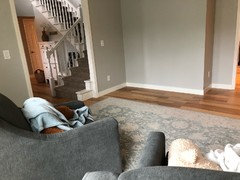
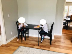
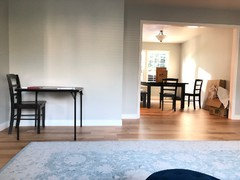
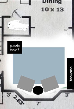
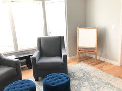
    We have 2 chairs in the window. And at the moment a card table in the corner. We’ll probably replace it with a little desk around the same size. I’m just testing out having a table there vs a chaise or something. We homeschool and use this room for reading etc. I’ll put some sort of artwork centered over the long bookcase. And the bookcase will be somewhat built in so I’ve got to decide on placement. Another option is to go wall to wall.

  • 7 years ago

    Try it. Don't like it? Move it. Simple.

  • 7 years ago

    It’s going to be built in so we can’t just move it :) and I need to decide... keep it like this or go wall to wall.

  • 7 years ago

    Offset and more to right than in your 'Offset picture'.

  • 7 years ago

    Thanks ci_lantro. It would actually be all the way to the wall. You have to just imagine this piece is flanked by 2 regular bookcases (same height). Hubby is lobbying for wall to wall because I would be easier to build lol

  • 7 years ago

    Hello. Unless you have something you wanted to put in one of the little spaces on either side, I think wall to wall would look best. It would keep those spaces from getting dusty or cluttered with odds & ends. Wall to wall would also give it a more built-in look. Plus it would be extra storage for school supplies.

  • 7 years ago

    Wall to wall. Visually no-breaks is easy on the eye and rare is the family who doesn’t appreciate extra storage.

  • 7 years ago

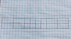
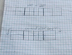
    My only hesitation on wall to wall is it would end up being 3 equally sized units, with the center being the cubes and the sides being shelves with a center divider (due to length). We are using a white ikea unit for the center and I think he’ll build the flanking units.

  • 7 years ago

    Essentially it would look like this rough sketch...

  • 7 years ago

    Could you do 2 of the cube units with one section of shelves on either side? Or shelves in the middle and a unit of cubes on each side. I guess it just depends on what fits your family’s needs the best.

  • 7 years ago

    The rug seems too small for the space. A larger rug would affect the appearance of balance.

  • 7 years ago

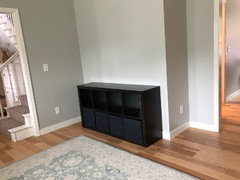
    Tanya - well at this point we’re committed to the center of cubes because we just got back from ikea. Husband didn’t want to paint the existing one so we got it in white. (Have has the other for years and we’ll either find a new space for it or Craigslist it.) But the dark one now serves as a visual of how it would look wall to wall. You have to use a lot of imagination here because it will be shelves not cubes. I’m just not sure if I like 3 equally sized sections.

  • 7 years ago

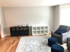
    jbtanyderi - it’s normally positioned a bit more centered between the bay window and opposite wall. I just moved it where it should be.
    So this is how much space it would take if I put the cubes in center and flank with smaller shelves on either side. It actually leaves about 24” on either side.

  • 7 years ago

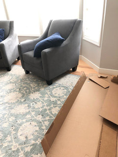
    Just to clarify - I can’t do a bigger rug or it leaves the bay weird. See all that space...

  • 7 years ago

    Maybe turn the rug?


  • 7 years ago

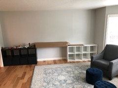
    And this is around the amount of room if I push it to one end... I actually kinda like it offset, but I’m still undecided.

  • 7 years ago

    I had a whole separate thread about the rug size LOL! It’s really tricky because of the bay window. And finally, here’s wall to wall...

  • 7 years ago

    Personally I still like the wall to wall, it just feels more complete/finished. This picture gives you a good feel of how it would look with shelves in the middle if you wanted to do cubes on both sides. If you don’t do wall to wall, I think centered looks better.

  • 7 years ago

    The more I look at it the more I think offset would be weird.
    Oh and regarding turning the rug... I tried that at one point and it was a definite no go. The other reason the room is awkward with a rug is this little bump out. It’s narrower on part of the room, and then opens up wider when you get closer to dining room.

  • 7 years ago

    I vote wall to wall. It will look custom.

  • 7 years ago

    Wall to wall is better in my opinion also ...please bring the rug back where you had it in the first place ..it should be centered in the room and leave the bay window area ..alone .

  • 7 years ago

    Thanks guys!
    skunst2017 - I’m not sure what you mean about leaving window area alone or where exactly you mean about the rug...?

  • 7 years ago

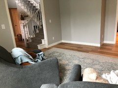
    This kind of shows how the rug is positioned (though it got moved back a little in the early photos I shared.) But when it’s where it’s supposed to be and I’m not pushing furniture around 50 times a day lol, it is centered like this..

  • 7 years ago

    Good luck with your project. Please post a pic when finished. I’d love to see how it turns out, regardless of the positioning and components used!!

  • 7 years ago

    That actually looks really good!

  • 6 years ago

    Thanks Tanya! I'll post again when it's finished. Since my husband has a day job, it could be a while :D

  • 6 years ago

    Now I need to figure out what (if anything) to put in the other corners. I had tried putting a little desk/table there but it felt too cramped. We moved over the old shelving unit for the time being but it will definitely not be staying in this room. I have been thinking a bean bag or two would get a lot of use. So maybe this is a good spot for that??

  • 6 years ago

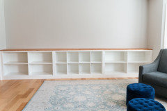
    Here’s our ikea “hack”... 3 Kallax cube bookcases set on a frame to lift to baseboard height, backer boards paint color matched do you don’t see the wall behind, project boards for the faux “butcher block” top, baseboards for a face and at the bottom. I think my hubs did a fabulous job and now I need to decide how to decorate it <3

  • 6 years ago

    Love it. now get fabric cubes or baskets to hide all the school stuff. Add a trio of canvases with larger one in center and maybe a couple plants or larger pottery pieces on the sides. Another cool hack would be a school message board that hides behind artwork or mirrors hinged as doors.