Software
Houzz Logo Print
erinisabel44

Need help with paint color - is Revere Pewter too blue in this room?

13 years ago
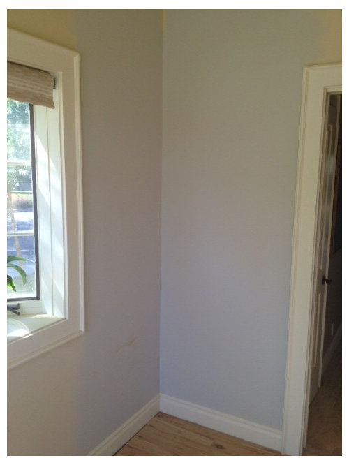
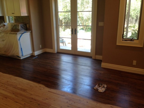
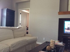
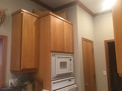
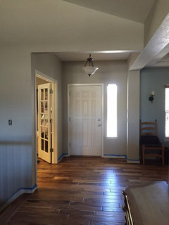
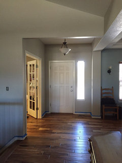
My husband and I just had our floors stained a medium to dark brown color and had planned to also have the walls painted Revere Pewter. I love the look of a light gray/beige wall and Revere Pewter from BM seemed to be exactly what we were going for (in photos we saw online). However, now that we have the floors done, and we have the wall sample up, it just looks too blue. Or is that because of the surrounding yellow color that is currently on the walls? We don't want 'blue' walls... does anyone have any advice or another color that might work here? This color will be going on the walls in most of our house (not the bedrooms) but basically everywhere else. Thanks in advance! I've never posted here, but you all seem to always have great advice and ideas :)

PS - first pic shows the Revere Pewter on top of the old color. second pic shows the new color of the floor. It's a little lighter than that bc the stain was wet when the photo was taken.

Comments (56)

  • 13 years ago
    last modified: 13 years ago
    Howellmsue - we did a small portion in 100% and it seemed really dark. Maybe that was (again) due to the very light yellow currently on the walls? And we actually haven't purchased the paint yet - our painter bought the sample to test it to make sure we liked it before be bought all that we needed. The room in the photo is facing north west... So maybe that is having an impact? If that is the case, should I consider another, more brown color, or do you all think this color will turn out ok? My husband is now saying he will trust me to make the decision but I'm nervous we will do it and it will be too blue! Also to note - the trim is not a true white. It has a tiny bit of yellow in it. Is that the issue?
  • 13 years ago
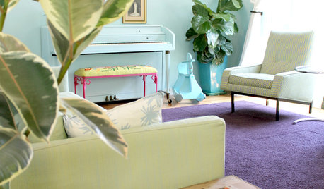
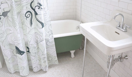
    [houzz=
    Powder Room Transformation · More Info
    ]
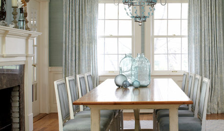
    [houzz=
    Dining Room · More Info
    ]
    [houzz=
    Console Table & Mirror Vignette · More Info
    ]
    [houzz=
    Silver Fox 2108-50 by Benjamin Moore · More Info
    ]

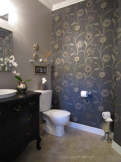
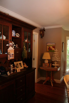
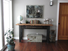
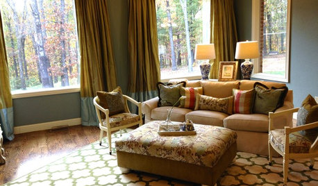
    Three images of Benjamin Moore 'Silver Fox' 2108-50. I have this in my living and dining room - at nights with lights on, it almost takes on a green(towards blue)tint. Daytime it's right in between grey and taupe with no blue or green at all. I love it! But as you can see from the images below, light plays an important role - all 3 say silver fox is the paint but they look quite different from each other!
  • 13 years ago
    erinisabele....the color will change with the time of the day. In the morning the color will seem more blue, in the evening the color will seem more gray. Consider what time of the day you use this room and if it will be more natural light or artificial (lamps). I have a room that is exposed to north, west and south light and it is such a chameleon. The color changes throughout the day- no matter what color I have had on the wall.
  • 12 years ago
    I am having the exact same issue with the Revere Pewter. I only have one coat on my walls but it looks very blue. We have both a west facing and north facing window in that room that might be causing it to look so blue. I was wondering, erinisabel44 what color you ended up with and if you're happy with it. Thanks for any advice!!
  • 12 years ago
    I have Revere Pewter in my kitchen. Def not blue. Must have been mixed wrong. I would take it back where you bought it.
  • 12 years ago
    I painted my west facing living room with both a south and north window, and the color looked very baby blue at both night and morning. I was disappointed and repainted with a light gray-brown. I am thinking I could use Revere Pewter in my east facing room and upstairs hall that gets little north facing light.
  • 12 years ago
    It does look blue in the photo
  • 12 years ago
    Revere Pewter must be a chameleon: the large swatch I got has a green-ish cast. I'd better get a sample can and primer first.
  • 12 years ago
    Just revisiting this post since there were some new comments last week...we actually went with Coastal Fog from BM, lightened to 50% and we love it - it came out a perfect mix of gray and beige. We also repainted all the trim white dove from BM which i think made a huge difference - I didn't realize how 'dirty' the cream trim would make the gray paint color look - everything is so much brighter and cleaner looking now, :)
  • 11 years ago
    Can you post a pic of your new color? Curious as I am having similar issues!
  • 11 years ago
    Update: I ended up painting my entire downstairs in Revere Pewter and am so in love with it. When it was next to my old colors, it affected how it looked. But I tried again and painted all the walls. I am so glad I went for it because it looked so good in many pictures I found online.
  • 11 years ago
    You aren't nuts. I used Revere Pewter and it definitely went blue on me too. My husband walked into the room as I was painting and said "I thought you said no blue". I took photos and went back to Benjamin Moore. The color experts there were stumped. They were scratching their heads at the photos and didn't understand how it could go so blue. They said there is NO blue in the formula! They contacted some other color expert by phone and that person told them it all depends on how the light hits the walls. Natural white light from outside contains blue he explained. Why do we see the sky as blue as an example? It all depends on the angles of the walls where the white light hits. It all made sense to me because I then noticed a part of the room that was completely enclosed, not getting light from the outside, WAS the pewter color I expected. I was very disappointed because photos I had seen of Revere Pewter were exactly what I wanted. Instead, I got a baby blue room. I purposely picked revere pewter because compared to all other grey paint chips it was more warm than any of them.
    So you're not going crazy. I believe you. And cutting it down to 50% makes no difference as long as every element of the formula was cut equally down by 50%.
    Deborah
  • 11 years ago
    And to others who are considering it....... don't rely on just a small spot on the wall. it can change from wall to wall and room to room. Instead, get a very large piece of cardboard. Mine was about 4x5 feet. I primed it first then put the Revere Pewter on it. I carried it from one wall to the next throughout my entire house. That is the only way you're going to know what you'll end up with.
  • 11 years ago

    Recently I read of using good size dry wall for paint sampling, and moving them room to room. Glad you like BM Coastal Fog. Nice gray.

  • 11 years ago
    I would get more samples of grays. Yes the Revere has a lot blue. Try different colors before buying. Colors look different in different light.
  • PRO
    11 years ago
    last modified: 11 years ago

    erin chose her paint m July , it is on the walls.

    I think houzz needs a "The End" , so that when a discussion is over, it is over.

  • 10 years ago

    I painted a large sample of revere pewter in a north facing room. Standing on one side of the sample, it looked taupe. Standing on the other side of the sample, it looked gray/blue! I painted in a bathroom with gray and yellows in the floor tile, and it is beautiful.

  • 10 years ago
    Same issue. Revere looking almost mint green. Looking for another color.
  • 10 years ago

    Ok... So I just spent some serious money on paint and painted the living room , foyer, hallway kitchen revere petwer... And here's my take..

    the first few walls did look blue!! Or greenish , in the living room the more walls I painted the more it all came together and looked amazing, I did a accent wall in dining room raccoon hollow and that was amazing too...however , the dark hallway once all painted looked green! So.... I realized the only thing different from other rooms was the lighting, I upgraded all other areas to recessed led lighting made my commercial electric, but the hallway still had the builders (upside down ugly boob lights) so i went and purchased two commercial electric t67 led lights , the ones that screw to existing junction boxes, and wow! The color is perfect, I know these led lights have a really high color Effeciency so the color is so crisp and clean, not sure if this helps but the led lighting made a huge different with revere pewter and I love it all... Now I just have to trim all doors and windows with some white dove and I'm set

  • 10 years ago

    Nice tip on the commercial electric t67 led lights, rollsayler. thanx.

  • 10 years ago

    Your welcome , I literally just installed them Tonite, and I never am good at leaving reviews but I had to on this, and those lights are a cheap upgrade, like 30$ per light

  • 10 years ago
    We thought about changing the bulbs. But a friend had used beher sculpture clay. Very close to revere pewter but no blue /green. Looks great.
  • 10 years ago


    Just painted entire main area of ranch Revere Pewter...

    (My previous color was a warm gold 90's era)

    When I was sampling on walls looked different at different times so was confused...

    It looks ...light gray ... at times light blue!

    I wanted the warm greige color I see in some photos!!


    Can accessories or things on wall in certain colors bring out the warmth

    Or do I need to repaint?

    What color do you suggest? Is my house light and direction doomed to reflect cold hues regardless of the color?

  • 9 years ago

    2dachs what color did you go with? RP is baby blue in my house

  • PRO
    9 years ago

    The yellow tones of the trim color can be making it look more blue, but also painting directly on top of another color will not give a true rendering. I would paint samples on white foam core so you can see how it looks on different walls. My last bedroom was revere pewter and it was very warm! Good luck!

  • PRO
    9 years ago

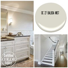
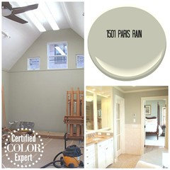
    Revere Pewter has a green tone rather than blue and is known to be a greige or gray/beige. I would double check that you have the color you asked for. If you like the green undertones try Benjamin Moore Paris Rain - it looks great with wood or even Balboa Mist which is fantastic with wood finishes

  • 9 years ago

    Old thread!

  • 9 years ago

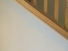
    I'm painting my entire downstairs in Revere Pewter. Here is a pic of where I have painted a 2" edge along the stairs. Very baby blue. I painted a half bath with no sunlight and it's almost a sage green. My kitchen looks sage green at times, blue at other times, and gray on occasion. I've painted the ceilings Simply White (a BM warm white). Unfortunately, my husband won't allow all the red oak trim in the house to be painted, so I was banking on the RP to give a nice contrast to the red oak

    The old color I'm painting over is a pinkish beige. I'm hoping once all the pinkish beige is gone in these rooms (open to each other) that it will appear more true RP. I have 12 gallons of Revere Pewter so I'm invested and will have to take however it turns out. Definitely the areas exposed to light from the North are the most blue. The main living has a bank of south windows and the largest 20' tall walls tested as more beige/gray (not painted yet) and hope they influence the baby blue notes that I'm getting on the North walls of that room.

  • 9 years ago

    Blue will remain - revere pewter is not good when you have red oak. You want a warm gray / nearly taupe undertone with the red oak tones. Try nimbus or Collingwood for the tone that you desire against the wood.

  • 9 years ago

    I read a lot of articles by different designers recommending Revere Pewter with red and orange oak. It has the sage undertone I'm wanting on most walls which is nice with the oak. It makes it pop. It's just the two walls exposed to North light that has the blue tone. Unfortunately there is no changing colors after purchasing 12 gallons of RP.

  • PRO
    9 years ago
    last modified: 9 years ago

    I love how older threads with great insights remain relevant on this forum! Four years later and Revere Pewter is still a topic people care about.

    If you see Revere Pewter as "greige", a warm gray, bluish, greenish or even blue-green, you're right. That doesn't mean it was mixed wrong.

    Because Revere Pewter is one of those chameleon colors it's a good reminder that referencing a paint color formula to determine how a color will look does not work. Technically it's called color constancy (not metamerism) and some colors have "DNA" that makes it more constant under different light sources. While other colors, like Revere Pewter, are not very constant and will shift and play in the light more.

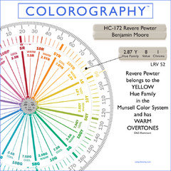
    FWIW, Revere Pewter belongs to the yellow hue family. Because of where it 'lives' on the color wheel, and based on a quality of light that is indirect and looks like daylight around noon, we know it's not unusual for it to look blue, green or blue-green in certain qualities of light. Change the light from a super balanced quality of light like I mentioned, and Revere Pewter will shift. (everybody knows, change the light, you change the color)

    For the other color geeks and freaks out there, here are the numbers for Revere Pewter illustrated on a color wheel:

  • 9 years ago

    The same thing happened to me , we painted our cupboards Gray Owl, and they are on that bluish tinge, so now after many samples we have decided to paint our walls with Revere Pewter diluted 50% to now tie in with the cupboards, exhausted

  • PRO
    9 years ago

    Awww, deba51, I'm so sorry that happened. :( Sounds like you've figured out a solution tho. It is exhausting. Hope it works out for you.

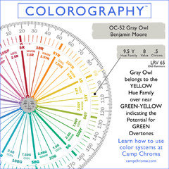
    Here's the spectral data for Gray Owl too. I've seen many on this forum say Gray Owl is a "true gray". It is not a true gray inherently. If it looks true gray it's because of the quality of light. Gray Owl can definitely have greenish overtones that may look blue-green or aqua.

  • 9 years ago

    So...pros...what color will look like RP, go with oak trim and not look blue at all?

  • PRO
    9 years ago

    Ha! Jen, that's not an easy one to answer. The best way to figure out what color will look like RP with your oak trim and not look blue in your space is to analyze what has happened with colors you've already sampled.

    What have you tried so far?

  • 9 years ago

    Well I thought for sure BM natural cream would work. We painted a whole wall to test it out and it looks blue in natural light

  • 9 years ago

    This happened to us when we painted Eider White. Our mouldings are off white and waiting to be painted bright white but the yellow tone of the moulding made our greyish white look purple until we got them repainted the bright white.

  • 8 years ago
    I have Revere Pewter is much of my house. It's not blue in any shape or form. And, I've got 3 stories and multiple light types. If anything it's green. I've been told it has a green undertone anyway
  • 8 years ago
    Yes.
  • 8 years ago
    I would say a warm gray that is cozy and inviting
  • 8 years ago
    It looked blue in my home too. Depends on the light unfortunately
  • 8 years ago
    It looked blue in my home too
    Depends on the light and direction House is facing I am told
  • 8 years ago

    I just painted my kitchen wall and Revere Pewter came out looking Blue also. I will get a sample of the Coastal Fog as I just painted my cabinets White Dove. Thank for the tip. I hav been freaking out for a few hours. Haha

  • 7 years ago
    last modified: 7 years ago

    Just painted RP..walls looks,light blue... 2 story walls in living room ….I hate it :(

  • 7 years ago

    Oh geesh. Was just getting on the Revere Pewter train but I definitely don't want it to show as blue. I have a whole house to pick one color for and know whatever I pick will look different in different lights. I see Green in my RP sample but if I got it on my walls and saw Blue - it would be a shock. Back to the drawing board, I think.

  • PRO
    7 years ago

    Just because it looked blue in someone else's house does not mean it's going to look blue in your house.


    Anecdotal color advice is well-intentioned but rarely useful.

  • 7 years ago

    Hi, Erin.. maybe a functional spin might set your mind at ease. You were sick of the old color and one day you might be sick of the new color no matter how 'perfect' it seems today. If its a high sun exposure area maybe you should go with whats natural and head toward a grey-yellow wash. Based on the stain, my gut says go with a 'black n tan' for color contrast.


    On the yellow side.. No matter what you decide its not like you can't repaint your room 5 years from now. Part of owning the color is owning the reason you chose it; even an excuse to repaint; including a fabulous disaster. I'm opting the nudge to help you think outside the box because.. ... pulling out your hair on fifty types of eggshell just isn't worth it. Since its a 2014 post , its probably decided by now..


  • PRO
    7 years ago

    Revere Pewter has a green undertone to it and can read as green or even blue in certain circumstances, paint a large white piece of paper with the color but leave a border of white around the sample and then try it in different spots throughout your home, especially in the darker corners to see how it reads. If you don't have the white edge you will only ever see how RP works with the existing color on your wall, you need the strip of white so you can step back and see how the color looks properly. I did make a comment earlier, instead of Revere Pewter try Edgecombe Gray, its a green gray and is a great universal color, if you put it with a lot of fresh clean colors it will read a warm gray, if you put it with a lot of woods and brown it will read as a greige but would be a great color for the whole house.

  • 7 years ago

    Thanks, Lori. I won't write off Revere Pewter yet. I like the warmth of it. I was all set on Agreeable Gray but when I put these two together, AG looked so muddy and cold. So I'll keep it on the list to try when it comes crunch time to pick paint. And I realized after the fact I was the one commenting on an old thread. Sorry guys.