


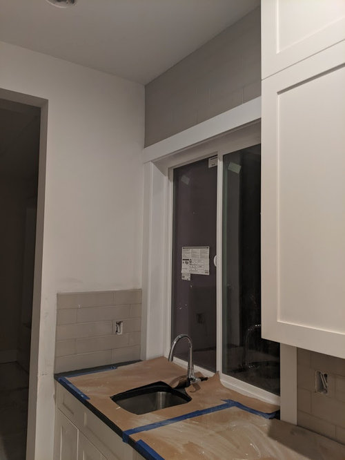
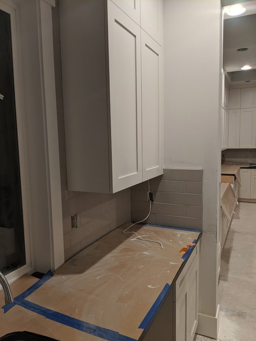
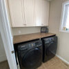
Backsplash tiles on butler pantry looks weird?
Mikey
4 years ago
last modified: 4 years ago
Featured Answer
Sort by:Oldest
Comments (9)

Jora
4 years agocolleenoz
4 years agolast modified: 4 years agoRelated Professionals
Vienna Kitchen & Bathroom Remodelers · Alexandria Flooring Contractors · Kansas City Flooring Contractors · South Peabody Flooring Contractors · Bonney Lake Architects & Building Designers · Everett Kitchen & Bathroom Designers · Murray Furniture & Accessories · Country Walk General Contractors · Dallas General Contractors · Rowland Heights General Contractors · Villa Park General Contractors · Beavercreek Kitchen & Bathroom Designers · South Barrington Kitchen & Bathroom Designers · Fort Pierce Kitchen & Bathroom Remodelers · Reading Cabinets & Cabinetry
daisychain Zn3b
4 years agolast modified: 4 years ago PRO
PROHALLETT & Co.
4 years agoherbflavor
4 years agomakmartell
4 years ago
eam44
4 years agolast modified: 4 years ago
flopsycat1
4 years ago
Related Stories
KITCHEN STORAGEWe Can Dream: 40 Beautiful Butler’s Pantries
These stylish butler’s pantries are the ultimate accent piece for any dream kitchen — butler not included
Full Story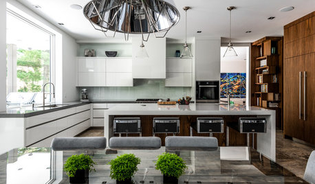
KITCHEN DESIGNA Butler’s Pantry Helps Serve Up Big Family Meals
High-gloss cabinets, hidden storage and warm wood make this kitchen beautiful and functional for entertaining
Full StoryKITCHEN DESIGNKitchen and Butler’s Pantry in White, Wood and Blue
Having a separate public-facing kitchen and a hidden space for baking and prepping hors d’oeuvres works for this family
Full Story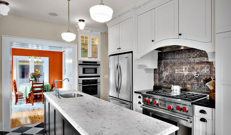
KITCHEN DESIGN8 Statement-Making Kitchen Backsplashes Beyond Basic Tile
Look to metal, glass and even wooden crates for an attention-getting backsplash that might even save you some money
Full Story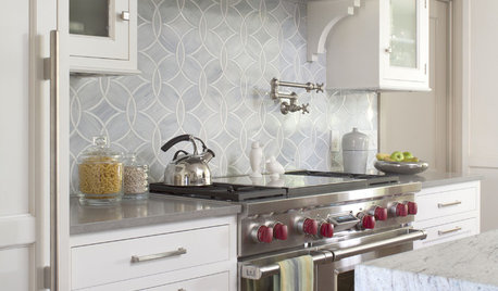
KITCHEN DESIGN8 Top Tile Types for Your Kitchen Backsplash
Backsplash designs don't have to be set in stone; glass, mirror and mosaic tiles can create kitchen beauty in a range of styles
Full Story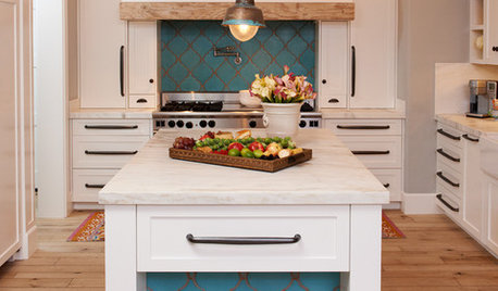
KITCHEN DESIGN10 Gorgeous Backsplash Alternatives to Subway Tile
Artistic installations, back-painted glass and pivoting windows prove there are backsplash possibilities beyond the platform
Full Story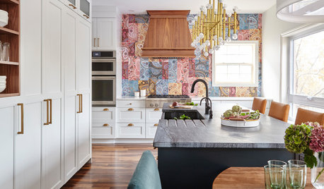
KITCHEN DESIGNPaisley Tile Backsplash Takes This Kitchen to a Whole New Level
The remodeled Toronto kitchen features a soapstone-topped island and a bold backsplash that makes an impression
Full Story
KITCHEN DESIGNDesigner's Touch: 10 Butler's Pantries That Bring It
Help your butler's pantry deliver in fine form with well-designed storage, lighting and wall treatments
Full Story
KITCHEN DESIGNThe Modern Butler's Pantry
Carve Out a Space for Today's Extra Serving Prep, Storage and Bartending
Full Story
KITCHEN DESIGNGreat Space: The Butler's Pantry
Be your own butler and bartender with a mini prep, storage and serving space off the kitchen
Full StoryMore Discussions


JAN MOYER