Software
Houzz Logo Print
mxk3

Rant: SW paint chips

6 years ago
last modified: 6 years ago

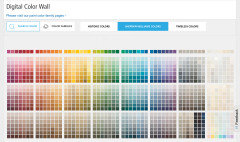
What the h*ll happened here? I went into the store to pick up a couple color strips to take shopping with me, and I'm faced with a wall of individual chips. Which is fine. Except it's extremely difficult to easily go a shade up or down and ensure the right undertone like you can with strips, have to hunt for everything, it's just a sea of chips. I have the old paint deck at home to refer to and knew the name of the first color on the strip, which I was able to find in this mess, but I couldn't remember the names of the other colors on the strip, which is what I was looking for. So I go to the counter and ask the guy for the paint deck -- it's not arranged that way anymore either. AAARRRGHH!! I asked him how the chips are arranged on the wall, thinking he could help. His answer? "There's no rhyme or reason to it". WTF #!*!&! I gave up and left.

Is there really no rhyme or reason to this anymore? Or have any of you cracked the code to the SW wall of chaos?

I'm not letting that old paint deck out of my hands, its value to me just increased exponentially...

Comments (40)

  • 6 years ago

    Same issue here. The Sherwin Williams chips are difficult to see hue variations when not in the deck. Head over to Benjamin Moore would be my suggestion.

  • 6 years ago

    ^^ I have the BM paint deck too :0p

  • 6 years ago

    Ask for the deck..? I got to look at one when I asked.

  • 6 years ago
    last modified: 6 years ago

    That’s an irritating development. I bought two SW paint decks about five years ago - I guess I’m lucky. At SW online things are sill arranged the way you want to see them, so try looking there.


    You can also still buy SW paint decks. You should have been able to borrow one from the store, or purchase one from the store or online. I’ve even seen them on eBay. They also have downloadable color files online.

  • 6 years ago
    last modified: 6 years ago

    The paint decks have changed, too -- they're not arranged in the same logical manner anymore, it's too confusing to use. Which is what raised my pissed-offedness level (well, actually it was the unhelpful, "so what" attitude of the counter clerk). So like I said -- hanging onto that old paint deck for dear decorating life.

  • 6 years ago
    last modified: 6 years ago

    Sherwin-Williams is a Cleveland company, and I’m a Cleveland girl. Their products have never let me down, but if you’re having trouble finding the color you want, perhaps instead of a rant, customer feedback would be more useful. Have you contacted the company?

  • 6 years ago
    last modified: 6 years ago

    Um...Lori -- I've been a homeowner (and thus painting) for 25+ years, looking at colors in a paint deck is not something I do because I read it recently on a blog. And I disagree that paint doesn't have an undertone. Look, I'm not going to claim to be a color "expert", and I don't know what the technical term is -- so I'm calling it an undertone here -- all I know is some colors clash horribly. White is not just "white", beige is not just "beige" --- put a beige with a pink tone and a beige with a green tone together and the room looks like puke. I'm not saying I've never made a bad paint decision, but they are few and far between.


    A sensibly laid out paint deck/chip system is invaluable in narrowing down color choices prior to final in-home sampling and choosing coordinating colors, and those strips DO go together -- e.g. SW 6070-6076, all on the same strip in the old paint deck, *will* unquestionably go together - same tone and no clashing (when I re-did the family room at my other house I used three colors on that particular strip and they flowed seamlessly into one another; just an example). Why muck things up by changing this simple, user-friendly arrangement of strips? Sure, the old paint deck also has some strips that aren't arranged that way, but the bulk of it is and it's just so much easier.


    But yes, I do agree -- there is subjectivity in terms of how individuals interpret color and how color looks in a specific room. I always paint sample boards before committing -- I don't want to pay the painter twice.

  • 6 years ago

    EAM44 -- I've used SW for years and will continue to do so, I'm not griping about the quality of the paint, I'm griping about the nonsensical new "system" they came up with. Although there probably (? maybe) is some sort of sense to it -- but what it is is a mystery to me at this point.


  • PRO
    6 years ago

    mxk3,


    It's weird time right now and paint and color world.


    The new color tools are disruptive. Started about 3 years ago.


    People are asking questions that haven't been asked before and challenging theories that have never been challenged.


    It'll be interesting.

  • 6 years ago
    last modified: 6 years ago

    mkx3, the point of my post was that you’re ranting to us when you should be providing customer feedback to the people who can actually do something about it. Take a minute, fill out the form. You might spur a resurgence of the beautifully arranged wall of color - or even the fan deck. You never know.

    I agree a good paint deck is useful. And Lori, most of us know that an individual paint card rarely depicts a change in saturation alone - but we experience this instinctively when we see the wall of color or view the paint card on a deck.

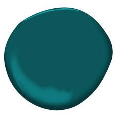
    Beyond that, the details of each color are specified online. The color I paint my shutters is SW 7618 Deep Sea Dive. Looking at the RGB values it’s clearly a blue with a lot of green in it [a lay person might call this a blue with green undertones - but who really cares about that? Color isn’t the only science in which lay people use inaccurate terminology.] I didn’t search for a blue green, I picked it from a perfectly arranged, traditional wall of color. Saw it, loved it, had it on my shutters the next day.


  • PRO
    6 years ago

    Looking at the RGB values it’s clearly a blue with a lot of green in it


    RGB Values are instructions that tell a device that lights up (like your phone) how much of each red, green or blue channel of light to light up to mimic an in real life color.


    RGB Values don't model how humans perceive color. They don't define or describe color appearance.


    This is a perfect example of what I'm talking about.


    Technical color information is being shared more and more because the people who know how to use it, want it.


    Sherwin-Williams includes RGB values for designers who are making mood and concept boards and are creating digital swatches - they actually have digital color palettes you can download.


    But there are a bunch of people who don't know what this information is.


    It's not a matter of terminology or semantics.


    It's a matter of mangled misinformation that everyone has molded into a color story that makes sense to them - individually.


    The technical, the science color world is organized and repeatable because it has to apply globally - the complete opposite of individually- because that's the only way to make color into tangible product. In volume.


    There's not a lot of alignment between the two.


    Never has been and honestly, it's never really mattered.


    Until innovation in color and design tools started happening.


    Like I said, it's weird and it will be interesting to see where it goes.

  • 6 years ago
    last modified: 6 years ago

    Lori - I'm interested to learn what you mean by new color tools and how these are changing things. (edited: you posted before my post submitted, I did see your post above -- is that what you mean by tools?)


    Eam44 -- that color is right up my alley, I imagine the shutters look beautiful! Right now I'm narrowing down choices for a bathroom vanity, I'd love to use BM Beau Green but afraid it might be too dark for the small bathroom with no natural light. Will play around with sampling after the holiday this week. I know I love the color because I originally thought of painting the walls that color and did a big sample board but switched gears and decided to keep the wall light because the room is so small. But dang this is a stupendously beautiful color.


  • PRO
    6 years ago

    I'm interested to learn what you mean by new color tools and how these are changing things.


    All colors are born in theoretical color space.


    There isn't a team of human artists creating tens of thousands of colors by hand/eye. That's not realistic considering the volume of color that needs to be made for various product - like paint.


    In other words, all colors are a kind of code first.


    We use that code for all kinds of stuff - like to formulate the formula.


    All of it involves measuring color.


    The science of measuring color is called colorimetry. It's the science of quantifying how the human eye sees color.


    *Sees color* is important because we can't confuse that with attempting to quantify how humans *experience* color.


    Versions of color lab instruments that are used to measure color (and cost thousands of dollars) have migrated out of the color labs in the form of affordable hand-held devices.


    Technology that has never been accessible to regular folks like you and me.


    Now it is.


    Products like: Color Muse $60, NIX $99, ColorReader $149.


    Anybody can get one of these devices and measure any color they want.


    I think all of them are on Amazon now.


    The devices have apps. They work with your phone/tablet.


    When we measure a color with one of these devices, the device captures the original color code and displays it on your phone/tablet.


    It's amazing and kind of a big deal.


    Because that means the same color code information that defines and describes color and is used to MAKE color, is now easily accessible to everyone.


    Think of that code as color DNA.


    And what that means is all the homespun kind of theories and methods that people have literally made up in an effort to explain color - the best they could - is being challenged by this very clear and simple, original color DNA information.


    The undertones theory falls apart as soon as you ask under what light source is the undertone determined.


    The color strip theories are easily proven wrong because we can measure each of the colors in seconds and prove if they do or do not all belong to the same hue family.


    Where do we go from here?


    The framework of color DNA (which is hue, value and chroma) is simple, logical and orderly.


    But it's something most people have never heard of.


    That's what makes it disruptive.

  • 6 years ago
    last modified: 6 years ago

    "Anybody can get one of these devices and measure any color they want."

    "When we measure a color with one of these devices, the device captures the original color code and displays it on your phone/tablet."


    But how would Joe Blow average homeowner actually make use of this information? IMO - another needless app people think they need but actually don't. Still need to sample that paint in your own home in the specific room/lighting conditions to be able to judge if you like it, if it's "right". Not talking about designers or graphic arts people here - just the average dude off the street. Having fancy-schmancy technology isn't going to make a difference, people will still get their decorating choices wrong (or right), just like they always have. And, still need to go to the paint store to mix the paint anyway -- So if someone wants to color match something, they can just have the store do it. And trying to recreate something from an image (on-line or in print) is a crapshoot, it's never going to look the same as the pic because the conditions of the finished product will be different.

  • PRO
    6 years ago
    last modified: 6 years ago

    You know, you're absolutely right.

    I think you should fax in your thoughts about undertones and the way the fandecks and displays are put together these days directly to the paint brands. I'm sure you can find the fax numbers in the yellow pages.

  • 6 years ago

    So, RGB values tell you what it IS, they don’t tell you what it’s going to look like to anyone else. Color acuity varies a lot among individuals, but knowing the numbers helps tremendously.

  • PRO
    6 years ago

    Well said Lori.

  • PRO
    6 years ago
    last modified: 6 years ago

    So, RGB values tell you what it IS, they don’t tell you what it’s going to look like to anyone else.

    RGB Values tell a device that lights up, like a phone, tablet, computer or even a TV what proportion of red, green and blue lights need to light up and mix together to mimic an in real life color.

    Outside of a device that lights up, RGB Values have no meaning. No application.

    This video explains it in more detail.

    And, yes, understanding color data values that define and describe color is incredibly useful. Absolutely.

    The data values - or notations - that DO define and describe how a color actually appears in real life to a human being is hue, value, chroma and LRV.

    There are few others too, but hue, value, chroma and LRV are the four basic and most handy.


    ETA jump ahead in that video to 2:40 to get the RGB stuff.

  • 6 years ago

    "The framework of color DNA (which is hue, value and chroma) is simple, logical and orderly.

    But it's something most people have never heard of."

    ^ THIS ^

    Unfortunately, talking about color often just turns into total nonsense, because most people do not understand the basic parameters of Hue, Value, and Chroma, so there's really no way to have a meaningful conversation about it.

    As for the SW color system, the last one that came to our office sits there collecting dust. We can't even figure out how to locate a color we know!

    Thanks @Lori A. Sawaya for the enlightening comments!

  • PRO
    6 years ago

    As for the SW color system, the last one that came to our office sits there collecting dust. We can't even figure out how to locate a color we know!


    I avoid pulling a chip out of that thing because it takes forever to figure out where to put it back.

  • 6 years ago

    "I avoid pulling a chip out of that thing because it takes forever to figure out where to put it back."

    Right??? I keep thinking "I should call the rep to come in and explain how to use it," but then I imagine I'd be trapped in one of those meaningless color conversations again. I think we may be missing the palette grid or something like that. Without the roadmap, there's no way to figure out where things are located. I just looked up on the SW website "how to use the Colorsnap Design Pro Suite." It is mindbogglingly complicated, and I'm generally pretty good at figuring out a system.

    I did not know BM Preview was that old! It's intuitive, that's for sure. And with the BM Classic alongside, I can generally get where I need to go. The last fan deck we got from Farrow and Ball also seems to be set up in some mysterious order--not numerical, not alphabetical, and there's no other clue to the sequence. Oh well.

  • PRO
    6 years ago
    last modified: 6 years ago

    Yep.

    Color Preview colors are more or less formulaic steps from darkest to lightest. Which is why the fandeck looks so orderly.

    The Classic Color collection is almost as old - maybe 25 or 30? The colors were curated by the BenM Color Manager at the time. Which is why this fandeck's order is so random - especially in comparison to to Color Preview.


    I took the F&B deck a part and put it order by color number. Worst "color tool" ever - also no LRV info.

  • PRO
    6 years ago

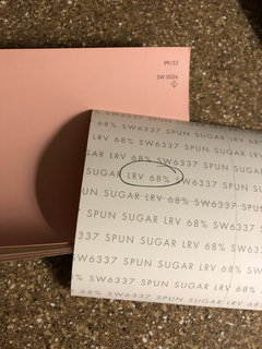
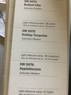
    You need only remember one thing. Paint companies are selling paint! Lol. BUT, the public is getting more and more educated and have access to so much more information, and from great experts like Lori, that they are beginning to realize they need to get on board. SW finally added LRV numbers on their paint decks. Etc. The leaders will push others as more and more buyers demand this information.

  • PRO
    6 years ago

    Yes, LRV on the back of SW paint chips is very helpful. Maybe next step is adding the other 3 basic color attribute info, hue, value and chroma! :)

  • 6 years ago

    "I took the F&B deck a part and put it order by color number. Worst "color tool" ever - also no LRV info."

    OMG I need to do that! I've already made my own Franken-fandecks out of the medium size samples which only include the "good" colors. They're actually quite helpful, especially because our clients are often past the point of decision fatigue by the time we get to paint. Now I just need a paint chip sherpa to keep them all in order ;-)

  • 6 years ago
    last modified: 6 years ago

    "I think you should fax in your thoughts about undertones and the way the fandecks and displays are put together these days directly to the paint brands. I'm sure you can find the fax numbers in the yellow pages."


    Ouch! That was not very nice. You pros upthread can banter about all you want -- I'm just the nobody consumer who buys the paint, and the chips and decks have served me well. There's no need to resort to insulting people.

  • 6 years ago
    last modified: 6 years ago

    And it is your post mxk3. It’s so funny to me when people post with no intention of helping, they just want attention or they have a pet peeve you just meandered into. My own pet peeve is when the marginally capable try to pass off their incomplete understanding of their own trade as science. But that’s me. This thread is about you.

    I love Deep Sea Dive, BTW, and the house looks gorgeous with it. One of the great things about paint is that you can get a sample, try it out, then try something else if it isn't right. A color consultant can help with that, but heaven knows they’re not really necessary. It isn’t rocket science. Have fun with it.

    Let us know what you pick.

  • 6 years ago

    I bought a Nix after researching white paints and reading a boatload of Lori's posts/website and watching her videos. It's fascinating! I already knew about LRV, but knowing more about chroma/hue helps a lot in searching for paint for north facing/low light spaces. One day I'd love to take your class Lori A. Sawaya!

  • PRO
    6 years ago
    last modified: 6 years ago

    My own pet peeve is when the marginally capable try to pass off their incomplete understanding of their own trade as science.

    Oh, I absolutely agree. The internet is rampant with misinformation.

    I recommend staying away from "color expert" blogs and YouTube videos in particular. Most of them just copy and paste the same misinformation from each other and try to reword it a little so it doesn't look like they're all copying and pasting the same misinformation from each other.

    All we can do is meet the misinformation with correct information and terminology so those who want to make the effort can go educate themselves.

  • PRO
    6 years ago

    Ouch! That was not very nice.


    Yeah, you're right. Sorry.


    Was meant to be funny but I know better. Takes a special knack to convey humor online and I'm not good at it.

  • PRO
    6 years ago

    Hi Lori, I have a question a bit off-topic.

    Aren't LRV and Value pretty much the same? As in, the lighter a color's value, the more light is reflected, correct? So don't they move in the same way, and why do we need 2 data points for the same idea?

  • 6 years ago

    Thank you, Lori - I appreciate that :0)

  • PRO
    6 years ago
    last modified: 6 years ago

    Oh, that's another good question, Diana. Happy to answer.


    It's super simple so it's even better.


    Science stuff first:


    LRV and Luminance are the same thing.


    In color science terms it's called CIE Y. If you do any research on your own, you will see CIE Y often.


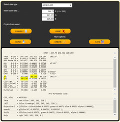
    How it's useful and easy for everyone - CIE Y is in the data values page for each color on EasyRGB dot com. Let's say you want to look up a paint color's LRV. For example Farrow & Ball doesn't publish that info. I don't think Behr does either?


    Here's what to look for on EasyRGB. It's only the capital "Y"s I highlighted - not any of the other ones. This is Farrow & Ball's Pointing. Its LRV is 88.136.


    Value is a function of CIE Y (also known as LRV and luminance.)


    The equation is a cube root function with an offset. L* = 116(Y/Yn)^(1/3) - 16.


    Don't ask me to explain anything about the math, lol! I only know what to do with the results.

    Plain English version:


    LRV is a quantity. A percentage that tells you how much light a color reflects from a surface. It runs from 0% Black to 100% White. Awesome for managing visual ergonomics and lighting design.


    Value is a visual judgment. We use a gray scale chart to visually judge what a quantity of light reflectance (or luminance) looks like. A gray scale chart like a Munsell Value scale is a tool that helps you understand a color's appearance.


    Both color data values, LRV and Value, are a handy framework that helps you anticipate how light or dark a color will look in a space.


    They're especially useful for comparing colors - easily. Without having to shuffle paint chips and stare at them til your eyes feel bent in half.


    Let's say I have F&B's Pointing on my walls right now and I know I want a change to a darker paint color I'll use Pointing's LRV of 88 as a benchmark.


    I will only consider paint colors with a lower LRV than 88 to ensure I get a darker color.

  • PRO
    6 years ago

    Thanks, Lori, I think I get it now.

  • 6 years ago

    While I have just read this thread and found it most interesting it probably won’t be very useful to the average homeowner. Probably the worst place to choose a paint chip is in the store! Next time ask to barrow the fan deck and take it home( they will let you sign it out). They have a newer, larger selection as of a couple years now so if you have the old fan deck ask to use the new one. What I find most confusing about SW is their numbering system. I have their large designer kit and I can never find anything in it! Only after viewing the colors at home should you get larger, individual samples. At this point you can go back to the store and drive yourself crazy trying to find the ones you like from the thousands on the racks! This is were the # problem comes up! You will need the # as the color won’t look the same in the store and you can look forever!!!

  • 6 years ago

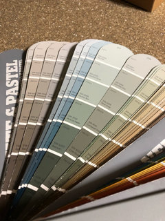
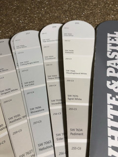
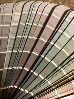
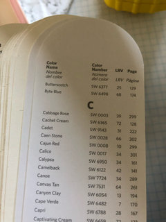
    Here is a pic of the new fan deck; it may appear the the color “ gradations “ that you are wanting to make your selections are here but do take a closer look. There is a lot more variation so don’t always trust the color strip. I do like my old fan deck as the grays are in one section and easier to find! The large color samples from my kit have the LRV on back( these are rather old!)

  • 6 years ago

    Btw, the old fan deck had more info on the back of the paint chips for anyone who actually wanted to use it! The new one does list the LRV on the back of each color as well as in the index. I’m sure the cost of producing the multi color strips may be part of the reason they no longer do it. Better to isolate your desired color anyway to get a feel for what you may like.

  • 6 years ago

    Ooh - hey, I got this Information from SW for you. Hope it's helpful.


    Thank you for reaching out to us to share your comments. We appreciate the opinions of our customers, and your comments have been forwarded to our marketing department for review.

    The colors are now grouped by color family, which was intended to make selecting colors easier for new projects. If you are seeking any color advice, we also have a team of color consultants on hand to assist you. If you wish, you can talk to our Color Support Team directly. They have a team of experienced Color Experts that can provide the advice you are looking for. To reach them please call our Customer Service line at 800-474-3794 then hit option 3 and option 3 again. This will get you directly connected to our Color Support Team. The team s available M-F from 8:30-6 pm eastern time and Saturday from 9:30-5:30.

    Lastly, if you find a color on our website that you are interested in, the color information shows where the color is located on the color wall. I have provided a sample link below:

    https://www.sherwin-williams.com/homeowners/color/find-and-explore-colors/paint-colors-by-family/SW6108-latte#/6108/?s=coordinatingColors&p=PS0

    Thank you again for reaching out to us and have a wonderful week!

    Appreciatively,
    Calli
    Sherwin-Williams Customer Service

  • 6 years ago

    ^^ Thank you, eam44.

Sponsored
Mary Shipley Interiors
Average rating: 4.8 out of 5 stars34 Reviews
Columbus OH Premier Interior Designer 10x Best of Houzz