Software
Houzz Logo Print
patjenjoe

Cabinet color help

6 years ago

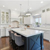
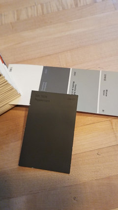
Im renovating an old farmhouse and would like to use peppercorn by sherwin williams as my cabinet color, but paint the island watery by sherwin. Too bold? floors will be light oak, walls mindful gray by sherwin. Thanks for your help! Originally was going to do dorian gray for island, but kinda want some color...

Comments (54)

  • 6 years ago
    I just did Eternal Serena. it's matte, but they do have a polished (I haven't picked a splash tile yet!)


    they make it in a charcoal too!


    if you want a real looking concrete, my stone place had this quartz slab that looked like concrete.


    oh, I love Naval too. with gold accents.

    Or, Hale Navy, Hague Blue, Gentlemans Gray, Cyberspace or mine, Wrought Iron.

  • 6 years ago
    Beth...awesome!! Thanks so much for your help!


  • 6 years ago

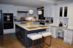
    Beth...love your kitchen!

  • 6 years ago
    last modified: 6 years ago
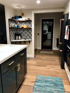
    thanks! not done yet!


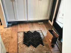
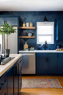
    I have a black herringbone zellige tile inlay going in front of that door.


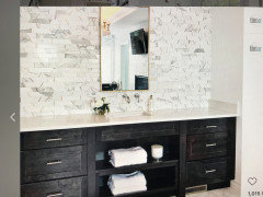
    (soon as I get around to doing it! I just finished tiling the coffee bar) and thinking about this for the splash. you like any of these?

    the two on the left,,,


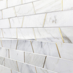
    hard to see, but it's calacatta w/brass


  • 6 years ago

    awesome...love your fixtures over the island too!

  • 6 years ago
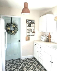
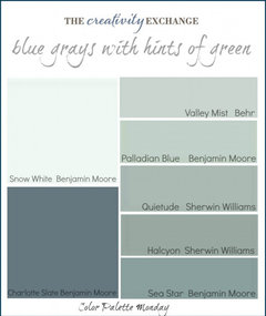
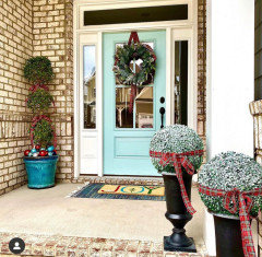
    I love a blue island. My front door is Watery. My island is Interesting Aqua. The thing about Watery is it is vibrant and it can be even more so depending on the lighting. Peppercorn is a “dusty” color and because of that the watery my show REALLY bright. Have you considered a more subtle color like Quietude?

    Patty McNamara thanked pink_peony
  • 6 years ago
    I love quietude!

  • 6 years ago
    Beth H,
    I just love the combos you come up with. And your kitchen is wonderful. You are my tile She-ro!

  • 6 years ago
    I think this picture of the quietude is showing green. But you will get the idea.


  • 6 years ago

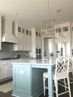
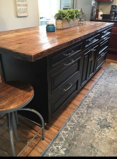
    This is my island

    My kitchen · More Info


  • 6 years ago
    last modified: 6 years ago

    why thank you JjJ!


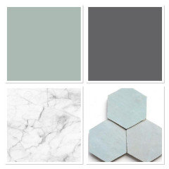
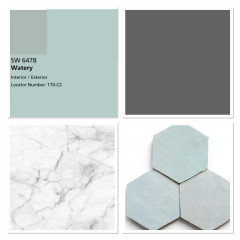
    watery is perfect w/those CleTiles


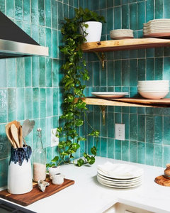
    I think these lean a bit more on the green side


    Patty McNamara thanked Beth H. :
  • 6 years ago

    pink_peony...love it! So pretty!

    Do you think too much contrast with dark perimeter cabinets...really wanna do a charcoal gray color...I'm limited to colors because I'm using mp campbell...


  • 6 years ago

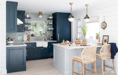
    patty, you like this combo?


    Patty McNamara thanked Beth H. :
  • 6 years ago
    last modified: 6 years ago

    yes...very much Beth!!! Any idea on colors???

  • 6 years ago
    last modified: 6 years ago

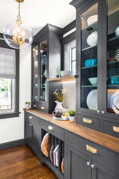
    So do I. looks like Gentlemans Gray and a very light blue/gray. I love this kitchen.

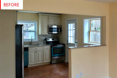
    here's the before


    https://www.brightbazaarblog.com/2017/10/beach-house-kitchen.html


    Waterworks paint brand? Cosmos and Decoy are the colors

  • 6 years ago

    Oh my goodness...thanks so much Beth!


  • 6 years ago

    Patty I think it depends on what style farmhouse you’re doing. The term is used loosely now. Modern , french country, classic, transitional are a few terms that can all coincide with the word farmhouse now.


    watery IRL beautiful color but it’s bold and not subtle.

    when I hear farmhouse I’m wondering what is the age of the home? What are it’s architectural features? how High are the ceilings? What is the lighting like I’m the space. Do you have any photos you can share with us?

  • 6 years ago
    last modified: 6 years ago

    Um. hello?


    Patty McNamara thanked Beth H. :
  • 6 years ago

    I would not do naval with peppercorn. They would fall flat against each other.

  • 6 years ago

    Thanks so much for all of your help! Be back in the am...ready for bed:) So appreciate all your help!!

  • 6 years ago
    last modified: 6 years ago

    yeah, no,,,not the two darks together.

    I like the Naval w/a white, the Peppercorn w/the soft aqua, soft gray or a white, or I like the two in the before/after, above Cosmos/Decoy.

    Pink,,real quick,,,you like these lamps? (sorry patty!)


    31.5" brass or the black base

  • 6 years ago

    Beth...I like the black base...:)

  • 6 years ago

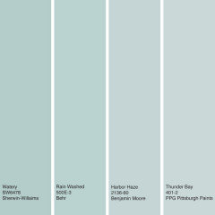
    I agree with the advice above to check Watery. Get a sample pot and paint a piece of foam core board. I thought it came out a little toothpaste-y. Compare it maybe to Rainwashed and Tradewinds, as well as BenM Palladian Blue and Woodlawn Blue.

    Patty McNamara thanked Holly Stockley
  • 6 years ago

    You know how the paint stores often have the paint color displays where the brightest colors are on top, then the second area is a bit less brilliant and the bottom row is muted, more washed out colors.


    I almost always use colors from that bottom row for large surfaces, moving to the second area for some furniture.


    The reason is that when you paint a large area the amount of color you see is multiplied by the square footage it is covering. All of a sudden white becomes green or gray becomes blue or taupe becomes purple.


    I love the use of color on an island and repeating the color in the back splash and adding flowers, art or chair seats in the dining area with the same color. My honest opinion is that watery will be too bright. I think it will feel jarringly bright and you would do better with a softer version of the same color.


    The only way to know is to look at large samples of the color. For this I would use at least a 24" x 24" sample to really get a feel for what it is going to look like in the space.

    Patty McNamara thanked Jennifer Hogan
  • 6 years ago

    I like this as well...door color on island, charcoal on perimeter https://pin.it/ml7o3gritl2xmy

  • 6 years ago

    @Beth H. :yes! I do like the lamps! I thought you had already found some? How is the backsplash choice coming along?

    Patty McNamara thanked pink_peony
  • 6 years ago
    last modified: 6 years ago

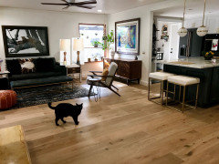
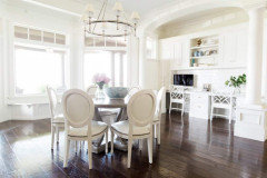
    Pink...9 ft celings, built in 1940. Have white cabinet in current...want to go dark...will do same cabinent paint on interior doors. White trim light oak floors. More transistion with industrial finishes. I have splashes of aqua thru out house, screen porch, etc...

  • 6 years ago

    Ahhhh Patty that inspiration picture tells me so much about your vision . I have some ideas but am off to back to back client appointments this morning. I will jump back this evening with some ideas. In the mean time can you share some photos or a sketched out floor plan? Need not be fancy.

    Patty McNamara thanked pink_peony
  • 6 years ago

    this is my current house...you can see aqua in window treatments, grasscloth in dining room, etc...will be black round pottery tabke at farm, new barstools but same l.r. furniture...will send pics of farmhouse later...https://www.zillow.com/homedetails/2607-Cass-St-La-Crosse-WI-54601/81371576_zpid/

  • 6 years ago

    actual paint color is not peppercorn...but this was closest I could get...using ml campbell

  • 6 years ago

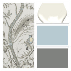
    I was just hopping back on to say that Peppercorn is really not charcoal per se. It’s a dusty black that actually has brown and green undertones. Your sample is showing even more brown. Mindful gray is one of the greige colors that actually has a pretty low LRV. is that going in the walls? Your door picture is light and airy. Is that what you are aiming for? Have you considered moving into a more deep gray for the cabinets like Grizzle Gray or cityscape? Keeping your walls a soft white and then moving into a less aqua and more blue for the island like Sleepy hollow? This is cityscape, Sleepy Hollow , Ben Moore Swiss coffee for walls and then because I couldn’t help myself Bird and Thistle wallpaper or fabric thrown in there!


  • 6 years ago

    pink...love it all!! thanks so much..be back later with more pics:)

  • 6 years ago

    pink,,love that combo! Patty, your house is beautiful

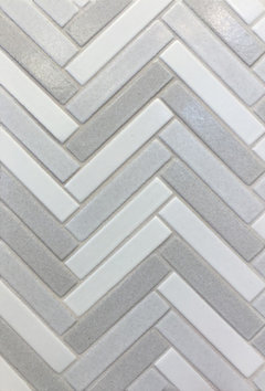
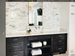
    Pink,,i'm narrowing it down! two samples on the left,,,maybe. or the Tilebar Matrix.


    and that current lamp I have is only 26". remember you guys all said to go taller. these others are 31.5".

  • PRO
    6 years ago

    Patty , its Pink here just on my lap top.....don't ask Houzz glitch ....on my lap top I am signed in under my business and on my phone Pink_Peony and it won't let me switch it for some unknown reason.


    Some of your posts hadn't come through this morning when I was on. The real estate listing is your former home or your current home? I guess I was a bit confused. It is beautiful BTW!

  • PRO
    6 years ago

    Beth gotcha! Yes taller lamps and I like those! I will have to look up tile bar matrix. Cant recall which it was, there have been so many LOL! I need to see the ones pictures in an install. I think I like them!

  • 6 years ago

    pink...current house..to give u feel for my taste. Obviously this is a more traditional home..but plan on keeping living room and do love the light airy feeling you mentioned earlier. one question, would it be ok to use true white trim with the swiss mocha walls? what do you think of repose gray?

  • PRO
    6 years ago

    Well I just typed a whole response and it didn't show up.

  • 6 years ago

    shoot!!!

  • PRO
    6 years ago

    Trying again. SO the home you have linked is one you no longer live in but has elements you will be bringing into the new space?


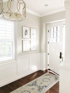
    Swiss Coffee can definitely be stunning with a white trim. Here are some photos of it with white trims


    The last two photos show it with blues and aquas.


    As far as repose gray its a lovely color. My caution would be with lower ceilings and dark finishes it can become really closed in. It can make for a striking combo but could lend itself to a more modern esthetic doing dark on dark.

  • 6 years ago

    love this pink!! sold...need to figure out fireplace brick and finalize countertops and i'm ready to go:) thanks so much for your help:)

  • 6 years ago

    pink,,here's the matrix


    patty, sorry to keep interjecting

  • 6 years ago

    no prob beth!!

  • PRO
    6 years ago

    Oh gosh Beth that was my favorite and probably still is. So hard to choose they are both great. This one (matrix) is more transitional and the other more modern. Either would be stunning in your kitchen. The Matrix is definitely more subtle.

  • PRO
    6 years ago

    Patty I am happy you love it. Just remember colors always look different in the actual space so try them out! I think it will be lovely.

  • 6 years ago

    For sure Pink!

  • 6 years ago

    pink..I showed my husband, he also likes it but is drawn to darker... maybe grizzle gray...

  • PRO
    6 years ago

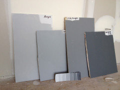
    Okay here are some photos of the colors discussed. Remember lighting is #1 ceiling height is #2 and you need to sample sample sample. I recommend ordering samples from


    https://samplize.com


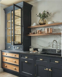
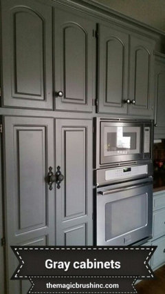
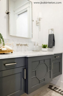
    Now here are the colors on Cabinets


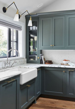
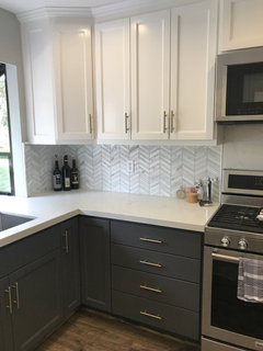
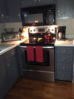
    City Scape


    Grizzle Gray


    a side by side sample of the two (right) cityscape & Grizzle


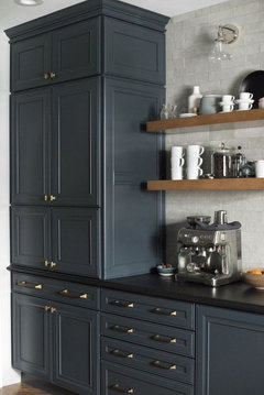
    and peppercorn on bottom cabinets and in last photo


    Patty McNamara thanked Design Interior South
  • 6 years ago
    last modified: 6 years ago

    Thanks Pink! Lots of windows/natural light. Will order samples and go from there! i like the cityscape better...

  • 6 years ago

    pink do you do remote clients?

  • PRO
    6 years ago

    Hi Patty, yes I do. You can message me on here or more directly at my email designinteriorsouth@gmail.com.