

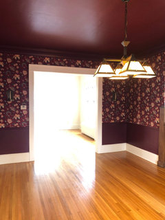
Decorating with vintage floral wallpaper
6 years ago
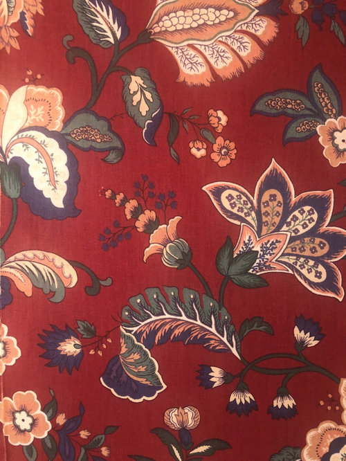
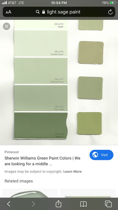
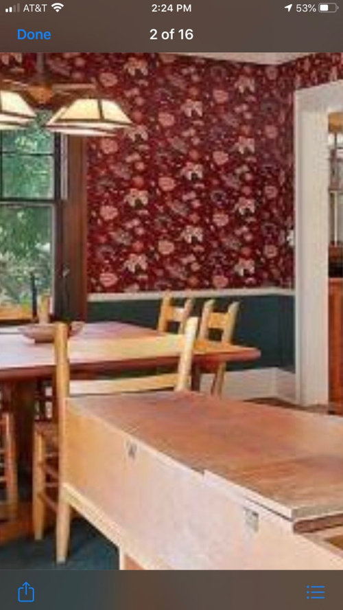
Featured Answer
Sort by:Oldest
Comments (21)
 6 years agolast modified: 6 years ago
 6 years ago
Related Professionals
Columbia Cabinets & Cabinetry · Frederick Kitchen & Bathroom Designers · Ontario Kitchen & Bathroom Designers · Bloomington Interior Designers & Decorators · Oxnard Interior Designers & Decorators · Victoria Kitchen & Bathroom Designers · Clearlake Kitchen & Bathroom Designers · Frederick Furniture & Accessories · Texarkana Furniture & Accessories · Middlesboro Interior Designers & Decorators · McAlester Interior Designers & Decorators · Providence Interior Designers & Decorators · Liberal Interior Designers & Decorators · Elizabethtown Kitchen & Bathroom Designers · Rolla Kitchen & Bathroom Designers 6 years ago
- 6 years ago
 6 years ago
- 6 years ago
- 6 years ago
- 6 years ago
- 6 years ago
 6 years ago
- 6 years ago
 6 years ago
- 6 years ago
- 6 years agolast modified: 6 years ago
 PRO6 years agolast modified: 6 years ago
- 6 years ago
- 6 years ago
- 6 years ago
- 6 years ago
- 6 years ago

Related Stories
DECORATING PROJECTSDIY Project: Vintage Book Wallpaper
Give your home getaway a well-read look with writing on the wall
Full Story
DECORATING GUIDESFloral Decor: It’s All in the Mix
Find out how to use color, pattern and scale to make your room design come together
Full Story
DECORATING GUIDESStep Away From the Wallpaper: Why Decorating Risks Are Overrated
Want to find your signature style? Try staying inside your comfort zone
Full Story
PRODUCT PICKSGuest Picks: Help Your Home Blossom With Floral Decor
Sprinkle hints of spring around your rooms with fabrics, wall coverings and more that recall nature's charms
Full Story
Floral Wallpaper for Today
Keep Your Fresh and Contemporary With Unique Designs and Bold Patterns
Full Story
DECORATING GUIDESBudget Decorating: How to Decorate Smart and Slow
To make the most of your decorating dollar, forgo the disposable stuff, think vintage and free first and give yourself a splurge
Full Story
DECORATING GUIDESStreet Style: Florals Done Right
Wallpaper spotted at a Brooklyn boutique gives us ideas for bringing vintage florals back home
Full Story
DECORATING GUIDESDecorating 101: How to Start a Decorating Project
Before you grab that first paint chip, figure out your needs, your decorating style and what to get rid of
Full Story
BUDGET DECORATINGBudget Decorator: 11 No-Sew Home Decor Projects
No seamstress skills? You can still show off fab fabrics and trim — not to mention your creative ingenuity — all around your home
Full Story
DECORATING GUIDESCelebrate Spring All Year With Florals in the Kitchen
Bring in the beauty of spring and summer color with a flourish of blooms on your kitchen backsplash, curtains, wallpaper and more
Full Story



Tracie Craig