Software
Houzz Logo Print
kat_jak

Colour scheme advice please

6 years ago
last modified: 6 years ago
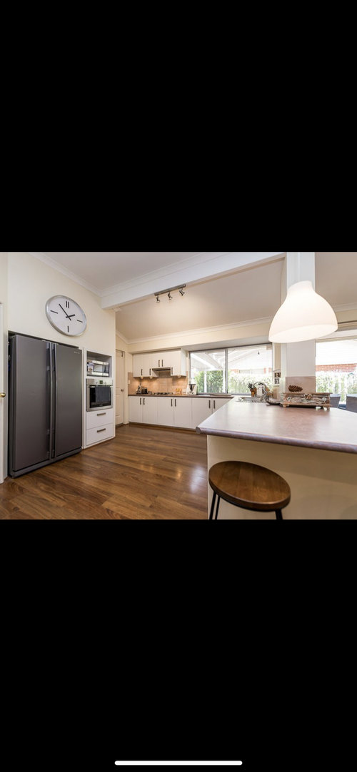
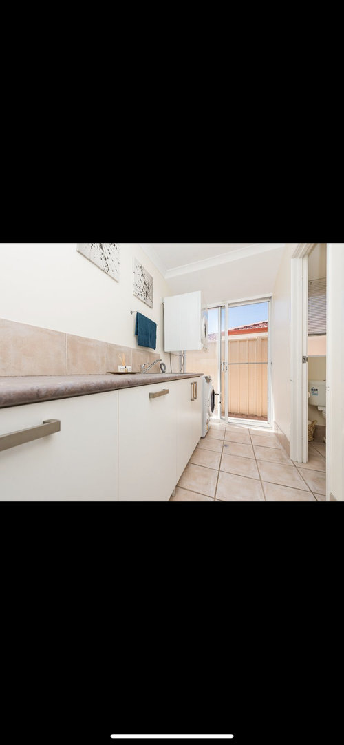
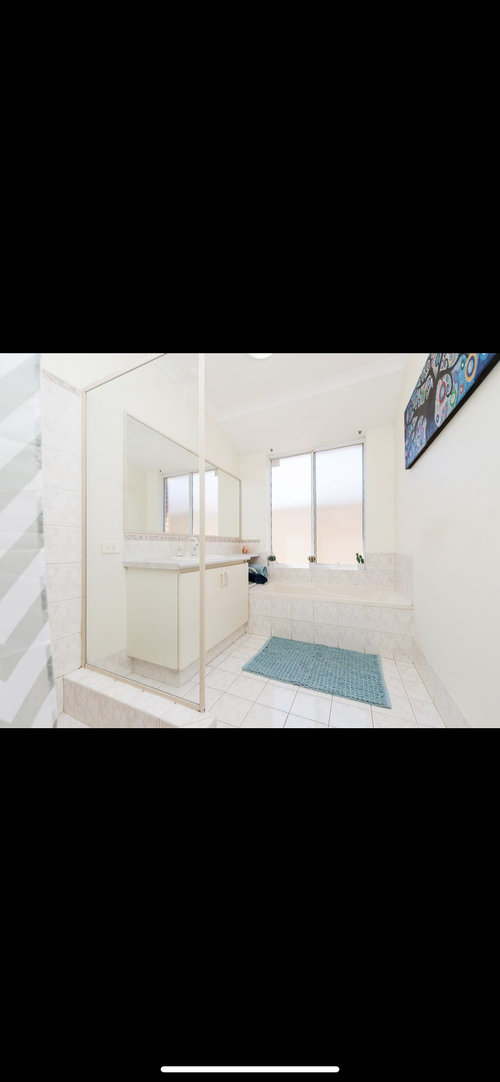
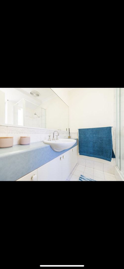
The current styling is of previous owners (sale pictures). Looking to keep palette colours similar to bench/ tile colours. However, after a more luxurious feel/ more depth.


Comments (10)

  • 6 years ago

    You seem to have a thing with blue, on painting towel and vanity so why not go with that as you main colour and add some orange accents

  • 6 years ago

    Kate , I think the blue is the previous owners choice . Personally , I don't like blue in a bathroom -- it equates to cold IMO .


    The kitchen is really nice , and the 'light terracota' tiles in the laundry , with their warm tinge of colour , is another highlight to me .


    So heres what I would do . Go to a quality towel ) linen ) store , and buy a bright orange towel , And a bright red towel . And an Emerald Green towel . and a bright yellow towel . Maybe 2 or 3 pastel shades too ( apricot , pastel blue , charcoal ) .


    Go home . Look at your laundry . Look at the blue towel hanging there , for 2 minutes . Change it to the pastel blue one . Does it look better ? Try the yellow . Better ? Worse ? Charcoal ? Red ?


    So not very scientific , but play and have fun . Pick your preference , or at least a range . Say you like Emerald Green towels . Go and buy 20 . 4 or 5 lightshades in emerald green . The one in the kitchen I'd go for a similar shape as the existing white one over the breakfast bar , but in a glass .


    Add some abstract art on the walls . In this example , Emerald green and light green and a little bit of fluro green , 3 shades of yellow , some teal , some light blue . Couches that match or compliment . Tan leather of you don't want green , but with emerald green cushions .


    Repeat on the other 117 items haha .

  • 6 years ago

    Thank you @User that was helpful!


    @siriuskey i don’t yet have access 👍🏼

  • 6 years ago

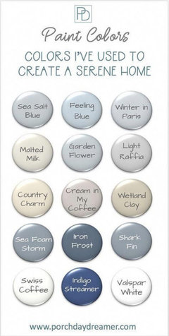
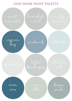
    Do you like brights contrasting colours as suggested above, is more serene colour schemes? Here is some inspiration from Pinterest that work with blue.

  • PRO
    6 years ago

    Hi,

    I wouldn't necessarily take a colour as a starting point, but what style would you like to decorate your home in? Would you want to go with a more country look, beach house style? Whatever style you pick can be tailored to pick up on the warm tints in the kitchen or bathrooms, but it will give you a much better idea for what your are looking for in terms of textures and patterns.


    Colours won't necessarily bring in depth, patterns and texture do, even if done in a range of pastel shades.


    Having a common theme run through your house is much more important than repeating the same colour everywhere. You might grow tired of a specific colour, or you end up getting stuck sourcing because everything is blue and now you must find the perfect blue anything for the laundry too. Having a style rather than a specific colour you are after will make your house feel more personal as well.

  • PRO
    6 years ago

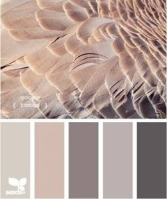
    Hi there. Luxurious feel and depth can be achieved with colour and texture. There are some lovely tones in the kitchen bench and splash back, violet based greys and taupes will be a great choice in these warmer areas to pull those existing violet tones from your bench top and create a soft feel. This will work with the larger bathroom and laundry too. The yellow and brown based paint on the walls needs to go ;) if you like white, go for a neutral based white.


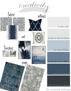
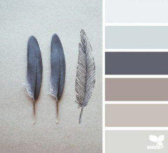
    For the bathroom with the blue, you can pull these tones in too but maybe work off the palette below to embrace the blue but keep the cohesion. This dusty navy would work much better than the previous owners bright blue accent choice.


    In regards to luxury, think introduction of velvet (kitchen stool), linen (window treatments and furniture) and a metallic accent like brass or bronze (hanging pendant in kitchen). Indoor plants would balance nicely.

    Congrats and enjoy :)

  • PRO
    6 years ago

    Nothing says " 80's " more than bullnosed benchtops and 'cream' framed glass screens with 'terracotta look' tiles, that faux 'cream on cream' glamour !

    May I suggest looking a re-finishing your vanity and bathroom/laudry benches with new tops of epoxy stone effects in some lovely warm Ironbark colors (a metallic gold, bronze and depp metal mice gray dirty pour stone effect looks great too. The backsplashes can be also installed to match.

    Then add some frameless glass, some well chosen black tap sets and some mirrored walls to expand on the light and bright look as well as some nice wall sconces to add some eye-level side lights of brass and frosted glass. Anchoring your colors with something deep and rich looking will create a luxurious feel and shouldn't cost the earth.

  • 6 years ago

    Do yourself a favour and have a nose around this blog:

    https://mariakillam.com/

  • 6 years ago
    last modified: 6 years ago
    Kat Jat - choosing colours is a slow process to get it right. Pottsy's idea of getting some towels or even pieces of fabrics in colours you would like is a good start to check the colour in the room. You then have to consider the aspect of the room - e.g. a south facing room will be much cooler than a west facing one, and often have more muted natural light so you need colours that won't mud in dull light and add warmth to the room. A west facing room is the opposite and needs more cooling colours, especailly when the afternoon light floods in. Keeping the colours fresh helps too.

    Once you establish what look to be the best colours for a room, use your fabric samples and towels, visit your local paint shop and ask to see their colour atlas (generally hidden under the counter). This contains hundreds of variations of shades so you can find just the right shade for your room. If you can pick up a colour chip good, but many colours never make it to chips.

    Then go on the Paint companies' websites, download photos of your rooms and you can do a virtual paint of the room to give you an idea of that shade in your room. Unfortunately colours do not reproduce well on screen but it will help you narrow colours down more and then you can pick up some paint chips or some sample pots to be doubly sure of the colour in the room. Leave the colours in the room for a few days too to check them out in all lights and at different times of the day. It is a slow process, but if you want to DIY, then i it guarantees the most success.

    PS - Funny Pottsy, I think blue is the perfect colour for a bathroom, to me it represents water and cleanness and freshness. Of course there are blues and there are blues, getting the right one matters. :)