Software
Houzz Logo Print
typeandrun

UPDATE Is this timeless or trendy?

6 years ago
last modified: 4 years ago
https://www.msisurfaces.com/kenzzi/leira/

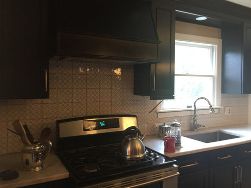
I have black cabinets, brass handles, taj mahal leathered countertop. How would this work for a backsplash?


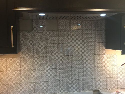
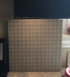
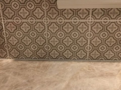
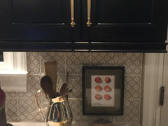
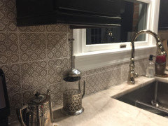
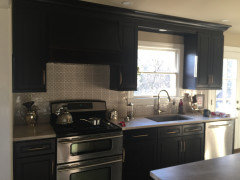
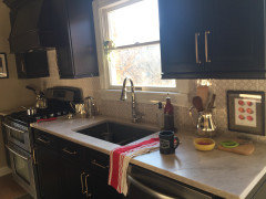
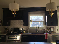
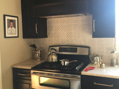
****the most wonderful man in the world (contractor aka hisband) installed the tile I love it! grouting later this week. I will post more pics with everything back in place. It compliments the countertops and cabinets so well. It is def timeless and not trendy.


Comments (95)

  • 6 years ago

    It will take a little effort, but as one poster did here on GW several years ago, I suggest that you photoshop the image of the tile to make a full page of it, then print off and hang the prints in the proposed area to see if or if not the pattern is the right scale or not, and too busy or not.

    The idea that a small space calls for a small pattern is a myth, BTW. Sometimes a large pattern will make the space seem larger while a small pattern makes it feel crowded and even smaller.

    For me it would be too busy -- but I generally don't like such figured patterns for more than a few days.


    typeandrun thanked raee_gw zone 5b-6a Ohio
  • 6 years ago

    what a great and simple idea! thank you

  • 6 years ago

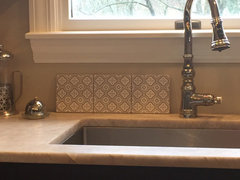
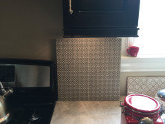
    rebeccamomof123 do you have the source for the blue and white tile above the stove?

  • PRO
    6 years ago

    Thank you for not doing a white kitchen with gray paint and white subway tiles!!

    Love the tile you chose - go for it!

    typeandrun thanked Debbi Washburn
  • 6 years ago

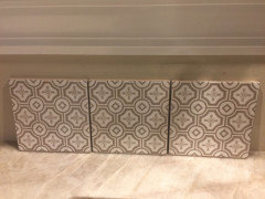
    Received my samples today. I like it

    whattya think? H wants to go with tan grout to match


  • 6 years ago

    Further out


  • 6 years ago

    Looks pretty!

    typeandrun thanked jkt107
  • 6 years ago

    Rather than describing it as either trendy or classic, I'd also use the adjective "busy" (rather than calming) -- but the color/pattern coordinates well with the countertop so it gets my up vote. (not a pro).


    Really like the countertop and the lights over the island.


    typeandrun thanked suezbell
  • 6 years ago

    Only you can see the colors in person. If they are not in conflict then I think it could look very nice. You will need to see how it looks at different times of day before you decide.

    typeandrun thanked emmarene9
  • 6 years ago

    it is so hard to capture the true colors on a phone @emmarene9 Since the sample tiles are mine we are going to take our time and view them at different times of day. So far so good. The color is very complimentary to the wood floor, walls, and countertop

  • 6 years ago

    It actually looks good in the photo you posted. If you decide to go for it we will love to see it finished. It is nice to see something other than white subway tile.

  • 6 years ago

    I would use something white for contrast. Because pastel tones are lost against the background of saturated black. It seems to me difficult to compete in saturation with black.

  • 6 years ago

    Trendy. I had vinyl flooring with that pattern in a house I bought in the 80's.

  • PRO
    6 years ago

    Love it! Do you love it??

  • 6 years ago

    I am remotely working for the next few weeks at least. I am sitting at my island looking at the samples all.day.long. I DO love it, @Debbi Washburn !

  • PRO
    6 years ago

    I am still working in the showroom... fingers crossed!

    It's tough to put stuff out there for the Houzzers to comment on - there will always be voices on both sides. In the end, it's your kitchen and your vision. You want to be happy when you are in your space, not regretting your decision. There is no right or wrong - as long as you are happy!

    Post after pictures!!

  • 6 years ago

    In your home, in the picture, it looks quite nice! Keep us posted!

  • 6 years ago

    It gives off a wallpaper look. Personally, I don't care for it.

    But whatever floats your boat. It's your house.

  • 6 years ago

    Both on trend and classic. I like it.

    typeandrun thanked keith Dcil
  • 6 years ago

    Yes, go for it! Very English and suits your home.


    typeandrun thanked Jay Inhoff
  • 6 years ago

    I do kind of like it in your space. Remember to get the right grout color so it doesn't look like a patchwork quilt. A coworker had a similar tile put in her kitchen and everyone told her light grout to match the colors in the tile, she went with a dark grout and is now unhappy...

  • PRO
    6 years ago

    Lovely home and super pretty kitchen! The tile looks great as a backsplash, I don't think it's too busy since your counter top is fairly uniform and calm. If the colors work, and you love it, go for it!

  • 6 years ago

    If you are going to be in this house for a while, I think you should do what you love! W e custom built a home 25 years ago because everything looked so blah to us. We built and designed what we loved for us. It is now time for us to sell as my husband is disabled. We haven't listed the home yet, but I've had a few people through that may be interested. It was so encouraging to see that today's buyers enthusiastically embraced design features that we did because we loved them! Our kitchen is original but still looks fresh today. I would say that good design endures and you should live with what you love.

  • PRO
    6 years ago

    I'm going with trendy. Have seen this style of tile in numerous houses and it already looks dated to me. Simply and serene is much more classic.

  • 6 years ago

    Not a Pro.

    To me the tile is too busy, but I love the pattern!

    I would use the pattern for window treatments.

  • 6 years ago

    So I was all ready to order then I saw this

    thoughts??


  • 6 years ago

    Close up


  • 6 years ago

    Personally, I think your first one is much prettier. That one reads too dark to me.

    typeandrun thanked jkt107
  • 6 years ago

    First one!

    typeandrun thanked Emily R.
  • 6 years ago

    the first one! the second one is gorgeous, but might make you dizzy when filling a whole kitchen. smaller pattern and higher contrast.

    maybe you can find an accent use for the new one somewhere else -- like to top a patio side table, or line a wood serving tray.

    typeandrun thanked User
  • 6 years ago

    I think the first one is classic but reflects some of today’s aesthetics by being a little lighter and brighter.

    typeandrun thanked J Inhof
  • PRO
    6 years ago

    The first one--the pattern in the second one is so small that it reads as a solid.

    typeandrun thanked Diana Bier Interiors, LLC
  • 6 years ago

    First one. Look forward to seeing it later.

    typeandrun thanked emmarene9
  • 6 years ago

    First (Original) tiles. Go with a lighter background grout, not a tan.

    typeandrun thanked User
  • 6 years ago

    Grout can make or break the final installation. I would do a sample board with each grout to see which you prefer.

    typeandrun thanked eld6161
  • 5 years ago

    Hey all, I finally ordered the tile!

    Posted more questions re grout color and what type of edge on right side. Schleuter or pencil edge ceramic

    https://www.houzz.com/discussions/6102239/what-type-of-edge-what-color-what-color-grout#n=0

  • 4 years ago

    backsplash installed, grout tomorrow. Wil add more pics once complete. In process pics in original post

  • 4 years ago


  • 4 years ago

    Beautiful! Would love to see a picture from farther back that shows the tile plus full cabinets and countertop together. Would especially love to see a picture of the range backsplash.

  • 4 years ago

    Lovely!

    typeandrun thanked jkt107
  • 4 years ago

    Looks like your tile guy did a nice job, you should marry him:)

    typeandrun thanked Kate
  • 4 years ago

    Beautiful!!

    typeandrun thanked kculbers
  • 4 years ago

    @mcarroll16 here you go

    photos are better at night these were taken in the morning


  • 4 years ago

    Thanks! It looks terrific!

    typeandrun thanked mcarroll16
  • PRO
    4 years ago

    Can't say I'm a fan of black cabinetry. When painted black you lose most of the detail of the cabinetry and generally the cabinets turn into a void. I understand there are those who like it but can't say I would ever encourage clients to select black.

  • 4 years ago

    Thank you, I love how it turned out. Def worth the wait, the tile samples sat on counter for a ful year and we never wavered in how much we liked it. Once this stove dies, I plan to replace with a slide in range. Backsplash is installed to work with that style as well. Going on 12 years, and works great. We only replace stuff when it dies lol

  • 4 years ago

    @Norwood Architects, you may want to reconsider. It might not work in every space. But for our kitchen layout it is anything BUT a black void. Our kitchen opens to a dining room, and there is a lot of natural light. While it does not photograph well, due to all the natural light, it looks beautiful in person and the cabinet detail is indeed noticeable and appreciated. The cabinets really compliment our countertops. We tried to keep it all classic as we incorporated furniture into the kitchen design as well. Trying to get the unkitchen affect.

  • 4 years ago

    We also had to match the dog of course! she doesnt photograph well either but def not a black void!

    :)


  • 4 years ago