Software
Houzz Logo Print
giorgi_o

here is the most ugly facade you ever seen

6 years ago
last modified: 6 years ago
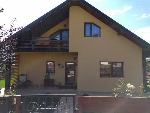
Hi everybody,


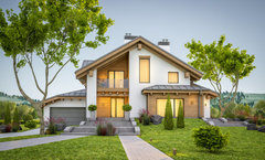
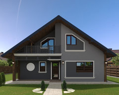
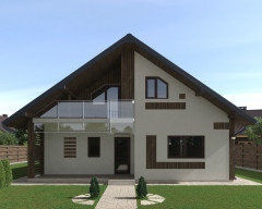
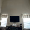
please help me renovating my ugly designed house facade (asymmetrical middle wall, asymmetrical right side windows, bloated roof so on...). I've contracted a freelancer architect but he lacks imagination so almost everything you'll see are basically my ideas. I have 2 house facade versions + same version with multiple color schemes but i'm still not sure if this is the best what i can obtain or if i can do better. let's have more beautiful houzzes :)


best regards


original:


1:


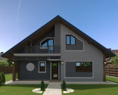
2:


3:


1
2
3

Comments (38)

  • PRO
    6 years ago

    That is quite an interesting design. I think you did a great job finding ways to update it. I personally love 2.

  • 6 years ago

    2 is the best. I'd paint the upper a lighter version of the darker green. Keep the railing dark and don't add many details. Maybe all the window trim the same dark color. Prettier paint alone goes a long way--you don't need distractions.

  • 6 years ago

    I like the original better than any of your proposals. And, while unusual, it's far from the "most ugly facade" I've ever seen.

  • 6 years ago

    I also think the original structure looks better than your mockups, although I'd change the color. it looks like you're trying to force a classic feel onto a modern house, and it's not working. have you consulted a professional designer?

  • 6 years ago

    The original is my favorite, but you can tweak it with some of your other concepts. I think your idea for expanding the footprint of the windows on the right side should be applied with material like the current balcony railing. Beef up the lattice on the ground floor left with the same kind of wood trim. Add much larger lights all around. We can't really see your landscaping, but I think an upgrade there will be key to the finished look. Can you stucco the brick "fence?"

  • 6 years ago

    How about making the window larger on the first floor, right side? To me that's what this house screams for, and the need you have been trying to meet with various trims. Why not go ahead and replace the window that's there with something larger that makes more of a statement? A bigger window would also allow more light inside and possibly enhance that interior space in the process. (Add me to the list that thinks the original isn't that bad, that ugly; it's just a contemporary house that probably wasn't built with top of the line budget and those limitations tend to show as the years go by.) I would make sure that whatever you add to the outside is clean and contemporary in styling rather than traditional -- so, for example, not the classic "carriage light" style of light fixtures or Chippendale lattice you have in mockups 2 AND 3.

  • 6 years ago

    PS

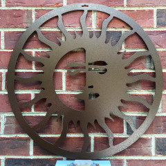
    I do like your idea of some artwork to balance the single window on the left of the main level. But I'd look for something metal rather than white, maybe brown, bronze or copper, depending on the color you settle on for the exterior, probably picking up on the color of the window trim somewhat.

  • 6 years ago

    I don't think your house is ugly. I think it looks interesting.


    I'm sorry, but I don't like any of your mock-up designs. They make things too busy. Far too much is going on.


    If you read the McMansion site, there are recommendations to keeping the siding changes limited and keep the windows similar. It creates a more cohesive feel. And if you have anything like brick (which I think appears in drawing 1), it should go all the way to the ground or it looks fake (real stone or brick is heavy and would need to be supported). I really do not like the railings in 2 and 3.


    If you really want to drastically change the appearance, maybe go for something like a modern swiss chalet (those House lines kind of remind of a Swiss Chalet). Or keep the basic exterior and start with small changes (e.g. paint) and keep layering them on.


    Here is a possible inspiration picture?


    In Progress - Chalet Style Retreat · More Info


  • 6 years ago

    ^^ This! If that house were mine, I'd play up the modern swiss chalet look. A lot of my budget would go into making the windows as huge as possible, but I imagine that could get pretty expensive.

  • 6 years ago
    last modified: 6 years ago
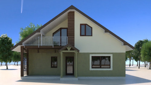
    hi everybody.


    very interesting opinions regarding the original facade :).


    MORE DETAILS about the HOUSE:

    the house is located in Eastern Europe where we embrace a Traditional Contemporary Style. and it's NORTH oriented so the right side of the facade tends to get moss/fungus where the rain falls, this is why i would go with a darker paint than the current one.

    the fence is wood slats.


    CAN'T:

    actually I can t extend the windows because this would mean an inside renovation too as behind the windows I have installed radiators.

    i don't want to use wood siding as it's very expensive here, it's heavy and hard to mount and also needs often maintenance


    CAN:

    I would like to paint the house because it's the easiest and most cheap way to get a fresh and more balanced look.

    I can change the current railing with a better one, and also add some "effects" by using polystyrene profiles which are very cheap and easy to apply over the current facade.


    here is an update for the second version. let s call it 2b but you can still vote 2 for it.


    2c color scheme:


    PS: I can t update in my initial post text probably because of the poll

  • 6 years ago

    @Kirsten, what do you mean by "keep layering them on." ? different shades of the same color or other paint technique?

  • 6 years ago

    Another vote for the original here. A change of color if you wish, but keep the scheme as is.

  • 6 years ago

    No Craftsmen Gable and no Chippendale railing. They look very out of place.

    The current balcony rail looks like ranch fencing. I would replace it with the simplest railing you can find. Clear glass even.

    Get consistent lighting that is not in a Colonial or Craftsmen style.

    If you want to use another material on the front then cover it all.

    I'd paint the house white as well as the fascia.

    Windows need to make sense from the inside of the house. If it works for you I would not change it.

    https://www.houzz.com/pro/uoflcardfan77/creative-visual-concepts-kevin-strader

    Look at Kevin's page and see if you think he could help you.


  • 6 years ago

    Your house is modern and you should play it up. I love the Modern Swiss chalet idea.

    Unfortunately, your mock-ups are too convoluted and cluttered. Simplify, simplify.

  • 6 years ago

    All of your designs make the railing much too prominent. I like the inspiration photo above, too. See if you can get celerygirl over here to do some more mock-ups.

  • PRO
    6 years ago

    It's not the ugliest fascade by any means. It does have a lot of potential but, as with anything, the cost will increase the more you change it. It does appear to be a modern interpretation of a Swiss chalet. It can be changed to most any style with enough money. Keeping it a chalet style is probably best. I love Kirsten's inspiration photo and would recommend that as your inspiration.

  • 6 years ago

    @hemina, that's exactly what i would like to achieve

  • 6 years ago
    last modified: 6 years ago
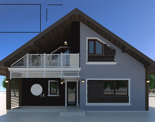
    I don't like the railings you propose. I would use the photo for @Kirsten as a guide for overall design and color. And enlarging the windows will make a big difference.

  • 6 years ago

    Agreed that the Chippendale railings are absolutely wrong for this house. If you really don't want to play up the modern aspect, then I honestly believe Kirsten's inspiration photo is the best one here. Hire a design expert to help you come up with something that's appropriate for this house.

  • 6 years ago

    I'm not sure how your railings are getting dubbed Chippendale....and in Eastern Europe, no less. They look pretty European to me!


    I don't think the original is ugly, but it has potential to be way cuter and more interesting. Before I read much beyond your first post, I had the idea of giving the house a black side and a white side like a yin and yang symbol. I think that would be good luck, "complete", satisfying. Your #2 and #3 come closest to that.

  • 6 years ago

    I like 2C - these dark, less obvious railings are much better! I am finding the light circle on the left side of the house distracting. I don’t think you need it.

  • 6 years ago

    I also like it as is. I could see it looking stunning in white with black trim and windows too.

  • 6 years ago

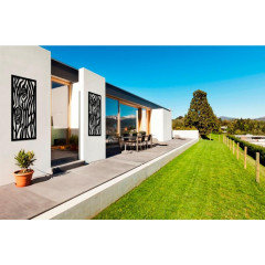
    That middle sun wall art is very yin and yang, and echoes the two sides of the house with the strong central divide.

  • 6 years ago

    @Kirsten, what do you mean by "keep layering them on." ? different shades of the same color or other paint technique?


    Sorry, what I meant is that try painting it first and then evaluate what further changes are needed. I think that paiting give you a lot of change for the cost. If you still think that the house is lacking, try another update, but stop before you make too many. For a railing update, consider just doing a glass or simple linear railing.


    I do recommend that you avoid that trim you are putting around the window in many of your mock-ups. I get that it is creating a bigger window look, but it is kind of dragging the house into the architectural version of the "uncanny valley". It creates an unnatural, unsettling look, in my opinion.


    Work with the house - don't fight it. The house has modern, straight lines. Unless you want to make archtectural changes to it, you should try to keep that esthetic with similar minimalistic features.


  • 6 years ago

    tangerinedoor: google "chippendale balcony". you will get a million photos that look like what the OP put in their mockups. it's a nice style, but totally wrong for this house.

  • 6 years ago
    last modified: 6 years ago
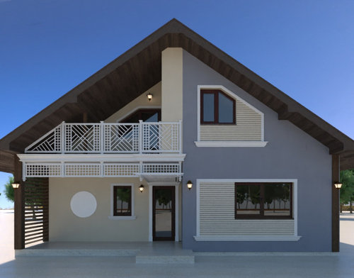
    per your suggestions here is a modern version of my house painted cream/white with a glass balcony and some modern lines to help the small windows.


    NOTE: the under balcony small glass/railing is needed to keep the rain flooding the first floor balcony/porch (it's lowering the entrance so the rain doesn't get to the door)


    Let me know what you think :)


    this is version 4:


  • 6 years ago
    last modified: 6 years ago

    better. I like the paint color. what if the balcony railing was horizontal wood slats that is an exact style match to the wood divider that's on the left side of your porch?

    personally, I don't like any of the ways you have tried to "extend" the size of your windows or add funky shapes around them. what about really simple window trim in a color that matches your roof trim?

  • 6 years ago

    I like #2 best, but I would use a simple railing.

  • 6 years ago

    I like 4. I like the simple lines and I think the colours work well together.

  • 6 years ago

    This latest image is the best you have posted. I still do not understand the desire to make the house look divided vertically but European tastes may be different than American.

  • 6 years ago

    @ Giorgi O. The view is very modern, it is even better than the option before. I think this is due to the size of the windows. Look very modern, but wood would be a good fit for this design.


  • 6 years ago

    thank you for all your help. i won't delete this post. I'll leave this post here for others to check the offered solutions.


    anyway because i can't edit this post ( i'm getting a "The page you requested was not found." message) i will create another poll with all facades versions

  • 6 years ago

    Number 4 is good looking. I like the lighter colors, too.

  • 6 years ago

    I picked the first one as the railings in second two are too strong- the house is by no means ugly,I think it quite quaint :)

  • 6 years ago

    Giorgi,

    About that window on the first floor room ....is the radiator under the existing window or on the wall to the left of it, when facing the house? If the radiator is simply under the window, then it seems like you could extend it horizontally to achieve the balance you desire, and yes, you would have to patch the wall but the radiator under the window could stay. If the radiator is on the wall next to the window, of course it's a different story! I don't know how your radiators are made, I relocated one in a home I owned years ago (where the radiators heated the indoor spaces by circulating hot water in a closed loop through a central boiler), and it was a fairly simple plumbing change for a plumber.

  • 6 years ago

    I meant to vote #2. subtract a #3 vote!!