Software
Houzz Logo Print
a_bev26

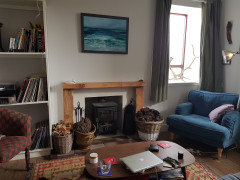
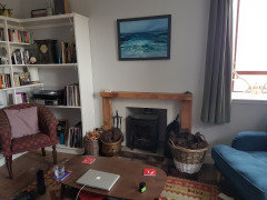
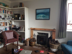
Something is missing from my living room and I'm not sure what...

6 years ago
last modified: 6 years ago

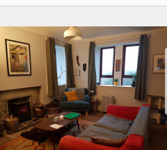
Any suggestions/advice would be appreciated! I like an ecclectic style comprised of a mix of items, patterns and colours. Photos in comments as I couldn't seem to add here.

Comments (36)

  • PRO
    6 years ago
    last modified: 6 years ago

    Where is the picture???


    Wait until it clarifies before you hit submit


    A Bev thanked JAN MOYER
  • 6 years ago


  • 6 years ago

    @JAN MOYER I have added them into the comments as I couldn't seem to get an upload option on the original post.

  • 6 years ago

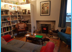
    Tidy up the shelves. Box up books and items you don't need/want. Get some larger accessories to mix in with the books and LPs. Get a larger painting for over the fireplace.

    A Bev thanked chispa
  • PRO
    6 years ago
    last modified: 6 years ago

    Star with a much larger picture over mantel, and curtains to the floor, A better mantel surround wouldn't hurt, either.

    A weed and prune of book shelves to some order. Cord and wire cleanup.

    More than that? Hard to say. Stand back and show the entire room/


    A Bev thanked JAN MOYER
  • 6 years ago

    Thank you so much everyone. Floor length curtains is a great idea I'd never have thought of. I just bought the painting and thought it would have been framed with a border which would have made it bigger. Very frustrating but I will try lowering it, hadn't thought of that, thank you! Also haven't got round to cleaning up wires but it is on the to do list. And as is tidying up the shelves now. Thanks so much for the speedy replies! 😊 I live in a remote location and am on the mainland at the moment trying to buy for the house and these were the best pics I could find on my phone.

  • 6 years ago

    I have just found some pics from before we put in the mantel and think I might revert back to this print which is bigger, and warmer


  • 6 years ago
    1. I like the 2nd picture much better, goes great with rug, flooring and furniture, particularly the red/orange couch. I think even the 2nd picture needs to be lowered also.


    A Bev thanked Flo Mac
  • 6 years ago
    last modified: 6 years ago

    Love the larger picture and the entire space, which has a great deal of cozy personality.

    A Bev thanked User
  • 6 years ago

    The larger picture does look better. It has the warmer colors in it, which suits it to the room well. I might scoot the chairs in a bit as they sort of look like they are pressed into the corners.


    If you're not particular about having books shelved by topics, for fun you might try shelving them by color. Could make for an interesting visual. Pop in a little piece of something else where colors break. You could also try the white branch? antler? on top of the shelving unit. The light might cause it to make an interesting shadow on the wall.

    A Bev thanked nwduck
  • 6 years ago
    last modified: 6 years ago

    I would recommend moving one of the large baskets of wood to a storage area. Maybe adding a plant or larger decorative item to the coffee table. Like your color combination,

    A Bev thanked dianabythelocks
  • 6 years ago

    Whichever art you use, lower it so the middle is at eye level when you are standing. Maybe whichever one you don't use over the mantle can be used elsewhere in the room. I like the blues and reds in your space. I would replace your drapes with floor length blue, red, or patterned drapes with one or both colors. The gray looks too dull and they need to be longer. As an alternative to the drapes, you could use woven wood roman shades above each window which would give you some texture.

    A Bev thanked calidesign
  • PRO
    6 years ago

    Second picture, and STILL you need to lower it to within no more than six inchse bottom of pic to mantel.

    A Bev thanked JAN MOYER
  • 6 years ago

    I actually like the seascape better, seems to relate better to stuff in room. That is just my personal opinion.

    A Bev thanked J Williams
  • 6 years ago

    You need more lighting. It looks like you only have a pendant? A floor lamp and a table lamp would make it more friendly-looking.

    Pictures are too high, IMO. I agree with posters upthread.

    If it were me, I'd add plants to the room. But right now the room looks so busy, I'd be afraid plants would make it even busier. A good start would be to get the bits and pieces off the bookshelf. Maybe look up some inspo photos for how stuff can be placed elegantly on bookcases. Items there should look bold, not busy.

    A Bev thanked tangerinedoor
  • 6 years ago

    Not a fan of long curtains or longer drapes for that window.


    Consider replacing the curtains with plantation shutters that fit within the window niche.


    Alternately, consider a long swag valance that covers the top of mini-blinds (for light control and privacy) and the wall/corner at the very edge of the window (top and sides).


    https://www.google.com/search?q=long+swag+valance&tbm=isch&ved=2ahUKEwiT2IzDq5voAhUGU1MKHfR3BdoQ2-cCegQIABAA&oq=long+swag+valance&gs_l=img.12..0j0i24.524777.531867..533871...0.0..0.90.1491.19......0....1..gws-wiz-img.....0..0i131j0i67j0i8i7i30j0i8i30.Ajmg6hTIU60&ei=bIZtXpPyFoamzQL075XQDQ#imgrc=VofWXLS4Y35WHM


    A Bev thanked suezbell
  • 6 years ago

    Thanks everyone! This is the first time I've posted on here and can't believe how helpful it's been! Heading home to swap that picture back and put it lower. Really like the idea of red or patterned curtains, thanks. I now have a side table with table lamp and a floor lamp which are in the first pictures but which I didn't have when I took the second pics. I think I'll also add some more plants - I like the business and clutter of the room. Thanks again for all the suggestions.

  • PRO
    6 years ago
    last modified: 6 years ago

    The first picture is still too small Lowering it won't change that : )

  • 6 years ago

    I'm going to swap it to the larger picture and lower that :)

  • 6 years ago

    following along to see the progress

  • PRO
    6 years ago

    Can you do something to build up the mantel? It seems too low and out of proportion, which is the real issue with the room.

    I know you said you like the "clutter." However, you can have an eclectic and decorated-over-time look without it looking haphazard. Your shelves need to be staged and organized better, and you probably could edit what's there and remove some items.

    Check out the English decorators who subscribe to the English country home look, for inspiration. Names that come to mind are Ben Pentreath, Rita Koenig, Peter Dunham, Lulu Lytle, and Amanda Brooks. Here's a link to a blog post with great photos of rooms in the style you like:http://www.cafedesign.us/color-stories-pink/

    A Bev thanked Diana Bier Interiors, LLC
  • 6 years ago

    Your wood storage baskets look a little too close to that hot stove- that is if it is a wood burner.

  • 6 years ago

    @Diana Bier Interiors, LLC Wonderful! Thank you 😊

  • PRO
    6 years ago

    Actually, A Bev, you might want to subscribe to the blog--Eva writes lovely articles and concentrates on a classic/traditional style.

    A Bev thanked Diana Bier Interiors, LLC
  • 6 years ago

    I love your room, looks very warm and welcoming.

  • 6 years ago
    last modified: 6 years ago

    Longer curtain panels will definitely help ground the room and make it look more finished. You have lots of pretty things but the short panels are a big reason the room looks a little off.


  • PRO
    6 years ago

    IMO there is nothing missing you have too much stuff in a small space

  • 6 years ago

    First few things that caught my eye was the mantle/picture over it...mantle fireplace surrounds looks a little too wimpy and the curtains too short..all which have already been mentioned. But I love the mix of everything else you have going on. Do you even need curtains?? Unless you close them for privacy I almost you could get away without them.

    A Bev thanked always1stepbehind
  • 6 years ago

    @always1stepbehind Thank you! Yeah we need the curtains at the moment as we currently have single glazed windows and they help keep the heat in during winter. I'll need to see what we can do about the mantel! We are thinking of tiling inside of the wood, but maybe a chunkier mantel would be good!

  • 6 years ago

    For me, what you are missing is Empty Space. I believe the eye needs time to rest between things.

    A Bev thanked littlebug zone 5 Missouri
  • 6 years ago

    Thank you @littlebug zone 5 Missouri. We have another sitting room which is very minimalist with lots of natural light and lots of empty space, so I'm happy with this room being more cluttered, but I see now that I should do some work on tidying up/ emptying out the bookcase a bit!

  • 6 years ago

    I really like the room. It is a comfortable, cozy room that has the look of a "home".

    A Bev thanked JustDoIt
  • 6 years ago

    You need some repetition of color. The sofa, rug and chairs are a nice color variety, but the draperies and pillows should repeat one of the colors, not add more. Pick a color and repeat it in the drapes and pillows, and that will be your main color. The others colors add variety and contribute to the eclectic look that you like.

    Rooms look more cozy and comfortable when the eye isn't darting up and down, but rather moves more horizontally within the room. (That's why a room looks better when art isn't hung too high.) And for that reason, I'd encourage you to remove all the decor items and the speaker from atop the bookshelf. Leave that empty so the eye stays in the "human height" area of the bookshelf itself. Another way to maintain an eclectic look and yet simplify, is to pull all the books forward so they line up with the front of the bookshelf. Make sure they're upright and not leaning.

    A Bev thanked partim
  • 6 years ago

    Some of the clutter in the bookshelves could be hidden if the items you rarely access were on the bottom and the sofa were turned with its back to the shelves and facing the double window. The two chairs can go opposite the sofa. Any items that knock your knees or tables that don't arrive at arm level on the seating should be removed. I prefer the vertical art, but agree that the mantel is lacking sufficient presence for the room and needs beefing up. Do you plan to tile the wall surrounding the firebox? That will add a ton of personality.

    A Bev thanked decoenthusiaste
  • 5 years ago

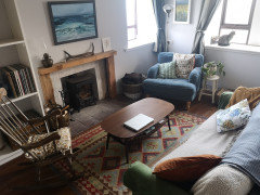
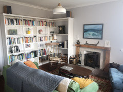
    Hi all, it has been a while but thought I'd update you on my progress. I've taken a lot of the comments on board (other than switching the painting as we love this painting), and I'm getting there. But I'm still struggling to pull everything together. I do still need to change the curtains to floor length ones, but I have no idea what colour/pattern to go for, so any suggestions would be very much appreciated!


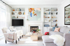
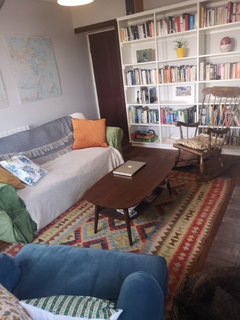
    I've tidied up the bookshelves, built up the mantel, and we've finally installed our wooden flooring, I swapped the corner chair for a rocking chair and think everything feels a lot neater now and less chaotic.


    As you can see, I ditched the red couch cover - the red and blue was too jarring for me. But now I think the green couch along with the blue chair is too much? If so, what should I do? Both are IKEA and can have their covers replaced, I just don't know what colours to go for...maybe a light blue for the couch? I also think I should change the grey walls to a cream? It's an East facing room so I'm limited on what wall colours I can use but I feel the grey is too cold and flat in the evening.


    I'm thinking it's my colour scheme that's stopping everything from feeling coherent, but it could be other things I'm not picking up on?


    Please ignore that half the tiles are missing from the fireplace, haven't got round to fixing them yet, also the plant has seen better days and I'm slowly nursing it back to health after it was attacked repeatedly by our kitten.


    Thanks all.