Software
Houzz Logo Print
sharon_hess58

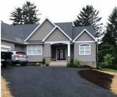
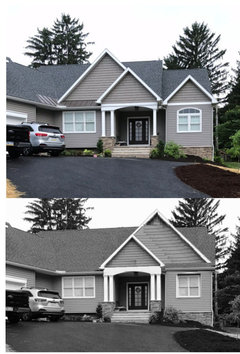
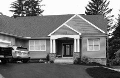
Asymmetrical front porch

6 years ago
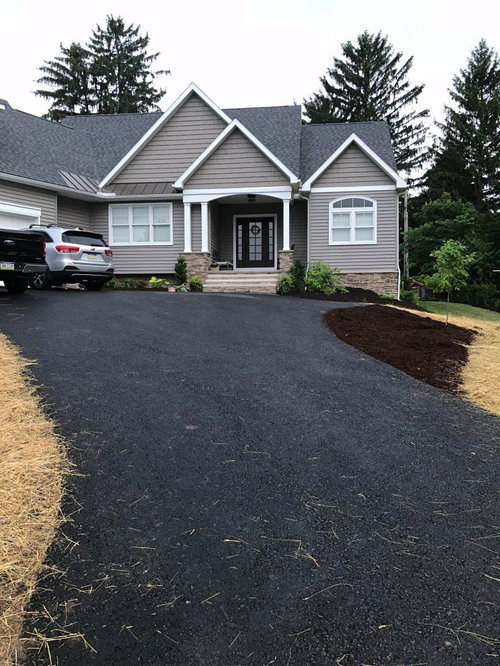
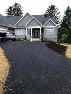
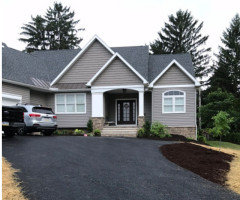
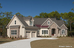
My builder didn’t do a good job on the front porch of my Don Gardner house plan. The lack of symmetry is really bothering me.


What

would you do?

Comments (37)

  • 6 years ago

    I do not know what to tell you but I would definitely not like that! I like everything balanced and you should have identical posts on the front of the house.

  • 6 years ago
    last modified: 6 years ago
    Remove the inside column on left side and have the arch that corresponds with step: door straightened. The column will then match with gables ends Taking arch out will stop emphasizing the unevenness The left base will still be wider but u want notice once landscaping matures

  • 6 years ago

    I agree.

  • 6 years ago
    last modified: 6 years ago

    Yeah I don’t mind it. It looks like it was supposed to be that way.

    The effect would be lessened with removal of the inside post on the left. Put something on that side of the porchlet to occupy the extra space. A nice iron bench plus a large (at least 14” circumference) tall pot beside it?

    The vehicles parked outside, blocking the view of your new home, are much more distracting to me. But I assume that’s temporary.

  • PRO
    6 years ago

    Agree with the above, design does have an asymmetrical balance, I wouldn't touch anything, not to mention this should have been addressed prior if you didn't like the design...

  • 6 years ago

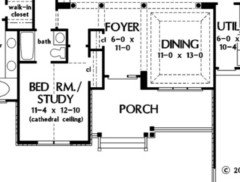
    What does it look like on the original plan? Was it asymmetrical?

  • 6 years ago

    Do landscaping on the Right Side to disguise it a bit... check to make sure whatever you plant there will work in the space [don't want a huge tree etc.]....

  • 6 years ago

    You won’t even notice it after awhile.

    Is that crushed asphalt? It looks so nice. Did they lay it and roll over it with equipment or just lay it and let vehicles drive on it? We are doing crushed asphalt as we both dislike white rock for both the harsh color (white...lol) and the dust.

  • 6 years ago

    Generally considered less than perfect to show license plates on the internet. They are readable. On car forums, everyone blurs them out. I am not sure all the reasons for that but there are issues I guess.

  • 6 years ago
    last modified: 6 years ago

    It should bother you. His plans are overrated. The pork chop returns aren't good, either.

  • 6 years ago

    Don’t know who Don Gardner is, but I think it looks fine. Symmetry is overrated . Nice opportunity for landscaping in the sloped area to the right of the driveway.

  • 6 years ago

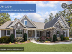
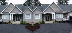
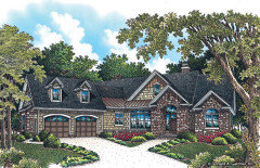
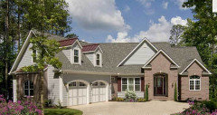
    Seems like Don likes that look:

  • PRO
    6 years ago

    It is exactly how it should be with the roof and without seeing the original plan who knows what the builder did. How many changes did you make ? This might be a kind of signature design as in the picture above. Post the picture of the actual design you chose .

  • 6 years ago
    last modified: 6 years ago

    A house should appear balanced but symmetry is only one way to do that and it' can be somewhat stiff and unimaginative. That was not the approach of this designer and that should have been quite obvious from the beginning.

    There's not much that can be done if the door can't be moved but the skimpy little segmental arch isn't helping.

  • 6 years ago

    I see that in the photo flopsycat added, the angle makes it look like there could be two posts on each side.

    It doesn’t help that the visual “Weight” of your house seems to lessen as you go to the right, even the lot seems to fall away.

  • 6 years ago

    I like it.

  • 6 years ago

    Get used to it. This should have been noticed months ago. Any change at this point would cost big bucks and not be worth the expense. Trish Walters idea to balance with landscaping was a good one.

  • 6 years ago

    The lopsidedness is emphasized by the fact that it's the SAME thing on either side, just double on one side. If you could change that up.... so I am not a gardener so i don't know how one would do this - but can a trellis be added to span the gap between the two posts for a lovely climbing blooming vine of some kind? A tall tree plant on the other side that has only one column? to widen the visual effect there? Landscaping is the way to go here.

  • 6 years ago

    Nope, @bpath reads banned books too. Not that it matters, but Don has included asymmetrical posts in that plan as well. I think he likes them.

  • 6 years ago

    What bothers me more is the small patch of standing seam metal roof.

  • PRO
    6 years ago

    It feels off because it’s both assymetrical and unbalanced. Reduce the stair width. Add a railing. Move the 2nd post over. Add a decorative railing between the posts. Redo the arch. Now you still have asymmetry, but it’s balanced and makes sense.


    Finger on a phone, but it gives you an idea.


  • 6 years ago

    Put a hanging basket full of petunias between the two left columns, get settled in, and see if you adjust.

  • 6 years ago

    I like it, but you could plant something tall, like cypress, next to the right column. I think your eyes will find symmetry that way.

  • 6 years ago

    Looks fine to me. Agree about the standing seam roof oddity.

  • 6 years ago

    The posts are apparently intended to frame the front door. If you are going to disturb that alignment you might as well just eliminate the odd third column.

    The original elevation drawing would help a lot.

  • PRO
    6 years ago
    last modified: 6 years ago


  • 6 years ago

    I think it looks exactly like the plan you purchased.

  • PRO
    6 years ago

    You could add on a small addition that will give the house symmetry.

  • 6 years ago

    As someone who obsesses on her house, I can empathize. But I’ve found most things are an easy fix, and don’t require major renovation, especially on a new house. Sometimes it helps to see another example of your house to give you a healthy perspective.


    I love this house and it’s mismatched columns.


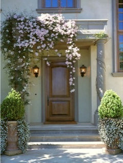
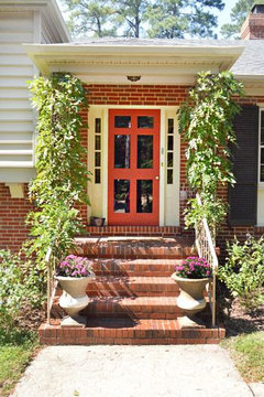
    How about vine plant that can be wrapped around the right column.


    Or have vines up both sides.


    or, like I said before, a “column-like” tree like cypress on that right side will bring perceived symmetry.


    For the record, I love mixed-material roofs and metal accent awnings. I love that feature on your house.


  • 6 years ago
    last modified: 6 years ago

    Although I am a fan of symmetry, that absence of symmetry with the posts seems deliberate and doesn't look bad.

    Before doing what A Foster suggests (removing the middle post), make sure that middle post isn't a weight bearing one. If you remove the post, then the arc above the posts could be covered and a straight edge across the bottom created and, if you end up with one base wider than the other, consider adding a statue or large flower pot there.

    Something you might try before removing or adding a post is add a bracket centered above the two left posts to hang a flag or banner flower pot or wind chime or bird house or a bird feeder or some art you like. Personally like the larger wind chimes. Also like colorful spinners:

    https://www.etsy.com/ca/listing/560453535/16-wood-wind-spinner-garden-spinner-wood

    If you change the look, do post after pics.

  • 6 years ago
    last modified: 6 years ago

    The standing seam piece must be for snow slide-off since 4 roofs converge right there?

  • 6 years ago

    Looks like it was supposed to be stone instead of white posts. The right side kickout doesn't look like it is set back enough weird.


  • 6 years ago

    Plant something tall on the right side to hide the single post.

  • 6 years ago

    Kh there are more than one set of plans. Not all have brick out front

  • 6 years ago

    Thank you everyone for your input. There were many good options that I didn't think about. This is the Rowan plan. I asked the builder not to use the stone covering for the front porch as shown on the plan because the front entry felt cave'ish to me. I'm leaning toward removing the middle column (if not weight bearing), having the arch replaced with a straight board and adding a nice pot of flowers that will spill over onto the stonework to fill the void. My builder recommended not adding handrails but I should probably consider adding those as well while I'm at it. Also, I like the idea of adding some landscaping height to the right side because the lot does slop down on that side. Thank you everyone!


  • 6 years ago
    last modified: 6 years ago

    I agree with omitting the brick element and with the changes to the posts and lintel. All major improvements.

Sponsored
Daniel Home
Average rating: 4.8 out of 5 stars20 Reviews
Premier Interior Design Team Transforming Spaces in Franklin Co, Ohio