Software
Houzz Logo Print
lbiscott

Advice re: paint colour

6 years ago
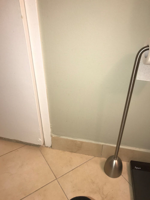
My bathroom walls are currently painted BM Mountain Air, a pale greyish green. The cabinets are BM White Wisp. The problem I have is that the porcelain floor tiles are beige with a bit of a yellowish tone that I don't like and that seems to be exacerbated by the green paint. Changing the floor tiles is not an option, so I'm wondering what colour wall paint might work better with the tiles. I'm considering blue or perhaps the same shade as the cabinets. Any thoughts on a colour that would tone down the yellowish hue? Any and all suggestions appreciated !


Comments (12)

  • 6 years ago

    Thanks for your comments, armchairshopper. Our bathroom is small, and we do have a bathroom mat in a light cream colour, but that doesn't seem to be solving the problem. I want to move away from the green as I feel it's bringing out the yellow in the tiles. I'm leaning towards the White Wisp as then the cabinets and walls would be the same and we could bring in other colours through towels, shower curtain and accessories. There is no other woodwork in the room - the door and frames are white as well. I thought that perhaps blue, as it doesn't contain any yellow tones, might be another solution. I'm interested that you thought the blue might bring out the yellow tones. Can you explain please?

  • 6 years ago

    I am no expert on color. Lori Sawaya is probably the best color expert on Houzz.

    https://www.houzz.com/pro/funcolors/lori-a-sawaya


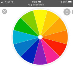
    If you want to make things stand out or have high contrast, mix colors on the opposite side of the color wheel. Blue is far from yellow on the color wheel.


  • 6 years ago
    last modified: 6 years ago

    To make a color stand out you pick a color opposite of the color on the color wheel or you pick a color that is not as strong as the color.

    Green won't highlight yellow/orange, but the color you have is so much lighter and more subdued than the flooring that the yellow is shining through.

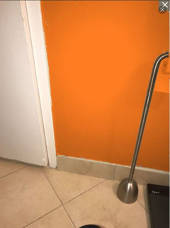
    Bright Orange would make the floor look very neutral in comparison


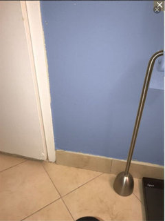
    Purple Blue will make the yellow/orange colors more noticeable, but because this is a stronger color I think it looks less yellow than next to your light gray green.


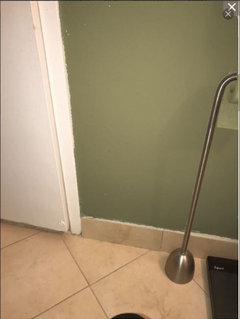
    A darker green will make the floor seem fairly neutral.


    lbiscott thanked Jennifer Hogan
  • 6 years ago

    Jennifer, what an amazing response! Thank you so much for taking the time to show me the picture with the new colours added in! This really makes the end result easy to see. The darker green is definitely an improvement over the one I currently have. You're a gem!

  • 6 years ago

    It was my pleasure.


    I do want to share another secret. Picking colors for your home is actually very much like picking an outfit. If you had a shirt the color of the floor what color jacket would you pick to wear over it?


    lbiscott thanked Jennifer Hogan
  • PRO
    6 years ago

    I'm leaning towards the White Wisp as then the cabinets and walls would be the same


    Do you like how White Wisp looks with the floor? It belongs to the Green-Yellow hue family so there would be a thread of color harmony with the yellowish floor. Would be pretty with crisp white towels, shower curtain, etc.

    lbiscott thanked Lori A. Sawaya
  • PRO
    6 years ago
    last modified: 6 years ago

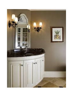
    I would suggest you work with the floor color, not try to camouflage it.


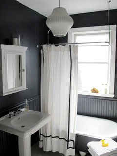
    B.M Raccoon Fur. on walls


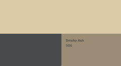
    B.M. Smokey Ash on walls


    lbiscott thanked JudyG Designs
  • 6 years ago

    Thanks for these ideas Judy. I actually have the same floor tiles in my kitchen, with White Wisp cabinets and walls, with a backsplash painted in BM Deep Caviar, which looks very similar to Raccoon Fur. I like the combo in the kitchen, but my bathroom is very small, so I thought the darker colour might be a bit claustrophobic. However, the white towels and shower curtain in your example is making me think again!

  • 6 years ago

    Lori, thanks for your encouragement, I do like how the White Wisp works with the floor. If I go that route, I would probably try to bring in an accent colour through towels and shower curtain. Any tips for that - I noticed you suggested sticking with white for these items as well.

  • PRO
    6 years ago

    Get the White Wisp in a different finish from the trim which I assume is satin or semi - Aura matte, for example, would be good for the walls.


    The variation in finish will make it more interesting, give you a layered look.


    If you go WW, you will essentially have a neutral shell or envelope to work with. I'd shop for artwork. Just one fab picture and pull accent color(s) for other decor from that.

    lbiscott thanked Lori A. Sawaya
  • 6 years ago

    Thanks again, Lori. Yes, I will go for a matte finish, and good idea re: the artwork directing an accent colour. I have a great piece in the bathroom now that will give me lots of inspiration. Cheers,

    Lynn