Software
Houzz Logo Print
adaena_tray

Sears Kit Home Exterior Restoration

6 years ago
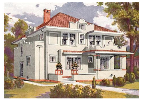
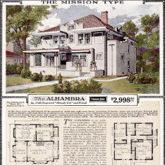
Last fall we purchased a 1924 Sears Kit home in need of restoration. We have been working with a contractor to make it look more like the original catalog ad (first photo) but had to stop when the weather turned. Now we are impatiently waiting for the COVID 19 restrictions on residential construction to be lifted.


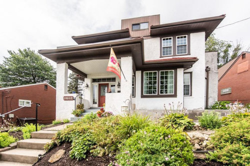
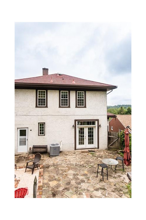
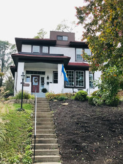
This is what the home looked like when we bought it. Being on a hill, it’s really tough to photograph.


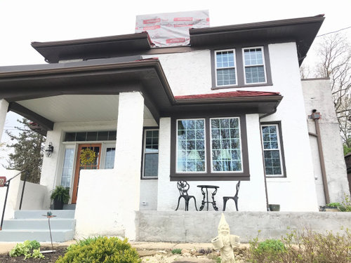
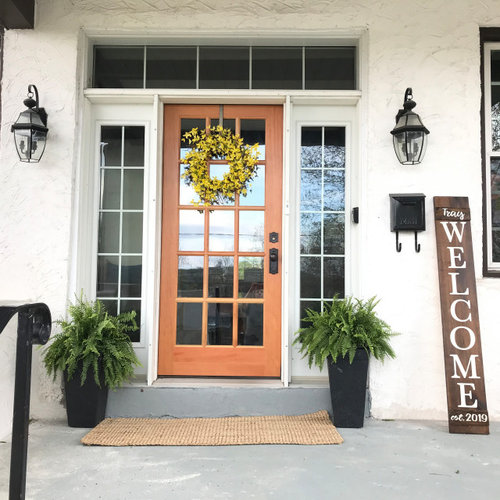
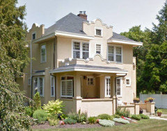
And here is how it looks today, mid-construction. We did get a new 15-panel beveled glass and wood door to match the original. Our dormer has been covered in paper since November, which is driving me nuts. The plan is to bring back the curvy parapets on the dormer and balcony.


After those projects are done, we are going to have the exterior painted. I’m thinking about our color scheme and really want to stick with traditional Craftsman colors. I’m feeling a bit locked in though because the red steel roof was just put on last year by the previous owners and will not be changed. The dark brown trim/eaves must stay as is because they are low maintenance vinyl and it’s not in the budget to replace or repaint them, plus my husband fears he’d be out there touching up every spring if we start to monkey with too much paint.


I’m currently leaning towards painting the house in an antique white, then painting the porch and terrace walls and floors in a sage green. We plan to add a window box in the same wood as our door to tie it in. But part of me wants to do the reverse and paint the whole house a lighter sage green, as the bodies of Craftsman homes often had colors that pulled from nature. What do you think?

Comments (44)

  • 6 years ago
    last modified: 6 years ago

    I'm confused. Your house doesn't look anything like the catalog photo. For one thing, yours seems much narrower, and the roof pitch isn't as steep. How did you figure out that's what it used to be?

    If you're really doing a reconstruction, I'd stick to the same paint palette as the catalog. It's part of the design: hints of Mexican mission style. The designer back then would have had the option to go with sage-y colors, but elected not to, and sage doesn't go with "mission".

  • 6 years ago
    last modified: 6 years ago

    Tangerinedoor, I think what is throwing you off is the angle of the photograph. The house is on a huge hill and it’s impossible to photograph accurately. You are basically seeing the underside of it. It’s a confirmed Alhambra - has the same exact room and exterior dimensions - and the Sears stamped lumber.


    I appreciate your input on the color choices. I’m leaning towards white too. I’m also thinking a creamier white might be pretty. This house stumps me because it’s both Spanish influenced and Craftsman.

  • 6 years ago

    If permissible, add a retaining wall alongside the road and level your front yard.

  • 6 years ago
    last modified: 6 years ago

    Thank you! We do have a retaining wall on the bottom portion of our yard, but when I say this house sits high on a hill, I mean REALLY high!

    And this is definitely an Alhambra. There were only two Spanish style homes made by Sears, and the other one is tiny. This has the exact dimensions, floor plan and features of the Alhambra, plus the stamped lumber. It’s been butchered over the years and, again, is hard to photograph accurately given the topography.

  • 6 years ago

    If you reverse the picture -- flip the negative over -- then, except for coloring, your house is already much the same basic look except for the top ornament and chimney. Your home's look is better.

  • 6 years ago

    Yes, this is definitely the reverse floor plan of the ad. A lot of people chose different finishes for their homes. Some Alhambras are even brick or stone! I appreciate your vote for keeping it as is. We are adding back the curves on the front, but most of the renovations are happening inside.

  • 6 years ago
    last modified: 6 years ago

    Wow. You weren't kidding when you said it was atop a hill.

    You might consider adding more retaining walls to terrace that hill at least on the side without the railing to make it easier to maintain.

    I still like your home better than the original.

    Trying to restore that top/center decorative feature seems totally unnecessary. If that is your chimney that appears to be wrapped, that, too, is an improvement and, perhaps because of its size, even seems to be in a slightly different location.

    Neither older -- or newer, for that matter -- is necessarily better. Would recommend you focus your remodel budget on function rather than appearance -- make what you have work for you.


  • 6 years ago

    If, however, you are determined to "restore" the home to its original look, I do wish you well and hope you will post after pics. Good luck with your project.

  • 6 years ago
    last modified: 6 years ago

    Thank you, Suezbell. We are bringing back the curvy parts of the house because, to me, they are what makes it. And it’s too late now - our dormer has already been ripped off - and work should begin next week :) I’ve been waiting a long time for these changes.

    I live in a hilly area and a lot of houses are on sloped lots like this. I always forget that people in other regions might not be accustomed to seeing this. Next spring, we are going to get the hillside professionally landscaped. I’m looking forward to that. Terracing isn’t that common here. Most people just use ground cover, oddly enough. I’ll be interested to see what the landscaper architect suggests!

  • 6 years ago
    last modified: 6 years ago

    Check the original flyer because it clearly describes the color scheme... Part of that info here.


    eta:. I thought it wasn't the same house either but I just realized they changed the stairs location for the porch, and there are none of the mission style elements visible in the photos - either due to the angle or them having been removed.

    Daena thanked party_music50
  • 6 years ago

    Thank you! Okay, white with a red roof it is! 😃 I think I’ve been watching too many design shows lately in quarantine. It’s making me second guess my design decisions.


    Our house does have a reverse floor plan, stairs in a different place, and all the mission style parapets were removed (which should go back up in two weeks!)

  • 6 years ago
    last modified: 6 years ago

    I totally agree that the mission style parapets should go back up! It's going to be a head turner!

    Also, the catalog photo looks to be more of a cream than a true white. It might have been described as "white" in a blurb, but it's possible buyers weren't attuned to different shades of white the way we are? That "white" was a "more or less" description? The array of available goods/colors/textures/fabrics was much more limited then.

    A cream color might also work well with where the house is situated?

    Would you do a blue-white, a pink-white, or a yellow-white?

    A grey-sage might work well on the underside of the roofs and maybe to pick out some of the detail?

  • 6 years ago

    Great link, party_music50 .

    I like the light gray of the original. You can see the trim around the windows is white. I think it looks good with the roof and the soffits.

    Consider one of these grays from Benjamin Moore. I have Horizon Gray on my house and it has a green undertone, so that might work for you.


  • 6 years ago
    last modified: 6 years ago

    I always thought the Sears kit homes were amazing, and you have done a beautiful job with the restoration. Congratulations!

  • 6 years ago

    I posted that link from my ipad, but when checking it on a different computer just now I see a completely different thing. lol! Here's the (poor quality) image of the 1924 Alhambra where it says:

    "The general scheme calls for a grey stucco body, with red brick foundation and red roof...." then talks about exceptions with green, etc. :)

  • 6 years ago
    last modified: 6 years ago

    I hope you'll post pictures as your renovation continues. What an exciting project! This pic shows the plan with the porch on the same side as yours.


  • 6 years ago
    last modified: 6 years ago

    See those empty "frames" (as though windows used to be there but never actually were) on the catalog models? This is why I thought your home might be narrower than in the catalog.

    What are those frames, anyway? It seems very odd to have pseudo-blocked windows.

    Ya know, now that I think about it, the style is Jacobean. Back then (16th century or so), IIRC, you had to pay a tax on windows, so some were blocked. Then there's the Flemish-influenced folderol. Aand the windows with a gazillion panes.

    Look at the exterior of Blickling Hall here: https://www.britain-magazine.com/features/history/stately-homes/inside-britains-jacobean-houses/

    Also, http://elizabethanenglandlife.com/Jacobean-Era/jacobean-houses.html

    Many photos

    https://www.google.com/search?rls=en&sxsrf=ALeKk014xW08X34sWMLnLh2oMYWSCRTULQ:1588164017589&source=univ&tbm=isch&q=jacobean+architecture+photos&client=safari&sa=X&ved=2ahUKEwi91fOA1I3pAhVihuAKHSy-Ah8QsAR6BAgDEAE&biw=1191&bih=734

    My college has more than one dorm with Jacobean doodads and proportions: late 19th/early 20th century.

    Here's just the thing: "Jacobean Revival", popular in US... https://www.oldhouses.com/9347

  • 6 years ago

    @Daena Did you see my info about the features of your home being in the "Jacobean" style? It didn't seem as though you knew about this style label before. This is just for your historical info bank, not action item. But it does make clear that your idea to replace the top knot embellishments is right on target.

  • 6 years ago

    Thank you @tangerinedoor! I somehow missed your comment. It does seem to have some Jacobean elements. That is helpful. And interestingly enough, I don’t like the frames on the front either. We will not be adding those back. I haven’t seen a modern day Alhambra with those intact, and for good reason.

  • 6 years ago

    tangerinedoor, I disagree about OP's house being Jacobean style. The flyer I posted refers to the Alhambra as 'The Mission Type'. Mission style architecture is known for stucco surfaces -- which fits. Jacobean architecture is known for its large/styled brick surfaces -- which doesn't fit. Further, the Alhambra shown in the flyer has mission-style parapets. I'd call OP's house Mission style.

  • 6 years ago

    Daena, I was typing while you posted... I would definitely add those frames back in! They are there to balance all of the elements visually. :)

  • 6 years ago

    What's that thing at the top with the vertical siding and slider window?

  • 6 years ago

    >It might have been described as "white" in a blurb, but it's possible buyers weren't attuned to different shades of white the way we are?


    White paint as we know it is a somewhat modern invention.

  • 6 years ago

    One vote from me for keeping the plain, linear structure you have now. It's very FLW & Prairie, with a more authentic & livable look than the curved ornamentation. My 2c.

  • 6 years ago

    @sambah006 It’s a really ugly dormer. It’s been removed!

  • 6 years ago

    @qam999 I like ornamental! I have toured Fallingwater several times and, while beautiful, FLW is just not my style at all.

  • 6 years ago

    Here is a link to another home of that model which shows some pictures of the interior.

    https://www.redfin.com/IL/Elgin/53-Crighton-Ave-60123/home/17014272

    Daena thanked Lyndee Lee
  • 6 years ago

    I agree that it looks very Prairie as it is! I like the look. In older homes, we typically see Victorians around here. Daena, re those blank frames, your house looks more narrow in front than the flyer you posted shows... yours might have had options w/ centered frame or small window in the front, but that's just speculation. From what I can see in the flyers that have been posted, it doesn't appear that they used the frames anywhere other than the front.

  • 6 years ago

    @lyndeelee Thank you! I hadn’t seen that one yet! I’ve found a lot of Alhambra’s across the country in conditions ranging from perfectly preserved to butchered! This one seems to be in fairly original condition.

  • 6 years ago

    When they refer to "Mission" I think they are referring to a style influenced by Spain. Frank Lloyd Wright's "Mission" style was completely different. This house does have the expansive overhangs though.

  • 6 years ago

    Don't forget to post after pics.

  • 6 years ago

    @party_music50 The Alhambra also came in red brick versions.

  • 6 years ago

    Yes, keep posting progress pics.

  • 6 years ago

    I think I'm concluding that the design isn't what "Alhambra" (i.e. Moorish) normally conjures up except with the orange tile and cream stucco. Very Mediterranean.


    Maybe the inside looks "Mission"?


    And then the folderol Jacobean/Alamo on top.


    Americans like style mishmash, and there couldn't be anything more American than Sears Roebuck!


    And I'm loving @Daena 's house!

  • 6 years ago

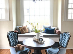
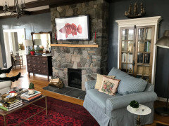
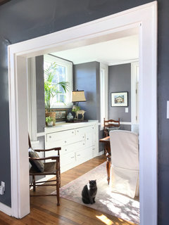
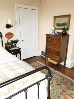
    @tangerinedoor Thank you. The inside is definitely Craftsman, some of which is intact, some of which has been chaged by previous owners. Here are some interior pics. (I’m currently painting the dark dining room.)


  • 6 years ago
    last modified: 6 years ago

    Wow, it's fabulous! did you pick that beautiful grey shade? And that's a yellow with a little bit of peach in the bedroom? Lovely floors. I'll bet this is a fun project.

  • 6 years ago

    @tangerinedoor You can see why I want to keep a lot of the historic elements of the exterior! The last owners picked the dark greys. I like how moody and cozy it makes the family room, but it reads so purple in our dining room that I’m going to paint it a nice greige. The bedroom is a Sherwin William historic arts and crafts color called Indian White. It’s really creamy and I guess does read a tad peach (I’m not a huge fan of that selection and I just made it two weeks ago!)!

  • 6 years ago

    Daena I just LOVE your home! I can't wait to see the exterior restored. I agree it should be restored as much as possible, to original plans. Please post updates as you progress.

  • 6 years ago

    Didn’t read all the comments but I instantly thought the house should be a creamy white, not a stark white.

    Daena thanked Anna (6B/7A in MD)
  • 6 years ago
    last modified: 6 years ago

    Anna, I am seriously considering a color called Westhighland White by Sherwin Williams for the body of the house. It’s an off white with some yellow undertones. I am also considering SW Grassland for the portions that are currently gray (porch floor and terrace wall and floor).

  • 6 years ago

    Love your style!

    Daena thanked houssaon
  • 6 years ago

    Daena your home is beautiful and we all look forward to seeing the exterior changes. It just possible that with a creamier white, the brown trim will be toned down. Just out of curiosity, I was looking at the floor plan of the Alahambra and wondered if there is only one bathroom?