Software
Houzz Logo Print
kim_weeks60

New house blooper

6 years ago

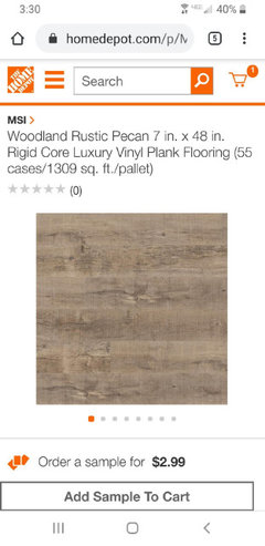
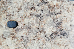
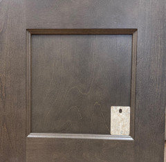
I messed up going with these cabinets, although I love them, I have found it hard to match other items up with them. I havent been able to get the original floors or tile I wanted because they didnt match at all, I dont want to mess up with paint colors.
My kitchen/ dining room area is facing towards the south with 1 small window and 1 big window. I need a whole house paint that will work with living room facing north with windows North and west plus a hallway with no natural light.
I really dont want white paint, but know I have to go light in the kitchen because everything else is dark. I have been looking at agreeable gray, revere pewter and balboa mist.
Whatever the color, it cant have the yellow orangey undertones and not overbearing pink or green.
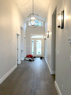
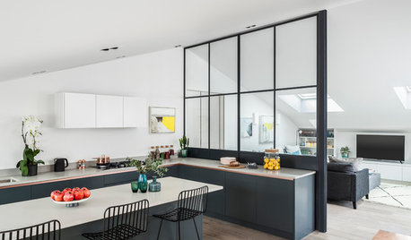
See attached pics of house, it's not been framed in yet but you can get the layout , cabinets and floor pics.
The attached pic is me in my bathroom looking towards kitchen/dining area

Comments (30)

  • 6 years ago


    Standing in bathroom looking towards kitchen/dining

    From hallway looking into livingroom

  • 6 years ago


    Cabinet

  • 6 years ago


    House Painted Perfect Greige. Any suggestions for front door

  • 6 years ago

    pale yellow.

    Kim thanked sambah006
  • 6 years ago

    Yikes no, never been a fan of yellow, but Thanks for responding.

  • 6 years ago

    I am doing Crushed Ice in my main level. It's sort of a really light version of gray.

    check it out.


    here's a picture


    Kim thanked Trish Walter
  • 6 years ago

    Okay fine. Now don't ask for advice if you are just going to throw it out.

  • 6 years ago

    Oh That is beautiful, might have to get a sample of that. I dont kknow about the whole main living area being that color. I may have to try and figure out how to transition colors.

  • 6 years ago

    Sambah005, I'm sorry if I offended you. I appreciate the advice but I just personally dont like yellow. I suppose I should have made it more clear that its it's not just the yellow, orangey tones I dont care for in original post.

  • 6 years ago

    I'm not offended. I just find it's a strange trait among some people to ask for advice and then immediately discount it.

  • 6 years ago

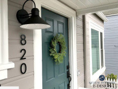
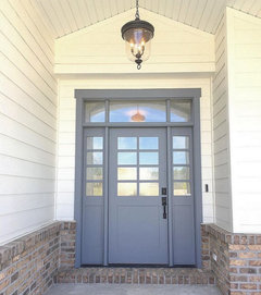
    front door ... SW Riverway?


    or storm cloud?


    Kim thanked Trish Walter
  • 6 years ago

    Oooh, I am loving them both but that SW Riverway is screaming at me.

  • 6 years ago

    And love the door colors.

    Kim thanked oreolucca1
  • 6 years ago
    last modified: 6 years ago

    glad you like. I am a huge fan of painting whole main areas same color if possible. Then your furniture and accessories are the star. Do colors in bedrooms bathrooms extra rooms if you have. But that's just my thing. You do you. Just saying why I do it.

    Note: I am not a professional color consultant. I do know [research] that Storm cloud is considered a complementary color to Perfect Greige. Not sure about Riverway but I dig it too.


  • 6 years ago

    Really liking both Riverway and Storm Cloud. :-)

    Kim thanked chloebud
  • 6 years ago

    Oreolucca1, I think Alabaster might be too white for me, but I can definitely envision the pale oak working for me.


    I had it down to two colors that I liked after weeks of research, Agreeable Gray and Pewter Revere, and although both are on the lighter side, I know those dark cabinets in such a small space is going to make it darker. Thanks for the input.


    Trish Walter, I am definitely painting whole house one color, I will probably let my youngest son pick out a paint color for his room, as long as he doesn't get too funky with it and will probably paint my bath later, theres just too many decisions to be made right now.


  • 6 years ago

    Color is never about the color, but how it plays together with other colors and how those colors make you feel.


    I am a winter. I look good in very bold, clean colors. My 2 sisters and my sister in law round out the other 3 seasons. Amazingly, each of our homes reflect the colors we learned to love because those colors make us feel pretty and everyone likes to feel pretty.


    Your home should bring you joy when you walk up to the front door and as you travel through your home from room to room.


    For me there is no perfect greige - by definition it is a very muted gray/brown/green color. Since anything muddy or muted looks terrible on me I won't ever love that color or want that color. I picked a red brick home with dark red siding.


    So how should you pick colors for your home? Start with what must stay (sadly most of us have to accept that some colors just can't be changed without spending money we don't have in the budget). Then you pick colors you love - the colors that make your heart sing!

    Now you figure out how to make the things that must stay work with the colors you love.

    Not saying that if you love blue and this is your favorite color in the whole wide world that you should paint the whole house blue. You have to decide which rooms may have blue walls and which rooms may have blue furnishings and which rooms may only have blue in the art and accents, but it is a great way to tie all the rooms together and give you a cohesive feel.


    Once you know the color you love and the things that must stay it is time to pick your neutral.


    Benjamin Moore Pale oak looks amazing with purples and teals, but not so good with yellows oranges and golds.


    Revere Pewter would not look good next to purple.


    Both are very popular colors, but not great in every home or with every color palette.


    The great thing is that you already know what works with the colors you love. You have been matching outfits and hair color and makeup to those colors for years.


    Now, just like some things look great on a hanger, but don't look quite so good once you try it on, paint colors can look good on the little one x one inch sample, but when you paint a whole room - wow - it looks pretty different.


    You can pick color families from small samples, but to refine the color and get the perfect color you will need bigger samples. You can paint your own or buy pre-painted samples.


    I always pick colors outside on a clear day somewhere around 2:00 in the afternoon.


    Why? Because this is perfect lighting. If any kind of undertones are going to show up or the colors are just a bit off you will see it in this lighting.


    Keep your flooring and countertops on a horizontal plane and your wall colors and cabinet colors on a vertical plane same as they will be in your home.


    If you have warmer lighting in your home all the colors will be slightly warmer, so they will still work together. If your lighting is a bit cooler the colors will all be slightly cooler, but will still work together.


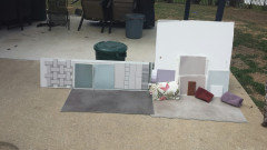
    Here is a picture of my process when I was picking colors for my home. I have the flooring and tile and paints and towels and bedding and upholstery all represented.


    I had 2 neutrals that looked pretty close in the house - look at what happened in the natural daylight - guess what would have happened if I painted my walls with the other neutral. I would have had pink walls.


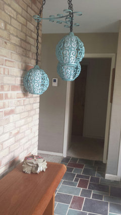
    Here is a picture of the slate flooring in my foyer - a must stay color grouping.


    Here is a picture of some of my favorite things - colors that make my heart sing!


    Here is everything together


    My heart will sing no matter where I go in my home.


    Kim thanked Jennifer Hogan
  • PRO
    6 years ago
    last modified: 6 years ago

    I always offer up Hunter Orange. I did it for the humorous aspect until I discovered three houses within three blocks on my own street have Hunter Orange for their front door color.

    Hiring an interior designer is many time a good option.

  • 6 years ago

    Oh Wow, Thank You for all the good information. This is a new construction and teal makes me smile so I may can work with the pale oak. Will get a sample soon.


    Just having a home that is mine will be enough to make my heart sing after losing everything in a fire last year.

  • 6 years ago

    My neighbors would get a kick out of a hunter orange door. My property meets up with a hunting club and almost everybody around here hunts.

  • 6 years ago

    @Kim join us in the May 2020 Build forum. It's super friendly.


  • 6 years ago

    I think some kind of teal-y blue would look great. If you don't like the reds and oranges, the teal family would be very inviting.

  • 6 years ago

    Thank You, I'm on my way to join yall now.


    I like the idea of real

  • 6 years ago

    Kim, I’m so sorry about your fire. We are also rebuilding after losing our home to one in February 2019. I hope you’ll keep us updated on your build!

  • 6 years ago

    Is there a question here?

  • 6 years ago

    Pewter Revere looks good with wood tones. It is light. I used it as the trim color in my bedroom instead of white. Also used it on the hall walls and trim.

    Kim thanked houssaon
  • 6 years ago

    I love teal blue greens. It is a fun color and you can go more green or more blue to fit into your total color scheme. I especially like teals with a more taupe neutral like pale oak. The white I use with teal and taupe is a color match done by Benjamin Moore. Ask them to use their formula for Devine Paint Color Icing.

    Kim thanked Jennifer Hogan
  • 6 years ago

    @Jennifer Hogan

    Thanks, will definitely check that color