Software
Houzz Logo Print
amanda_wise54

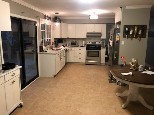
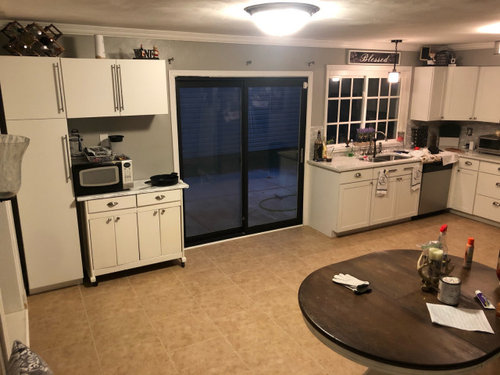
I’m so stressed not sure how to bring out my kitchen please help

5 years ago
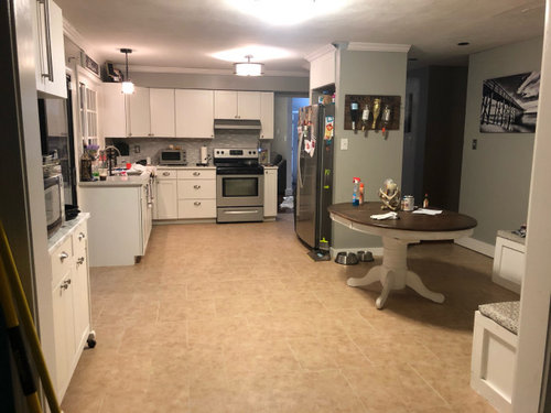
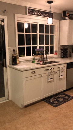
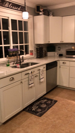
Please help me make this kitchen a wow factor not sure how to bring this layout out

Comments (19)

  • 5 years ago

    New lightning can make a big difference. Wonder if you can put an island somewhere

  • 5 years ago
    last modified: 5 years ago
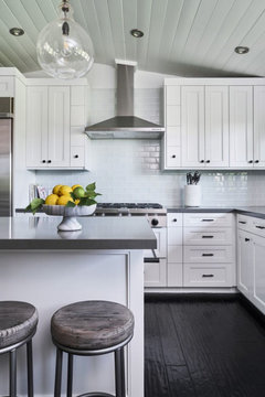
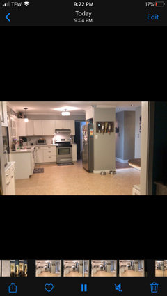
    The only difference between your kitchen and some of the amazing ones you see here is professional photography and a fancy oven. The only thing I'd change is the crown molding in the middle where the fridge is. But if you're looking to remodel, I'd take out that center wall portion and add an island. I'd make the area on the left of the door all pantry. Or if you budget is larger, move the slider down to make the kitchen more cohesive. Lots of potential depending on budget.

  • 5 years ago

    Don't sweat it! We are here for you. One second at a time. Let's work together on this.


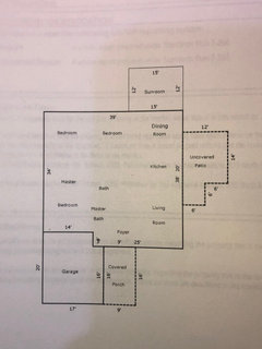
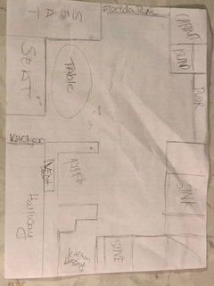
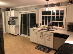
    What is your style, budget, and what do you not like about your current kitchen? Keep in mind that the kitchen is one of the hardest working rooms in the house. Therefore, it must be user friendly and designed to its highest efficiency possible. You can certainly bring out the wow factor, but these other issues need to be addressed as well. Do you have lighting under the cabinets? If the three lights that we see are the only ones, lighting may be another issue that you may need to address. I don't see a lot of counter space. Do you have enough counter for food prep? Do you use that table? Could you please give us a floor plan, including the adjacent rooms? What is the traffic flow like? I already see three openings - one going outside via slider, one between the stove and fridge, and one behind the table. Useful? Not useful? How many people use this kitchen on a regular basis? Do you all run into each other while cooking? There's definitely the kitchen triangle there.

  • 5 years ago

    Take everything off the fridge, countertops, and table. And from overtop the cabinets. Why is the table in the middle of the floor? Shouldn’t it be over by the banquette seating?

  • 5 years ago

    Agree with the comment to remove things from fridge, top of cabinets etc.

    What hits me about the space is the floor (and that may be because of the angle of the photos). Is the floor original and you redid the cabinet color, counters and backsplash? Everything besides the floor is grey/black tones (backsplash, counters, stainless appliances, sliding glass door, paint color (can't tell exact color -- grey/green?)) and then the tan/brown floor which doesn't seem to go with everything else.

    Assuming you are not going to change the floor, I'd try to bring the two color ways together? The one thing I notice is the small planter you have on the sink window sill -- that seems to be something that nods to the floor a bit instead of trying to ignore it. I think you need more of that -- an area rug that has both grey, green and brown/tan tones in it? lighter wood accents? (easy things like replacing the paper towel holder with a wooden one, replace whatever those black things are to the right of the sink, a wooden bowl of fruit on the table, changing out the hand towels to something with more varied color), changing the cushions/pillows on the banquet to something besides all grey tones, maybe a roman shade for the window with fabric that brings in both color ways?

    Also agree that lighting could help -- under cabinet lights. You could maybe replace the flush ceiling light over the table (or where the table should be) with one that hangs down a bit or even a chandelier type?

    A couple other ideas/thoughts:

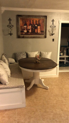
    The wine bottle art -- that wall seems to want something that is more vertical? Also, I'd replace the light switch with a color to match the paint.

    The pier art -- I like it but something with a little more color variation might work better there. Whatever you put there (or keep there) should be hung lower on the wall - there is some rule of thumb..."middle of art should be X inches from floor" - I just don't remember it, but that art is too high.

    Remove the curtain rod holders if you are not going to hang anything there?

  • PRO
    5 years ago
    last modified: 5 years ago
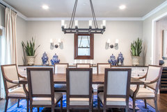
    Your current tan floor does not compliment your counters and backsplash. The flooring should be changed to reflect the updated look you want. Continuing the hardwood into the kitchen will be a game changer and really take the kitchen to the next level.

  • 5 years ago

    Hi everyone thank you for taking the time out your day to give me some insight. I am sorry for the late response work been crazy. To answer some of everyone’s question
    1: my walls are modern grey
    2: the floor are beige I am unable to change at the moments due to budget
    3: I am not sure if curtains are a go or not
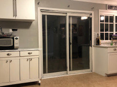
    4: the sliding glass door I am turning back to white currently taking the black paint off
    5: I am not able to raise top cabinets high due to the ventilation system being in the way
    6 : a vent door on the other side of the fridge wall

    I appreciate everything and any ideas especially getting rid of the black items if needed. I am open to any styles . I will post a few pictures and a drawing of the layout not the best unfortunately.

  • 5 years ago

    More

  • 5 years ago

    Last ones

  • 5 years ago

    1

  • 5 years ago

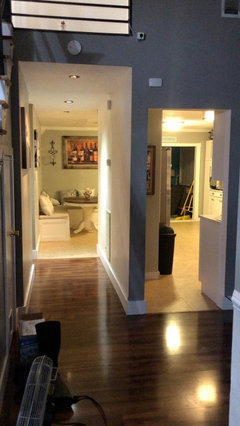
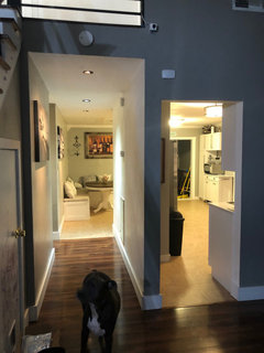
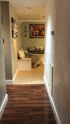
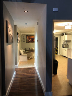
    The three lights are the only ones for the kitchen right now because I have no idea what should be and how to be placed in this kitchen for the lights. Here a full hallway shot

  • 5 years ago

    1

  • 5 years ago

    Your picture of the wine bottles is too high, and doesn’t need to be flanked by sconces. Your table is a bit small, and a rectangular table would work better, plus you can probably add three more chairs, which would fill out that area more. It’s really a nice kitchen. You still have a lot of stuff sitting out, I suspect your cabinets could use a bit of decluttering and organizing.

  • 5 years ago
    last modified: 5 years ago
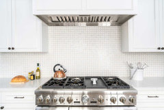
    I don't think the grey wall color goes with the floors. Since it's cheaper to paint than replace floors, I'd repaint the walls with a warmer color. The wall art is in warmer colors as well so it's fighting with the wall color. Your color story in the kitchen is confused.

  • PRO
    5 years ago

    Lighting (as in recessed cans) and a lovely little round or oval rug where the table is would really add a lot of impact!

  • PRO
    5 years ago

    Well the good thing about it, you've got great place to start with. Tons of room, but my only tip on this.. the table seem a bit out of place or odd to me. Also the color on the walls, I dont think help with the black and white theme of the room. I'd go with a light grey

  • PRO
    5 years ago

    We might recommend decluttering a little, and then adding pops of color with bowls or fruit. We also might try adding some artwork around.

    Modern Ranch · More Info


    New Build · More Info


    Kitchen Remodel · More Info


  • 5 years ago
    last modified: 5 years ago
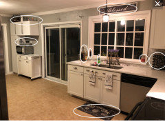
    1. Remove everything from the tops of the cabinets. These are not display shelves or storage areas. Design-wise, a room feels more comfortable and looks better when the eye stays at the lower level where people live. It is not good to draw the eye up to the ceiling and then back down again as you look around the room. For the same reason, find a lower place for the word art if you want to keep it.

    2. I would concentrate the wall art pieces around the dining area, and remove anything else from the walls. You want to focus the eye on that area as an attractive place to eat, and leave other walls blank so they do not distract from it. So I would remove the wine bottles from the short wall and just put 2 pieces of wall art on either wall above the built-in. The wine bottle picture is very bright and orange and doesn't complement any of the other colours you have in your room. I doubt you want to add more orange accents to your room, so I would find another place for the picture. Maybe the dining room? The sconces are just visual clutter on that wall and should be removed.

    3. If you are not changing the floor now, consider a warmer colour for the walls, that goes with your floor.

    4. If you look at the "wow" photos of kitchens, they don't have items on the counters that are not necessary. They're either in the cabinets, or in decorative containers such as baskets. For example, if you need to keep things on top of the refrigerator out of reach, put them in one a basket that looks attractive. Is there a better place for your spices or are there only a few that you really use that you can put in a handy drawer or cupboard, and the rest can go in a less-accessible cupboard for occasional use? Same with the oil and vinegar bottles on the left side of the sink. Also, if you keep your dish soap out on the counter then decant it into an attractive opaque pump bottle e.g. those meant for hand soap.

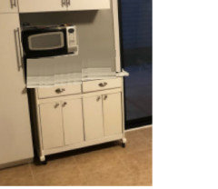
    5. Your rolling island would be much more useful if the microwave was not sitting on it. Install a shelf so the microwave can sit on the wall, freeing up the counter space. Also safer because you have a good landing space for hot things below the microwave. Could your toaster oven also sit on the same shelf? That would give you such nice clear working space around your stove.

    6. Agree that curtains would not add anything here, either on the door or the window. Looks great that you removed the black paint from the door - that must have been quite a job!