

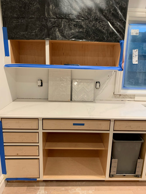
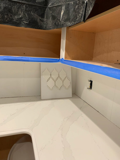
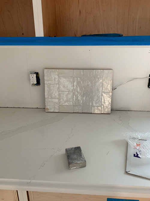
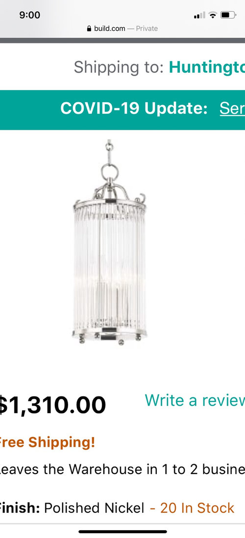
help! can’t decide on backsplash!
5 years ago
Sort by:Oldest
Comments (15)
Related Stories
HOUZZ PRODUCT NEWSHow to Help a Client Visualize a Project When You Can’t Meet
Inspiration photos, mood boards, 3D models, sample boxes and even drones help bridge the gap in a remote client meeting
Full Story
DECLUTTERINGCan’t Figure Out What ‘Sparks Joy’? Try This Question Instead
If you can’t decide whether to keep something or let it go, shift your perspective to find the answer
Full Story
COLOR8 Color Palettes You Can't Get Wrong
Can't decide on a color scheme? Choose one of these foolproof palettes for a room that feels both timeless and fresh
Full Story
PETS5 Finishes Pets and Kids Can’t Destroy — and 5 to Avoid
Save your sanity and your decorating budget by choosing materials and surfaces that can stand up to abuse
Full Story
KITCHEN OF THE WEEKKitchen of the Week: We Can’t Stop Staring at This Bright Blue Island
A single mom updates her childhood kitchen, so she and her daughter have a functional and stylish space
Full Story
KITCHEN DESIGNTrending Now: 25 Kitchen Photos Houzzers Can’t Get Enough Of
Use the kitchens that have been added to the most ideabooks in the last few months to inspire your dream project
Full Story
WALL TREATMENTSCan't Find the Right Wallpaper? Make Your Own
For one-of-a-kind walls, just use your imagination. Custom wallpaper is easier and less expensive than you might expect
Full Story
HOUSEPLANTS8 Houseplants You Can't Kill
They're forgiving and let you forget. Houseplants don't get any easier than this
Full Story
MOST POPULAR9 Real Ways You Can Help After a House Fire
Suggestions from someone who lost her home to fire — and experienced the staggering generosity of community
Full Story
SMALL SPACESHouzz TV: You Won’t Believe Everything This Tiny Loft Can Do
Looking for more floor space, a San Francisco couple hires architects to design a unit that includes beds, storage and workspace
Full Story
Sponsored

Patricia Colwell Consulting
Lori KambackOriginal Author
Related Professionals
Gary Interior Designers & Decorators · Jamestown Interior Designers & Decorators · Hannibal Architects & Building Designers · Murrieta Architects & Building Designers · Vancouver Architects & Building Designers · Carbondale Kitchen & Bathroom Designers · Danville Kitchen & Bathroom Designers · Richmond Kitchen & Bathroom Designers · Tuscaloosa Kitchen Remodelers · Springfield Kitchen Remodelers · Branson Kitchen Remodelers · Dallas Kitchen Remodelers · Atlantic City Custom Countertops · Fort Worth Custom Countertops · Seattle Custom Countertopsfelizlady
ishop19
ishop19
Lori KambackOriginal Author
ljptwt7
porkchop_z5b_MI
ishop19
Lori KambackOriginal Author
Lori KambackOriginal Author
herbflavor
Linda Stefanish
Lori KambackOriginal Author
Linda Stefanish