

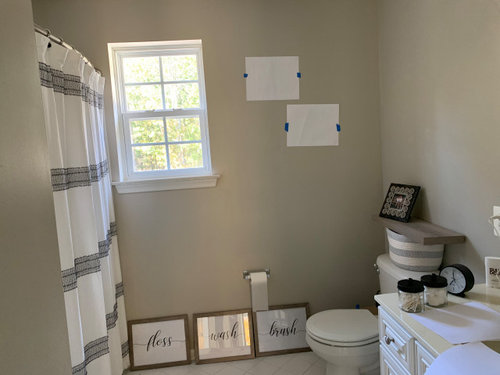
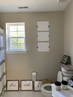
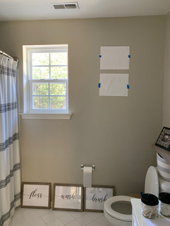
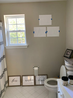
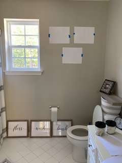
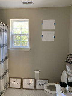
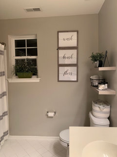
Two or Three pics?
6 years ago
Featured Answer
Sort by:Oldest
Comments (28)
 6 years ago
 6 years ago
Related Professionals
Madison Interior Designers & Decorators · Frederick Interior Designers & Decorators · Brunswick Architects & Building Designers · Vidalia Architects & Building Designers · Alexandria Architects & Building Designers · Cleveland Architects & Building Designers · Green Bay Architects & Building Designers · Pine Bluff Kitchen & Bathroom Designers · Columbia Kitchen & Bathroom Designers · Bennington Kitchen & Bathroom Designers · Sacramento Design-Build Firms · San Francisco General Contractors · Rock Hill Flooring Contractors · Farmington Flooring Contractors · Auburn Kitchen & Bathroom Designers PRO6 years agolast modified: 6 years ago
- 6 years agolast modified: 6 years ago
- 6 years ago
- 6 years agolast modified: 6 years ago
 6 years ago
- 6 years ago
- 6 years ago
- 6 years ago
 6 years ago
- 6 years ago
- 6 years ago
- 6 years ago
- 6 years ago
 PRO6 years ago
- 6 years ago
 6 years ago
- PRO6 years ago
 PRO6 years agolast modified: 6 years ago
- 6 years ago
- 6 years ago
- PRO6 years ago
- 6 years ago
- 6 years ago
- PRO6 years ago
 PRO6 years ago

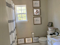
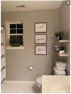
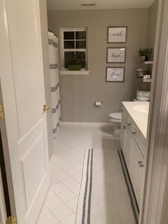
Related Stories
MODERN STYLEHouzz Tour: Three Apartments Now a Three-Story Home
A grand new staircase unifies a sophisticated, industrial-tinged London townhouse
Full Story
HOUZZ TOURSTwo Homes, Two Tributes to Dad
Father-son relationships shape the design of cherished family homes
Full Story
KITCHEN DESIGNKitchen of the Week: Cooking for Two in Ontario
Three small rooms become one large kitchen, so an Ottawa couple can cook side by side and entertain
Full Story
HOUZZ TOURSHouzz Tour: Three Pods Make a Beach House in New Zealand
See how separate living and utility zones boost the beach experience on Waiheke Island
Full Story
DOORSThree-Panel Doors Offer a Portal to Classic Style
Victorian roots and Craftsman approval mean this door style works wonderfully in traditional and contemporary interiors
Full Story
REMODELING GUIDESA Pattern Language: Light From Two Sides
For a More Successful Room, Bring In Daylight From Two Directions
Full Story
HOUZZ TOURSMy Houzz: Three Stories of Serenity in a Toronto Townhouse
Former school playing fields become a homesite for a Canadian couple with a flair for modern design
Full Story
KITCHEN DESIGNTwo-Tone Cabinet Finishes Double Kitchen Style
Love 'em or not, two-tone kitchen cabinet treatments are still going strong. Try these strategies to change up the look of your space
Full Story
MOST POPULARThree Magic Words for a Clean Home and a Better Life
Not a natural tidying and organizing whiz? Take hope in one short phrase that can change your life forever
Full Story
HOUSEKEEPINGThree More Magic Words to Help the Housekeeping Get Done
As a follow-up to "How about now?" these three words can help you check more chores off your list
Full Story
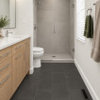
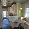
Celery. Visualization, Rendering images