Software
Houzz Logo Print
shoozyq

living room layout help

5 years ago
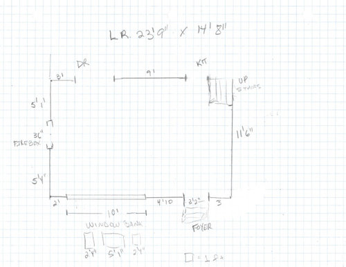
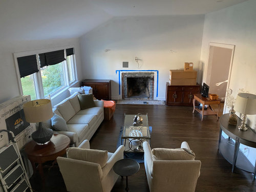
First , thanks to all of the pros and others generously sharing their talest on this forum. Been struggling too long with tv and furniture placement and could use help!! Leaning toward above the FP, a bit high for viewing, but haven't come up with better alternative. The wall adjacent right side FP is too short for a corner tv placement. Maybe add a curtain to that doorway to hide tv from adjacent DR? Furniture pieces are existing from previous home. They are in good condition, but been shopping around since the room doesn't feel right and not sure what should be edited to make this a cohesive, inviting and tv friendly space. Sorry for the boxes and mess. Thanks in advance for any suggestions!


layout


Comments (20)

  • 5 years ago

    Thanks! TV on articulating arm to right of FP was my initial instinct but not sure how to finish off the FP area. The chests currently flanking the FP are 30" tall. I am reluctant to place the tv on demi lune wall, even though would have best viewing height, because then I see the TV straight away when ever entering the house which I don't like and also find furniture placement awkward.

  • 5 years ago

    Maybe I should make a different post to focus on the fireplace wall?

  • 5 years ago

    No don't add another post just confuses commenters. Continue your questions here in the comments

    shoozyq thanked jck910
  • 5 years ago

    oops -already made a new post. Is there a way to combine the posts to alleviate confusion?

  • 5 years ago

    Add the other photos from the previous posts here in a comment. The demi-lune table feels a bit lightweight for the wall it is on, and all the stuff on top of it gives a top heavy feeling. Did you try the ivory buffet there with the two matching lamps on either end? I think it has the volume that wall requires. Art layered with the lamps would look nice there. Try the sofa perpendicular to the 9' and 4'10" walls with the demi-lune behind it if it isn't too tall. Would the smaller chest fit on the landing upstairs past the railing and opposite the Asian art and the larger one below under the railing. Add a tall ficus to the right of it in front of the wall. Can you paint that black box to match the wall color and do the same to the vent above the art on the landing? Angle the two chairs in front of the window with the round table and the other table lamp. This leaves you room to do something more dramatic with the fireplace wall and integrate TV better there.

    shoozyq thanked decoenthusiaste
  • 5 years ago

    thanks will move furniture aroun and post pics tomorrow


  • 5 years ago

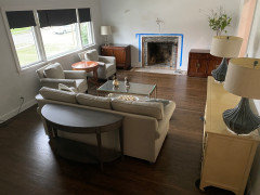
    Rearranged....


    Not sure if this is what you meant to re-arrange . Unfortunately, with the sofa centered to the FP, the path between the sofa and credenza is too tight at 23". The credenza doesn't need to be in this room, it can be used in my BR and the chests could possibly be used elsewhere too, but too deep for upstairs hall area. Not sure what peices I should purchase or how to arrange existing to make it feel more balanced.

    As far as creating a more dramatic FP with best ingrated TV, I'm chalenged on that end too. At first glance it seems like it would be good to flank the FP with units that have shelves and storage underneath. but unless they are narrow, the FP, which is flat along the wall would be sort of sunk in. That when I decided to try the chests to flank the FP as a way to create something without closing in the FP, but as you poined out the "line" around the room with same size pieces is not helping. I am open to and grateful for ideas. Thanks.

  • 5 years ago

    I like the couch by the window better! Forsure. We need to find a rug for this space. What do you think of molding on the FP wall? As far as art goes where do you plan to put it?

    shoozyq thanked HU-187528210
  • 5 years ago
    last modified: 5 years ago

    I like the demi-lune behind the sofa, but yes, the credenza is too deep for that area. Once the credenza is gone you may have room for the two chairs to group with the sofa, facing each other over the coffee table. Anchor seating on a very generous rug. Still believe you need to focus on the fireplace wall first. The rest will have to orient to that anyway if the TV and FP are your focal area. If you have other places for the casegoods, you might see the room with fresh eyes if all those pieces were removed.

    shoozyq thanked decoenthusiaste
  • 5 years ago


    D

  • 5 years ago


  • 5 years ago

    Here are some thoughts, my sketches leave a bit to be desired but the idea is to maybe incorporate board and batten to some degree. Thoughts?

  • 5 years ago

    I get the impression you're looking for traditional or maybe transitional style at the FP???

  • 5 years ago

    The goal is transitional.


  • 5 years ago

    is there a way to transfer ideabook photos to this comment section?


  • 5 years ago


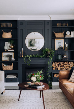
    maybe painted dark

  • 5 years ago

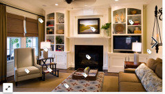
    More traditional shelving units on my wall would nicely accomodate a tv and great for displaying items. My FP does not protrude at all, so it would resemble the photo below in which FP recedes. Do you think units like this will be awkward with my ceiling slope? Maybe if I paint everything a dark color it will be a little less awkward? or would paining it dark just draw attention to it?


  • 5 years ago

    Painting it all dark will delineate the sloped ceiling even more. Matching the color to the ceiling will make the slope less prominent. Load a photo of the FP wall onto one of the paint company sites that lets you "try on" colors and just play with it for a bit.

  • 5 years ago

    I love the dark one. Yes it will draw att to the slope which I think is fine for this space. Or you can even out the molding and leave the top portion untouched. I’ve seen this in spaces without slopes and it looks gteat

Sponsored
Bella Casa LLC
Average rating: 5 out of 5 stars17 Reviews
The Leading Interior Design Studio in Franklin County