Software
Houzz Logo Print
primekittycat

Backsplash help

5 years ago
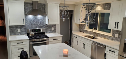
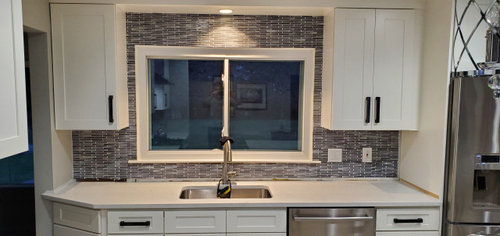
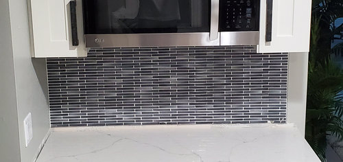
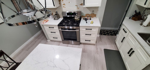
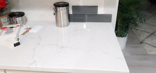
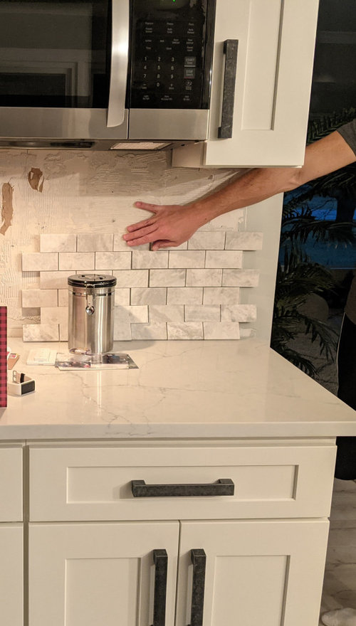
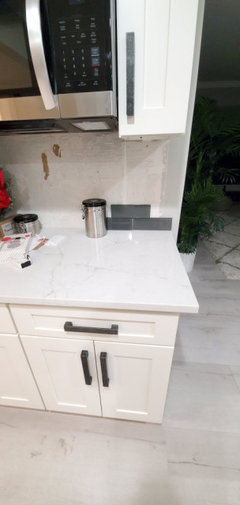
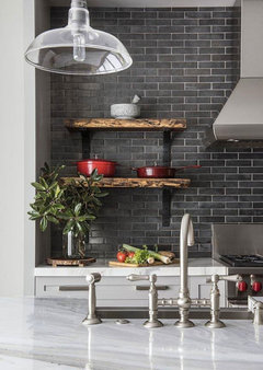
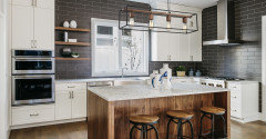
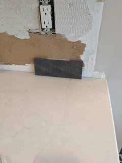
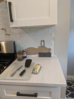
Hello! Thank you so much in advance for your help. We are getting a new backsplash for our kitchen and are running into design idea problems. We just replaced the countertop with Calacatta Monaco (MSI), white quartz with gray veining. The pictures with the darker mosaic backsplash is our old backsplash that we had taken out while removing the cracked/stained concrete countertops. To me it was a bit too busy and I'm not really a fan of mosaic backsplashes, and removing the concrete left us with a gap between it and the new countertop.


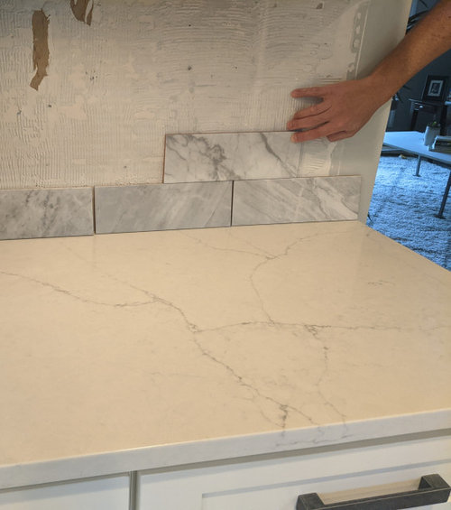
The backsplashes we've leaned towards the most have been natural stone (marble or travertine) neutral tiles but they seem to either be too much light gray; unfortunately we also have light gray floors AND walls (I know paint can be changed though) so gray gray gray is a bit much, lol, or start getting too warm with pink hues. I also don't want them to compete or clash with the veining in the quartz.


We've also considered darker glass subway tiles for more of a contrast. Keep in mind we don't get too much light in here even with the big windows (lots of trees) so I think keeping it bright/light is preferred... but just looking for thoughts/ideas outside of what we're looking at. We've bought like 10-15 samples and just can't figure out what will work.. and probably overthinking.


We will also be replacing the pendant lights with likely glass globe pendants with dark rods (to match the slate dark gray cabinet pulls), as well as replacing the stools with dark gray/black backless ones too for more contrast.


Reminder, these first three pics are of our new countertops but the OLD backsplash that we had ripped out.


Comments (24)

  • 5 years ago

    1st and 3rd fight with counter. 2nd looks like glass which is a trend that went out IMO. I think you need a softer gray. Are floors staying?

  • 5 years ago

    I like the third one above. Seems just right to me.

  • 5 years ago

    I'd stick with one color pattern and your countertop already gives you that.

  • 5 years ago

    Are your counters cambria ella?

  • 5 years ago

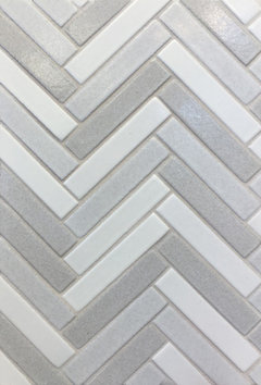
    The first and third definitely fight with the counter. I'm not a fan of more than one stone finish in a room and since your counters have prominent veining, stone would be out for me. I like the second one bit it seems a bit dark, and as you mentioned, maybe too much grey. Have you thought about a color, like a soft blue or green? What about white in an interesting pattern (chevron, herringbone, etc) or with a crackle finish to add some pizazz?

  • 5 years ago

    @kodiac23 the floors are staying. I'd thought the same about glass going out of style but wasn't sure. I definitely do like matte styles better. The counters are Calacatta Monaco by MSI.


    @biondanonima (Zone 7a Hudson Valley) I have considered a herringbone or chevron pattern in the area over the stove. I haven't seen the crackle style before, thanks for bringing it up.


    What does anyone think about a darker slate looking tile that would match the cabinet pulls? Do dark and contrast-y?

  • 5 years ago
    last modified: 5 years ago

    I don't care for the marble options. the one tile size is too small, the other, too much veining.

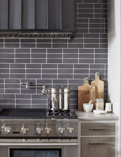
    I do like this one

    but I'd like it better in slightly larger tile.


    Like this one. it's from Seneca Tile. blend of 3 of their darker colors.


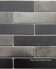
    this is their brushed nickel metallic. love this one for yours


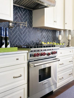
    With this option, you could definitely do a herringbone layout, which would bring some nice pattern to the party. and, it would be the perfect match for your handles.

    https://senecatiles.com/senecametal/


    or, look at their 1x6 quarry paver herringbone. this is the white/gray blend, but they could do any colors you like


    and the darker tile would tie in with super heavy looking pulls. if you go too white/soft, those pulls won't really compliment.

    I think something like this would look great w/your pulls. bring in some natural wood like walnut, somewhere. stools, shelving, vent hood, whatever.


    the wood looks amazing w/the black and white.

    this tile is a 3x12 matte finish.

    let me show you some other options.

    love this one too. has slight variations.


    instead of glass though, look at Fireclay tiles. they have a zillion sizes and shapes, but do have custom glazes. they will send you samples.

    This is Meteorite


    Tilebar Cadenza tiles. 3x12. they have a bout 10 colors. (you get 5 samples for $5 there)


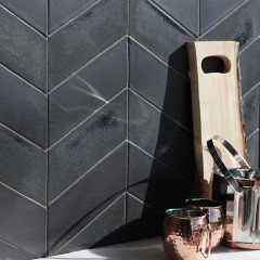
    Encore Ceramics. Large Chevron (it's about 3x8 or so) this is the metallic glaze, Nebula/iron


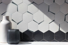
    check out their "kiss" or cookie dip tile options.


  • 5 years ago

    What about a blue? Or a black. Just do a unique shape. Small finger tiles? I love herringbone ... very pretty kitchen. Looks great!

  • 5 years ago

    @Beth H. : Thank you so much for your very thoughtful input!! I really love the Seneca tile too, I visited their site and also called one of their sellers near me and unfortunately they removed their product from the floor and are not taking any orders because there was a fire at Seneca. *cry* But I am definitely going to check out the others you posted.


    Thanks all for the input!

  • 5 years ago

    @Beth H. : What about this one? This is the closest I could find out of all tile shops around me. Getting samples from Tilebar and Fireclay though.


  • 5 years ago

    Think that’ll look great

  • 5 years ago
    last modified: 5 years ago

    Is that Basalt? It could work ( when you seal it, it will deepen the color) I do like the slightly longer sizes though.

    did you check out the alloy glazes over at Encore Ceramics?

    https://encoreceramics.com/product/nebula-alloy-glaze/

  • 5 years ago

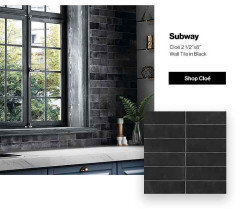
    Subway wall tile in black is definitely the one! It will give you both pop and polish!

  • 5 years ago

    Love the black

  • 5 years ago

    I don't see the need to pick up the gray in the countertop. I'd rather see a color, like a strong orangey-yellow.

  • 5 years ago

    Something that blends well with your countertops. If you go with a bold color, you may get tired of it sooner than later. For pops of color use items on your countertop, since there is a lot of white. As long as you stay away from subway tile, the worst design since the 1960's school locker room walls.

  • 5 years ago

    I believe you mentioned in your first post that this kitchen does not get a lot of natural light so I would trust your instincts to go lighter and consider the 3x12 light grey tile a poster showed above. Anything darker will look have the same feel as the original mosaic you took out. The grey paint color on your walls is not as complimentary to your flooring as a warmer white or greige would be. It could be why you're struggling with a tile choice.

  • 5 years ago

    I wouldn’t put another dark one in. It will look like the one you tore out!

  • 5 years ago

    I like the idea of a medium gray like the one eld6161 posted above. I think that one would look fantastic in your kitchen though you did say you didn’t want another gray so....?

  • 5 years ago

    Freda H.


    I think a light tile (similar to the lighter color in the counter top) with a dark grey grout might add the pop you are looking for.

  • 5 years ago

    What did you end up doing? I'd love to see pics!

  • 5 years ago

    Hi Lisa,
    I am not sure if you finished your backdplash or not. If you have not, maybe you could just continue the granite on the counter tops as your backsplash. You might also consider a slightly darker paint color on the walls so that the quartz pops.

  • 5 years ago

    Red

    Белый Farm · More Info