Software
Houzz Logo Print
verano20

Another paint drama

5 years ago

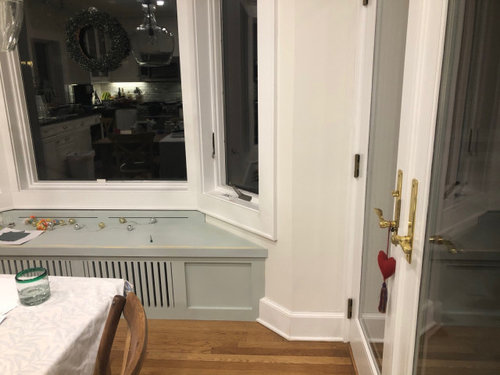
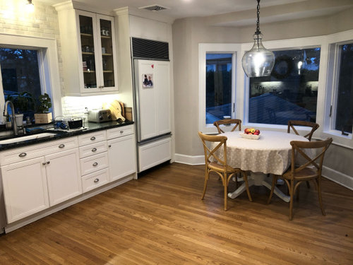
Hi! I just got a kitchen window bench made and decided to paint it SW Comfort Gray. I’ve wanted to use this beautiful color somewhere in my home for ages but I just don’t think it works here, it just looks too pastel.. The walls are SW pearly white. This is an old kitchen and the cabinets are a creamy off-white so the walls can’t go too gray or white. Any ideas? I was hoping to use something beyond boring white but now I’m not so sure. Thanks

Comments (52)

  • 5 years ago

    I think a charcoal gray would work. This gray is coming off a kind of green pastel.

  • 5 years ago

    Very hard to be able to tell the exact color. But I think it looks good. Maybe paint the trim on it to match the kitchen so there’s less green? But definitely needs a cushion

  • 5 years ago

    I think it's lovely. It also looks a tad green on my monitor, and may look different in person. I agree that adding a cushion will help, but beyond that, I really like the current color, as it seems to provide just the right amount of accent without being too "out there."

  • 5 years ago

    I like it!

  • 5 years ago

    Please provide me with your address so I can come steal your adorable pupper!

  • 5 years ago
    last modified: 5 years ago

    It’s hard to get gray to look good with cream. If you must have gray, get a very deep dark gray.


    Personally though I’d pick a different color.

    I’m not a dog person, but that’s a really cute doggie.

  • 5 years ago

    I think it needs to match the trim.

  • 5 years ago

    Love it....charming

  • PRO
    5 years ago
    last modified: 5 years ago

    You can use it around both windows from both sides.

  • 5 years ago

    Celery - you think? I can try!

  • 5 years ago

    The window seat has a definite green look on my laptop, too.

  • 5 years ago

    It is definitely green, which was my idea but not sure it works

  • 5 years ago

    I just feel it’s so difficult to update a cream kitchen..

  • 5 years ago

    Looks great to me. Keep it for a while.

  • 5 years ago

    The one good thing, is that it's only paint. Paint color can be changed at any time.


    Do you have an inspiration picture you were working off of?

  • 5 years ago

    Sherwin Williams shows Jogging Path as a coordinating color

  • 5 years ago

    I think it should match the trim...

  • 5 years ago

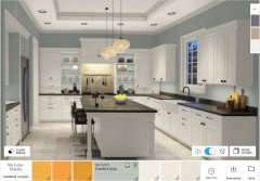
    Comfort gray is green. It is a subdued gray green. Green and cream is a lovely combination.


    Have you looked at this color next to your cabinets?


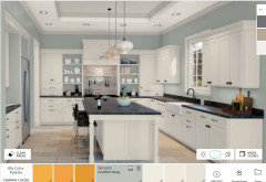
    Pearly white is a gray white, making it look a dull and lifeless next to cream.


    Why not paint the room Comfort Gray, paint the window seat Acacia Haze and ditch the Pearly White?


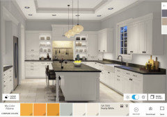
    Cabinets - SW Creamy, Walls Comfort Gray - night

    Cabinets - SW Creamy, Walls Comfort Gray - Day

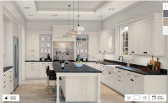
    Cabinets - SW Creamy, Walls Pearly White - night

    Cabinets - SW Creamy, Walls Pearly White - Day


  • 5 years ago

    Jennifer, wow, thank you for the great info!

  • 5 years ago

    Pretty much any color is going to look weird unless it matches trim. I’d do same color as millwork.

  • 5 years ago

    Is your third picture post the kitchen wall color before you put in the window seat? I see a grey wall color there that doesn't look good with the window seat color. But the off white wall color looks good with it. I love the color of the window seat and think your cabinets would look beautiful in that color also, get the color in other places, in other words.

  • 5 years ago

    I agree, paint it the color of your trim, and then put some nice cushions on it. Having it a different color, makes it look like it doesnt quite belong. I do like the window seat. Cute dog too.

  • 5 years ago

    Your kitchen seems to be crying out for some pops of a bolder accent color than comfort grey. I notice you have red apples on the table and a red heart hanging from a door. If you like that combo with your existing colors (I do) you might consider paying homage to the time period of your kitchen by painting your lovely new window seat white (the detailing will still stand out and look awesome) and then finding a period appropriate fabric for a seat cushion that includes a generous amount of red or other accent color you like. If you tie this in with just a few other matching color pops like a vase on the counter and something on a wall, it would all come together and look lovely with your cream cabinets and black countertops... ?

  • 5 years ago

    I agree with Lisa- Creamy white+gray-green + red pops would be lovely. A darker gray would be great too- more high contrast and maybe a bit more formal. Is that the direction you want to go?

  • 5 years ago

    I agree with you. It does look almost too subtle, due to its beautifully soft and subtle shade. I think a strong medium gray would look perfect with the white kitchen. It would break up all that white and compliment the appliances and black.

  • 5 years ago

    I think a couple of accent pillows would bring the room together. I like the current color.

  • 5 years ago
    last modified: 5 years ago

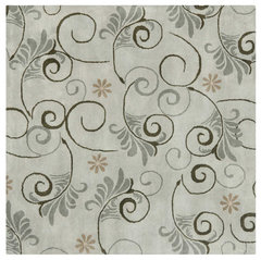
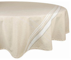
    Any feeling for going in this direction?

    rug


    Soho SOH220 Area Rug, Gray/Silver, 6'x6' Square · More Info


    Tablecloth


    DII White French Stripe Tablecloth 70 Round · More Info


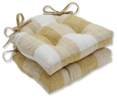
    cushion


    Indoor Check Please Sunshine Yellow Reversible Chair Pad Set, Set of 2 · More Info


    Valance


    Dolores Room Darkening Valance Yellow 52x18+2 · More Info


  • 5 years ago

    Before you get too deep in the idea of painting, try tablecloths with colors that pull in the grey from the windowseat and cream from the cabinets. Moreover you have a red heart on a door handle and red apples on the table. I think you can use even more red accents. I bought a house with lipstick red kitchen cabinets and black granite countertops, small shiny square caninet pulls—very contemporary. I was set upon repainting until I picked up two April Cornell dishtowels in a wild red, gold and sage floral print on black background. I moved in my 70s style dining room cane back chairs with sage and gold stripe seats and suddenly the whole room made sense as transitional style.
    Go find linens, a few decorative items and art that you love, relax and have some fun in that wonderful kitchen!

  • 5 years ago

    ooh I love that rug and also the chair pads.

  • 5 years ago

    After reading your window seat paint question and viewing the posted comments, I will add my advice to the group’s suggestions. We recently updated out kitchen breakfast nook that contains a window seat and worked with a designer. She transformed our kitchen with the addition of quality coordinated fabrics. We added an area rug, chair and window cushions and pillows, a sort of valance, and some wall art. The colors of the pieces made everything work and she pulled out fabric that I would have spent years trying to find, let alone coordinate. It was probably less expensive to use her services than to try to find stuff on line and it looks fabulous.

  • 5 years ago
    last modified: 5 years ago

    Your big pendant makes me think it would be best to have a sort of big, strong window treatment.. If you like the rug and the chair pads, maybe either of these would be fun, or something else that plays yellow, red and gray off each other, in the direction of French country


    Sawyer Mill Red Ticking Stripe Balloon Valance 15x60 · More Info


    Sawyer Mill Red Plaid Balloon Valance, 15x60 · More Info


    maybe the table doesn’t need a. Tablecloth and placemats would work, and give you variety

    I would bring up the pendant a couple of notches higher over the table

    hiring a consultant is generally good advice!

  • 5 years ago

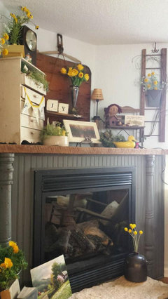
    I think it just needs a little black with it. I would go walk thru Joann's and look for an inspiration fabric. Something with gray and maybe your favorite accent color. Then make a pillow. Add other pillows, maybe one with a word on it in black....or a silhoutte of your cute doggie. Your kitchen floor is gorgeous, I love the crown at the top of the cupboards. Have fun decorating! PS. I painted a cupboard, our fireplace, and our island with gray craft paint and then glazed with special walnut stain, wiped off right away....maybe just some water downed black glaze is all the window seat needs! Here is my fireplace.


  • 5 years ago

    Grey's been so over done I think it's kinda run it's course. Add some color - maybe a darker blue. Doesn't have to be Navy as that ones getting used to death too.


    I love the blue trim used in the area of England where "Doc Martin" was filmed - check out this door in this first photo - I LOVE it!


    https://www.solosophie.com/doc-martin-filming-locations/


    We seem to fear color in America these days - break the mold!

  • 5 years ago

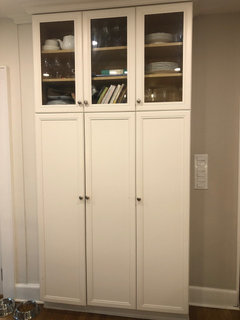
    Lynn G - I was thinking of getting a color consultation with Farrow and Ball! I can’t paint the whole kitchen at the moment but this pantry on the side of the kitchen is screaming to be painted! The kitchen is 30 years old so it has already earned its timelessness reputation!

  • PRO
    5 years ago

    Cute doggy!

  • 5 years ago

    I would do it the same white as the woodwork and make a cushion for the top to bring in color. I would also make matching placemats. Coordinate the fabric color with your backsplash or countertops

  • 5 years ago

    Your kitchen is lovely! Don’t be afraid of your enamel color, it looks very pretty. I would definitely paint the bench to match your trim and then use pretty gray colors for the bench with some cute pillows. Warm grays will look very nice with enamel that is a little warm than the stark white.

  • 5 years ago

    Jennifer had the right idea of painting the walls a different color for most impact and keeping the bench the same color as the millwork. Farrow and Ball have an amazing selection of subtle colors that are not too jarring but very warm. Good idea to get a consult and if you can’t do everything at once just break it up into smaller future projects. Instant gratification is not always the best solution as 2020 has shown us, sometimes patience is what pays off in the end.

  • 5 years ago

    I have Comfort Gray in a bedroom, it can look powdery/pastel and flashes green gray. How about going deep charcoal or even Tricorn Black? Black is a classic look and will help the trim pop.

  • 5 years ago

    It looks a little off. You have white cabinets and walls and black countertops. There is no other gray anywhere so it stands out instead of blending in. You need to decide if you want a pop/stand out color or if you want a blending in. Frankly, I don't think anything except your trim white color or maybe black will blend in. How about painting it the trim color and then getting a bench pillow for a pop like using a rug in a way. The other choice is to strip it and stain it to get the natural wood to match your flooring.

  • 5 years ago

    Wow. Great suggestions here..
    I think your eye is being thrown off by the visual heaviness of the black counter top.
    Once you balance that black with one of the suggestions that others have given, you’re going to fall back in love with that fantastic kitchen.
    I can relate to the decorating “brain fog”. Although I work w color every day for a living.. sometimes I get a block when it comes to my own “old house” dilemmas.
    I think maybe your fog is clearing? Now you can go HAVE FUN!

  • 5 years ago

    Hey! I just read the first article in today’s Houzz. 37 Design Trends and your problem is the #1 new trend! You can be happy with what used to be thought of as mismatched. In 2021 it is blended and totally stylish. 😅

  • 5 years ago

    Either match the trim, or paint it a dark graphite gray.

  • 5 years ago

    OMG...could your dog be any cuter!!

  • 5 years ago

    The neutral is doing just that - being neutral. It looks good, and if you love the color, you're done. If you wanted it to pop, then paint it in your favorite color. Love the doggie ;)

  • 5 years ago

    What are you doing the cushion in? You won't see the top of the thing with the cushion on. I have a built in seat like this and it is terrible to sit on without the custom made cushion.

  • 5 years ago

    I have a wooden chest made for sitting and storage that my husband’s cousin made as a custom order but the purchaser backed out. And I had an black Icelandic sheep skin that I could never find a use for until I threw the skin on top of the chest. Perfect solution all ‘round—appearance, function, and pride of craftsman and ownership.

  • 5 years ago

    My mind goes towards a Bold Statement.... ⬛️Black

  • 4 years ago

    I know this is an old post but could anyone share a photo of pearly white in your home? I have very red wood floors and worry the yellow will pop and clash.