Software
Houzz Logo Print
esther_smith58

Need help deciding lower cabinet color!

5 years ago
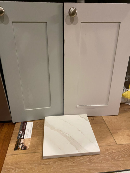
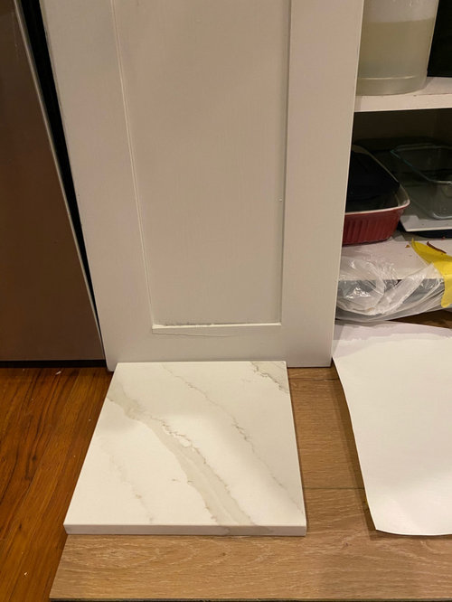
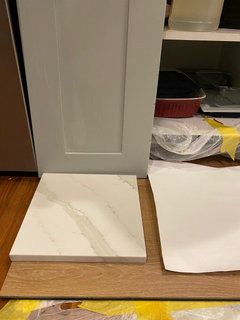
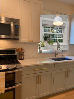
We are down to the final two options for cabinet colors and I can’t decide between magnetic gray and crushed ice. Magnetic gray is a really pretty gray that reads green. Crushed ice is an off white/light gray. The crushed ice looks better with the quartz but I love the look of magnetic gray. It has a homey, cozy feel. The upper cabinets will be sw pure white. Does the magnetic gray look ok with the quartz? What looks better? Don’t care about future resale - we will be here for awhile. Thank you!

Comments (69)

  • 5 years ago

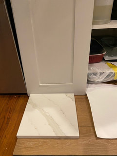
    Thank you all. Here are some photos with the pure white painted on a 11x17 piece of paper. I love the magnetic gray but my concern is it doesn’t work with the counters. The crushed ice seems to work better because it picks up the tone in the veining but if I go with the magnetic gray, I just want to make sure it doesn’t clash.

  • PRO
    5 years ago

    the darker one. Change things up a bit!


  • 5 years ago

    seeing all the elements : you really can do either. You have more info than any viewer can have because it's there in your space.

  • 5 years ago

    like the magnetic gray, think you need a different countertop that isn't reading tan to my eyes.


  • PRO
    5 years ago

    People confuse matching and coordinating. Magnetic gray doesn’t match your countertop, but it DOES coordinate with them beautifully.

  • 5 years ago

    Thank you! I think we’ll go with the magnetic gray. We went to go look at the full slabs of the quartz today and brought the doors. The magnetic gray actually looked really beautiful against it. Thanks for all the input!

  • 5 years ago

    They both still look good to me, but you are there and we aren’t. Are you set on different color upper and lowers? Just asking because it makes all other decisions more complex. If you’re open to same color upper and lowers it will constrain you less.

  • 5 years ago

    The magnetic gray is very magnetic... Loving your counter and floor options too. Can't wait to see this unfold.


  • 5 years ago

    I am set on white uppers primarily because we are trying to lighten everything up. We don’t get a ton of natural light so I’d like light cabinets at least on top. It definitely does make things more challenging but when we put everything together, it flowed nicely. We are doing our fireplace in white faux brick floor to ceiling so I think the white upper cabinets would balance our open concept living space. Hopefully!

  • PRO
    5 years ago

    Isn't it amazing what looking at the whole slab and the doors together does for your decision? You probably took one look at the composition and said "that's it"! As adalisa mentioned, coordinating is your goal, not matching, and that's difficult to do when looking closely at a small sample.

  • 5 years ago

    Thanks for sharing your project dilemma and happy that Houzzers could assist you with your decision. Best wishes

  • 5 years ago

    If you are trying to lighten things up....pay careful attention to your lighting AND to the kind of bulbs that you use. It isn’t just about the surfaces that you choose. Good choices! Good luck!

  • 5 years ago

    Thank you! I appreciate all the feedback. I’ll share after photos!

  • 5 years ago

    Please do share your “after” photos - I hate not seeing the final result!

  • PRO
    5 years ago

    Looks fantastic

  • 5 years ago

    I love the Magnetic Gray.

  • PRO
    5 years ago

    Very nice--good choice!

  • 5 years ago

    Mission accomplished! The kitchen looks light and bright, your choices blend well together, I love the faucet and pulls and knobs, too. Thanks for the “after” photo.

  • 5 years ago

    BTW, I think your flooring (the bit showing in the photo) looks great with the gold tone hardware.

  • 5 years ago

    lovely

  • 5 years ago

    @H S - so gorgeous! In one of the other post you have mentioned that you went with Calypso oak floors. Do you mind telling me what is the wall paint and trim paint color that you went with? I am debating between Cairo oak and Calypso oak. Cairo oak is backordered and Calypso oak seems a little too pale/ yellow in samples. I am very afraid to pull the trigger on Calypso oak.

  • 5 years ago

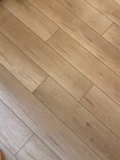
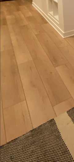
    We went with sw alabaster white for the walls and SW pure white for the trim. I LOVE alabaster white - so warm and beautiful especially in the sun. To be honest, I wish I went with Cairo. I love the tone of calypso - it’s gorgeous and not as yellow as I thought it would be, but I don’t like the painted bevel. It’s a personal preference but to me, it looks fake. I don’t know if Cairo has painted bevel but I would be careful with looking at photos online because you can’t really see the lines. If you’d like, I can send you photos of my floor so you can see them better.

  • 5 years ago

    Also Calypso is not as pale as the sample. I was afraid of that too. It’s actually very warm and I really do love the tone. It’s just the bevel lines that bother me.

  • 5 years ago

    Thank you so much for the input. I would love to see some pictures of your floor. Is there a way you can DM me that? Sorry, I am not very familiar with Houzz.

  • 5 years ago

    The tone of it is somewhere between these 2.

  • 5 years ago

    I also like that Cairo was the wider plank. It doesn’t look as busy.

  • 5 years ago

    Has*

  • 5 years ago

    The floors looks warm and beautiful. They don’t look pale at all. Thank you for the pictures.

  • 5 years ago

    I can’t tell about the painted bevels from the picture, but the bevels do look more pronounced in your first picture. They still look beautiful though.

  • 5 years ago

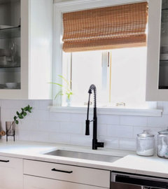
    love the kitchen. I'd put up a bamboo shade in the window


  • 5 years ago

    Your kitchen looks fantastic! The lower cabinets look very warm and work well with both the floor and countertop. Enjoy it!

  • 5 years ago

    Thank you! Yes, I wanted to do bamboo / light weave shades in my dining and kitchen!

  • 5 years ago

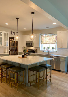
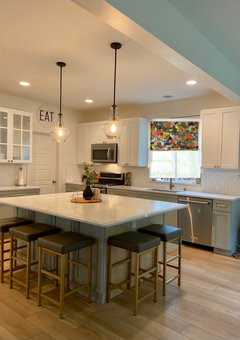
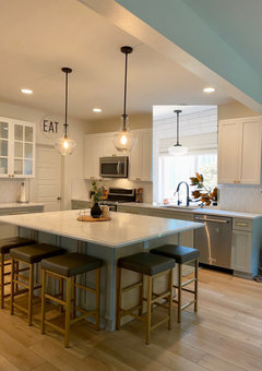
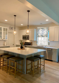
    ES, you did such a nice job! love the colors.

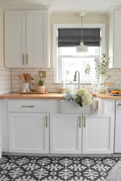
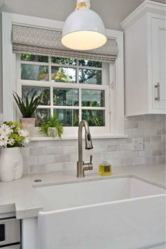
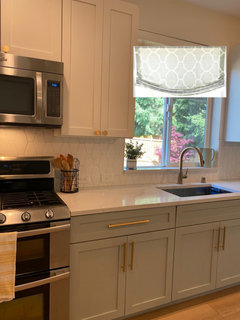
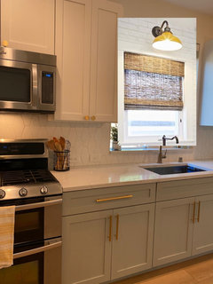
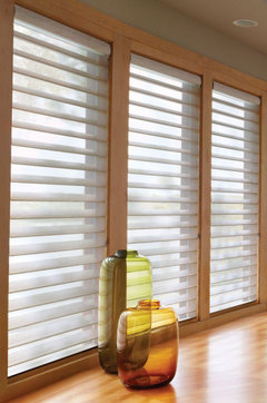
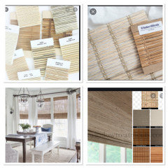
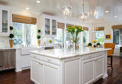
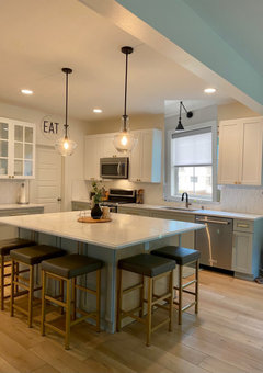
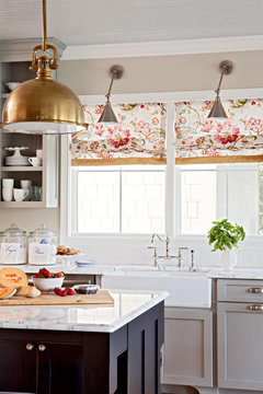
    glad to hear you want to do a blind. I photoshopped a few for you. (think about doing a pendant too,,,


    I like this blind. and the white pendants. any way you could squeeze in some window casing?


    plain roman shade in sage/gray color


    ignore the sconce color, but I do like the look


    the silouettes would look nice


    blinds.com has a huge selection. you can see samples in HOme depot


  • 5 years ago

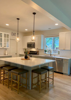
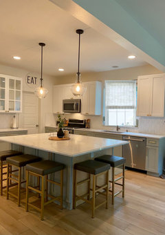
    Beth, wow! Thank you!! I love those and gives me some great ideas. Here is a photo of my island with 2 pendants. Do you think having another pendant over the sink is too much?

  • 5 years ago
    last modified: 5 years ago

    so pretty! it's up to you. it looks fine as is. (I actually have the same type of set up and debated on bringing in a pendant. ) since you have plenty of lighting, I think you can get by w/just some type of blind.

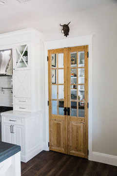
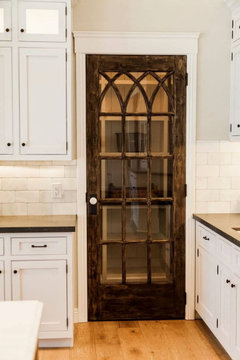
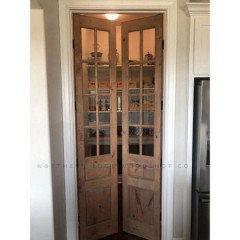
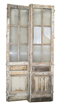
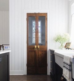
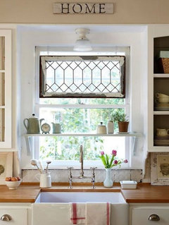
    (what I would consider for you, is to bring in a salvaged type of vintage door! that would look great

    you could always frost or 'mercury' the glass.


  • 5 years ago

    It looks like there is a recessed light right above your sink, so another light is t really needed. The window treatment ideas @Beth H gave you are great. I would only question the silhouettes since they’re hard to clean. A pretty fabric that complements your gorgeous color scheme in a Roman shade comes to my mind.
    The whole room looks great.

  • 5 years ago

    I agree silhouettes in a kitchen will collect too much odor and grease and grime, based on my experience with them in a den.

  • 5 years ago

    It is possible to wash silhouette blinds. I did it years ago with my honeycomb blinds and know that others have done it with their silhouettes. I did it by immersing them in my bathtub with Dawn detergent, sloshing them around and changing the water until they got clean, then rinsed them in fresh water. Others have used hoses to rinse them. Allow them to hang dry and re-install. Check out discussion about this on Houzz. In other words, don’t rule out Silhouettes if you like them.

  • 5 years ago
    last modified: 5 years ago

    instead of the silhouette, maybe something like the Kombi blinds? Just trying to get that type of look.


    However, I think with all of the solid and muted tones, a printed covering w/some colors may look better?

    (and, I really liek the salvage pantry door too)


    but I do like the woven woods too. you just need the right shade


    this is a woven wood in a white tone. I think I like the wood tones better


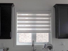
    a type of solar shade (they come in a ton of colors and prints) , shown w/a sconce


    I also like this idea. find or make yourself a vintage stained glass or beveled glass piece that's framed to fit perfectly inside the window, and hang it like this. (look on Etsy. they'll custom make anything for you. I had one made for my bathroom window)


  • 5 years ago

    I love all these ideas! I really love the brighter, prints actually. There was something missing - I agree it needs a little color. And I LOVE the idea of a vintage door. I’ll come back and post photos of what we ended up doing. Thanks again!

  • 4 years ago
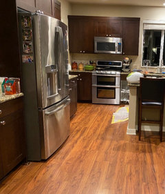
    I wanted to come back and post our before and afters! I have done anything with window treatments yet.

  • 4 years ago

    More

  • 4 years ago
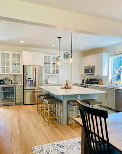
    Wow! that's 100x better.

  • 4 years ago
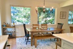
    Beautiful changes.

  • 4 years ago
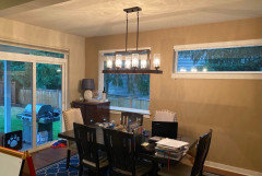
    last modified: 4 years ago
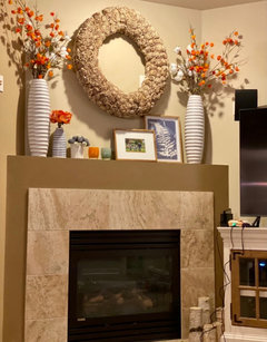
    One of the best before/afters I've seen someone do on here! Great job.

    (but I'll wait for that vintage door and the window treatment as the cherry on top! )


    Can you post an after picture from this same viewpoint?


  • 4 years ago
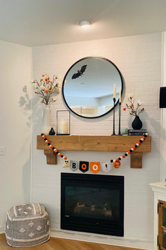
    Wow. That kitchen has no relationship to the original. Looks fantastic!

  • 4 years ago
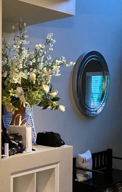
    This is all SO beautiful! Quick question, what is the quartz called? Thank you!!

  • 4 years ago
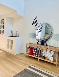
    I used a Sherrington Williams color called Anonymous 10 years ago. It is very similar to your green-grey. I still love it! It is a fantastic neutral.

  • 4 years ago
    Sherwin Williams