Software
Houzz Logo Print
dave_tisdale

Paint Color Frustrated/Overload

5 years ago

I have painted the various room in my house with a variety of colors including:

SW 9037 Baby Bok Choy,

Paint Color SW undefined Baby Bok Choy from Sherwin-Williams from Sherwin-Willia · More Info

SW 6478 Watery,

Paint Color SW undefined Watery from Sherwin-Williams from Sherwin-Williams · More Info

SW 6129 Restrained Gold and

Paint Color SW undefined Restrained Gold from Sherwin-Williams from Sherwin-Will · More Info

SW 6136 Harmonic Tan.

Paint Color SW undefined Harmonic Tan from Sherwin-Williams from Sherwin-William · More Info

My house is a modest 1700 square foot ranch with an open floor plan. The front entrance is painted with the Bok Choy and Watery colors. This opens into the living room which is painted Restrained Gold. The entrance area also has views into the dining/kitchen combo which walls are painted the Harmonic Tan.

The flooring is similar to the SW 6126 Navajo White.

Paint Color SW undefined Navajo White from Sherwin-Williams from Sherwin-William · More Info

The wood trim throughout the house is a blonde oak.

Is this too much color? How about a color I could use to complement all rooms in small touches? Blues? Greens? How could I improve the flow? Any suggestions are welcomed! I am experiencing overload! I like many different colors.

Comments (26)

  • 5 years ago

    I used to have multiple paint colors, but after hiring a paint consultant, we did everything in Benjamin Moore Gray Horizon. It’s a greenish beige gray, depending on the light. So happy with the flow it created in my home.

    Dave Tisdale thanked curlycook
  • 5 years ago

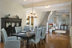
    With your warm cream floors and blonde oak trim, I think the blues and greens would be better without the two tan/camel colors. You can keep your rooms in blue and green and then paint the rest of your space a light nuetral, like Sea Salt or a nuetral white. A lighter more nuetral color on the walls allows you to use different accent colors in each room. This example shows a warm white with Pallidian Blue in an adjacent space.

    Dibros Design & Construction · More Info


  • 5 years ago

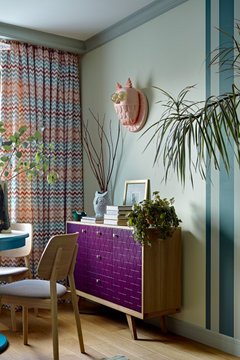
    Depends on how much you like color!

    Природа в доме · More Info


    Home Office · More Info


    Рок-волна · More Info


    Dreams · More Info


    the swell house · More Info


    My Houzz: Rugs Define Living Spaces in a 750-Square-Foot Apartment · More Info


    КВАРТИРА 43 КВ.М В МОСКВЕ · More Info


    Wohnzimmerbereich mit heller, warmer Atmosphäre · More Info


    Have fun in life

  • 5 years ago


    East London Apartment · More Info


    Denver Highlands Bungalow · More Info


    Buena Vista · More Info


    IRISH COUNTRY HOUSE · More Info


    Presidio Heights Home · More Info


    Transitional Living Room · More Info


    Bella Fiore · More Info


    By the way, one way to make a colorful home work is to bring in lots of house plants.

    Dave Tisdale thanked User
  • 5 years ago

    You can always paint over the color if you don’t like it, but if you do like the color, sometimes the way to make color immersion work is to put a very strong shape or graphic in the room. Don’t have ordinary furniture if your walls aren’t an ordinary wall color like white, beige or gray

    Vintage Apple Collection 'Art Deco Hat' Canvas Art, 14" x 19" · More Info


    Divani Casa Slater Modern Leatherette Lounge Chair, Cognac · More Info


    Surya Dazzle Area Rugs Style DAZ-6537, 5' x 8' · More Info


    Sumatra Solid Natural Teak Wood Round Deco Table · More Info


    Paulette Duval and Vaceslv Svoboda Dance- Framed Paper Poster 20" x 30" · More Info


    Delmar Del-1 Multi, 8'0"x10'0" · More Info


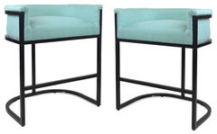
    GDF Studio Best Wide Bucket Upholstered Barstool, Light Blue/Black, Set of 2 · More Info


    Jezebel Radiance Stingray Chandelier, Sky Blue, 18" Drop Height · More Info


    "Berliner Secession" by Vintage Apple Collection, Canvas Art · More Info


    Curvly Style Mirror In Strong Cobalt Blue Finished · More Info


    Pixelated Ball Vase, Blue, Large · More Info


    Sailor'S Delight, Geometric Print Pillow, Navy Blue, 26"x26" · More Info


    "Internat Ruder Regatta" Poster Print by Niklaus Stoecklin · More Info


  • 5 years ago

    I do have lots of house plants and a couple of large colorful framed art that I love. I'm not sure if the wall colors work with my artwork though.

    Kina Lillet · More Info


    Zambelli-Bassi Giclee Print by Achille Luciano Mauzan at Art.com · More Info


  • 5 years ago

    I really like these photos but don't know where to start.

    Home Office · More Info


    Transitional Living Room · More Info


    Denver Highlands Bungalow · More Info


    Bella Fiore · More Info


  • 5 years ago

    I think if this poster was in this room, it would look fine with a few tweaks to the room, like a strong blue throw on the chair, and a stronger hue in the curtains, maybe a blue and white patterned ceramic table lamp rather than a white one.

    Kina Lillet · More Info


    Transitional Living Room · More Info


    I also think this poster would work instead, maybe with just a much stronger red ceramic lamp as the only change.

    Zambelli-Bassi Giclee Print by Achille Luciano Mauzan at Art.com · More Info


    Dave Tisdale thanked User
  • 5 years ago
    last modified: 5 years ago

    This works for me with some tweaks, like some strongly blue pieces on the sofa table if I put the poster up where the 3 prints are in the back of the room, or a blue ottoman cushion and sofa pillows if I put the poster over the mantle framed in black


    Kina Lillet · More Info


    Bella Fiore · More Info


    Dave Tisdale thanked User
  • 5 years ago
    last modified: 5 years ago

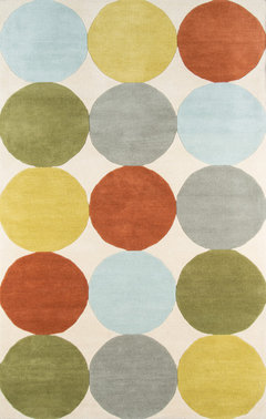
    Do a tan and red patterned rug instead of tan and orange, and I think either poster works for this room.

    Denver Highlands Bungalow · More Info


    Your posters are lively and the rooms you like have some serenity, so you might want to think about where you put your posters if you want that serenity. You might not want them as the focal point of the room, but an accent piece off to the side.


    Interestingly none of the rooms you like have chandeliers or ceiling fixtures, although some have colored ceilings. I think your Lillet poster probably demands a chandelier (depending on room) but otherwise you might think about how you like the focus of the room at eye and seat level — apparently!

    Dave Tisdale thanked User
  • 5 years ago
    last modified: 5 years ago


    Home Office · More Info


    I think it is hardest to make your posters work in this, unless you framed this one in as strong and thick a gold frame as the artwork in the niche is framed in the left behind the sofa, and instead of the pale center pillows on the sofa, one with bright red or coral squiqqles, one with feathers! I might put a feather throw on the chair.


    Zambelli-Bassi Giclee Print by Achille Luciano Mauzan at Art.com · More Info


  • 5 years ago
    last modified: 5 years ago

    I think the place to start is with the function of the rooms. All these rooms you like look very comfortable and useful. I think a comfortable room works in any color if you can see a reason for being in the room, doing what you want to do.

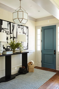
    If your entryway is Watery and Bok Choy, can you bring in cream and black and plants?


    Transitional Entry · More Info


    Nantucket · More Info


    Eclectic Entry · More Info


    Uptown Penthouse · More Info


    Dave Tisdale thanked User
  • 5 years ago

    I have the Lillet in my dining/kitchen area above the fireplace. The walls are painted SW Harmonic tan which reads as a medium olive green in this space. I do have a chandelier above the table. A portion of this space is where I have a dark green leather reading chair, end table, and table lamp. The lamp base is a strong blue and cream ceramic with cream shade.


    The walls of my entrance area are painted SW Watery and the front door is SW Bok Choy. I do have plants in this space and am currently looking for cream or white pottery.


    I never thought about the tension between a calm and practical space and lively artwork!

  • 5 years ago

    Find pictures of rooms, with the colors you like, and pick out parts that you like and copy them. Its nice you like color. Its a bit refreshing to see, to me, since everything is either white, or tan, or gray or beige these days. Do what you like. You live there. Its part of your personality.

    Dave Tisdale thanked cat_ky
  • 5 years ago

    I also like these rooms and colors. Can't seem to find any common thread? Direction to go in decorating my rooms?


    Chatham Residence · More Info


    Colorfully Refined Living Room · More Info


    Beach Style Living Room · More Info


    Lake House Mudroom · More Info


    Buena Vista House Powder Room · More Info


    LINDENWOOD CIRCLE · More Info


  • 5 years ago

    What is attracting you more in those photos (if you know)


    The adobe clay glow or the blues and green pops?

  • 5 years ago

    I'm not sure

  • 5 years ago
    last modified: 5 years ago

    Are any one of these reasons you like these rooms?

    tjey are reminiscent of pleasant times you’ve spent, either a past home. or a memory of a part of the country whose culture you like, or a travel destination, places you felt content

    the rooms look very doable to you, something you could achieve and not professionally decorated

    Blue is your favorite color but you like earthy things like wood, stone and clay

    Dave Tisdale thanked User
  • 5 years ago

    I like earthy things like wood, stone, clay. I like blue but also like other colors.

  • 5 years ago

    I like texture and plants.

  • 5 years ago

    Keep your blue/green entry and paint your two tan rooms in a lighter more nuetral color, incorporating deeper colors of greens and blues in your artwork and accessories. Add natural elements, texture, and color in your furnishings with rugs, textured fabrics, and accessories. Your home will look more cohesive with less wall colors.

    Small Space Bedrooms · More Info


    Scandi Modern · More Info


    Fresh Interior · More Info


  • 5 years ago

    I looked, but maybe I missed it…do you have pics of your actual house/rooms?

  • 5 years ago
    last modified: 5 years ago

    It seems to me your most problematic paint choice is Harmonic Tan, which you say is reading as an olive green on the walls of your house. I don’t think any of the furnishings calidesign has shown in the pictures need a neutral wall. Appears to me they’d look nice with your paint choices, but you are the one standing in your house looking across the spaces and not feeling satisfied. Hard to know what isn’t working for you

    It does occur to me that you might prefer furnishings without a lot of decorative design on them, and most furniture sold does have a lot of design: wood carving, floral fabric, decorative rugs, lamps with a lot of shape and trimmings. So maybe you haven’t got a problem with the color on the walls but with the busy-ness of your furniture in your newly colored rooms. If you can experiment that way —- change the chairs in the room or put a sheet over a floral rug or upholstery to see if you like it better, that might tell you something.

  • 5 years ago
    last modified: 5 years ago

    everyone is going on about colors and accessories but no one has even seen your house.

    why on earth don't you post some pictures so you'll get better guidance? seldom do paint squares on line look exactly like that in real rooms. You're asking if "it's too much color" How would we know? have no idea what your style is, what furniture you have, what your lighting is like.

    post pictures!

  • 5 years ago

    @Dave Tisdale you might find this interesting. Completely different style of house but one that uses several of your color combos. Deliberate use of fields of gray and black/white graphics to separate out the color fields.

    https://www.houzz.com/houzz-tv/visit-an-architects-color-happy-contemporary-home-stshtvvw-vt~150329120?utm_source=Houzz&utm_campaign=u16343&utm_medium=email&utm_content=gallery4_4&newsletterId=16343

    Dave Tisdale thanked User