Software
Houzz Logo Print
jonnyt

backsplash with white dove dove cabinets

5 years ago
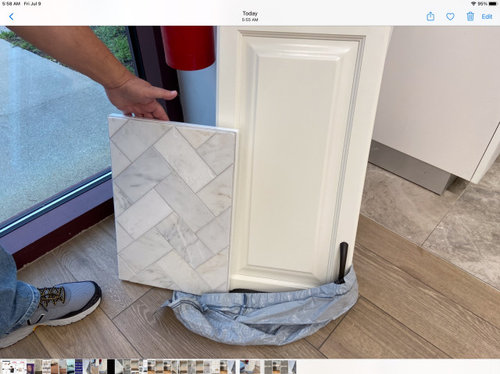
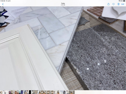
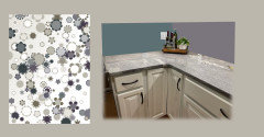
Can this work? I’ve lost count as to how many tile samples I’ve tried and nothing seems to look good. The woman I’m working with at the tile store thought maybe this could work, some of the creamier tiles seem to work better with the cabinet color and picks up a bit on the floor. We are waiting for some samples to try in the kitchen but in the meantime, just inquiring
I never dreamed this would be such a challenge

Comments (20)

  • 5 years ago
    last modified: 5 years ago

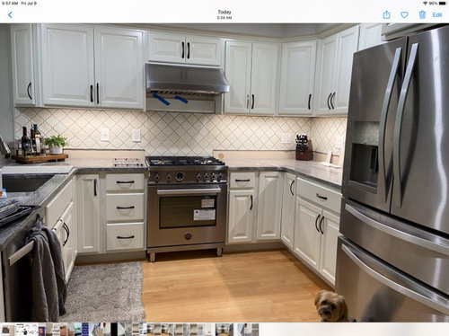
    @jonnyt Good morning, Thank you for including the photos. There are a few questions that could help. Is that a photo of your kitchen with all of your lights on or a showroom display? Also, there is a blue and grey counter photoed. Which one do you have? I also see that there is a backsplash installed in the full kitchen photo. Thanks!

  • 5 years ago

    if all the elements remain......floor ,cab color , and counter......I'd go ahead with your option for the splash. It has the various tones and is not too busy or overdone. I would however change the hardware...the black is too prominent. . Pick one of the more subtle metal shades.

  • 5 years ago

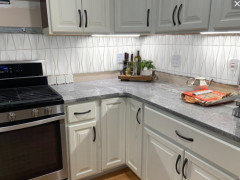
    We are guessing at what is actually part of your house. It looks like you new kitchen is installed and you’re removing a white arabesque shaped backsplash. The grey swirl stone looks like it’s already installed and your floor is a light wood. If that’s your kitchen I would go for something different than your tile sample in the first photo. The whites don’t seem to work well together. Something solid with a hint of the gray might marry the two better. A glass tile could be the answer, but you have to do a sample of it on a board since glass tiles slightly change color when installed. To my eye, the sample tile fights the countertop.

  • 5 years ago

    Do you happen to have a sample of the counter top, maybe the piece that was cut out for the sink?


    In the photographs the backsplash feels too blue gray.


    Natural daylight reveals issues with colors that are much less obvious when looking at the same colors inside.


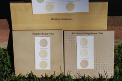
    I would take all three samples outside and look at them on a clear day about 2:00 in the afternoon. I use this to compare color tones when I have tough color decisions.


    In my home the two tiles that were installed by the previous owner looked quite similar, but in sunlight you can see that the kitchen tiles were much more pink than the family room tile.


    colors · More Info


  • 5 years ago

    Put the sample up in your kitchen and stare at it for a day or two. You gotta love it!!
    I think it might work but I would like to see a sample in the kitchen with all the kitchen elements together and in the kitchen lighting.

  • 5 years ago

    That tile is too gray for the cabinet color. Wait until everything else is installed to choose the backsplash.

  • PRO
    5 years ago

    Have you thought of going with a color to avoid too many neutrals?

  • 5 years ago

    It is not the gray in the tile, it is that the bright white fights the white of the cabinets.

    It also dosen’t coordinate with the gray in the counter.

    I would find a light gray that matches the counter.

  • 5 years ago

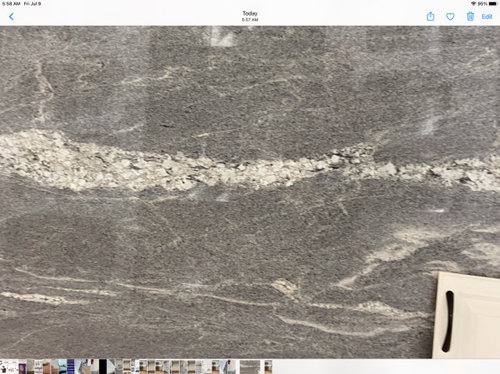
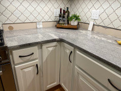
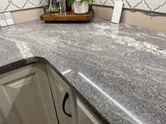
    Original photos submitted this morning, two were taken at the tile showroom with our counter sample and cabinet door. The larger photo of the granite was taken in the showroom and I’ve added closeups of the counter in our kitchen which looks completely different, much lighter (picture of current kitchen included in today’s post)
    We will remove the current backsplash once we find a replacement. Cabinet hardware will also be changed
    We are waiting for the store to get us tile samples as shown in the herringbone pattern to see how it looks in the kitchen. It was mentioned the tile has a blue tone to it and in person the colors worked so well but looking at the pictures I agree, I see a blue tone
    I’ve been hesitant about a grey backsplash as we live in an open floor plan condo, all of the walls are painted Mindful Grey and we won’t be painting anytime soon
    Susan Tiritulli mentioned going with a color, what color given the current color scheme we have? I am however someone that likes a neutral pallet with the option of adding color with decor, wish I could be more daring
    I think I’ve brought home just about every tile sample in NH and have yet to find something that works which gets more frustrating every day! I’m hoping the latest samples will be like magic and end up working once in the kitchen, hope springs eternal if not, back to the drawing board - again
    As always, I appreciate your time and thoughtful comments…there has to be a tile, any tile that will work with all

  • 5 years ago

    @jonnyt: Thank you for the additional info. How about finding a tile that looks good with your paint and granite, but choosing it in glass, metallic, or a beveled subway to add interest? Daltile and Emser have some great options, as does Sonoma but Sonoma is very pricey. I think the granite is the star of your kitchen. My suggestion is to let it shine and keep the backsplash simple.

  • 5 years ago

    Look at Sonoma Tilemakers in the Gardenia color. lots of choices of shape/design. just try it out.


    it looks green online but its not.

  • 5 years ago

    I don't know if this helps, but when I saw your first photo in the thumbnail, I thought "Wow, that looks really nice" and that's why I clicked on this discussion. I'm also not super great with minute color differences, but I love your second photo: I feel like the blue/gray undertones in the tile go nicely with the blue/gray undertones in the countertop.


    Regarding the suggestion that you add color to avoid too many neutrals -- Maria Killam (designer and colorist) always advises that the best way to create a timeless look is to get all the expensive components in clean, non-trendy neutrals, and to leave the color to cheaper things like painting and decor. In general, I have found her blog to be super helpful in thinking about color. Unlike a lot of design blogs I've seen where the designer just tells you what looks good, in most posts Maria uses examples to prove to you why her advice is good so you can see it with your own eyes. It might be worth looking for relevant blog posts there to help you get more confident in your plan. https://mariakillam.com/blog/

  • 5 years ago

    I don't think that splash works with your counters.


    Have you looked at tilebar?


    This is in "natural"

  • 5 years ago

    That looks nice. Unfortunately,the person/company installing our backsplash works exclusively with Daltile. Thank you for the visual

  • 5 years ago

    Are you saying your contractor won’t install any tile you like? Just one from Daltile? That’s something I’ve never heard before. If you are restricted by that one company, you’re going to get more frustrated. Backsplash choice is super hard and having all the tiles available as options is the only way we all get done with this task. Now I see why you’re having a problem.
    Your countertop is STUNNING! That is the star of the room so make sure your backsplash is a small, barely noted member of the chorus. (And rethink who does your tile work.)

  • 5 years ago

    Do the backsplash last. Wait until all else is installed

  • 5 years ago

    Actually the backsplash and hardware is all that needs to be done-counter has been installed, dark beauty granite

  • 5 years ago

    I was just looking on the website of the company he works for trying to see if they carry other tile brands but it didn’t provide that info, I guess a trip to the store to find out. It has been incredibly difficult trying to find someone, seems everyone has more business than they can handle. Even more frustrating, numerous calls and no one calls back! My husband just wants the backsplash up and be done with it although I’m not willing to settle and if it takes longer to find exactly what I want, so be it-I’m getting used to the 1/2 finished look!

  • 5 years ago

    You asked what color, so here is what I am seeing based on the pictures.


    Your cabinets have a creamy undertone, the counter has both the creamy undertones and a bit of purple gray (purple and yellow are complements and often found together in nature)


    Worldly gray is a deeper gray beige..


    Using these colors blue green grays would be a very good color choice.