Software
Houzz Logo Print
swetha_rajendiran81

Feedback on the Backsplash

5 years ago

Hello everyone,
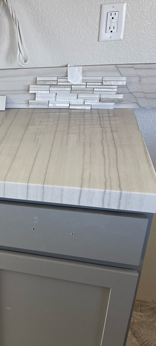
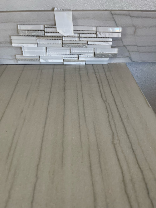
We have installed white macaubus quartzite countertop and have gray cabinets. I am leaning towards the backsplash shown in the below picture.. please let me know your thoughts on if they look good together..
few other questions-
What grout color would go best ?
Would the grout be hard to maintain?
I am open to other backsplash suggestions as well..
thank you!

Comments (32)

  • 5 years ago

    Oh boy, no...what is going on here? You have counter veins running one way, looks like a 6-8" splash with veins running another way. Are you adding the tile above the vertical quartzite? Why is the splash taped in front of it...as if the splash tile starts from the counter?

  • 5 years ago

    Since you asked, no, I don’t think that backsplash and the counter go well together.

  • 5 years ago

    These always seem like they could work when you only look at one sheet, but look at the photo below ... is that the look you want? Because that is what this tile will look like once it covers your whole backsplash. The forum is now starting to see people who put these in in the last 14 years and can't wait to rip them out.


    Kitchen Backsplashes | Tile, Stone & Glass · More Info


  • 5 years ago

    Hi Rookie Mom - great choice on that gorgeous stone! I, too, am confused by what you want to do. Are you keeping the Macaubus splash? Even if you aren’t keeping it, the tile you chose is just too busy and takes your eye away from the stone. My non pro opinion is to remove the current splash and use a more neutral tile in its place — Something not so obviously linear. I do love your stone and cabinets. Good luck to you!

  • 5 years ago

    Sorry everyone, I missed adding that we will remove the quartzite strip in the backsplash.. the builder gave us with that strip, which will be removed..

  • 5 years ago

    No, they don't go together. I'd keep the strip over that backsplash. Maybe Beth H has some ideas for you. Interested to hear why you opted to run the veining opposite direction of how you did it on the island? It's different but I think will force you to go with a very plain tile or like I said keep the strip.

  • 5 years ago

    Thanks for the honest feedback everyone.. Would be great if any of you have suggestions.. below are a few options I have been looking at.. would it look good if I laid one of the below in herringbone style ?

  • 5 years ago

    As far as why it was laid vertically, the builder did not have us stay when the countertop was installed so we did not have a choice in the layout..

  • 5 years ago

    Maybe it's your camera but do you see how the countertop has a warm undertone and your tile choices have more like optic/ cool tones? The cab paint and countertops look nice together but you'll need a tile in the same tone. Can you take a piece of the countertop to the tile shop?

  • 5 years ago

    Also I am wondering why that strip extends beyond the cabinet edge? But if it's getting removed I guess it doesn't matter :). Just curious is all.

  • 5 years ago

    I took the countertop to the tile shop and these were recommendations from the daltile folks ..

  • 5 years ago

    I had pinned the belo backsplash from
    Houzz and the countertop here is white macaubus quartzite as well.. would this work with gray cabinets ? Also the tile is Lunada bay tile shinju in moonstone ..

  • 5 years ago
    last modified: 5 years ago

    In your picture above, the counter below the backsplash is not the white macaubus but a solid black. The problem with the busy backsplash patterns in colors similar to your white countertop is that the patterns clash. If you want to do herringbone, try that in a darker color with dark grout so the pattern isn't as obvious as with light grout. What about black or charcoal herringbone? Looks like you want some bling...just don't use a light color to get it.


    eta: I take that back. Here's a light and somewhat blingy backsplash that might work because the scale of the pattern is really different - if you use the same color grout as the tile so the pattern is minimized:


  • 5 years ago

    Ooh the dark tile with dark grout could look really striking. I am surprised the tile shop recommended those to you OP! Like I said maybe it's just your camera making the two look so very different.

  • 5 years ago
    last modified: 5 years ago

    I think you have to work with the lines in the counter acting like stripes and taking the eye up. Try picket fence or vertical stacked tile. You can go dark gray or near black . But try for the creamy shade in the background of the counter first .....I think the more subdued color would be better.......but . then do something like champagne bronze hardware [a little "stand out" ] to shift the focus a bit . This can actually end up quite nice..... but careful .

  • 5 years ago

    A plain crackle tile stacked vertically like herbflavor suggested would help make the direction shift make more sense. This one was an in process shot and the crackle tile is from MSI (I think Pearl was the color)

  • 5 years ago

    What you have picked right now, is way too busy with your countertops. You need something more of a solid color. Olychick, just posted two examples that look good. I particularly like the charcoal. Its a show stopper

  • 5 years ago

    I think I would keep the short backsplash and just do a bigger piece of quartzite behind the cooktop.


  • PRO
    5 years ago

    I agree that the tile you posted is not a great choice, very busy and overdone. I’d do something with texture like Waterworks Grove Brick collection-it’s a glazed brick that comes in some dramatic dark colors. Or a glazed terra cotta (zelige)

  • 5 years ago

    Actually I like that particular stone so much that I feel like almost anything will detract from rather than add to it.

  • 5 years ago

    Do you folks think installing the same quartzite as backsplash be better ? Only issue would be the way the veining runs ..

  • 5 years ago

    I think the relative direction of the veining is a matter of taste. Horizontal would look fine and vertical would just give a different look. In stained woodwork unless you are doing a fancy grain matching sort of thing, woodgrain runs in different directions on different components, and sometimes even on the same door, like a panel door or a five part drawer face.

  • 5 years ago

    I would worry that the veining in a new slab would contrast unfavorably with the existing and perhaps the colors would be "off" as well.

  • PRO
    5 years ago

    This Waterworks tile would look awesome!

    Waterworks Offerings · More Info


  • 5 years ago
    last modified: 5 years ago

    Great counters.

    I would go dark on the back splash.

  • 5 years ago

    I think I would try to match the color of the backsplash with the cabinet color. Or a bit lighter but with the same hue? You did an excellent job matching the cab color with the veining in the countertop, so just do the same with backsplash. I would probably do a matching grout so as to minimize any more pattern. Something like this? Sorry for the weird mockup.


  • 5 years ago
    last modified: 5 years ago

    I agree with rebunky I would try to match the grey in the vein color. A warm gray tile would look beautiful! I know daltile has some warm gray tile.

  • 5 years ago

    Looks like they have three different grays in their 3x6 they probably have more in their other styles too.


  • 5 years ago

    i love the idea a dark, near black, b/s!

    what is the finish of your hardware? a matte gold would be stunning.

    what material/color are your floors?


  • 5 years ago

    Hardware would be satin nickel .. floors are LVP in light wood tone

  • 5 years ago

    The suede gray tile above looks nice. Get a sample and see if it works

  • 5 years ago

    No mention of what the floor color is. That should be factored into to the decision IMO. The backsplash is what pulls the floor, cabinet and countertop together.